Strong submissions define the problem, explain its significance, and show how design decisions delivered meaningful outcomes.
This article provides practical advice on writing a stand-out entry, with insights and guidance from past Jury Members for each of the 13 Design Disciplines including:
- Built Environment
- Communication Design
- Concept Design
- Design Research
- Design Strategy
- Digital Design
- Engineering Design
- Fashion and Textiles
- Next Gen
- Policy Design
- Product Design
- Service Design
- Social Impact
- Sustainability Award
The top 3 tips across all categories were:
1. Clearly define the problem and why it matters
Start with the brief and the problem your project set out to solve and explain its real-world impact. Help the Jury understand who it affects, why it matters and what makes the problem worth solving.
2. Show the thinking behind the design
Go beyond polished outcomes. Explain the constraints you faced and the trade-offs along the way. Submissions written from the perspective of the design team are often the most compelling.
3. Evidence your outcomes
The Jury want to understand the impact of the project. Where possible, data, evidence and testimonials that reinforce the intended and potential impact of the project are incredibly helpful.
Built Environment
Advice from Good Design Juror: Isabelle Toland – Director, Aileen Sage Architects
- Give useful context. The Jury want to understand your design decisions. Be sure to explain any historical and cultural context of the project by including archival photographs, maps, drawings or written descriptions, that may be relevant and have influenced the outcome of the project. Good design sits within a broad cultural context, so understanding and explaining what has come before, the current context, and consideration for how it might need to adapt for the future, will help the Jury better understand your design journey.
- Include varied submission material. Materials such as photos of the finished project, video content and interviews will assist the Jury to fully understand and appreciate the site, the project, the perspectives of others involved (clients, user groups, stakeholders, builders & makers), and the impact it has had for the people and communities it serves.
- Illustrate environmental integration. Good design in the Built Environment is not just about aesthetics. It’s equally about how the design responds and contributes to the environment around it. Make sure that this is illustrated and clearly communicated in your submission, not just verbally, but visually. This could be through photos or drawings that show how the built form interacts and engages with the landscape and communities around it.
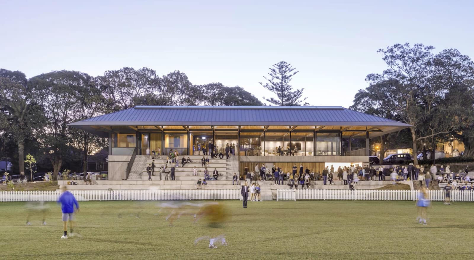
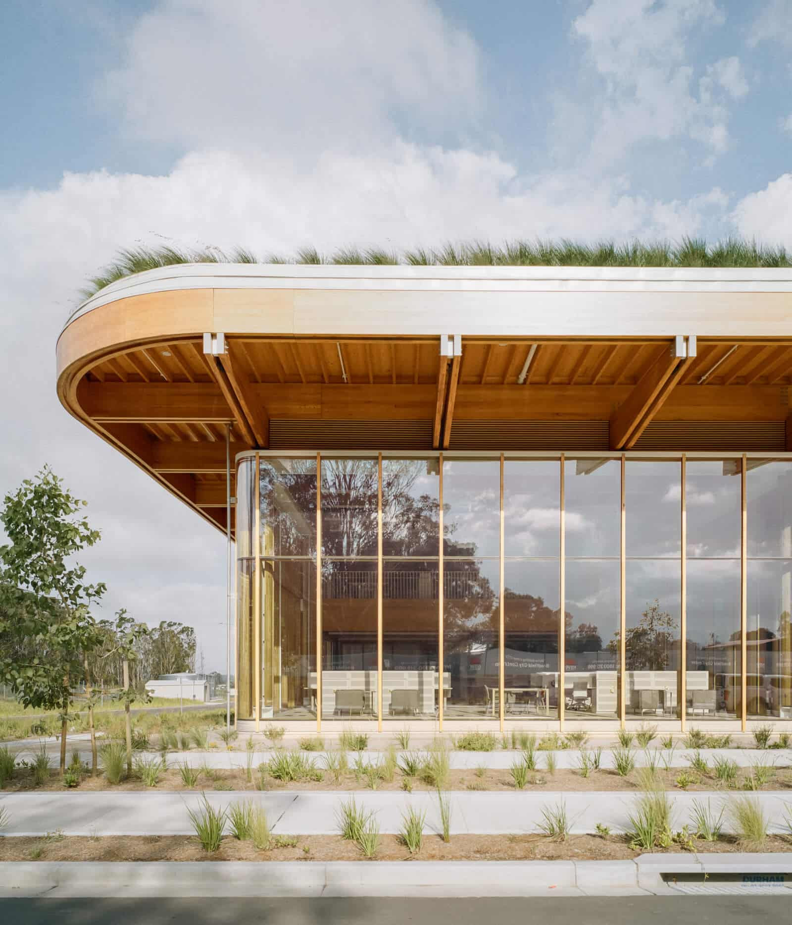
2025 GDA Best In Class Built Environment – Architectural Design Winner: The Allan Border Oval Pavilion. Image: Supplied
Communication Design
Advice from Good Design Juror: Marcel Wijnen – Creative Director, Hulsbosch
- Be clear and concise. Award submissions are not case studies, we don’t need a breakdown of all the processes and every single deliverable. Strip out any unnecessary content that doesn’t relate to the ‘idea’ you’re selling – and avoid duplication.
- Clearly outline the problem being solved. The power in the idea is directly related to the problem that is being solved. Simplifying that problem to its core is critical. Do this in the most straightforward and human way – avoid jargon, and cliché’s. The problem should be the flip side of the idea – connect these two elements for a powerful submission.
- Tell the design story. Ensure the designer’s voice comes through, rather than marketing-led language. It’s important to get the designer’s perspective. All the marketing-led jargon can overcomplicate a submission, and get in the way of communicating the idea.
2025 GDA Best In Class Communication Winner: Connections. Image: Supplied
Concept Design
Advice from Good Design Juror: Esther Lekeu – Senior Designer, Defy Design
- Identify the problem and alignment to SDG’s. Clearly outline the problem and/or need being solved. Demonstrate real users and real world needs, with added value beyond the existing market offering. Past successful applications were also more clearly aligned with the United Nations ‘The 17 Goals’.
- Demonstrate meaningful innovation. Use radical innovation to solve real problems rather than adding tech for tech’s sake, including novel solutions within design areas.
- A picture is worth a thousand words. Entries with clear images/drawings effectively communicated their design over those using low-res images, confusing images, irrelevant images, or no images at all. The addition of videos often helped demonstrate the product’s functionality, its level of realness, and/or user interaction and user feedback (when possible).

2025 GDA Best In Class Concept Winner: First Responder, Portable Neurodiagnostic Device. Image: Supplied
Design Research
Advice from Good Design Juror: Vesna Popovic – Professor Emerita/Adjunct Professor of Industrial Design, Queensland University of Technology
- Define the purpose of the research clearly. Design Research recognises scholarly investigation integrated within the design process. Clearly outline the aims, scope, objectives and research questions, showing how the investigation targets a specific gap and advances knowledge in the design disciplines.
- Demonstrate rigour, innovation and method. Clearly explain and demonstrate suitable research methods, data collection, analysis and results. Show research rigour, ethical practice, and diversity considerations, and evidence how methods or combinations of methods are used in innovative ways to produce new findings.
- Show real impact beyond the research itself. Evidence tangible outcomes and impact, including intellectual contribution, commercial potential, and value for the community, with clear economic, social, and environmental benefits resulting from the research.

2025 GDA Best In Class Design Research Winner: Central Station Sydney Metro. Image: Supplied
Design Strategy
Advice from Good Design Juror: James de Vries – Principal, Weft Strategy
- Make it easy for the Jury to understand. Don’t make it hard work for the Jury. Be clear about what the strategic design is. Show how the design was excellent quality. We need more than just adequate UX, or evidence that stakeholder workshop sessions were held.
- Use strong images. Show strong visuals that differentiate your work. Not just screen shots of an app or website.
Show the outcomes. Demonstrate the difference it has made. This may be difficult for some but demonstrating the measurable and/or potential impact is essential to the Jury understanding if the strategy has been, or will be effective.
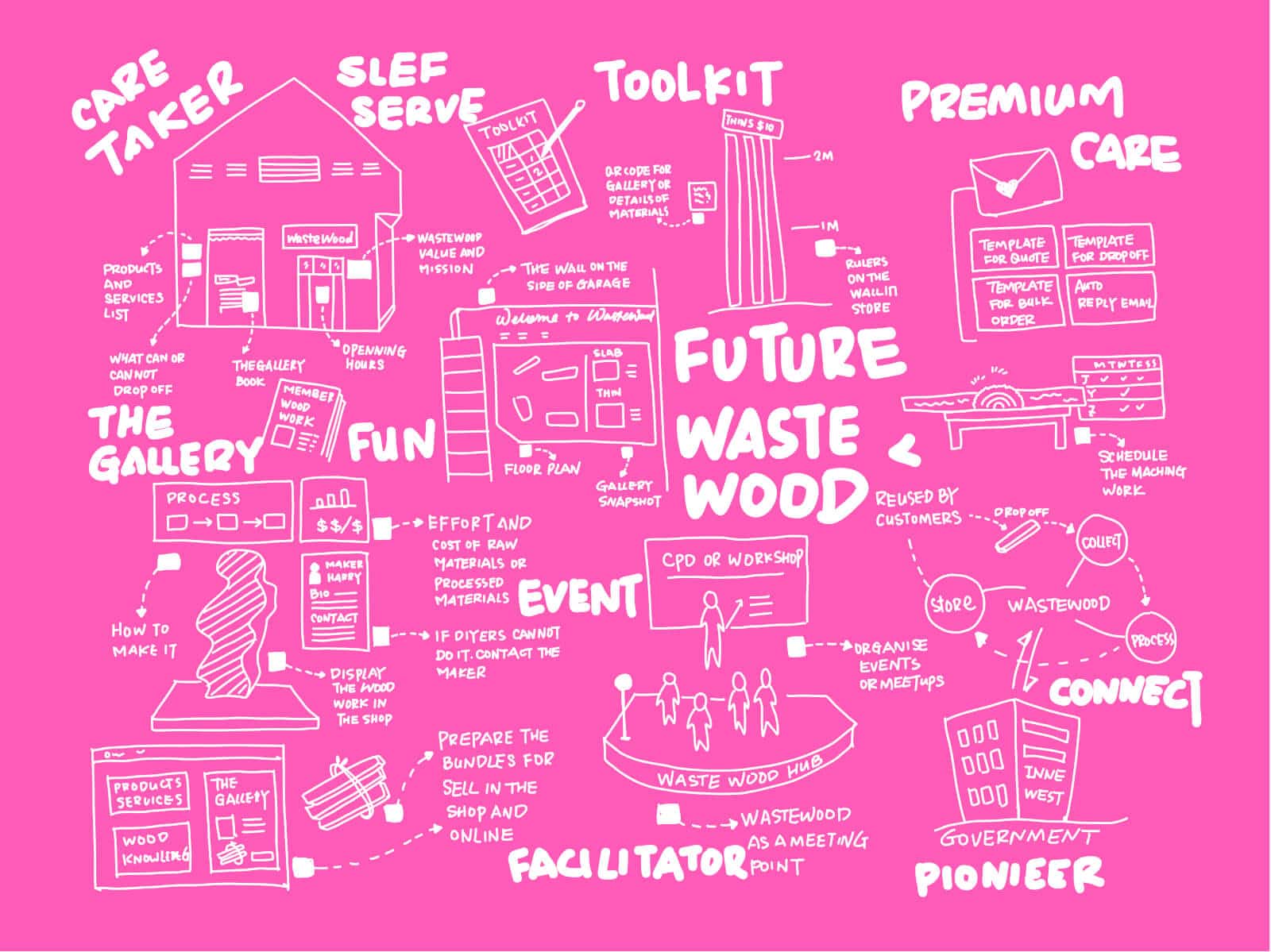
2025 GDA Best In Class Design Strategy Winner: Wastewood. Image: Supplied
Digital Design
Advice from Good Design Juror: Ben Crothers – Design Strategist, Bright Pilots
- Provide design insights. The strongest entries are immediately recognisable, not because they’re polished, but because they feel real. Submissions written from inside the design team rather than marketing are often much stronger because they provide a clear line of sight into how decisions were made and how trade-offs shaped the final outcome.
- Articulate the problem clearly. The strongest entries define the problem with clarity and demonstrate a deep understanding of the impact that problem had on people’s lives.
- Help us understand the process. Surface level statements like “we used a user-centred design approach” carry little weight without context. What matters is how that process played out in reality, including technical constraints, negotiations within design systems and the decisions that required saying no.
- Be honest. Tell us what changed along the way. Unexpected findings, pivots, compromises and lessons learned all help the Jury understand the quality behind the design.
- Show you care. Show us what kept you up until three in the morning and what you argued about. The strongest entries read like a thoughtful handover rather than a highlight reel. They show how the design fits into real constraints, real systems and real lives, and in doing so, make it easier for the Jury to recognise design that truly leads.
- Use the right imagery. Highly stylised screenshots and portfolio-style mockups do little to help the Jury assess the work. As well as hero shots, show interfaces in use, edge cases, state changes and moments where design thinking solved a specific challenge.
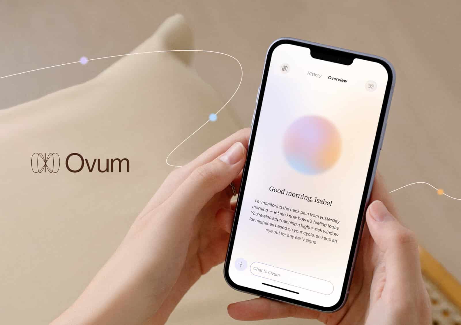
2025 Best In Class Digital GDA Winner: Ovum. Image: Supplied
Engineering Design
Advice from Good Design Juror: Professor Amin Heidarpour, Director of Enterprise and Engagement at Department of Civil and Environmental Engineering, Monash University
- Define the engineering problem clearly. State the technical challenge upfront, including the constraint, limitation or performance gap being addressed. Explain why the problem mattered and why it was difficult to solve.
- Demonstrate measurable impact. Support outcomes with evidence such as performance improvements, efficiency gains, safety metrics, compliance results or testing data. Clear metrics help the Jury assess the significance of the design.
- Lead with the engineer’s perspective. Explain decisions, trade-offs and technical differentiation in clear, precise language. A direct account of how and why the solution works carries more weight than marketing language.
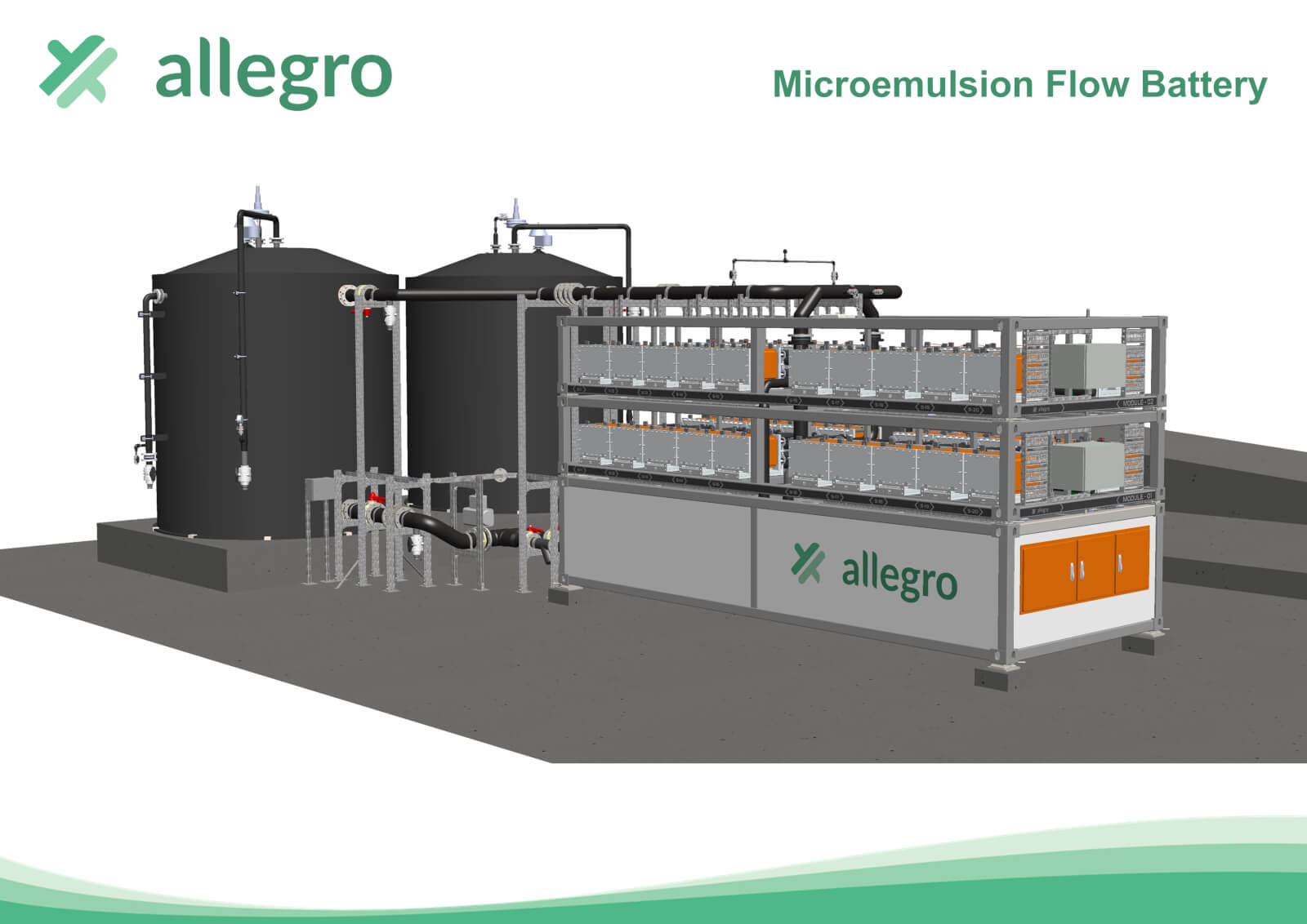
2025 GDA Best In Class Engineering Winner: Allegro Energy – Microemulsion Flow Battery. Image: Supplied.
Fashion and Textiles
Advice from Good Design Juror: Melinda Tually – Director, Ndless: The New Normal
- Category clarity. Be sure you are entering the right category. If your entry could satisfy more than one category, select the one you have the best prospects for winning.
- Evidence your claims. Don’t forget to back up any claims with evidence. Sustainability claims need to be verified with measurable data. Entries that have provided this will always come out on top.
- Demonstrate your why and point of difference. Clearly articulate the problem your entry is trying to solve. The Fashion and Textiles category is looking for entries which address some of the sector’s biggest environmental issues so entries that take time to demonstrate their ‘why’ and how you might be doing things differently from others will stand out.
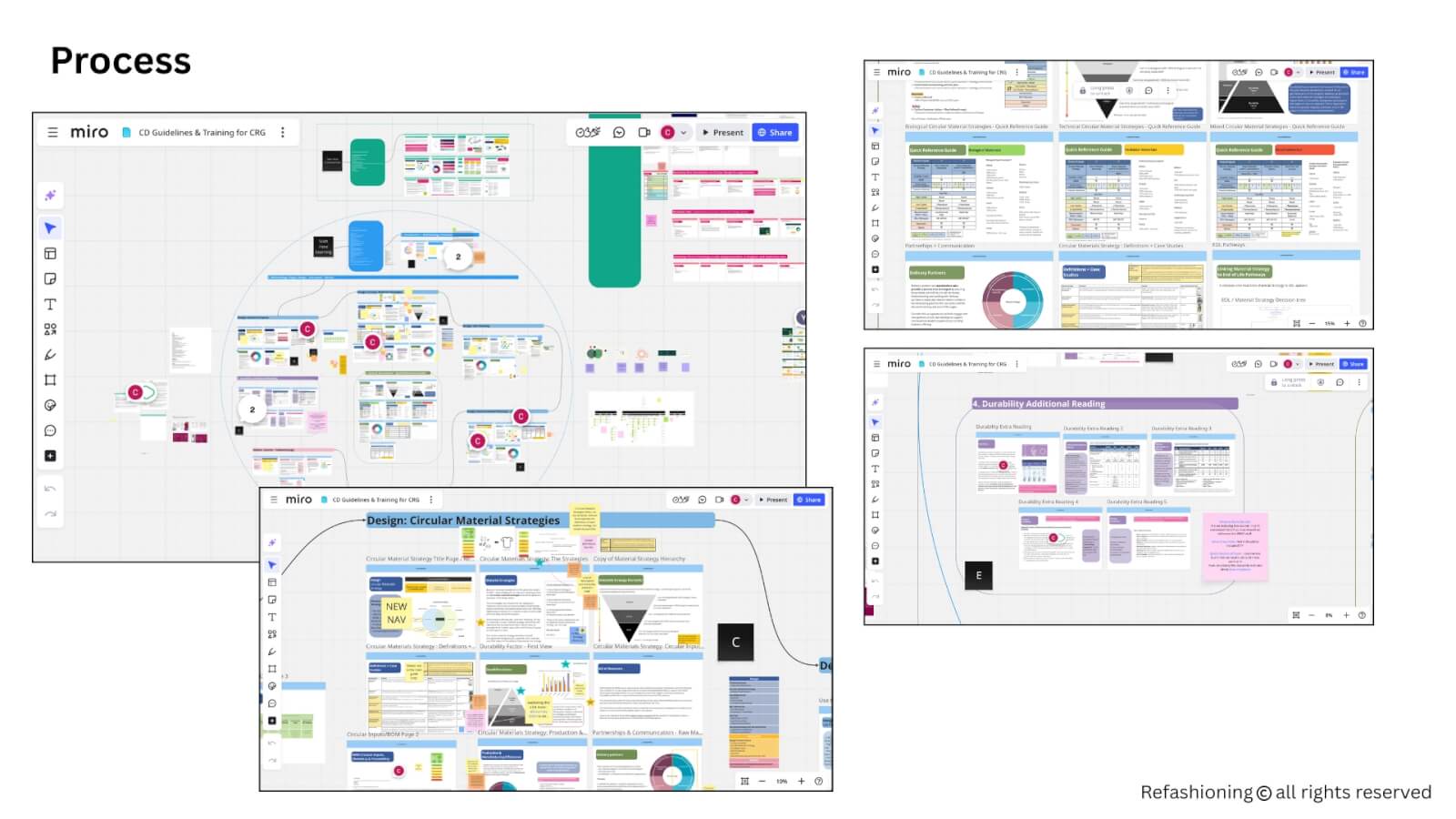
2025 GDA Best In Class Fashion Winner: The Refashioning Circular Design Guide. Image: Supplied
Next Gen (under 30s)
Advice from Good Design Juror: Ian Muir – Professor, Faculty of Design Architecture and Building, University Technology Sydney
- Prove the problem. Make sure “solutions” are for problems that actually exist for people. Don’t assume you are the user, and there are lots of people that think the same as you. There may be, but prove it. Don’t just say “people struggle with X.” Provide qualitative quotes from interviews and quantitative data from surveys. Is it a problem for 5 people or 5 million? Desk research can help develop a theory, getting input from potential users will validate and formulate a deeper understanding of the problem. A simple everyday problem can be as valid as a wicked problem.
- Evidence your findings and research. Deriving a simple, impactful solution is hard work and requires innovative thinking, objective distance from being the “expert,” and a clear journey from problem to validated solution. Listen and observe to understand. Evidence how you achieved this objective. It needs to be clear you’ve done the legwork.
- Clearly communicate the outcomes to the Jury. What matters is positive human impact, commercial viability, feasible production and a thorough, empathetic understanding of the problem space, supported by diverse user input.

2025 GDA Best In Class Next Gen Winner: Sooze Modular Eye Care Device. Image: Supplied
Policy Design
Advice from Good Design Juror: Jane MacMaster – Global Engineering Integrity Director, Babcock International Group
- Provide impact data where possible. Try to quantify the impact if you can, and provide evidence if that’s possible.
- Avoid repetition. Long-winded applications are harder to read, especially if there is a lot of repetition. Aim for shorter, succinct sentences that are easy to read, understand and remember.
- Give clear examples. Be as specific as possible and provide concrete examples. Vague or general statements and ambiguous claims are less effective and resonate less.
2025 GDA Best In Class Policy Design Winner: Evidence for Impact. Image: Supplied
Product Design
Advice from Good Design Juror: Sam Lanyon – Co-Founder and Director, Planet Innovation
- Write like the people who did the work. Not like someone marketing it. Once an entry is written two or three layers away from the design team, it shows – the insight disappears. The language skims the surface and it becomes harder for the Jury to assess the quality of decision making behind the product.
- Do not trivialise the problem solution space. Great products do not win because they are declared great. They win because they are proven, used and valued over time.
- Focus on the core technology. When it comes to technical detail, focus on the engine that delivers the value proposition and supports safety and efficacy. Features can help, but too many bells and whistles distract unless they clearly strengthen the case.
- Show impact and outcomes. A strong entry proves itself through tangible outcomes, third party validation and credible case studies. Hullbot was a standout example where this was done well, because the application didn’t just describe what it was – it used specific real world case studies to show why it mattered and what it changed, including impacts that were not obvious at first glance.
- Aim for clarity. The strongest entries invite understanding, build confidence and help the Jury advocate for the work because it’s grounded in evidence, shaped by insight and proven through use.
Advice from Good Design Juror: Nila Rezaei – Co-Founder and Lead Designer, RK Collective
- Use your voice. We can immediately tell when an entry has been copied and pasted from ChatGPT or similar AI tools. By all means, use AI to help structure your thinking or frame your response, but the final submission must be in your own voice.
- Be clear, concise and strategic. Start with a systematic approach: map out all the criteria questions in Miro or a similar tool, answer each one directly, then think about your narrative: What’s the one critical thing the Jury needs to understand? Build your storyboard around that. The Jury assesses against specific criteria, so answer those questions clearly rather than burying them in flowery prose.
- Define and prove. Define both the human challenge and the technical needs you’re addressing. What emotional need does this solve alongside the functional requirements? Think about your theory of change, how did you get from problem to solution, and how do you prove it worked? This is where metrics matter: show us the X% reduction in waste or footprint, the community testimonials, the measurable before-and-after impact, not vague claims about “significant improvement.”
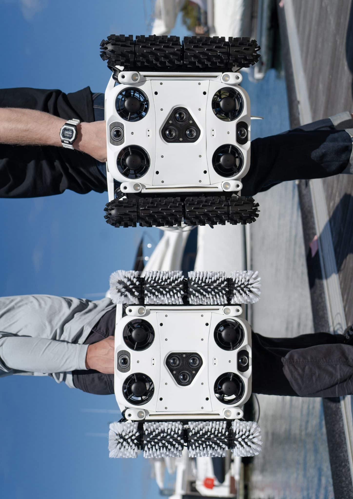
2025 Australian Good Design Award of the Year: Hullbot. Image: Supplied
Service Design
- Define the problem and the full service journey. Clearly explain the issue the service was designed to solve. Judges need to understand where friction existed and how the service redesign addressed it across the entire system.
- Show how the service works in practice. Outline the people, processes, platforms and touchpoints that deliver the service. Strong entries demonstrate how these elements connect into a clear, efficient system rather than existing as isolated features.
- Prove the value with evidence. Support your claims with measurable outcomes such as improved satisfaction, efficiency gains or cost reductions. Quantified results help the Jury understand the real-world impact of the project.
2025 GDA Best In Class Service Design Winner: Aftercare Service for LGBTQIA+SB Community Members Experiencing Suicidal Distress. Image: Supplied
Social Impact
Advice from Good Design Juror: James Toomey – CEO, Social Ventures Australia
- Define the problem and the social outcome. As a Jury the first question we ask is always, what’s the problem you’re trying to solve. Is it a design problem or an actual person’s experience problem? Strong entries begin with a clearly defined human problem and demonstrate a deep understanding of how that problem shows up in everyday life for the people affected. We look for work that produces measurable improvement in people’s lived experience.
- Document the designer’s insights. The Jury really values entries written by the designer because they reveal intent, judgement, and decision-making. Designer-led submissions better explain how they took account of the lived experience of the people the project was meant to serve. Deadly Democracy was a great benchmark. The project clearly articulated its aim, embedded human-centred design, and showed measurable shifts in engagement and participation.
- Language carries weight. Clear, respectful language signals proximity to the community and care in the design process. Strong entries communicate with precision and openness.
- Demonstrate dignity. The most effective Social Impact entries show how design affirms value, builds trust and creates lasting change. Puntukurnu AMS Healthcare Hub was a great example where the team combined community collaboration, locally sourced materials and architectural quality. The building clearly communicated respect and belonging through its design.
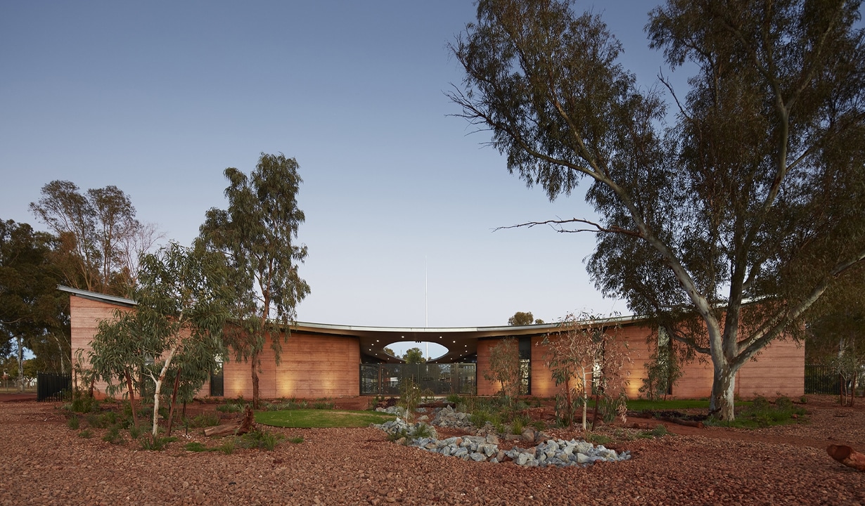
2021 Good Design Award Winner For Sustainability: Puntukurnu AMS Healthcare Hub. Image: Supplied
Good Design Award for Sustainability
Advice from Good Design Juror: John Gertsakis – Director, Product Stewardship Centre of Excellence / Adjunct Professor, UTS Institute for Sustainable Futures
- Don’t rely on AI. Do not use generative AI tools like ChatGPT to draft entry content. Use them to refine but we need to hear from you.
- Prove your claims. Only use general terms like ‘sustainable’ or ‘circular economy’ or ‘circular design’ if you back them up with specific detail, data and evidence that clearly demonstrate the noteworthy features embodied in the design.
- Evidence your outcomes. Include and highlight evidence that demonstrates that the ‘sustainability’ features communicated in the entry have successfully addressed the intended environmental objectives.
Are you ready to enter?
Across all categories, Jurors emphasised that strong entries come from clarity, care and proximity to the work.
Keep these insights in mind as you prepare your submission, and focus on articulating the problem, the decisions made and the impact achieved.