Inclusive Testing of Next-Generation Myki Fare Validators

good-design-award_winner_rgb_blk_logo
  • 2026

  • Design Research

Designed By:

Designed In:

Australia

Paper Giant conducted inclusive design research for the Victorian Department of Transport and Planning, evaluating next-generation myki fare validators across hardware and screen design. Testing with 44 diverse participants — including 21 people with disabilities — in a simulated transport environment produced evidence-based recommendations now shaping infrastructure millions of Victorians use daily.
view website

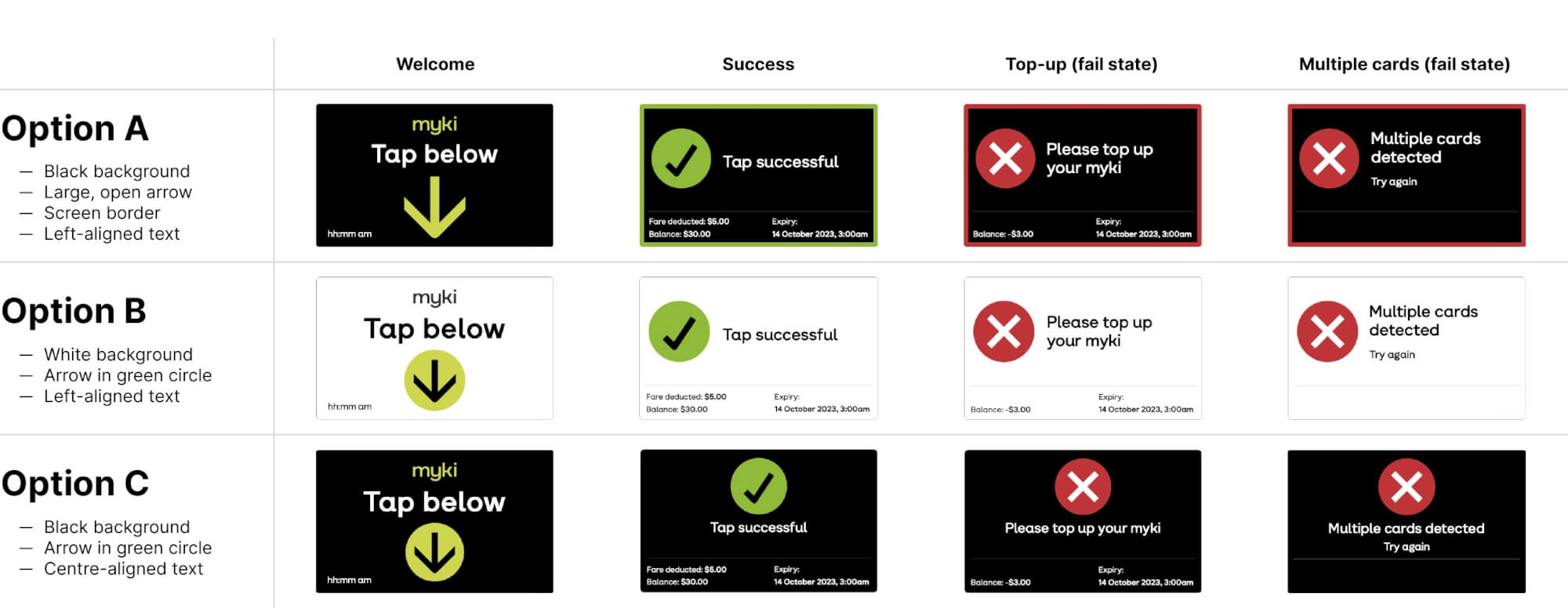
submission-2-design-options-grid.jpg
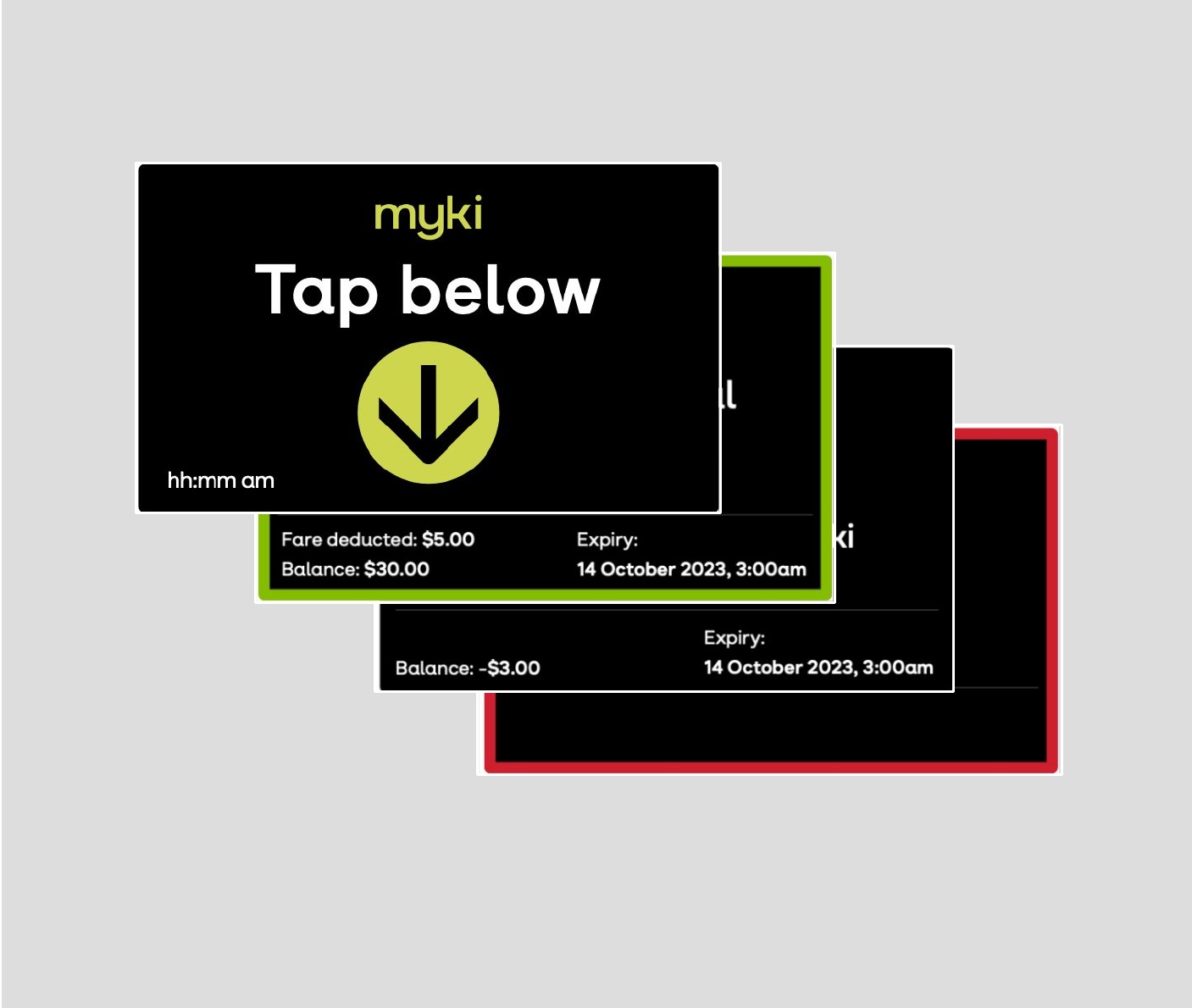
submission-5-hybrid-recommendation.jpg
  • CHALLENGE
  • SOLUTION
  • IMPACT
  • MORE
  • Victoria's public transport serves millions with very different needs — from confident commuters to people with specific accessibility requirements, from regular travellers to those navigating the system for the first time. Ahead of deploying next-generation fare validators, the Department of Transport and Planning needed solid evidence on which hardware designs and screen interfaces would be most accessible, safe, and intuitive for everyone.This was not a typical usability study. The research spanned both physical device selection and Human-Machine Interface (HMI) screen design, evaluating colours, icons, language, and layout for devices that would shape daily experiences of millions for years to come.

  • Paper Giant designed an inclusive research methodology combining observations with semi-structured interviews in a purpose-built simulated transport environment — complete with fabrics, imagery, ambient noise, and representative seating. Functioning validators with live RFID sensors and preloaded screen designs allowed genuine interactions.A cohort of 44 participants was recruited to represent Victoria's full spectrum: 21 people with disabilities (mobility, psychosocial, intellectual, developmental, vision, speech, hearing, acquired brain injury), 7 youth, and participants from metro and regional Victoria. A two-stage session design — walkthrough then comparative evaluation — balanced structured ranking data with qualitative insight. Close collaboration with hardware provider Conduent ensured findings were feasible.

  • The research determined both the preferred hardware design and optimal screen interface for statewide deployment. For HMI screens, the team recommended a hybrid design option combining the highest-performing features from customer testing — black backgrounds for readability, coloured screen borders for instant comprehension, centre-aligned icons, and single-line primary messages — giving DTP clear specifications for manufacturing.Beyond device and interface selection, Paper Giant delivered customer value propositions and messaging for future phased releases of the new ticketing system. The research is directly shaping next-generation myki infrastructure across Victoria, and the testing methodology represents a replicable model for evaluating public infrastructure in Australia.

  • Purpose-built test environment: A simulated transport environment with fabrics, colours, imagery, ambient noise, and representative seating arrangements — providing realistic context for testing while maintaining controlled research conditions. Three functioning OBVs with live RFID sensors allowed genuine tap-on interactions.Deeply inclusive cohort: 44 participants including 21 people with disabilities (10 mobility/physical, 8 psychosocial, 4 intellectual, 3 developmental, 3 vision, 2 speech, 2 hearing, 2 acquired brain injury), 7 youth aged 13–19, and participants from both metropolitan (38) and regional Victoria (6). All research sessions documented with 2 fixed cameras and 1 researcher-worn camera.Two-stage session design: Each 60-minute session combined a walkthrough (observing genuine tap-on behaviour across design options, rotated to reduce bias) with structured comparison (side-by-side evaluation of each HMI state, including card sorting for accessibility). This balanced behavioural data with attitudinal insight.Five-theme evaluation framework: Screen designs assessed against colours, icons, language, modern appearance, and best overall — providing granular, comparable data that identified precisely where specific designs succeeded or failed for particular user groups.Hybrid design recommendation: Rather than simply selecting the most popular option, analysis revealed an optimised hybrid combining the strongest-performing features from multiple designs — a recommendation supported by both ranking data and direct customer feedback.