Wholegrain Milling Co.

good-design-award_winner_rgb_blk_logo
  • 2026

  • Communication
    Branding and Identity

Designed By:

Commissioned By:

Wholegrain Milling Co.

Designed In:

Australia

Wholegrain Milling Co. is no ordinary flour mill – it’s Australia’s pioneer of sustainable flour. With decades of history behind them, they embarked on an ambitious re-branding project to modernise and re-invent their look and feel in a way that better articulated their purpose, vision and commitment to care and sustainability.

view website
Buy online

2.jpg
3.jpg
4.jpg
5.jpg
6.jpg
7.jpg
8.jpg
  • CHALLENGE
  • SOLUTION
  • IMPACT
  • MORE
  • Wholegrain Milling Co. is one of Australia’s leading suppliers of Certified Sustainable flours, yet its brand underrepresented this leadership and impact. They needed a cohesive brand strategy, identity and new branding system that reflected who they truly are: pioneers of sustainable flour, champions of regenerative farming, and partners to artisan bakers who care about quality, provenance and planet. The challenge was to honour their heritage and credibility, while positioning them boldly for the future, helping them to stand apart in a crowded commodity category.

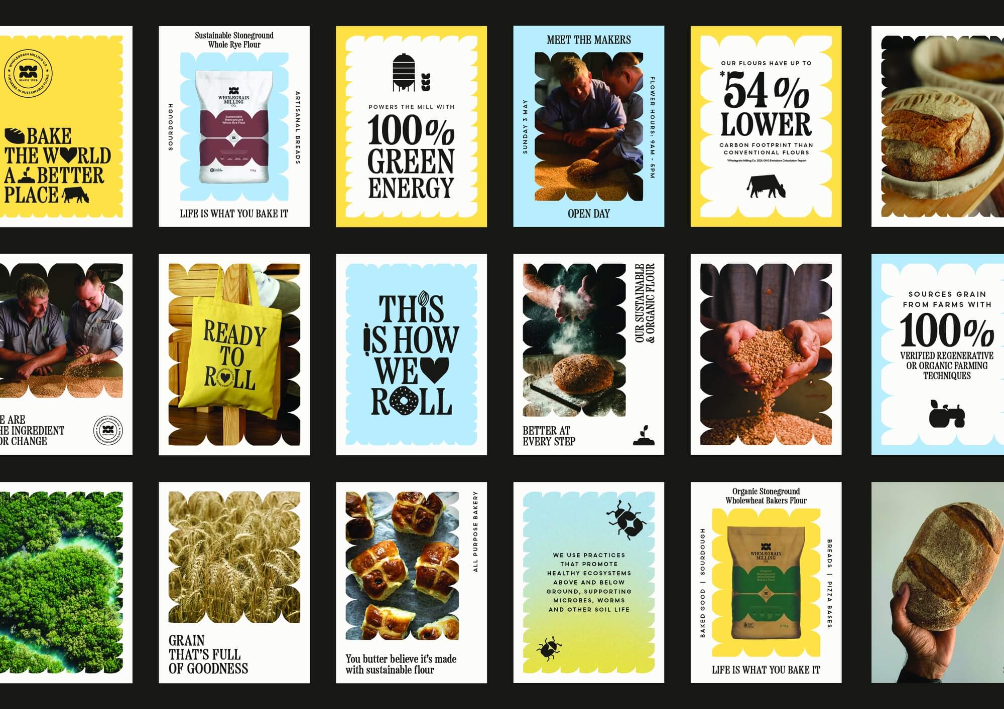
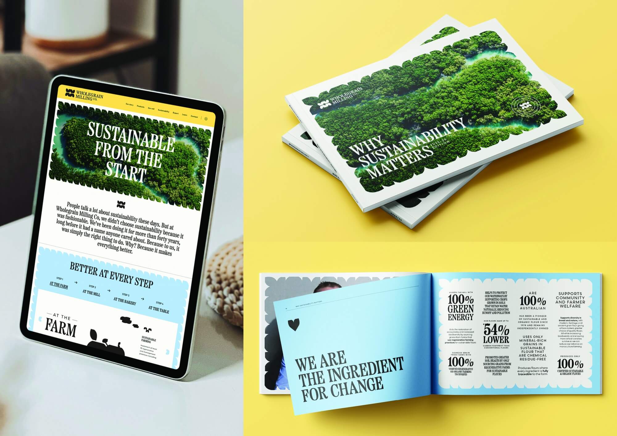
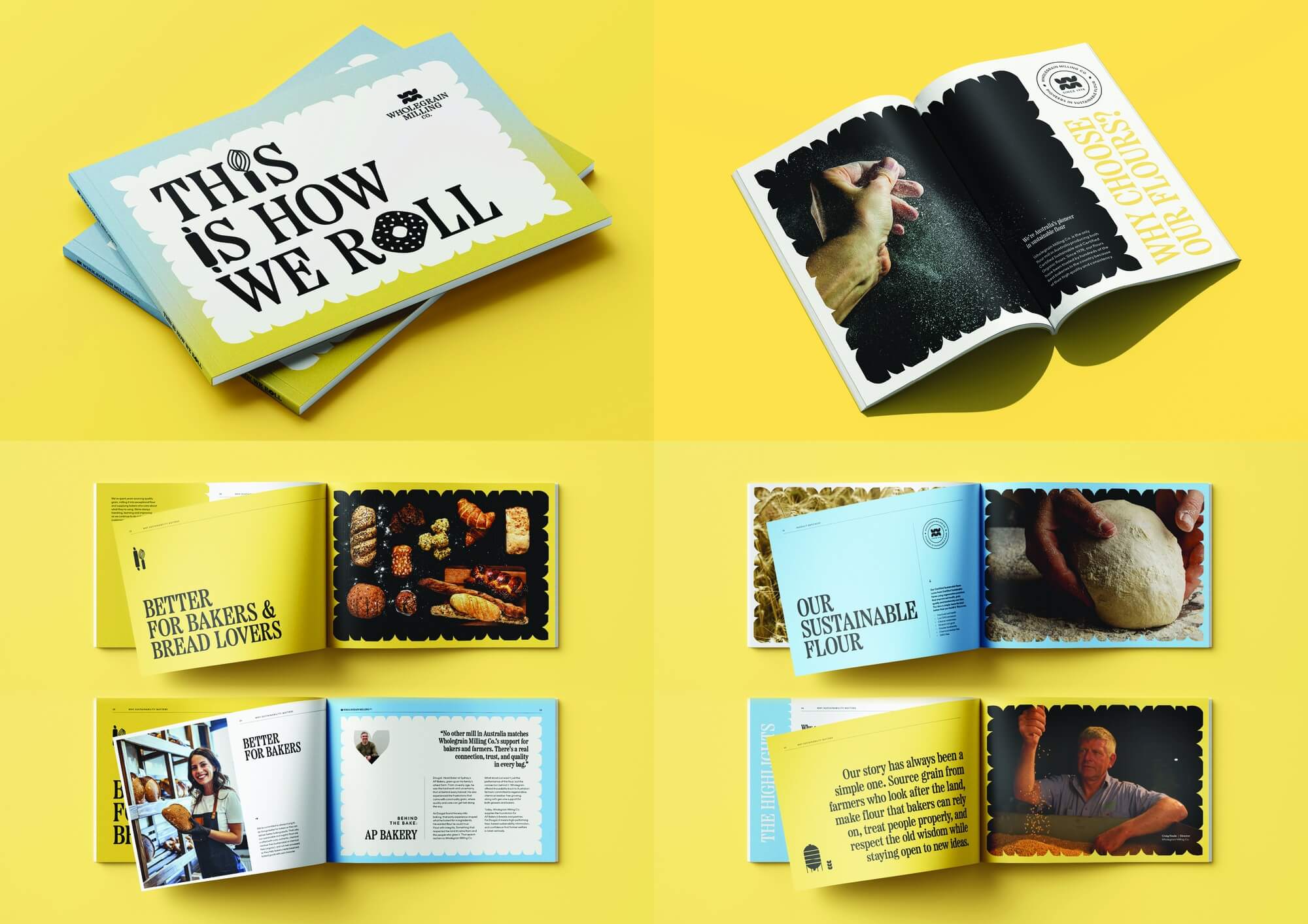
  • The rebrand repositions Wholegrain Milling Co. as a leader driving meaningful change for people and planet. Built around the organising idea “We are the ingredient for change,” the new branding system expresses sustainability not as a claim, but as an ongoing practice and commitment. Visual elements drawn from grain, soil and sky reflect regenerative cycles, while a grounded, no-fuss tone of voice reflects Wholegrain’s personality. The system was applied consistently across packaging, brochures, website and trade tools to communicate authenticity, impact and product quality. By aligning brand and story with practice, the design makes their leadership visible, tangible and scalable.

  • The rebrand strengthens Wholegrain’s position as Australia’s pioneer in sustainable flour, helping bakers (and bread lovers) recognise and choose quality products that are better for people and planet. Commercially, it differentiates the brand through externally audited credentials, a reputable history and a genuine commitment to ‘being better’. Environmentally, it amplifies practices like regenerative farming and green energy that deliver up to 54% lower carbon footprint. Socially, it builds trust through transparency, traceability and support for farming communities. By demonstrating values rather than simply claiming them, the brand showcases genuine leadership in a field historically built on yield, rather than care.

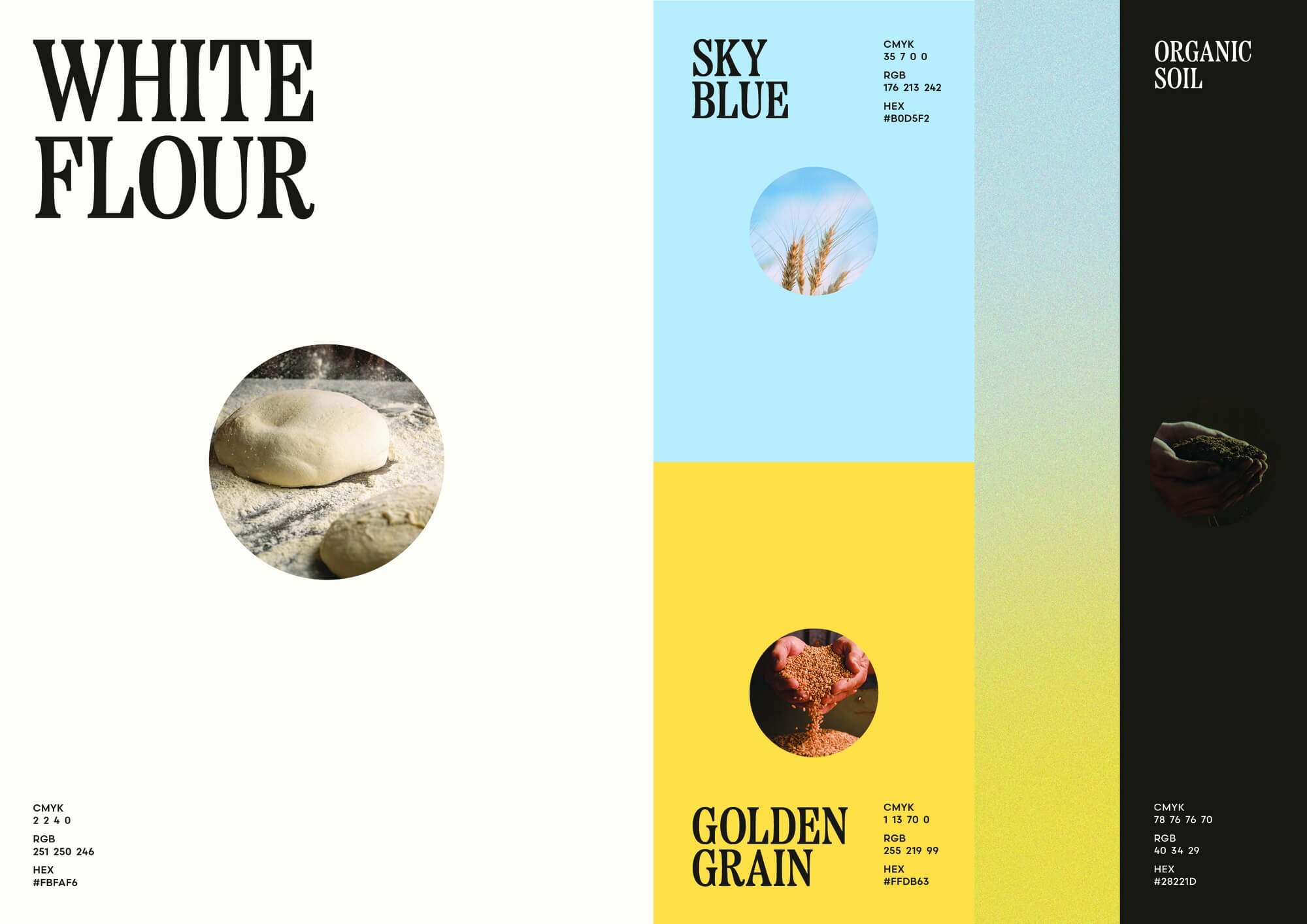
  • At the heart of Wholegrain Milling Co.'s identity sits a logomark we custom-crafted to tell the whole brand story in one elegant form. Look closely: the 'O' in 'Wholegrain' is shaped like a grain. Flip it, and it becomes a stylised 'W' and 'M' for Wholegrain Milling, with subtle carvings echoing the grooves of traditional mill stones - a deliberate nod to the brand's heritage balanced with a modern sensibility.That grain-shaped mark is the seed for everything else. It's the starting point for our suite of icons representing everything from farmers to silos, and a library of graphic shapes we use to frame content across every touchpoint.Even the colour palette is drawn straight from the source: White Flour, Organic Soil, Golden Grain and Sky Blue - the four elements at the heart of Wholegrain. Our signature 'Sky to Grain' texture brings them together, visualising the Australian horizon melting into the harvest below.The result is a system that feels truly rooted in the paddock. Considered, and deeply connected to the people, place and purpose behind every grain milled. A brand that doesn't just look the part, but embodies what Wholegrain Milling Co. stands for: being the ingredient for change.