WIRE

  • 2017

  • Social Impact

Designed By:

Designed In:

Australia

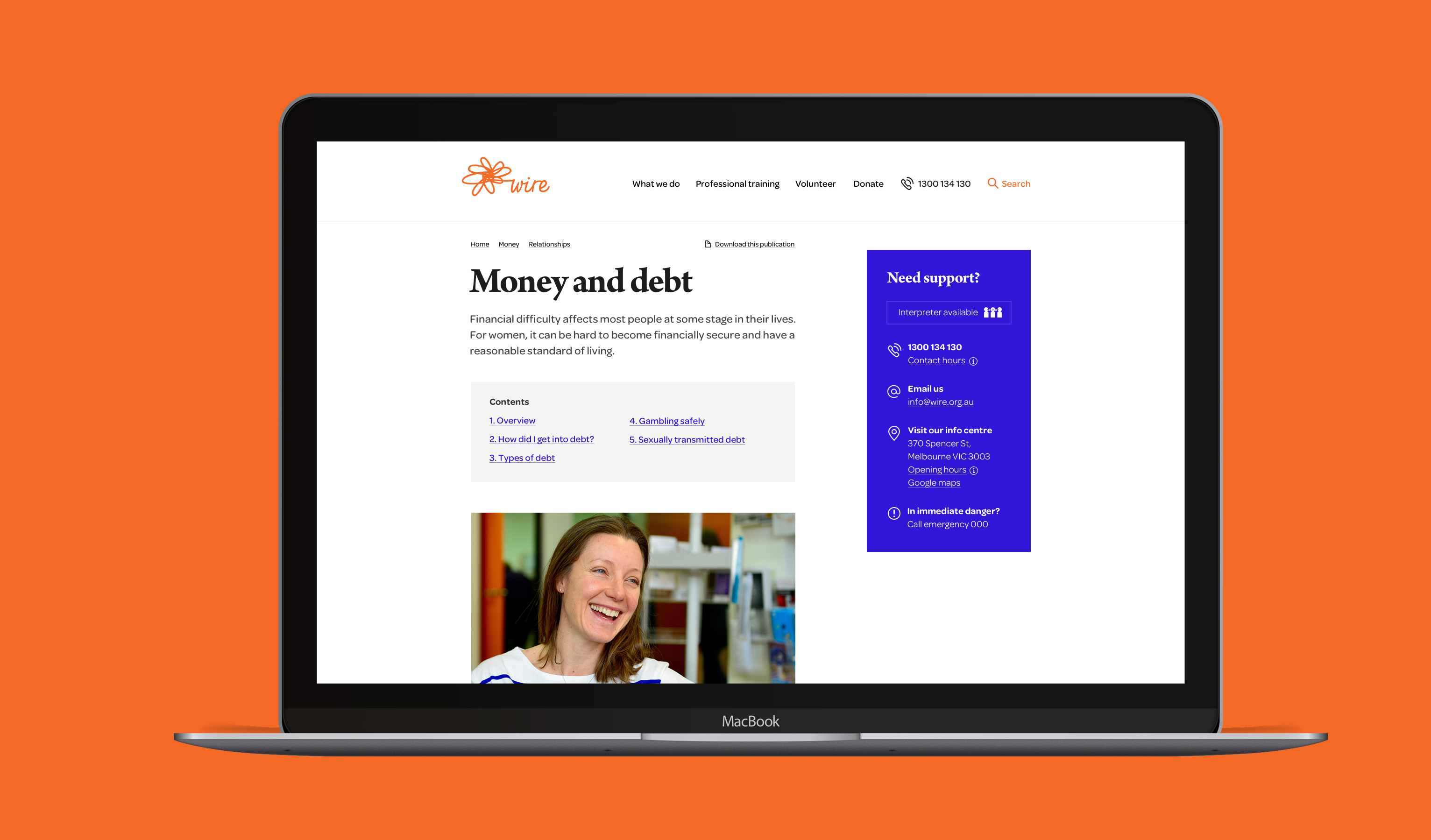
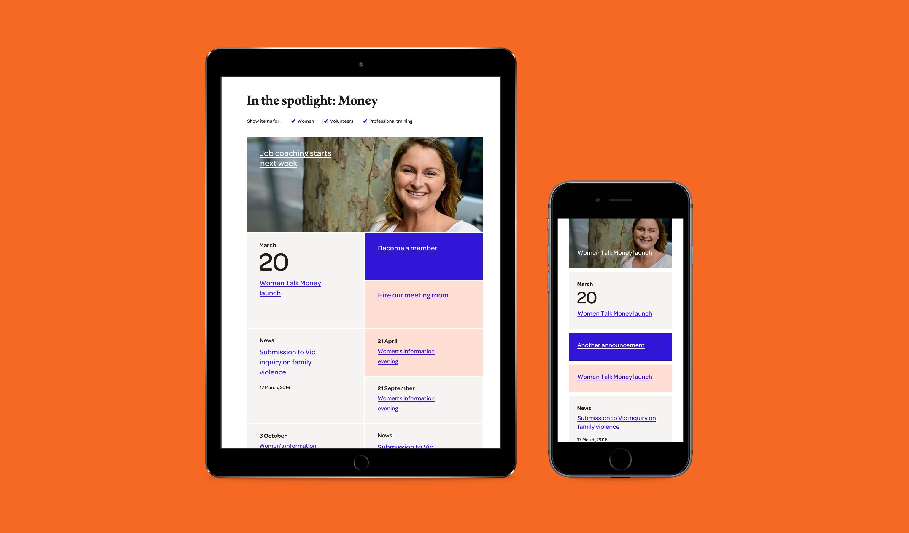
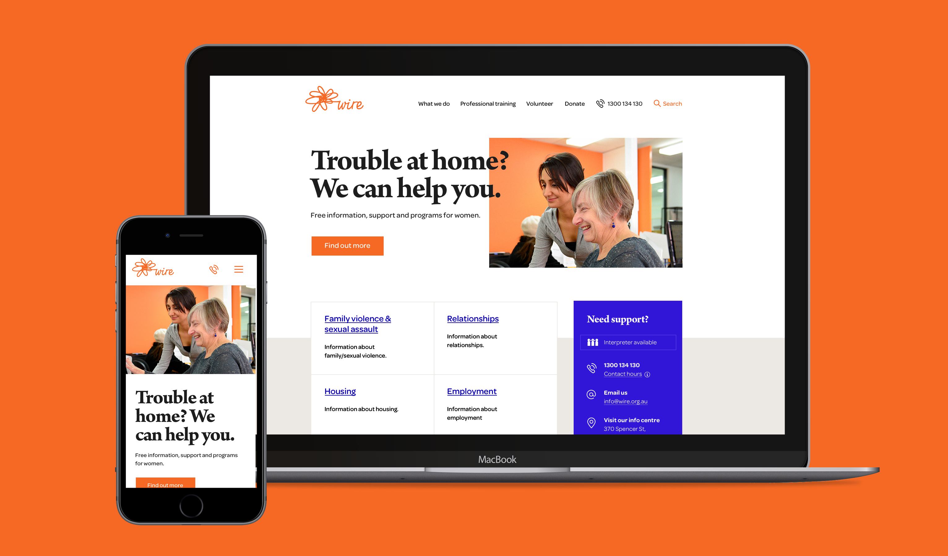
WIRE is an organisation dedicated to providing Victorian women direct support, through both counselling and training programs. The redevelopment of the site combined best practice user research, user testing and a refined visual design and content strategy to vastly improve the digital experience for their users.
view website

  • CHALLENGE
  • SOLUTION
  • IMPACT
  • MORE
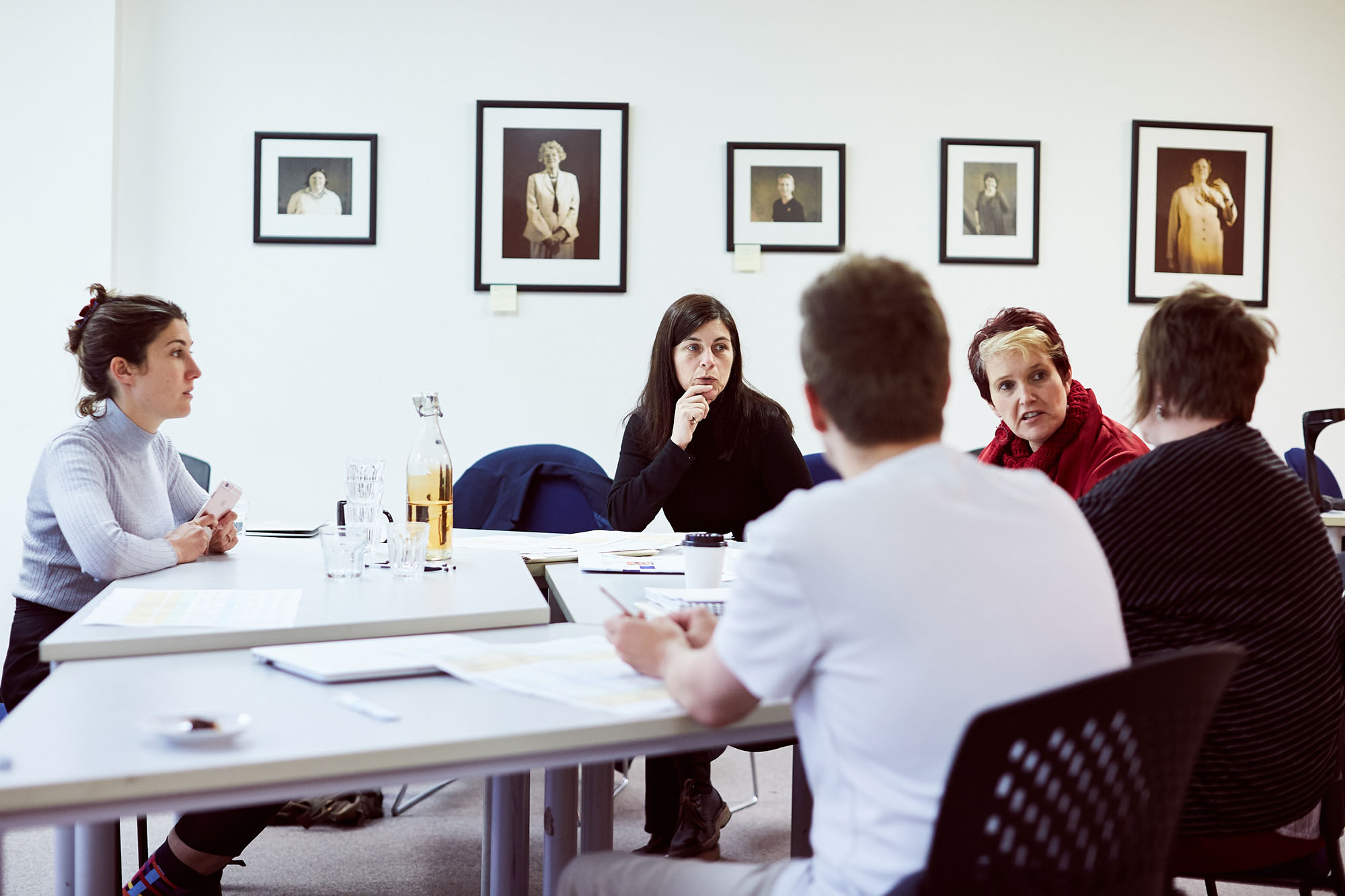
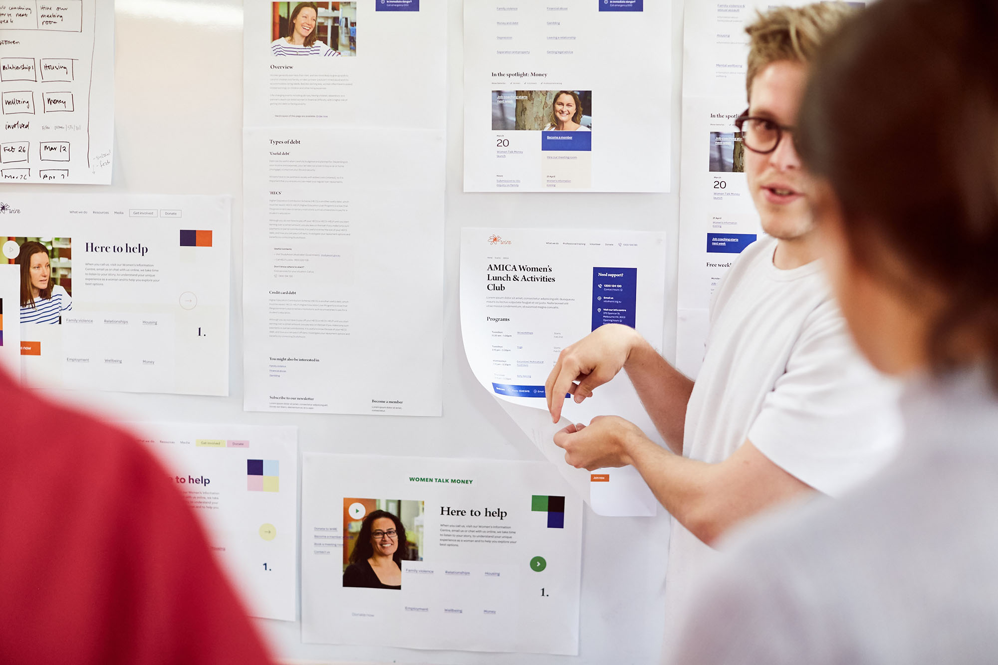
  • We paid careful attention to colour and type, purposefully distancing the site from elements typically used by female-focused not-for-profits. A key focus was to ensure that the site felt welcoming without appearing playful, as the nature of the content is sensitive and serious. Clear visual cues draw the user's attention to critical information. Bold colours highlight critical information, helping users quickly and easily access support and live chat features. Throughout the design process we presented many iterations of the site to WIRE's users to ensure that their needs were being met. The site is accessible to all users, and the final design of WIRE exceeds the WCAG AA accessibility guidelines.

  • Minimalism helps to create a clear, focused user experience but it is an approach which is vastly underutilised in not-for-profit websites. Extraneous details or features that were 'clever' for the sake of it undermine usability and efficiency - we purposefully chose to 'under design' the site to avoid this. Domestic violence, financial abuse and relationship issues place users in highly stressful situations. Decisions around navigation become difficult under stress, and reducing the number of decision points helps users reach important information, quickly. Our approach uses a series of straightforward topic headings to guide users to the information they require quickly and easily.

  • Due to the sensitive nature of site content, it was essential to design a 'panic button' to redirect users to an innocuous site to hide what they were looking at. The obvious and easy solution was to create a plain link, but what would happen in the case of a slow or disabled internet connection? Any implementation would need to be able to respond to a worst case scenario. The solution was to erase everything on the page as soon as the panic button is hit, and then redirect. The redirect will still fail in the case of the disconnected internet - the user will be left with a blank page instead of leaving an incriminating trail. The panic button was developed as a module and released as an open-source tool.

  • The existing site content was great, but it was undermined by clutter and a convoluted information architecture. In reworking the content structure we created a site that is radically simple and easy to use. We identified the core functionality of the site and used it to inform a mobile-first design. This constraint forced us to create a simple information architecture structure which prioritised easy access to actionable information. We structured the content in a way that appropriately spoke to women, ensuring they felt trusted, safe and willing to acquire help during a potentially highly stressful time.

    The WIRE site has been designed with seamless integration with Stripe for donation and membership payments. This has drastically improved the user experience for those wanting to donate, resulting in an instant return on investment. The new site design plays an active role in helping WIRE provide women with professional support and gender specific training programs. It now functions as a core service for its members and audience, presenting a big shift in how they communicate and share content.