Wedderspoon Brand Transformation

good-design-award_winner_rgb_blk_logo
  • 2026

  • Communication
    Branding and Identity

Designed By:

Commissioned By:

Wedderspoon (Florenz)

Designed In:

New Zealand

Wedderspoon’s brand transformation repositions Mānuka honey from occasional medicinal use to a joyful everyday wellness ritual, combining New Zealand origin, beekeeper craft, product potency, clear benefits, and innovative formats like pops, drops, sprays, and jars under the promise “Bee naturally powered to live joyfully everyday.”

view website
Buy online

2.jpg
3.jpg
4.jpg
5.jpg
6.jpg
7.jpg
8.jpg
9.jpg
  • CHALLENGE
  • SOLUTION
  • IMPACT
  • MORE
  • To help Wedderspoon stand out in a growing but under-differentiated Mānuka honey category. Consumers recognize Mānuka as premium, natural, potent, and linked to New Zealand, but many still see it mainly as something to use when sick. Loyalty across Mānuka brands was limited, and purchase decisions driven more by attributes of potency, origin, certifications, and price than by brand meaning. Wedderspoon needed to move beyond generic claims and make Mānuka feel more accessible, enjoyable, and relevant to daily life.

  • To reposition Wedderspoon around everyday vitality, making Mānuka honey feel less like a medicinal product and more like a joyful daily wellness ritual. The new brand promise, “Bee naturally powered to live joyfully everyday,” connects Wedderspoon’s potent Mānuka benefits with emotional appeal, taste, and convenience. The strategy combines credibility from New Zealand origin, beekeeper craft, certifications, and potency with a warmer, bolder, more playful identity: “joyful meets powerful.” It expands the role of Mānuka through innovative formats - pops, drops, sprays, lozenges, chews, syrups, and jars, supported by a clear benefit-led architecture such as Defend, Digest, Soothe, and Elevate.

  • The desired impact is to make Wedderspoon an everyday wellness essential, not just a product people reach for when they are sick. To increase consumer understanding of Mānuka’s benefits, build stronger emotional connection, and make the range easier to shop through clear benefit cues like Defend, Digest, Soothe, and Elevate. It should also help Wedderspoon own white space in innovative formats such as pops, drops, sprays, and spoonfuls, where competitors are less established. Ultimately, the goal is to strengthen brand distinctiveness, drive more frequent usage, attract younger wellness-minded consumers, and reinforce Wedderspoon as credible, joyful, potent, and naturally powerful.

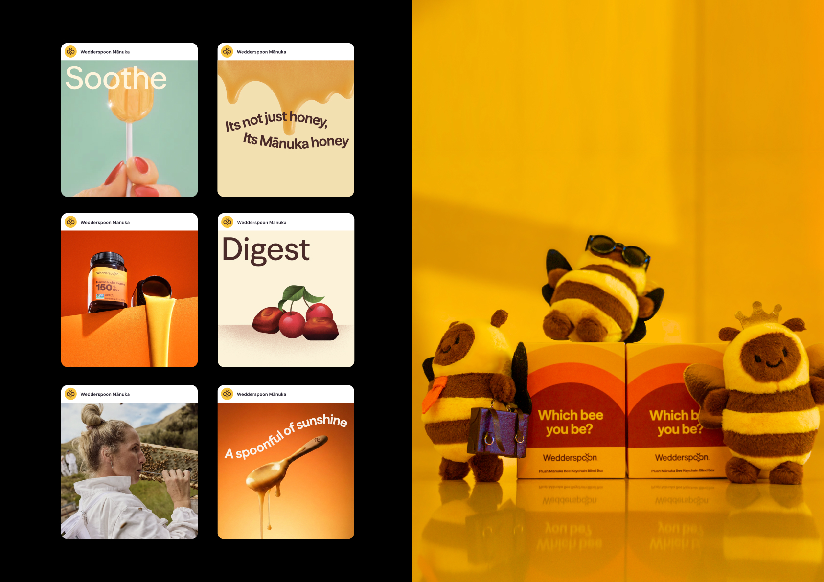
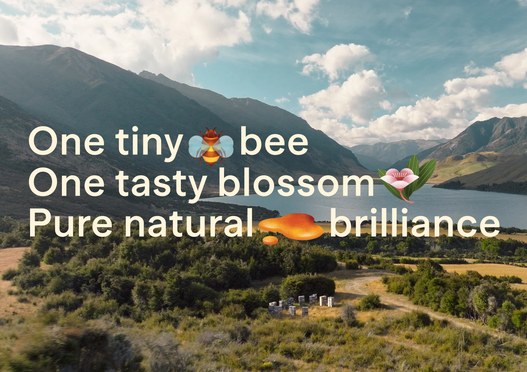
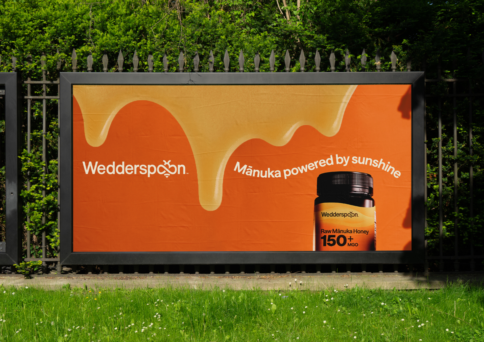
  • Key aspects of the solution include repositioning Wedderspoon Mānuka as an everyday vitality product rather than only a sickness remedy. The brand promise, “Bee naturally powered to live joyfully everyday,” makes wellness feel more positive, daily, and enjoyable. The creative idea, “joyful meets powerful,” balances emotional warmth with credible efficacy.The solution also builds distinctiveness through New Zealand origin, the Mānuka flower, intentionally placed hives, happy bees, and beekeeper craft. Product benefits are made easier to understand through a clear architecture: Defend, Digest, Soothe, and Elevate. This helps shoppers quickly connect products to needs like immunity, gut health, throat support, and natural energy.introduction of a core brand colour across the range of products versus different colours for different sub-cartegories ensure we were building one coherent branded offering along with a strong visuals symbol of honey - being the layers of goodness graphic system.Another key feature is innovation beyond the honey jar, including pops, drops, sprays, lozenges, chews, syrups, and spoonful formats. The visual identity uses bold orange/yellow “Layers of Goodness,” charming flavour illustrations, benefit icons, and a bright, warm tone of voice that makes powerful natural ingredients feel approachable.