TeaMates

good-design-award_winner_rgb_blk_logo
  • 2026

  • Communication
    Print and Packaging

Designed By:

Commissioned By:

TeaMates

Designed In:

New Zealand

Traditional Chinese tea is steeped in history, meticulous crafting, flavour and numerous health benefits. TeaMates bring this premium tea from China’s finest tea fields to New Zealand in a brand & packaging design that reflects both cultures and the act of gift giving.


view website
Buy online

2.jpg
LS Creative Studio https://lscreativestudio.co.nz/
3.jpg
LS Creative Studio
4.jpg
LS Creative Studio
5.jpg
LS Creative Studio
6.jpg
LS Creative Studio
7.jpg
8.jpg
LS Creative Studio
  • CHALLENGE
  • SOLUTION
  • IMPACT
  • MORE
  • TeaMates’ founder had observed a strong tea culture in New Zealand and an open embrace of Japanese tea and matcha; but noted a gap in the market for premium grade Chinese tea that has been a staple of Chinese culture for centuries, offering full flavour beverages with many health benefits. A majority of these teas were only found in Asian grocery stores, the packaging lacking the comprehensive language translation for english speaking customers and visual packaging design appeal. Clearly, there was an opportunity to market premium tea to a western palette with a more targeted package and brand design.

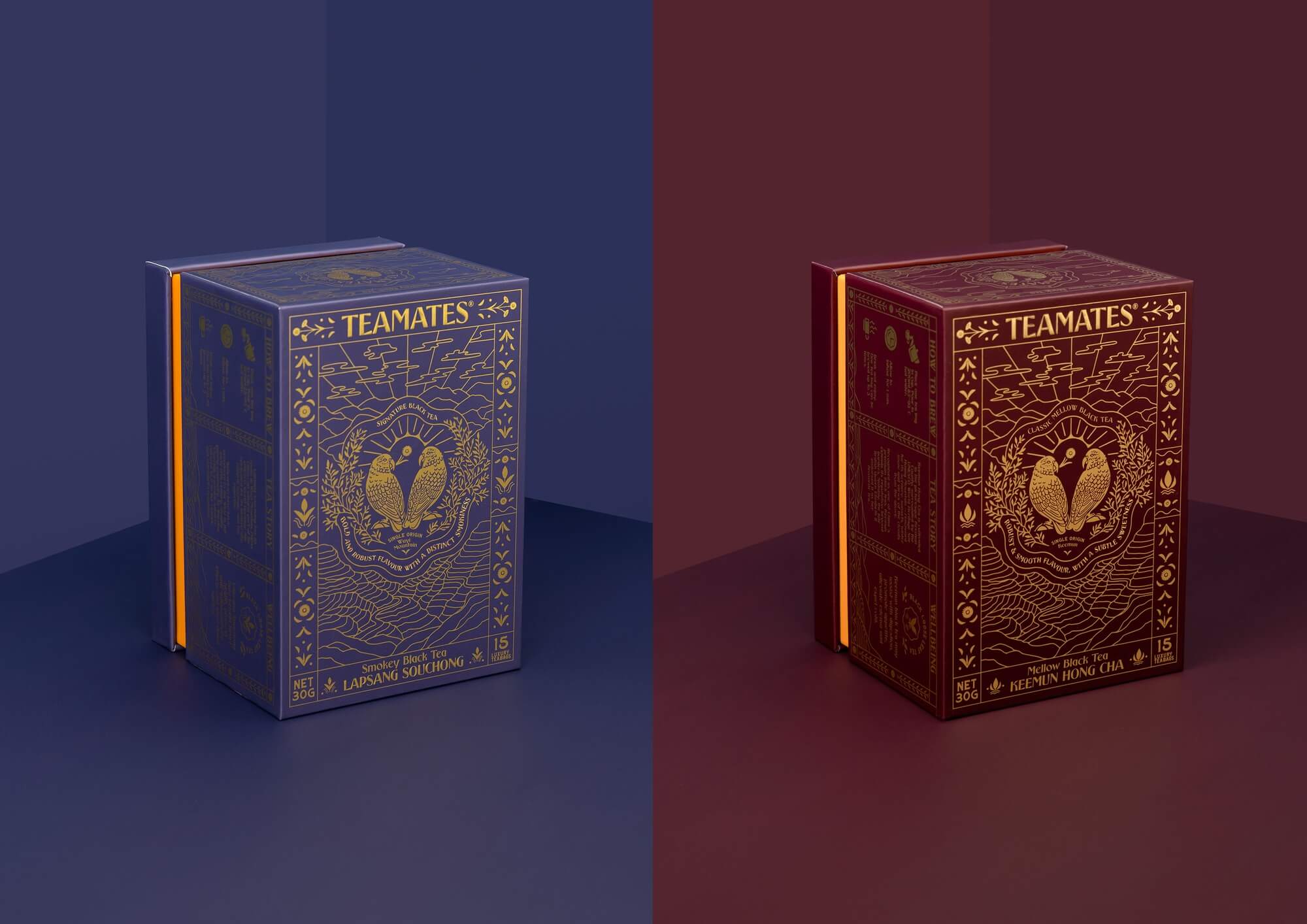
  • Conducting thorough research into Chinese tea culture, there was a clear understanding that premium tea is gifted to one another and sharing a cup of tea combines a ritual of careful brewing and drinking. There was strong design solution to bring apply this idea straight onto a physical receptacle of packaging design, whilst also using design aesthetics to appeal to a targeted western palette and shelf space. The result is a packaging design that looks like a gift, with all the flourishes of an ornately wrapped offering translated onto functional surface space through careful design, print and construction.

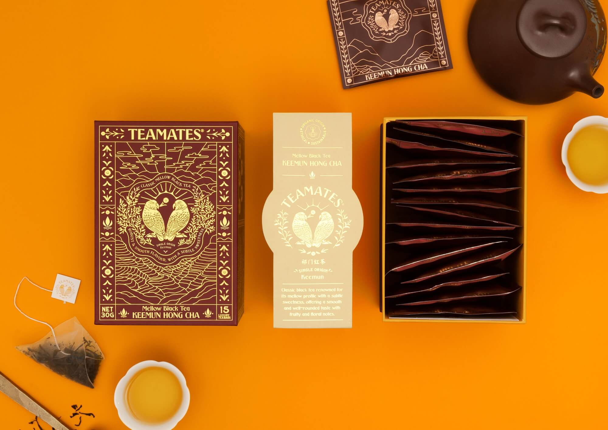
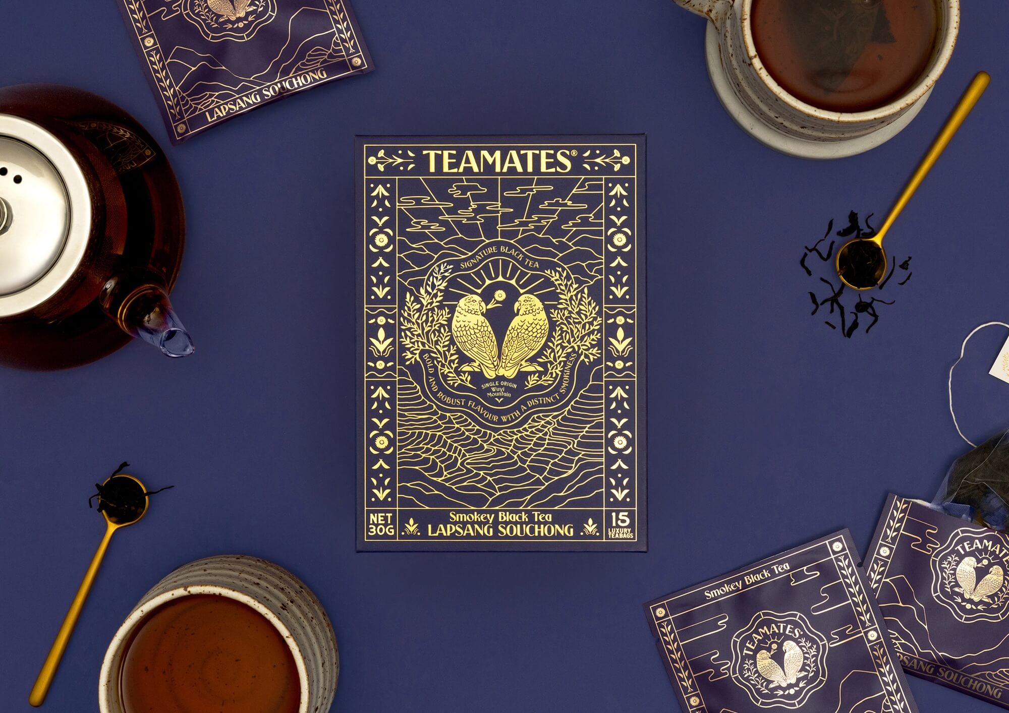
  • In a modern throwaway culture, much of our food and beverages arrive in packaging that is immediately discarded upon opening. TeaMates packaging is designed like a beautiful antique tea tin, to be displayed even after the box is empty. The colours chosen are rich yet subtle, with gold foil printing that speaks to the premium quality of the tea without being overpowering. Not only is it designed to sit on a bench, open shelf or kitchen surface; it can also be used as a re-gifting or keepsakes box, the sturdy construction allowing for repeated use.

  • Many features of the box are designed to act as components of a carefully wrapped gift to reinforce the theme of gifting tea as part of tradition. The box is presented with gold foil and printed cream outer sleeve akin to a decorative ribbon, the removal of the sleeve reveals a gold foil printed box, with an intricate illustrated design incorporating all the essential information of the tea and visuals of the tea fields from which the tea derives. Like a luxurious wrapping paper, the gold foil printed design covers all five surfaces of the lid, the information on each side has a continuous illustration that wraps around the faces of the box, intricate details, decals and icons all linking to the brand's identity and tea product visually represented. When the lid of the box is removed, a display of gold foil envelopes are uncovered, each containing a compostable tea bag of the tea. These sit against a bright orange interior, a metaphor for the change of colour (and flavour) tea provides once brewed, whilst also serving as the brand's main brand colour.