Noopii

good-design-award_winner_rgb_blk_logo
  • 2021

  • Communication
    Packaging

Designed By:

  • Ima Creative

Commissioned By:

Noopii

Designed In:

United Kingdom

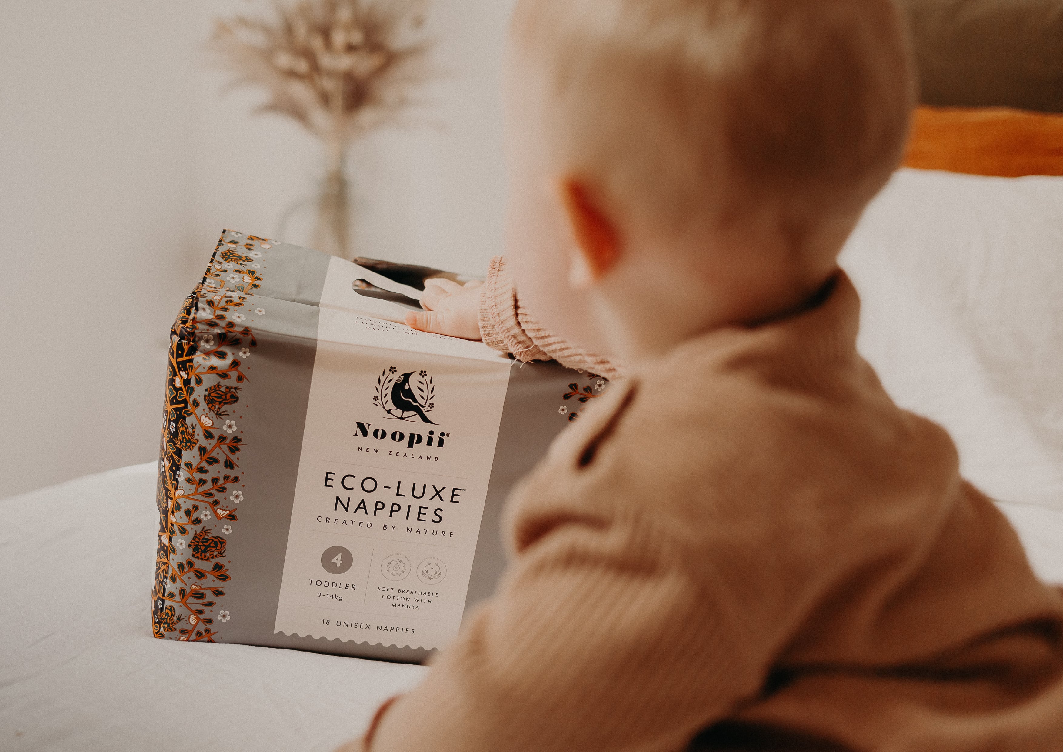
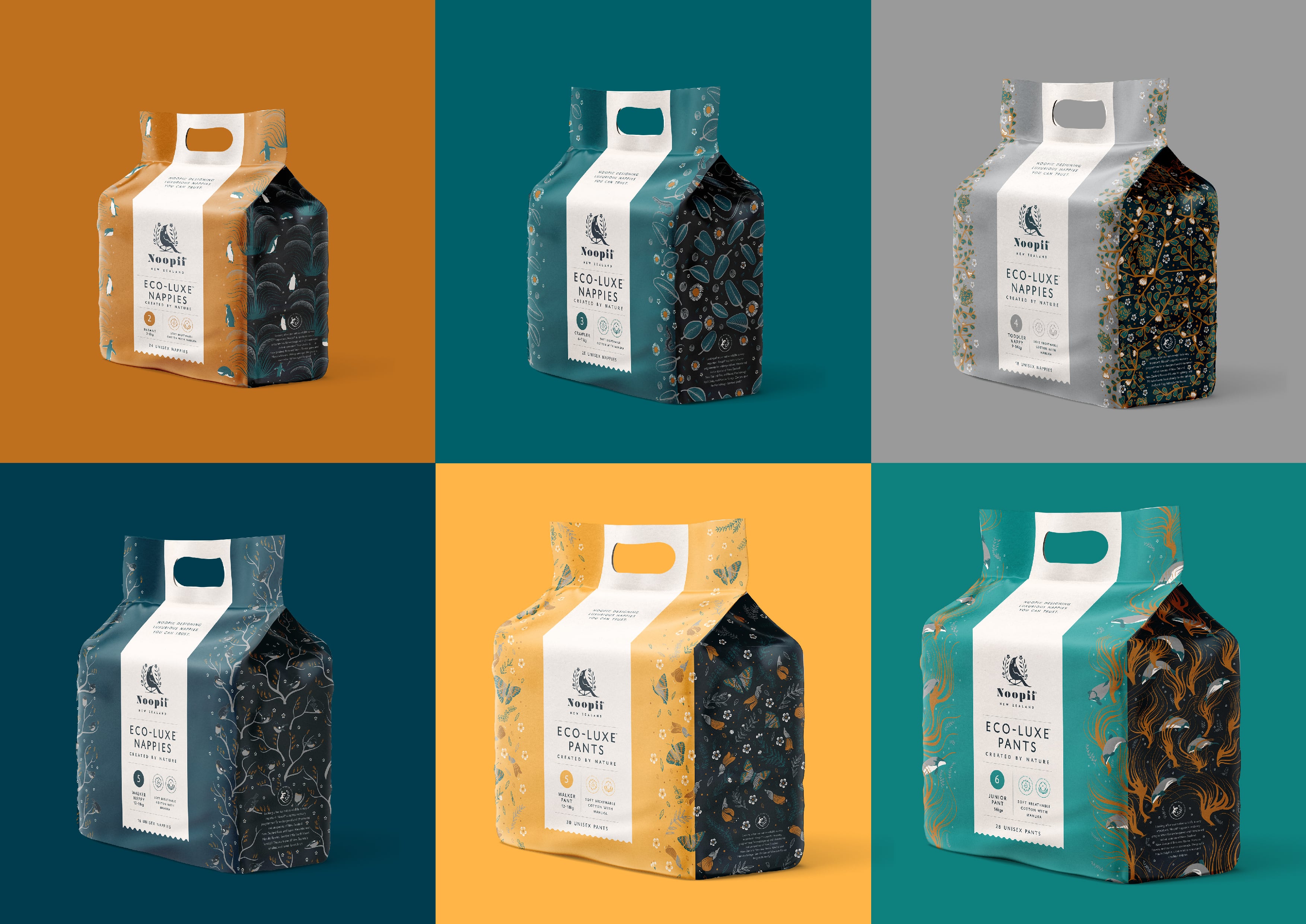
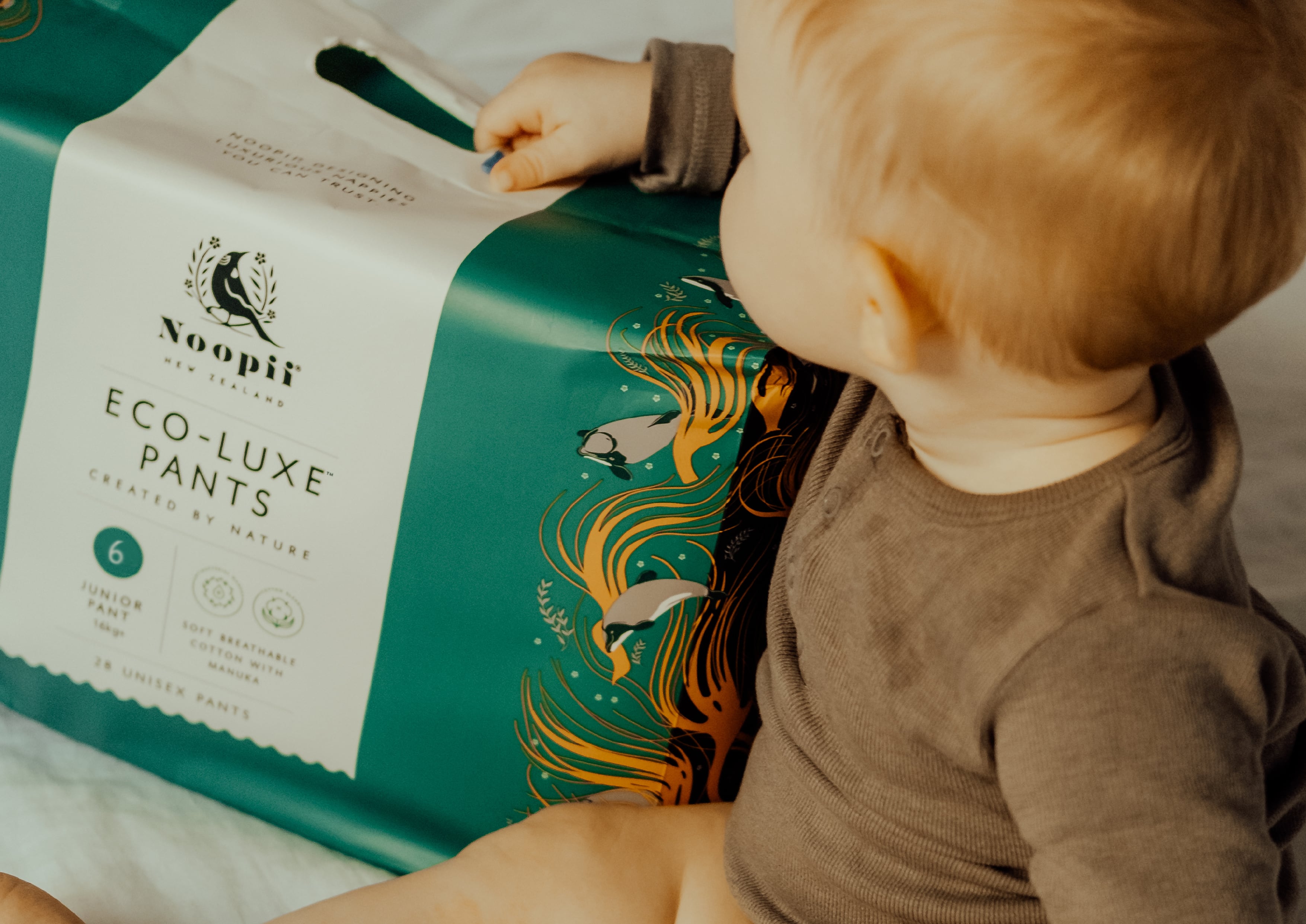
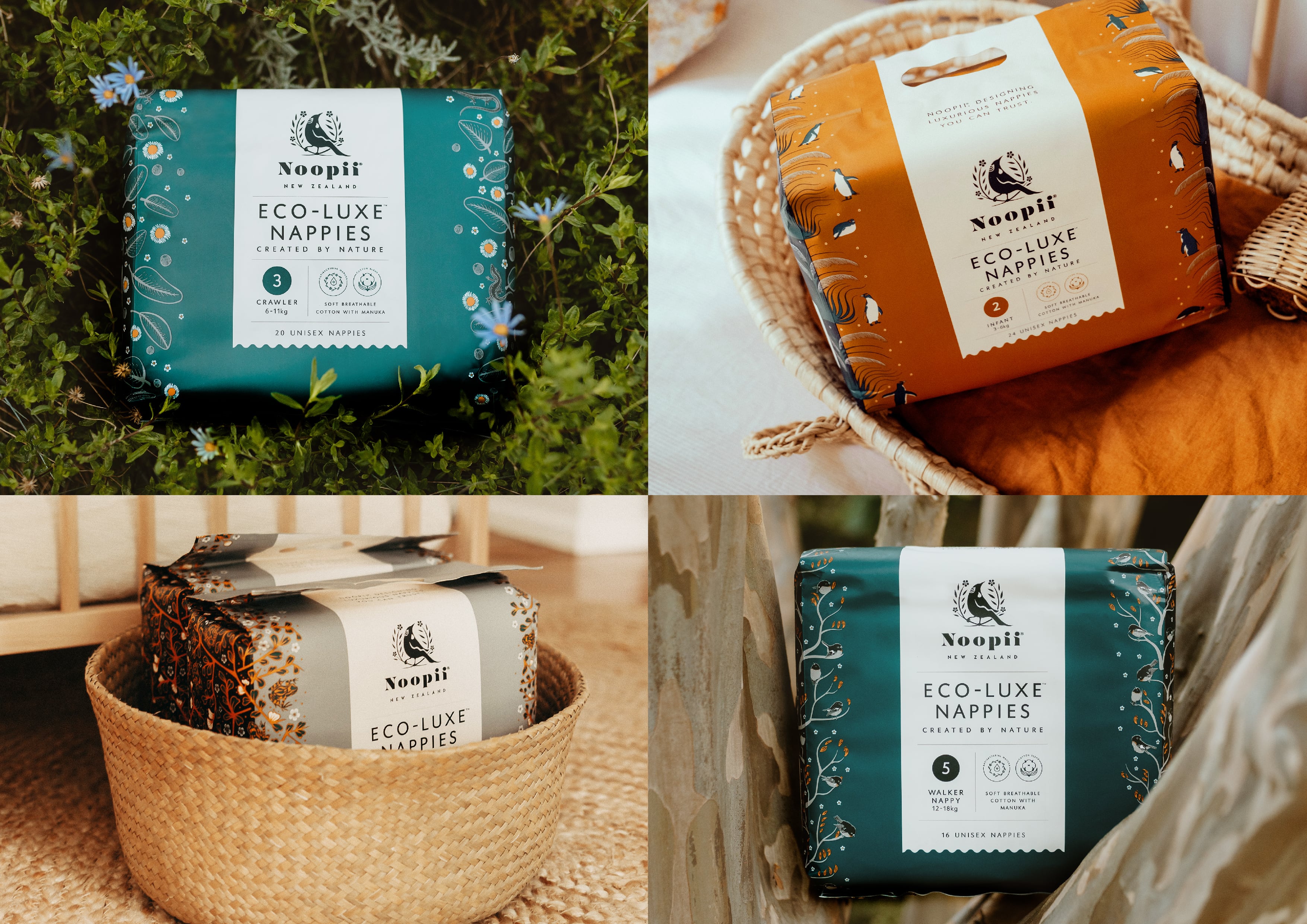
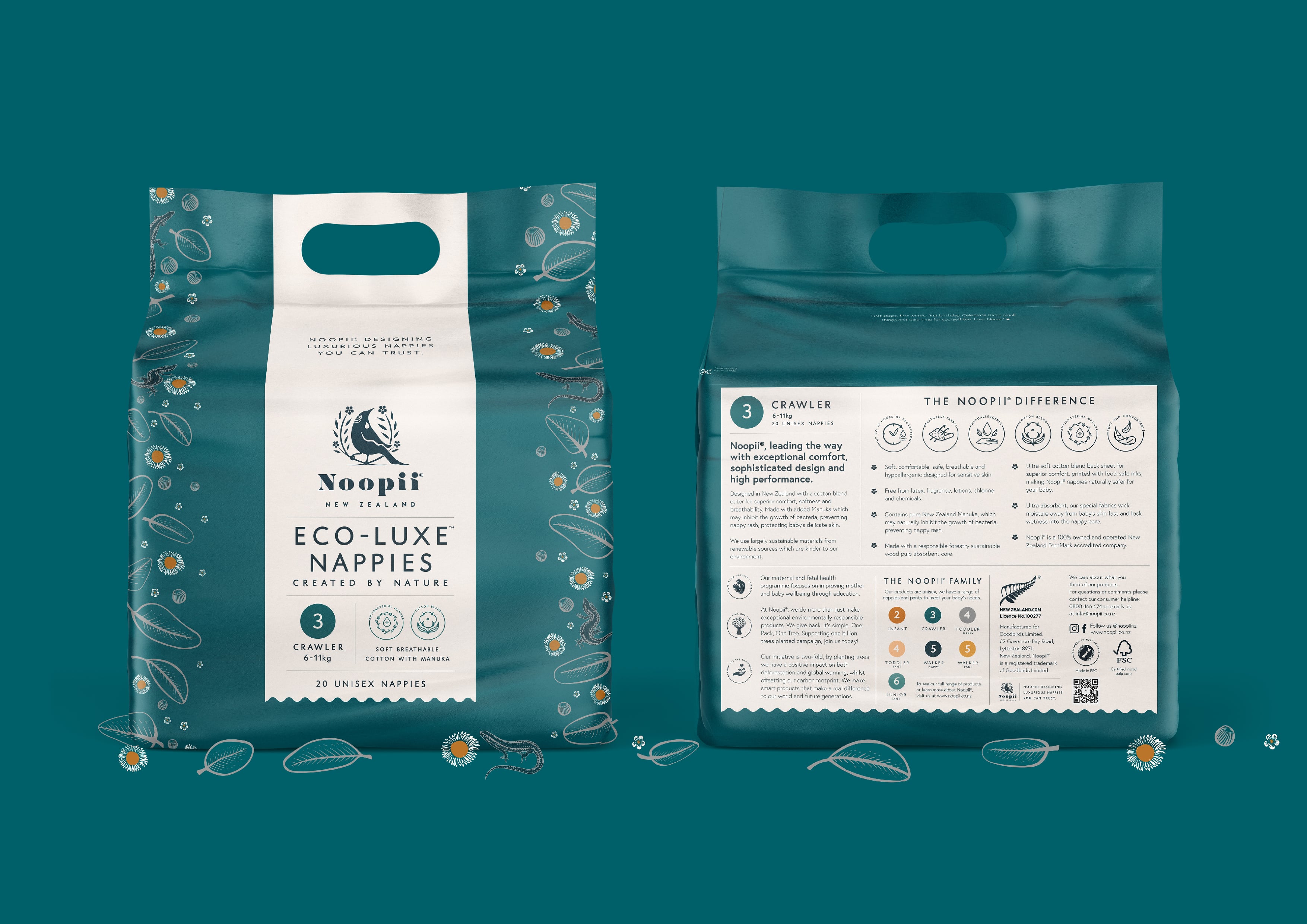
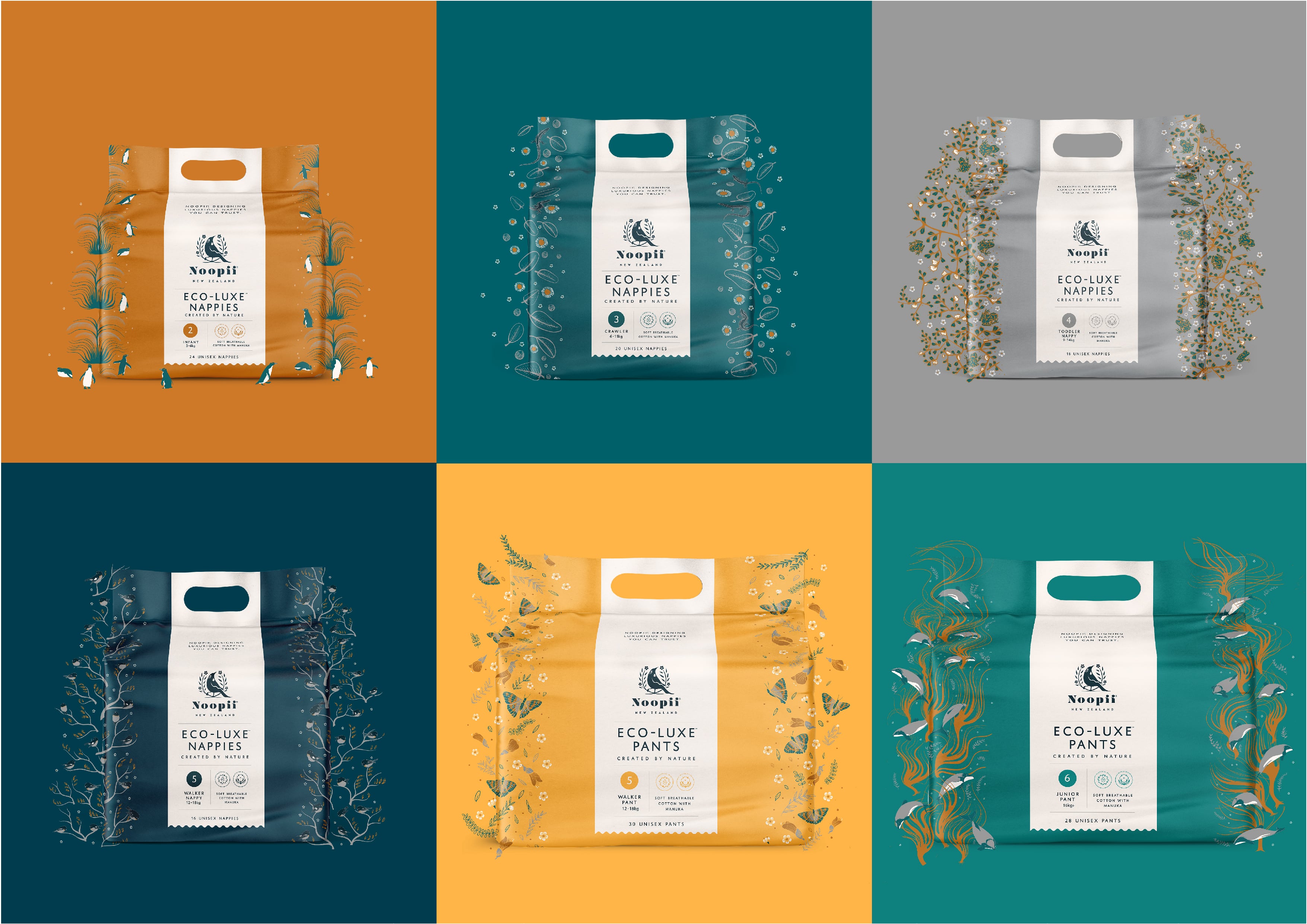
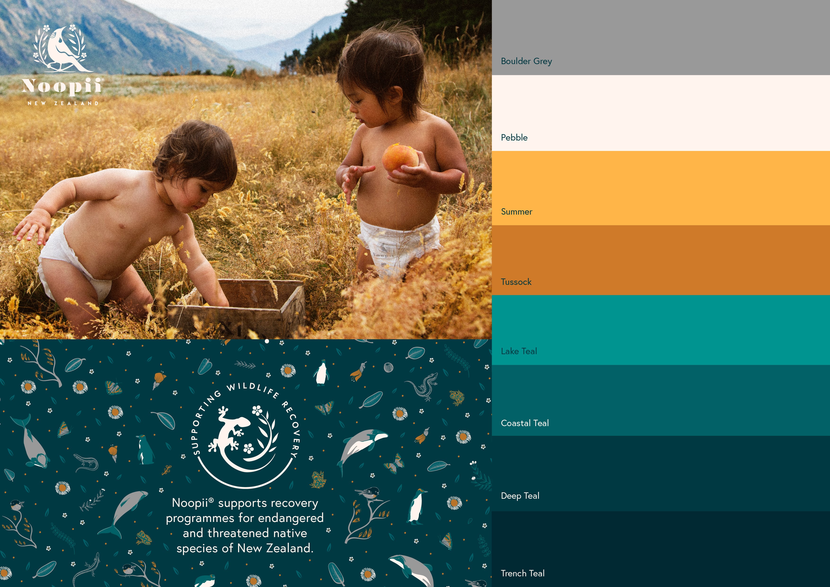
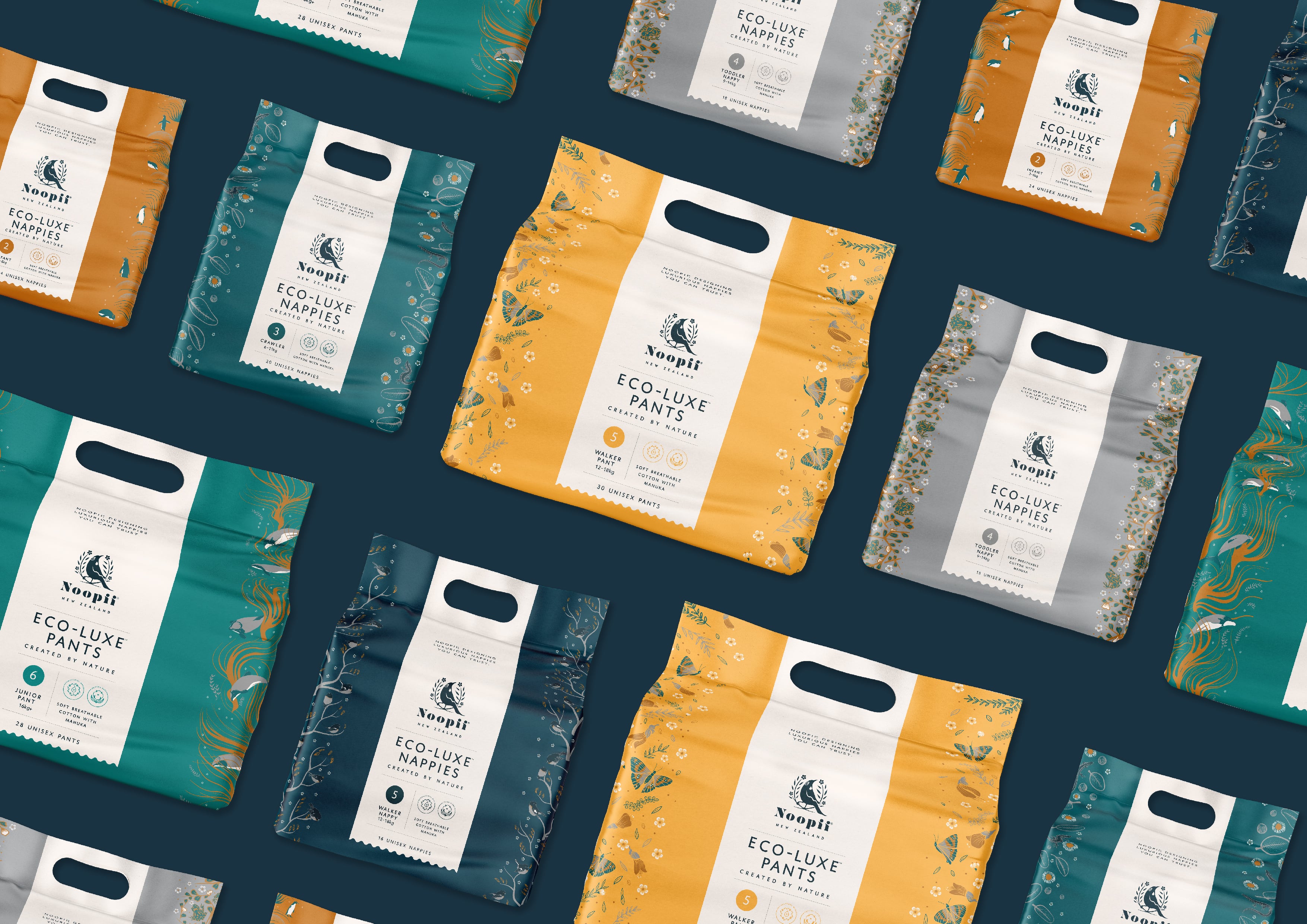
Noopii is a New Zealand owned and operated, social enterprise business with a difference. Noopii was created by two Kiwi mums who saw a gap in the market for a unisex, disposable nappy option that was performance driven, safer for babies’ skin, made from sustainable materials and kinder to the environment.


view website
view facebook
Buy online

Image: Noopii 1
Image: Noopii 2
Image: Noopii 3
Image: Noopii 4
Image: Noopii 5
Image: Noopii 6
Image: Noopii 7
Image: Noopii 8
  • CHALLENGE
  • SOLUTION
  • IMPACT
  • MORE
  • As a new brand, Noopii's brief required a packaging concept that challenged the 'norm' of infant products, demonstrated the brand's values in New Zealand, their commitment to sustainability and to stand out; both as a product and as a branded visual identity. Above all, the packaging design needed to reflect the Eco-luxe quality of the nappy and pant products.

  • The shape, design and orientation of this packaging is a contemporary update from standard nappy packaging, the graphic layout on the packaging is simple and concise. Essential information - the pack's sizes, infant weights, and benefits clear on the front to allow busy parents to pick correct products easily, whilst shopping. A quick turn to the back and iconography of the product's points of difference clearly communicate why and how Noopii is unique. The choice of colours and graphics were chosen to distinctly communicate Noopii's New Zealand inspired heritage without, the wash of white and green usually associated with eco products.

  • The packaging design reflects the product's high quality; the sophisticated design of the package, bold but elegant colour palette and strong visual link to New Zealand's heritage on each pack immediately stands out on the shelf amongst competitors and promotes the premium quality of the brand and the product. This appeals to the purchasers - the parents and caregivers - many of which are becoming more educated and ever conscious consumers who want smart but affordable consumer products. The environmental initiatives, an integral part of the brand's ethos, are clearly communicated through the design to the consumer on every pack.

  • Every pack is designed with a unique colour and native New Zealand species in mind. The colours are chosen for their gender neutral quality - a clear depart from gender-stereotyped pink and blue pastels on competitor infant products - and to clearly communicate Noopii's New Zealand heritage without using typical eco colours - green, white or 'kraft cardboard brown'. The palette is directly lifted from NZ's landscape - stonewash grey of river boulders, golds and ochres of rugged tussock landscapes, bold turquoises tones of South island lakes and the deep teals of the ocean that surrounds New Zealand. Each pack sold supports native wildlife and habitat recovery, therefore each of the nappy, nappy pants and packs are illustrated with a native New Zealand animal, combined with native flora. The use of illustrative graphics provides an element of playful design, as Maui's dolphins, South island tomtits and Yellow-eyed penguins peek out from the front and sides of the packs. The packaging material itself is made from a recyclable paper and non-woven material combination and is designed with a handle for easy transport - even little kids love to carry these colourful packs into the house as they help with groceries.