Jiffi – Clarity Makers

good-design-award_winner_rgb_blk_logo
  • 2026

  • Communication
    Branding and Identity

Commissioned By:

Jiffi

Designed In:

Australia

Jiffi’s rebrand is a brand strategy and identity system for a Sydney technology agency helping growing businesses move from operational chaos to clarity. Designed by Born, it reframes Jiffi from a vague technical helper into a category-defining partner built to make complex systems, workflows and decisions make sense.


view website

2.jpg
3.jpg
4.jpg
5.jpg
6.jpg
7.jpg
8.jpg
  • CHALLENGE
  • SOLUTION
  • IMPACT
  • MORE
  • Jiffi needed to explain a business that did not fit one neat category: software, systems, strategy, implementation and advice. In a market obsessed with specialisation, that breadth risked reading as vague rather than valuable. Its clients faced the same problem. Technology had become embedded in every team, tool and decision, so issues no longer arrived as isolated tech, strategy or operations briefs. They arrived as one tangled organisational mess. The challenge was to name that condition, the problem of everything, give Jiffi an ownable position, and make an abstract challenge feel simple, credible and human.

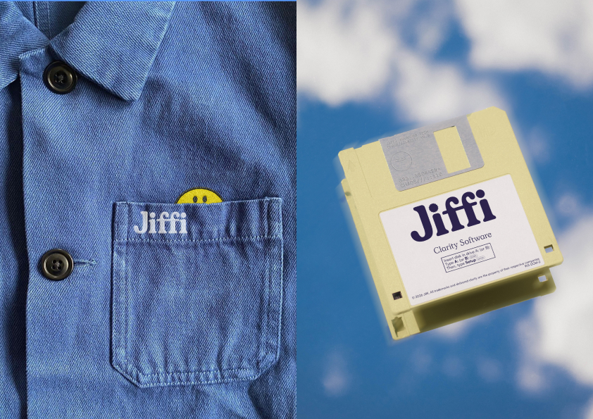
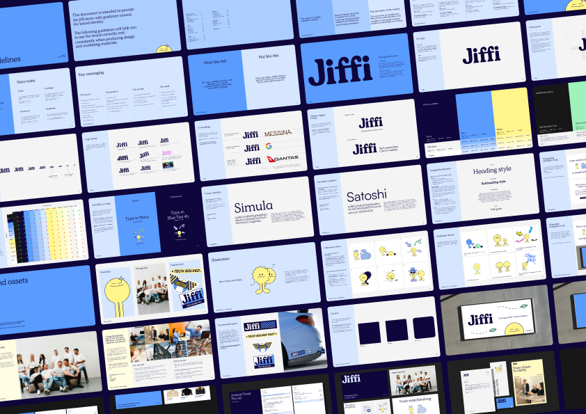
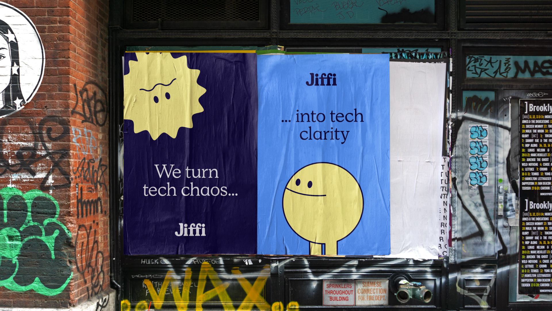
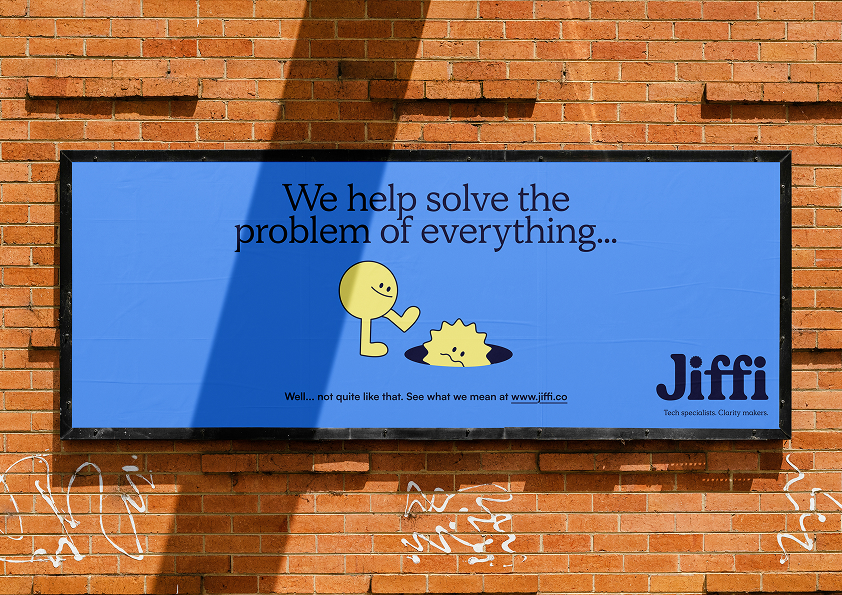
  • Born created Jiffi’s Theory of Everything: a strategic framework that reframes modern business complexity as a single, solvable condition. Instead of selling services, the brand positions Jiffi as the clarity-maker that embeds inside organisations to diagnose, design and deliver what actually works. The identity shows that journey from chaos to clarity. The logo moves from irregular to resolved forms, while small yellow characters personify Chaos and Clarity, making an invisible problem instantly understandable. Across messaging, illustration, typography and colour, the system removes jargon and helps clients see what matters.

  • The rebrand gave Jiffi a clear category, language and story for the value it was already delivering. Internally, it created confidence and alignment around what Jiffi solves. Commercially, the sharper narrative made sales conversations easier by reflecting how clients already felt: overwhelmed by tools, systems and decisions, and looking for clarity. Founder feedback captured the result: the brand finally felt like Jiffi, created pride in the team and made selling to clients easier. The work shifted perception from technical support to strategic partner, giving Jiffi a scalable platform for growth.

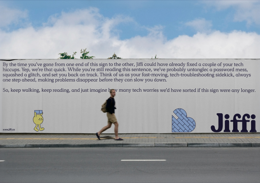
  • Jiffi’s Theory of Everything reframes complexity as the real problem facing modern businesses, giving the brand a distinctive strategic point of view. The identity system translates that idea visually: the logo’s two i-dots move from rough and chaotic to smooth and resolved, embedding the journey from disorder to clarity into the mark itself. Chaos and Clarity, a pair of small yellow characters, turn an abstract consultancy proposition into a relatable human story. Illustration replaces corporate jargon, making complex technology and operations problems feel accessible without being simplistic. The typographic and colour systems balance technical credibility with warmth, using precision, openness and optimism to signal a partner that is serious without feeling cold. The verbal identity does the same work: direct, pragmatic and lightly irreverent, it speaks to leaders who are tired of over-complication. Together, the strategy, language and visual world create a practical toolkit Jiffi can use across sales, culture, content and client engagement.