Explorers Club Brand Refresh

good-design-award_gold-winner_rgb_blk_logo
  • 2020

  • Communication
    Branding and Identity

Commissioned By:

Jo Sinfield, Explorers Club

Designed In:

South Africa

Explorers Club is an eclectic collection of accommodation paired with off-the-map expeditions, based in South Africa and beyond. More than accommodation, Explorers Club offers an experience like no other. Each Explorers Club property has its own distinct theme, character, and story to tell.


view website

  • CHALLENGE
  • SOLUTION
  • IMPACT
  • MORE
  • As a decade-old brand, Explorers Club required a refreshed logo and identity to represent the spirit and exclusivity of the brand; one that would appeal to the discerning traveller looking for a unique experience.

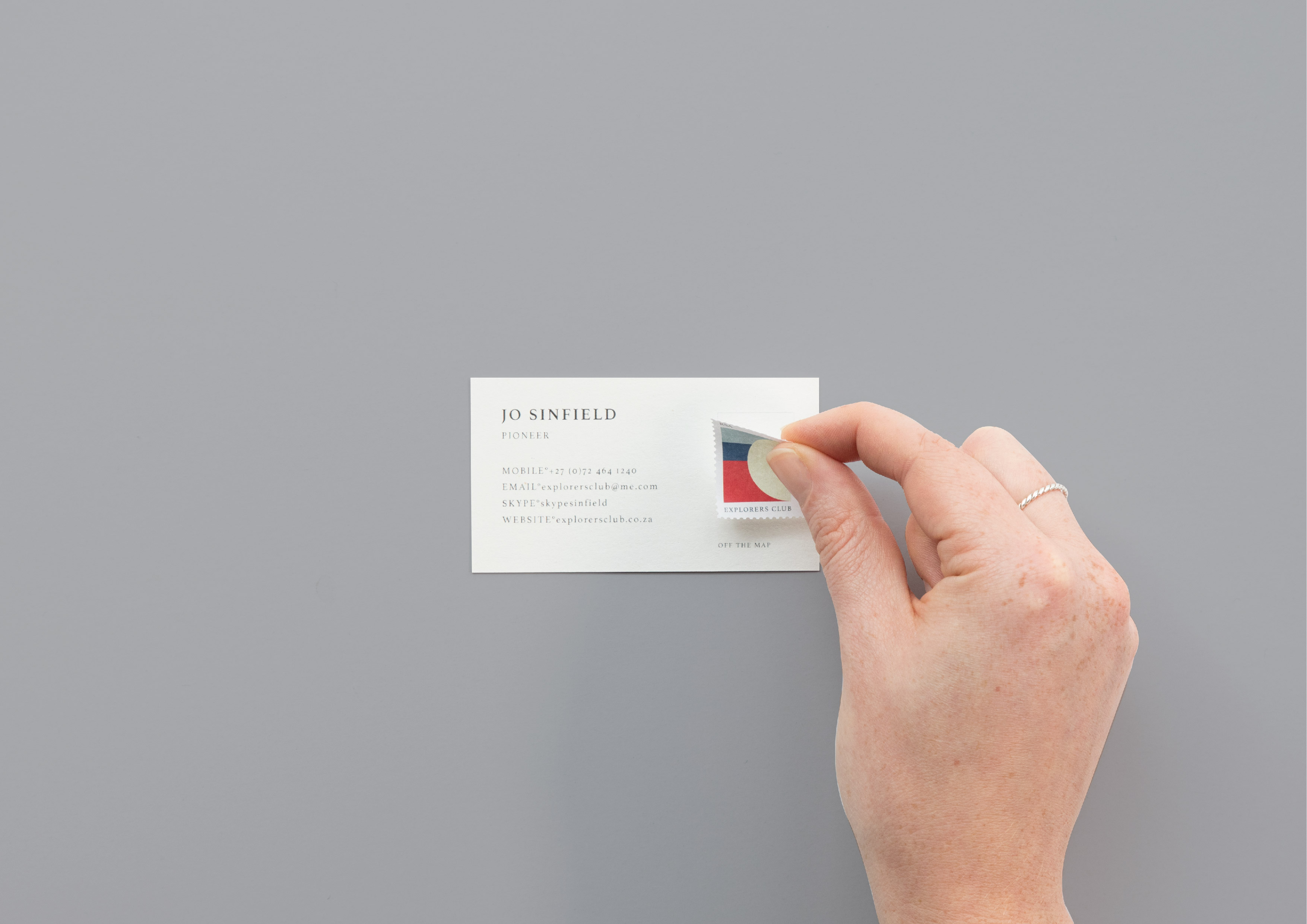
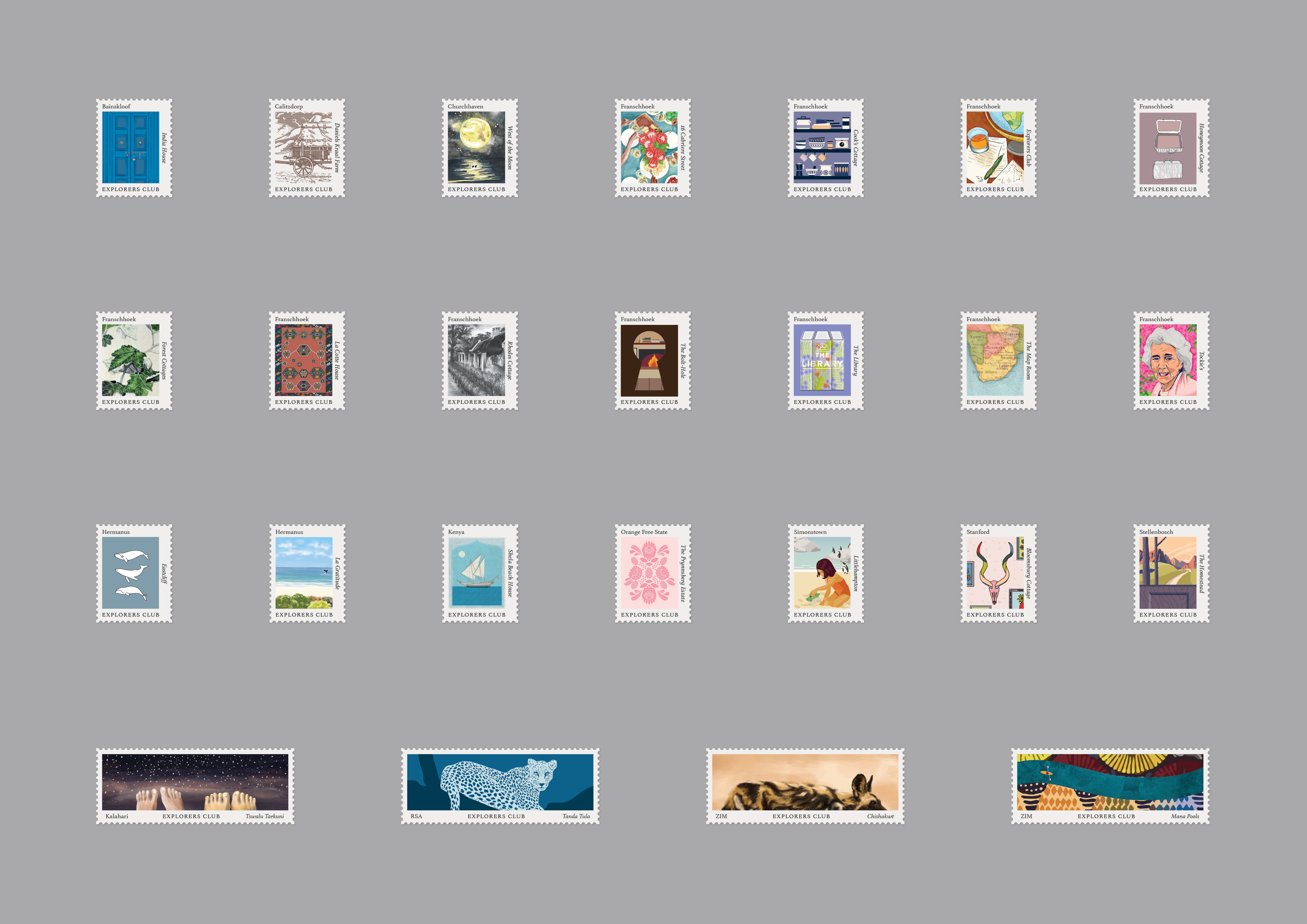
  • The solution was found in the humble postage stamp – iconic symbols of travel and exploration. With every accommodation being unique, the stamp was the perfect device by which to express the individuality of each property. We established what makes each Explorers Club property one of a kind. These unique stories and anecdotes served as the inspiration behind each stamp and were translated into a series of designs, with each stamp’s aesthetic determined by its story.

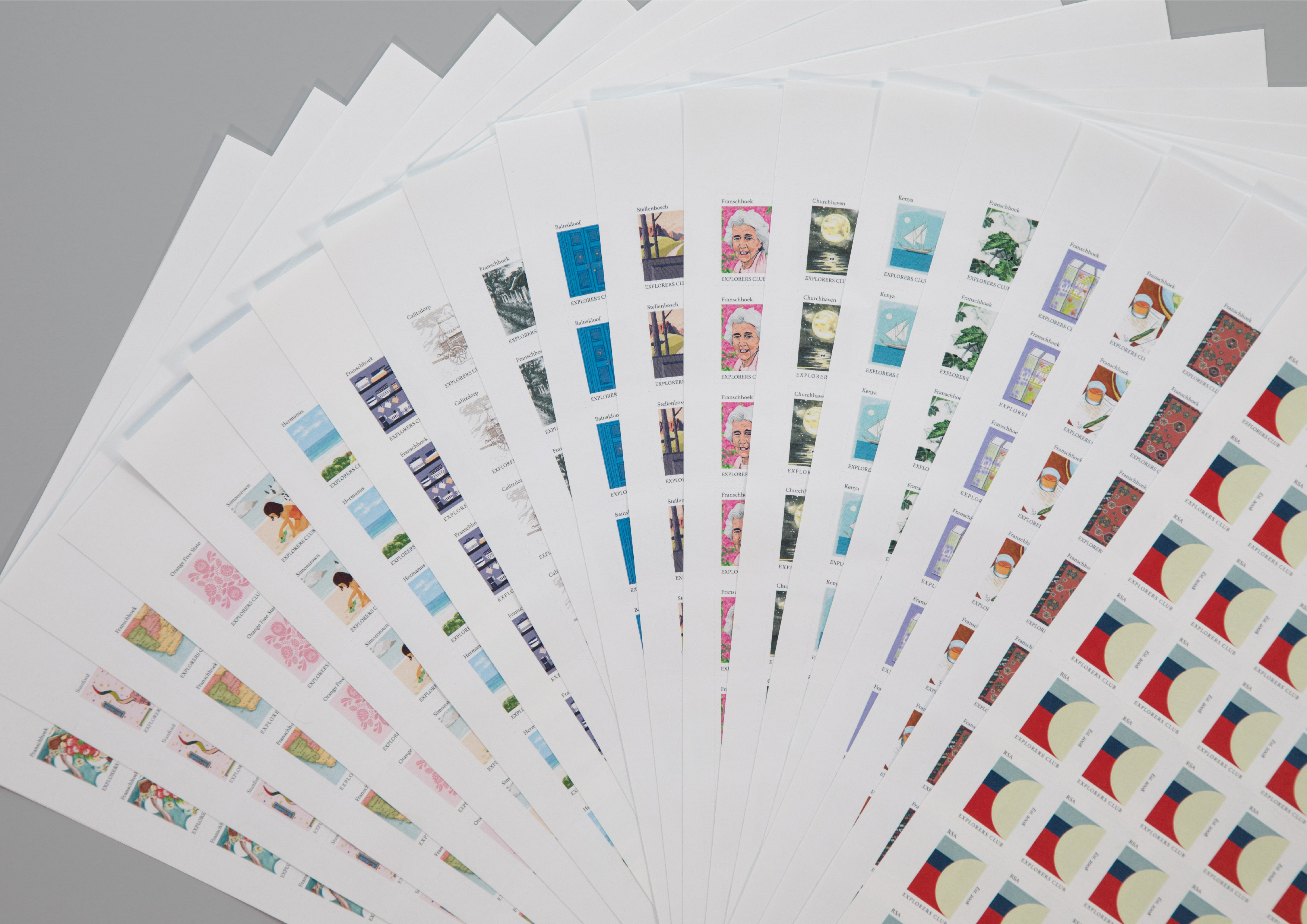
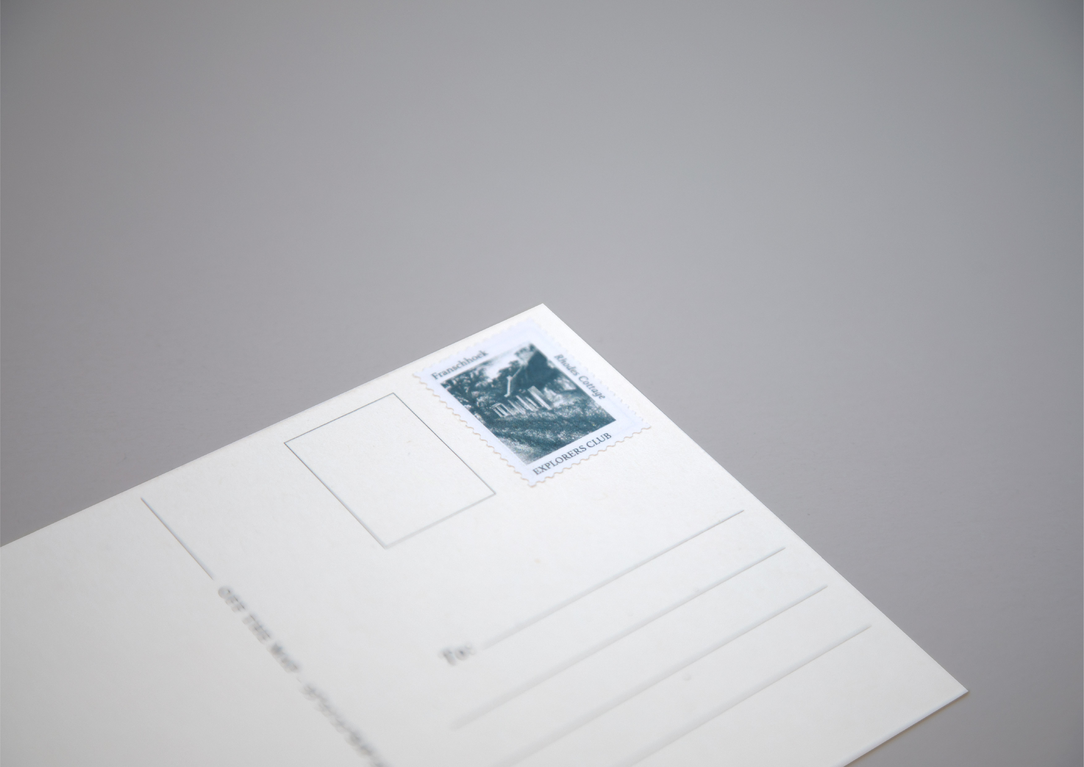
  • The result is an eclectic identity that provides a window into the brand and captures the individuality of each the properties that form part of it. One where guests don’t just collect stamps, but experiences to write home about. The identity comprises a collection of 25 stamps (with new stamps being added as Explorers Club grows its footprint), letterhead, business card, welcome card, postcard (all of which can be tailored to each property), field notebook, luggage tag, and website.

  • We identified what makes each property/expedition special through in-depth questionnaires and translated these stories into a collection of stamps with the design unique to each accommodation. In this way, we were able to capture the heart of each property, while creating a cohesive identity that reflected the greater brand.