Doshii: A Rebrand Putting Hospo First

good-design-award_winner_rgb_blk_logo

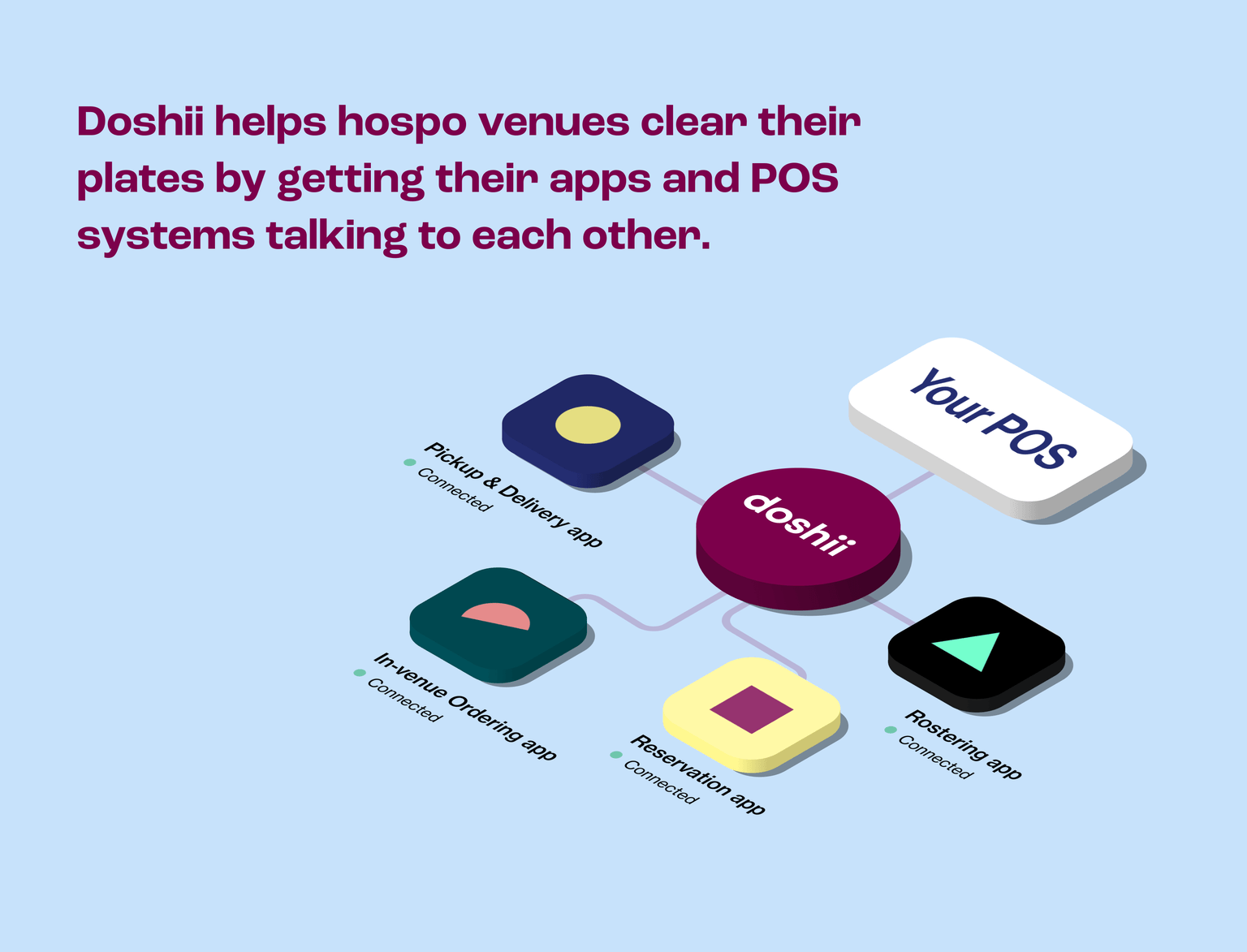
Hospitality-tech scale-up Doshii was launched in 2016 to help restaurants streamline the chaos of app integrations into one clean, calm counter. Our 2021 rebrand was driven by a pivot to the people – venue owners & hospitality workers – who give the industry its unique flavour. Our brand centres around empowering hospitality.
view website
view facebook
view twitter
Buy online

  • CHALLENGE
  • SOLUTION
  • IMPACT
  • MORE
  • With a change in leadership, Doshii turned its gaze to better understanding what the hospitality owners, operators and workers who use tech to support their business really need. Our research told us that venues were overwhelmed by the volume, cost and learning curves of apps required to run a competitive hospitality business. Overstressed and understaffed (especially post-COVID), they craved seamless tech designed specifically to serve them. We vowed to create a brand that speaks to them (and their needs) directly with human-centred design and a communication suite created to serve and delight in equal measure.

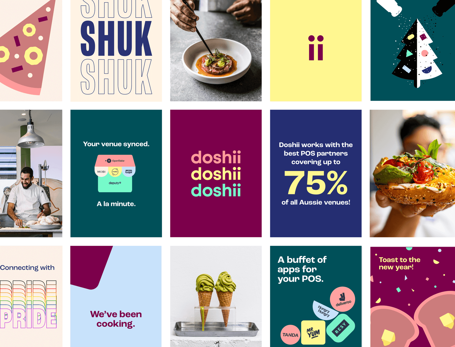
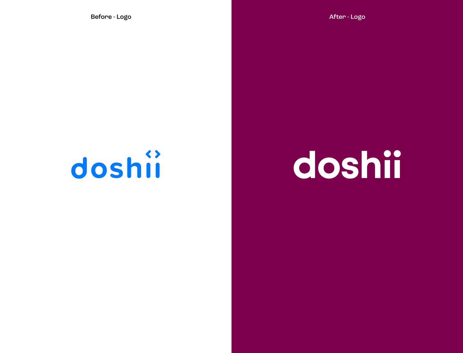
  • We had a new mission: to empower hospitality workers and help venue owners take control of their tech-integrated future. We built a brand that speaks specifically to the passion and personality inherent in the hospitality industry – a brand filled with vibrant colours and playful, emotive language designed for our hospitality heroes. We reimagined it all from the ground up, from logo to typeface and everything in between, with a single word in mind: served. - Integration served simply. - Payments served quickly. - Insights served with opportunity. - Operations served with clarity. - Mistakes served rare.

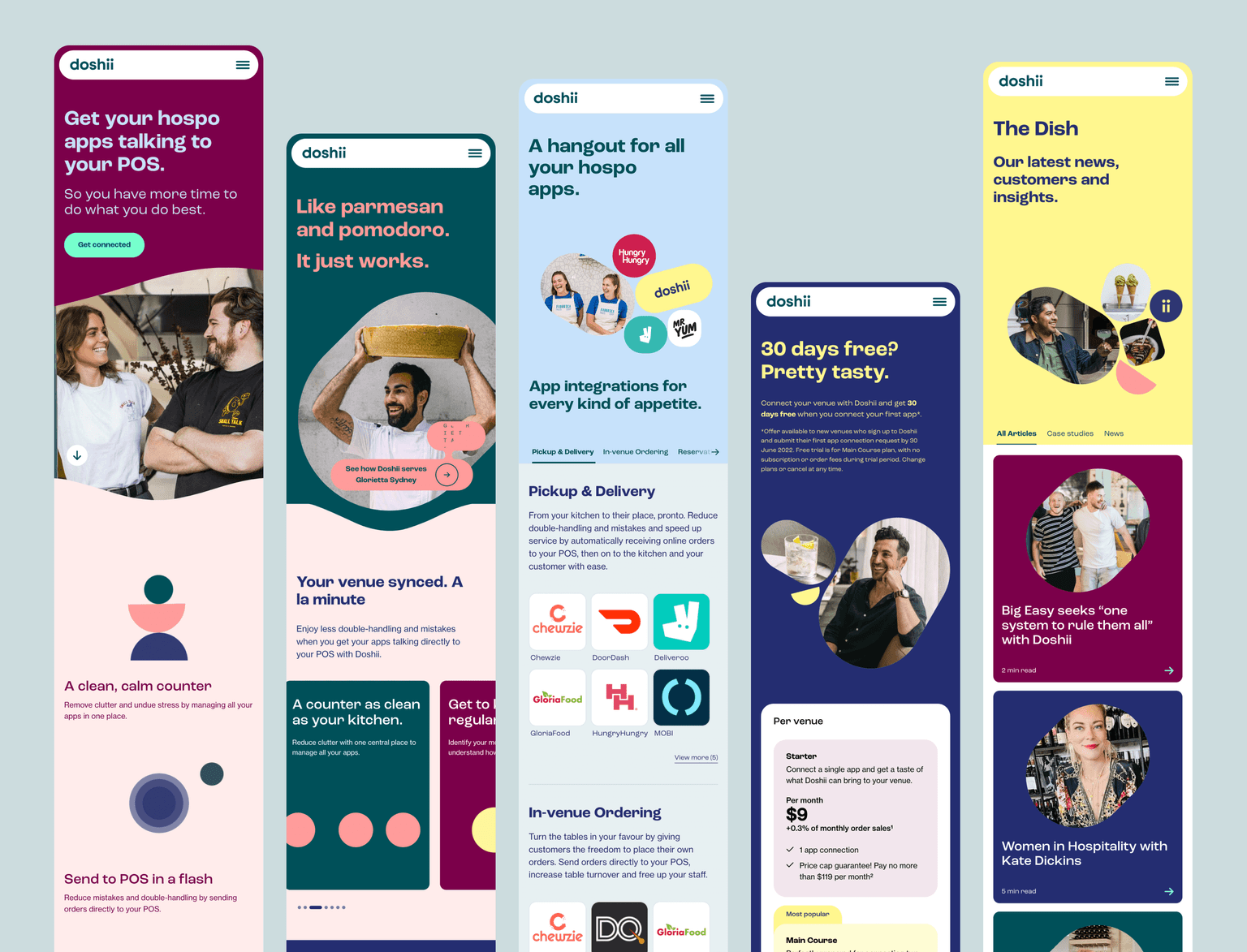
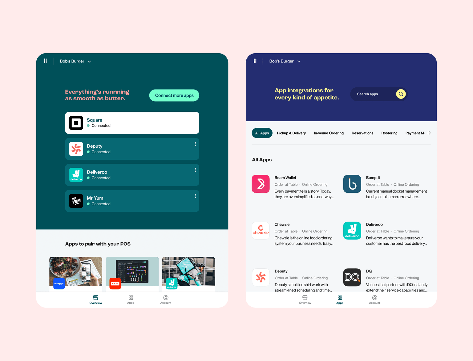
  • Our approach to transforming Doshii from a middleware tech solution to a seamless customer-facing service was multifaceted. Emphasising usability, the new Doshii uses strong, attention-grabbing colours and hospitality- (rather than tech) focused -language to make our offering, its value, and its potential benefit to hospitality venues clear and easy to understand. Our hard work paid dividends, with our post rebrand campaign generating over 8.5 million impressions – 171% above target – and our new ads yielding higher engagement. More customers are now spending more time on our site and subscribing to our service – a pretty delicious result.

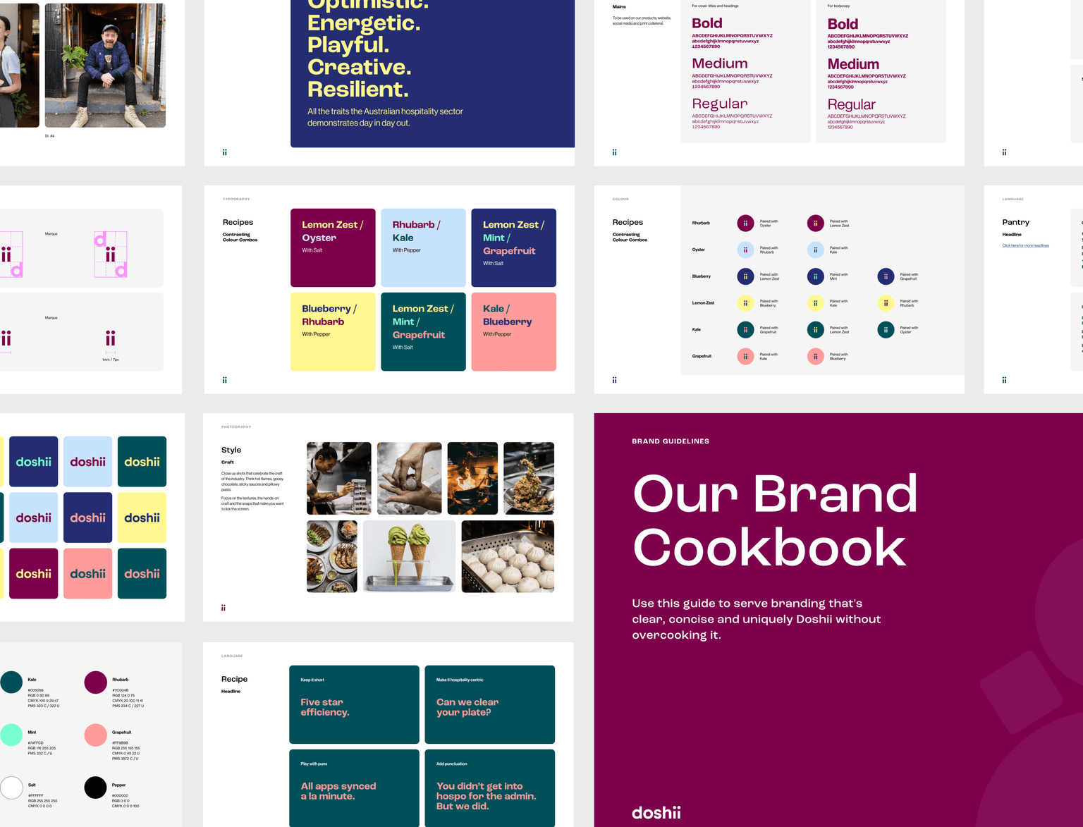
  • We needed a brand that would underscore the concepts of simplicity and service that are so central to everything we do. We offer simplified tech integration to venue owners and workers lost in a sea of apps, POS and devices, and wanted our branding to reflect this operational streamlining at every step and in every phrase. We also realised the importance of building an emotional connection with our users – individuals doing business in a difficult industry, powered by passion and perseverance. Cognizant of the importance of authenticity, we transitioned to using images of real people working in the industry. Rather than use stock photography, we now opt to use our partner venues and hospitality workers captured doing what they do best. We also began to build a friendly, helpful relationship with our customers based on the following pillars: Served simply. Happy to help. Playful, but punchy. Ready to flex. Warm & welcoming. This is especially evident through our colour palette, which is a blend of carefully chosen, vibrant colours that mirror both the hues and names of delectable ingredients and seasonings – Rhubarb, Blueberry, Kale, Grapefruit, Oyster, Lemon Zest, Mint, Salt & Pepper – speaking the visual language of our hospitality heroes.