CommBank App for Tablet

  • 2016

  • Digital
    Apps and Software

Designed In:

Australia

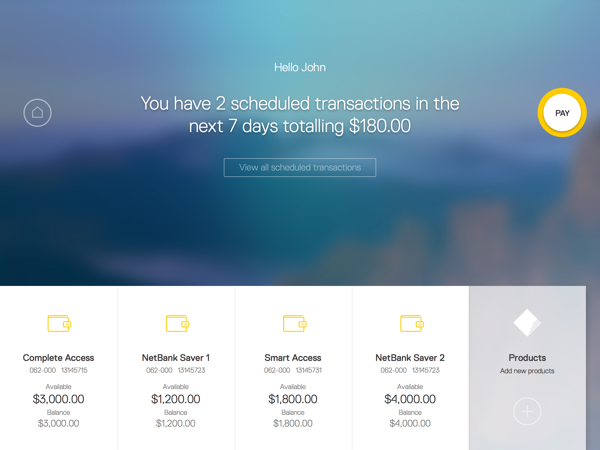
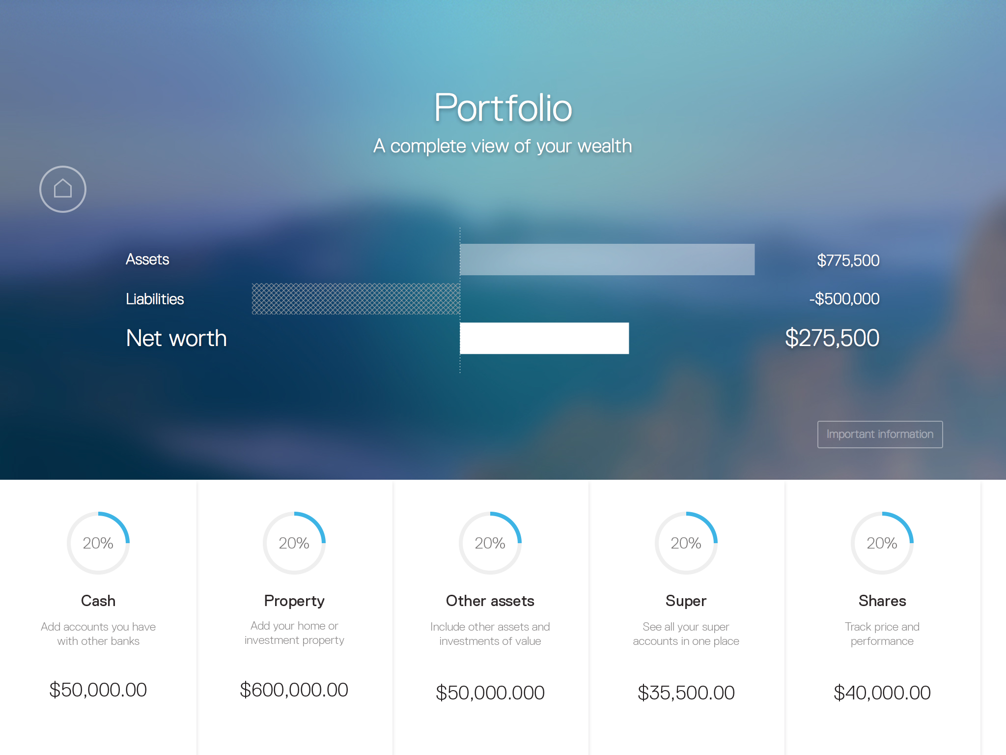
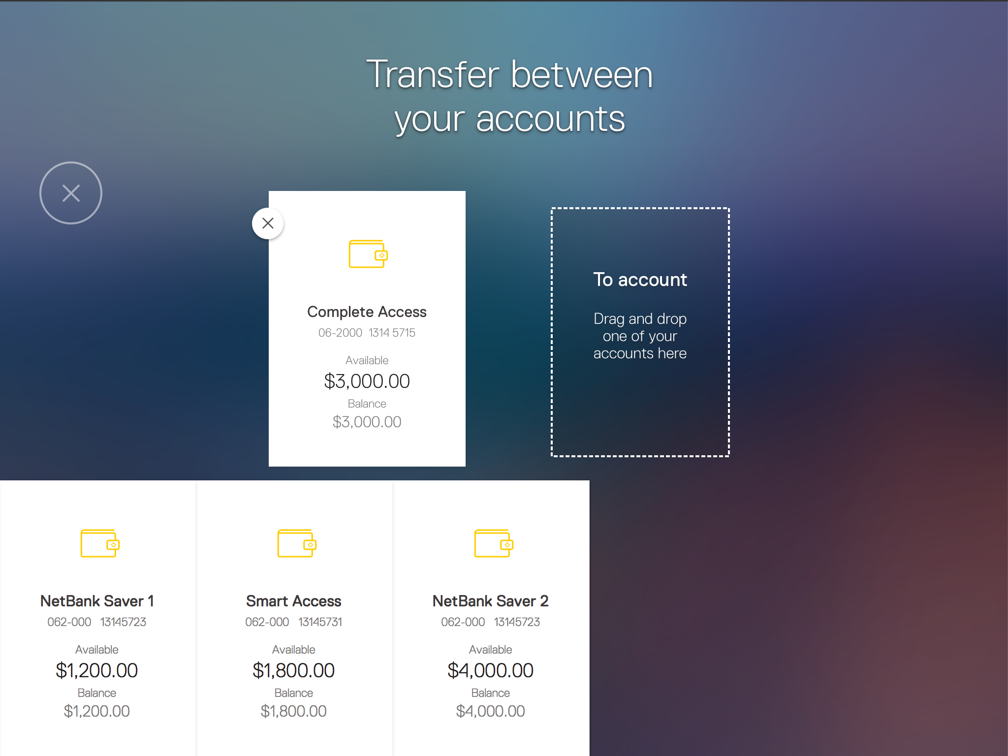
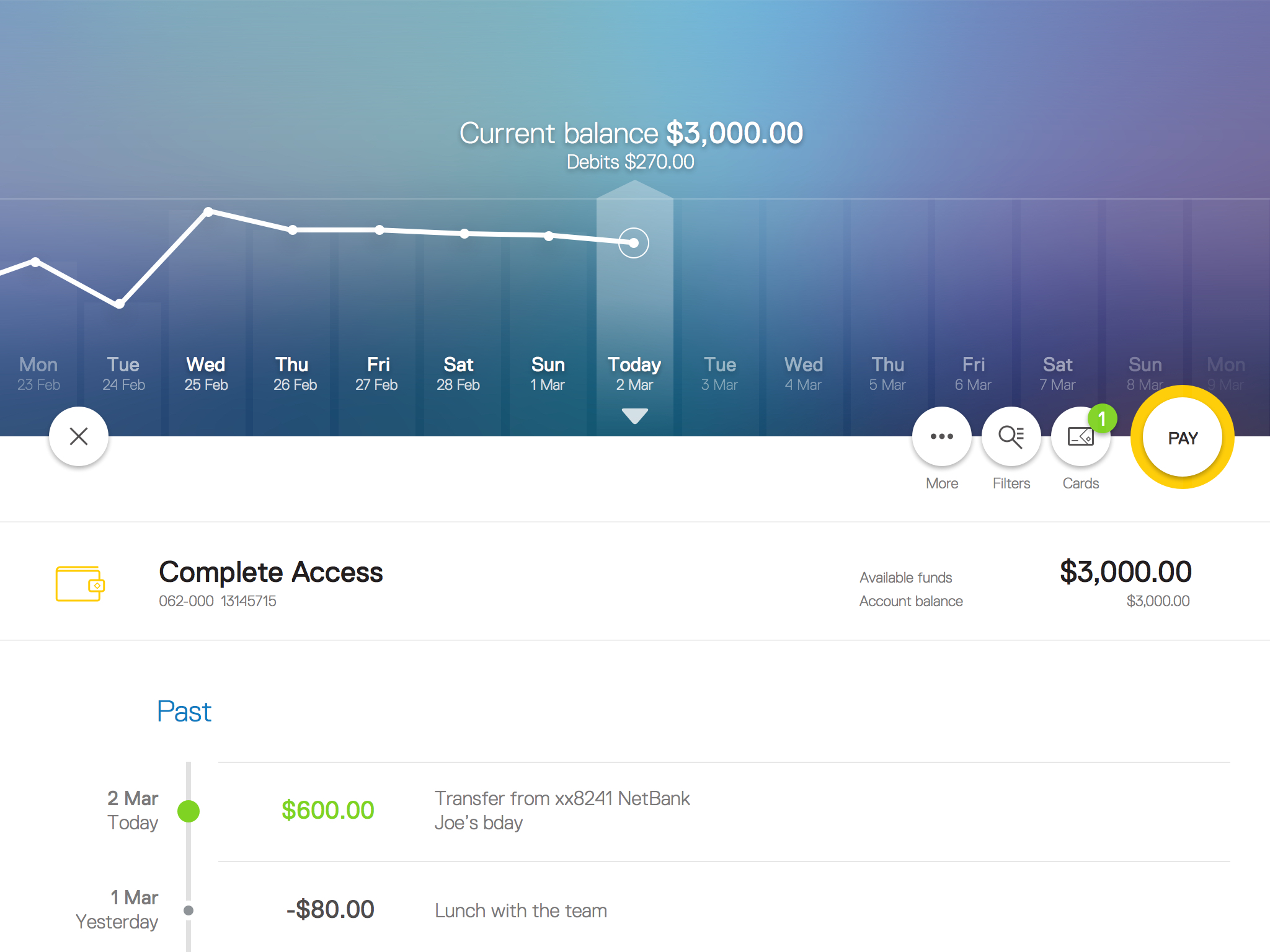
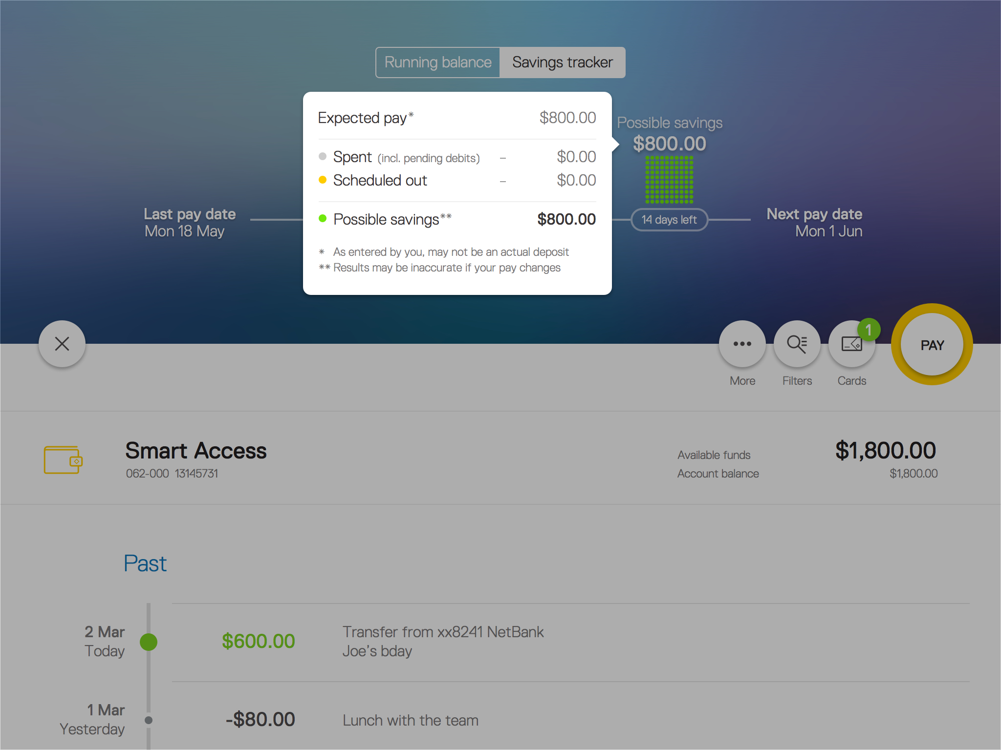
We’ve built a new CommBank app for tablet, designed for customers with a preference for tablet who want a larger screen experience than the mobile app. We designed a new app interface that took advantage of the tablet screen and context, with visualisations to help customers manage their money.


view website
view facebook
view twitter
Buy online

  • CHALLENGE
  • SOLUTION
  • IMPACT
  • MORE
  • Dimension is a live visual language that captures the meaning to our approach. It is a design metaphor built upon spatial navigation. Depth of field, focus, scale and the layering of objects created a unified design language. Dimension refined the interaction model, UI elements and transitions and teaches designers to constantly evolve their design decisions by aligning them to the core design principles. Dimension has brought clarity, reduced the complexity to brutal simplicity and provided meaning to motion through thoughtful, balanced choreography. Dimension is the space in which we created, built and developed over time. It is what drove the experience model.

  • We designed for the bigger screen in mind and skewed for an older demographic. This meant we created more visual elements in transaction history for easy scanning, and intuitive drag and drop functionality for transfers. Running balance provides a financial view of the last 35 days. There is a daily current and closing balance, providing a view of everyday spending habits in a simple, visual way. The savings tracker estimates possible savings, using expected pay, amount spent, pending and upcoming debits. It assists customers by providing insights that empower them to make informed decisions.

  • We found most customers felt they could achieve key financial milestones like retirement or paying off their mortgage if they had a clearer, consolidated view of their finances. To address this, we created portfolio view, an easy to use alternative to other manual methods such as a basic spreadsheet which some of our customers were using. The portfolio view provides customers with a better view of their financial position and net worth by pulling in CommBank bank account details. Customers can then add all their assets and liabilities information for property, shares and loans.

  • The CommBank app for tablet is designed with speed and ease of use in mind, so we pulled the top tasks customers complete within the app and created handy shortcuts on their app home screen for easy access. We also designed contextual payment shortcuts from the accounts view, allowing customers to view their scheduled transactions or make quick payments with a couple of taps.

    We operate in feature based scrum teams with two week sprints, enabling high quality, accelerated features. Our process allows us to identify customer problems, rapidly prototype & user-test, iterate based on feedback & quickly deliver value to customers. For design we uncovered when, why & how people use their tablets & used our findings as a significant basis for decisions. We conducted usability testing fortnightly, and continuously put concepts in front of a customer panel to validate design assumptions. We refined deep research into robust design principles for tablet based financial interactions. We use feedback for rigorous design, producing many variations, testing and then reworking them regularly