Breadcetera Brand Identity

good-design-award_gold-winner_rgb_blk_logo
  • 2026

  • Communication
    Branding and Identity

Commissioned By:

Breadcetera

Designed In:

Australia

Breadcetera–a neighbourhood marketplace–designed to nourish the curious. From fresh pantry staples to exotic provisions, Breadcetera gives locals the best of what they need and things they never knew existed.A restaurant hospitality group challenged Blurr to help them make the leap into retail, transforming an empty storefront into an upscale marketplace.
view website
Buy online

2.jpg
Photographer: Michael Pham
3.jpg
Photographer: Michael Pham
4.jpg
Photographer: Michael Pham
5.jpg
6.jpg
Photographer: Michael Pham
7.jpg
Photographer: Michael Pham
8.jpg
  • CHALLENGE
  • SOLUTION
  • IMPACT
  • MORE
  • The client team had spent years sourcing top-shelf ingredients for their high-end restaurants. But how could they expand their relationship with patrons beyond special occasions and into their everyday lives?Could a new brand flex from insta-worthy interiors to grab-and-go meals? What does a community of sophisticated foodies need that they don't already have?The storefront's location had plenty of amenities, yet locals struggled to find one key ingredient: fresh bread. Combined with the team's gift for curation, Breadcetera was born.

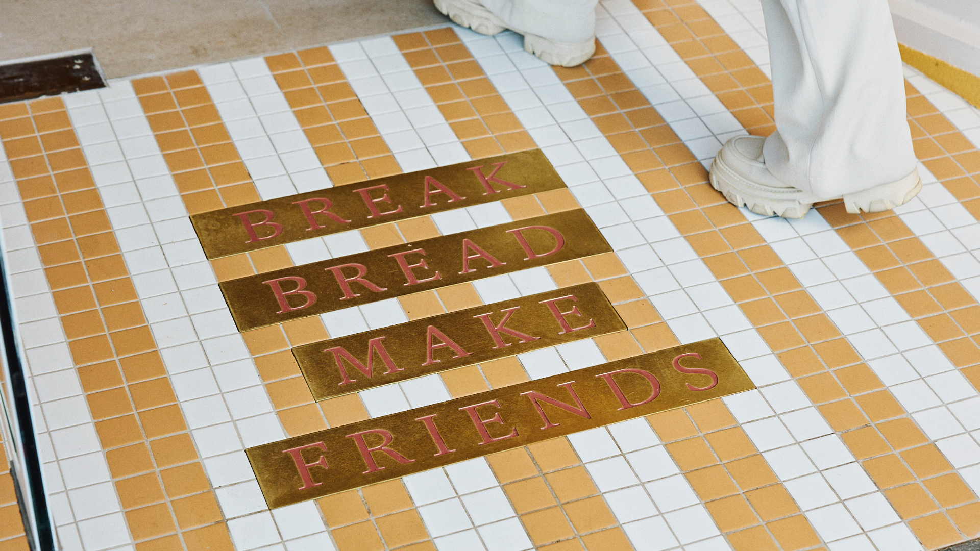
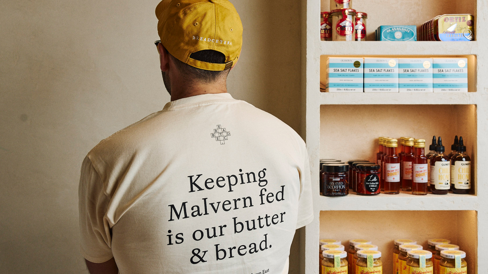
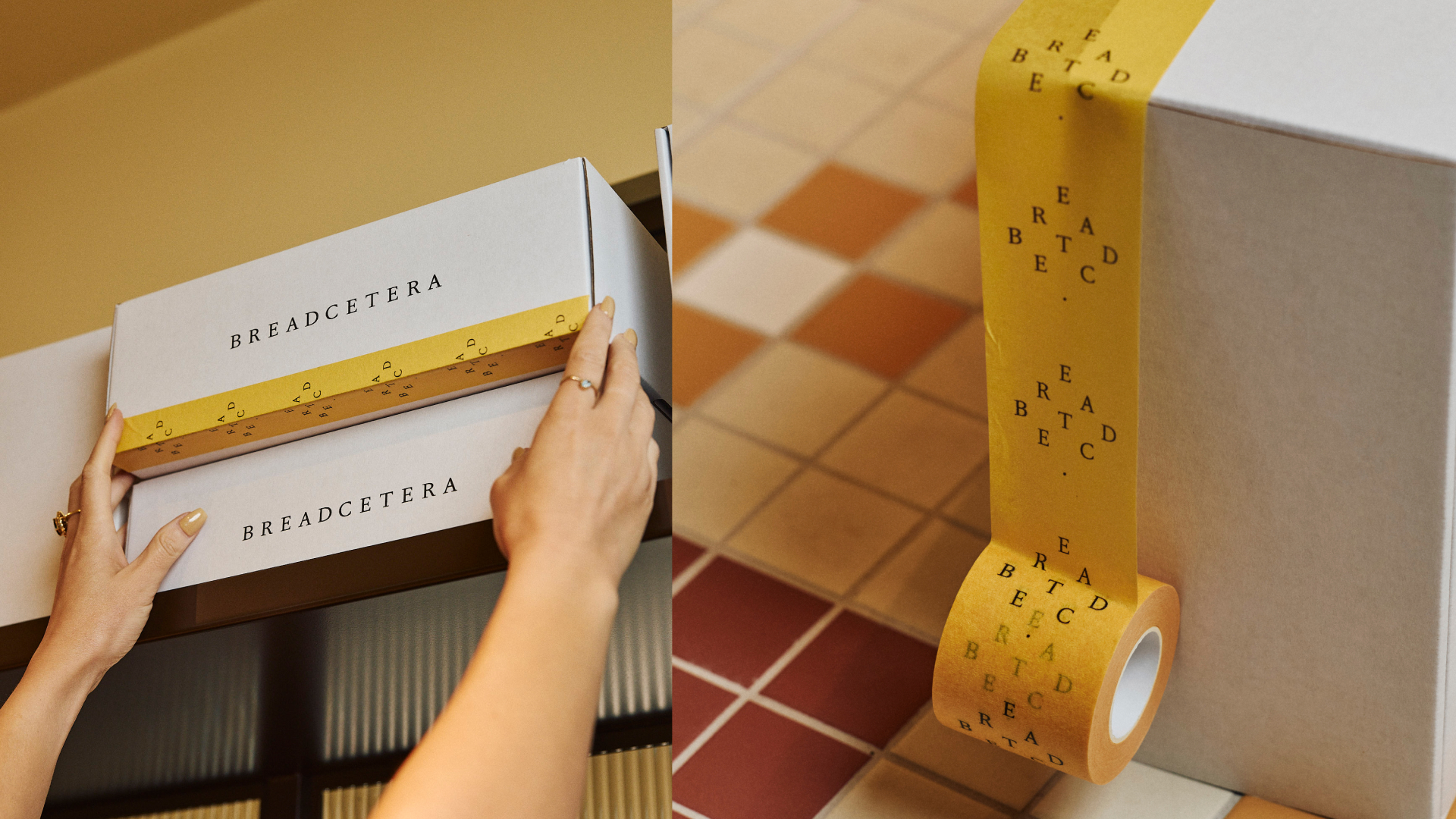
  • More than a marketplace, Breadcetera is a love letter to the art of gathering. With shelves offering both essentials and artful, international goods, the brand triples down on the groups undeniable bread and butter: fostering genuine connection through a shared love of food.The central design motif draws from Scrabble tiles, mixing letters like ingredients to tell stories about new products and daily specials. Those tiles become floor mosaics that mimic a rug and central foyer—a warm welcoming that invites neighbors inside to say hello, explore the shelves, and take something special home.Breadcetera: Break Bread, Make Friends.

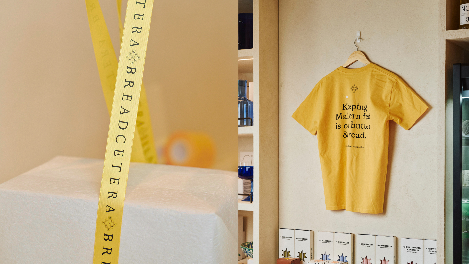
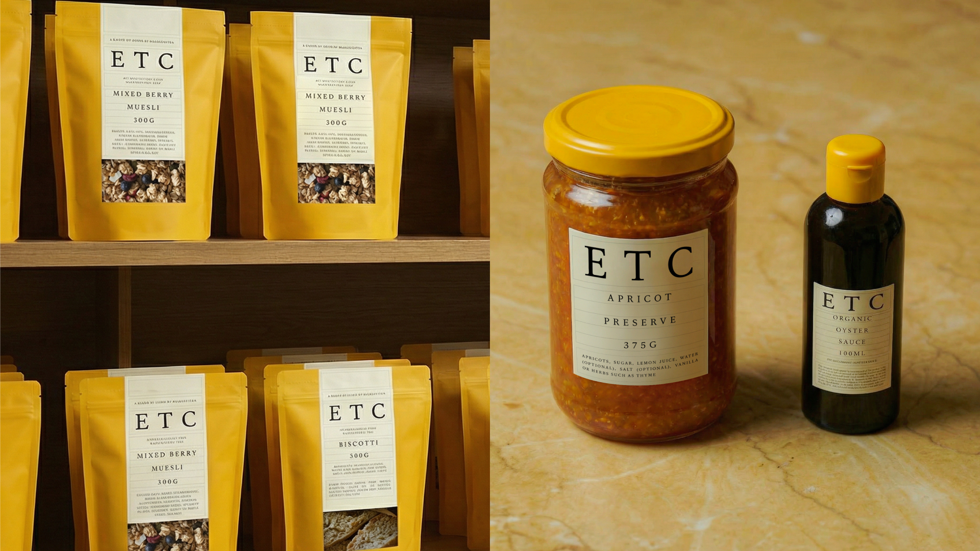
  • Breadcetera has rapidly established itself as a high-performing neighbourhood destination, driving strong repeat visitation and increased dwell time. Within six months of launch, the brand expanded to a second location, demonstrating immediate commercial success and scalability.The project has also been recognised globally, with Breadcetera’s packaging winning 1st place at the Dieline Awards, reinforcing the strength of its design system beyond the physical space.By blending strong commercial performance with cultural relevance, Breadcetera extends the client’s reach into a daily ritual—proving how thoughtful design can deliver both business growth and industry recognition.

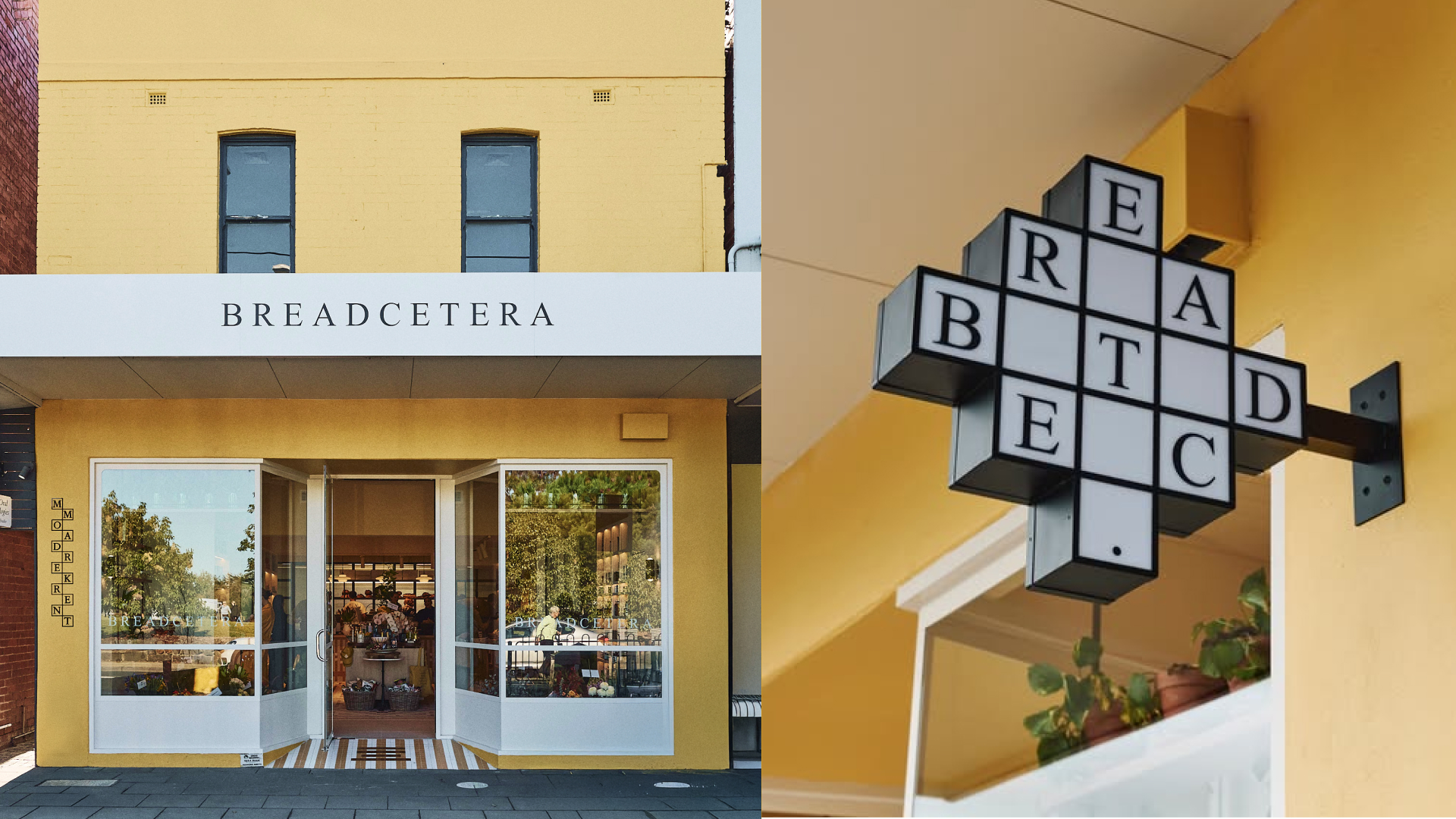
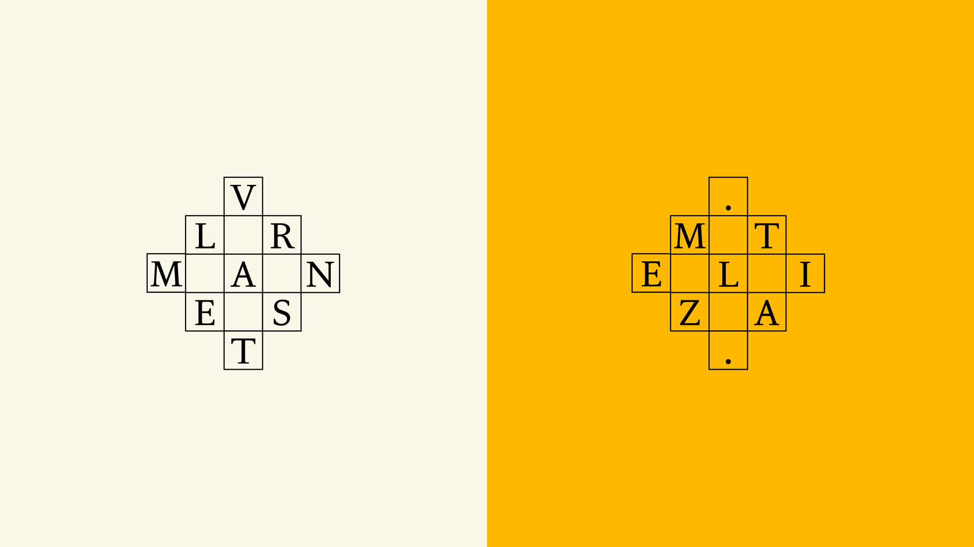
  • Breadcetera’s execution combines spatial design, brand storytelling, and a flexible identity system to create a distinctive neighbourhood retail experience designed for scale.Naming & Verbal Identity: The name Breadcetera is built on the idea that everything revolves around bread - and the “etcetera” that completes it. It celebrates both staple and supporting ingredients, shaping an optimistic, relaxed tone of voice that balances warmth, playfulness, and quality across all touchpoints.Physical Space: A bold, sunlit yellow exterior creates strong street presence. Inside, the space unfolds as a journey of discovery, guided by large-scale Scrabble-inspired mosaic floor tiles. Products are carefully merchandised -bread elevated as sculptural centrepieces - while warm bread and butter colour tones and soft lighting encourage exploration and dwell time.Visual Identity & Signage: Inspired by the combinatory logic of letterforms, the identity is modular and adaptable. A flexible brandmark, custom typography, and interchangeable signage (DIPS, SIPS, CHIPS, ETC.) create clarity while reinforcing the brand’s playful narrative.Digital Storytelling: Social content mirrors the in-store experience, highlighting seasonal products and curated finds to build familiarity, spark curiosity, and drive repeat visits.