For centuries, surfboard designers and shapers have innovated at the crossroads of technology, engineering, physics and craftsmanship. They’ve led a journey from balsa wood and reed to foam and fibreglass, all the while dictating the way that waves are ridden and what swells can be ridden.
However, the history of surfboard design is a nuanced narrative. Different styles of surfing have always called for different thinking, and “good” surfing is truly subjective. Even then, certain shapes, materials and forms have become standard in our modern day.
From single-fins to quad-fins, fibreglass to epoxy and extreme to flat rockers, let’s ride through the key moments of surfboard design innovation.
The quest for performance
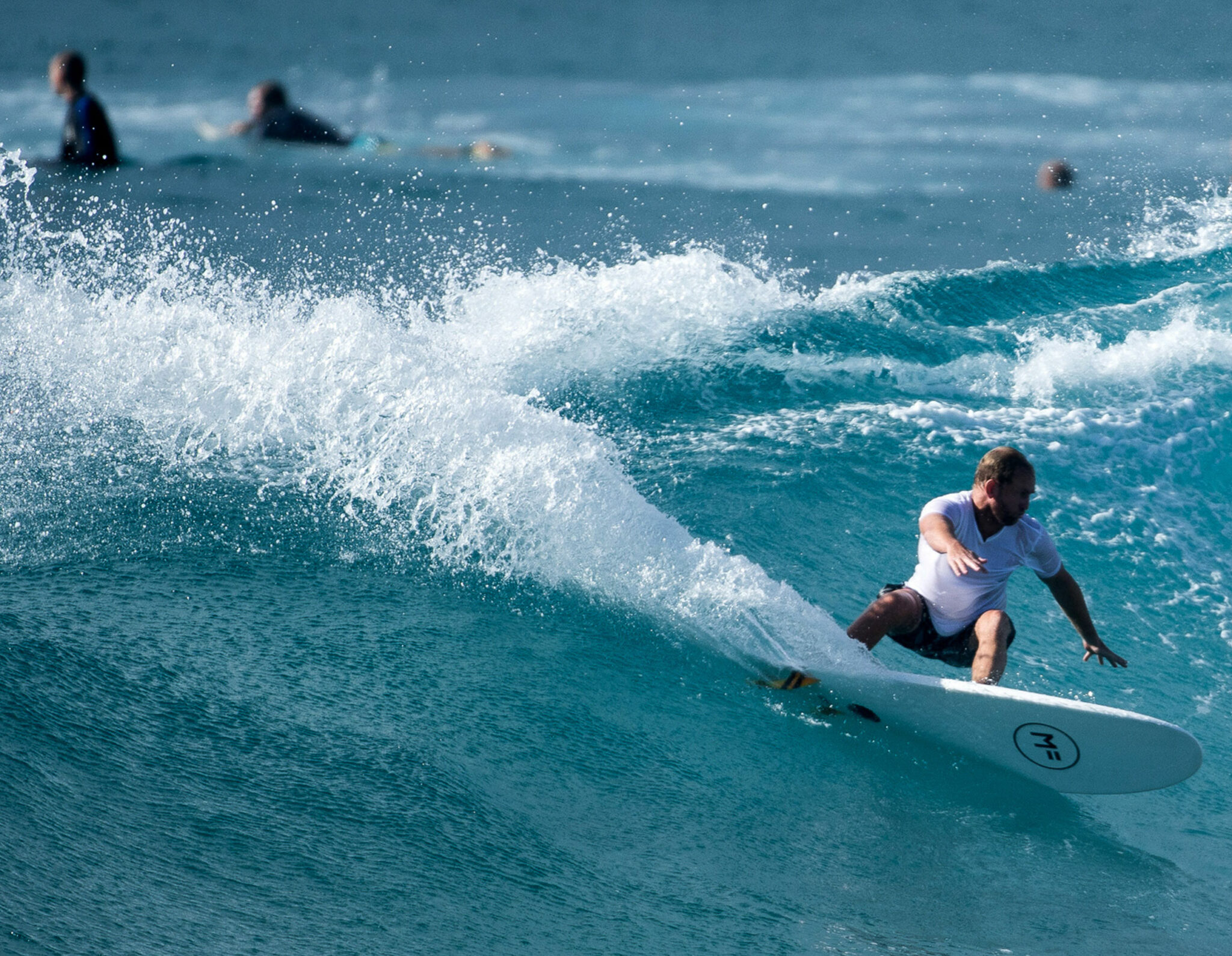
Before we take off, we need to talk about “performance” – an operative word thrown around incessantly in the surfboard design space. Generally, a board shaped for performance is one that allows a rider to surf at their highest level, perform the most critical manoeuvres and handle high speeds.
Though performance is relative to the kind of surfboard, as not all boards are designed to surf the same. A longboard, for example (which usually ranges from 8’6” in length and above), can never reach the level of manoeuvrability or technicality that a shortboard (roughly 7’ and shorter) can due to their size and weight. On the other hand, this means that a shortboard’s smaller size cannot be expected to permit “classic” surfing moves such as noseriding, which are considered part of the longboard performance realm.
As we delve through the history of surfboard design, the idea of performance is front and centre. It sees designers and innovators shooting for the pinnacle of what each type of surfboard can do for its rider.
Gliding through the years
- Pre-1900s – Cultural origins
Although the act of wave-riding can be traced back as far as 3000 years BCE in ancient South America, surfcraft that somewhat resembles what surfers ride today can be linked to the Hawaiian culture of he’e nalu. Translating roughly to “wave sliding”, he’e nalu was brought to the Hawaiian Islands around 300AD, seeing solid wood crafts ranging from 3’ to 20’ in length used in rituals and recreation.
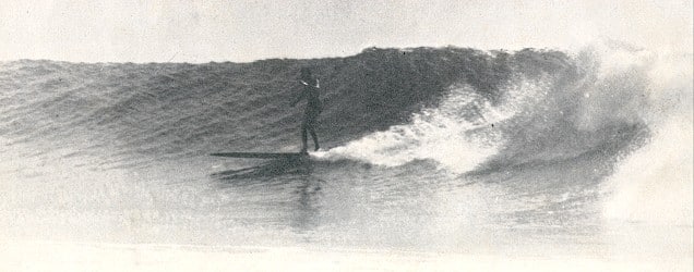
The alaia (usually between 7’ to 12’ long) was the most common and versatile Hawaiian craft. English colonist Captain Cook was the first westerner to witness Hawaiian people riding the flat, finless alaia in 1778.

- 1900-1920s – Worldwide expansion
After the United State’s annexation of Hawaii in 1898, American settlers quickly took interest in the culture of he’e nalu. Mainland innovators such as George Freeth popularised a shorter and lighter version of the alaia using redwood from the States, yet it was Hawaiian legend Duke Kahanamoku’s sugarpine shape that introduced surfing to the world.
In 1914, “The Duke” – as he is now popularly known – hosted a demonstration of “Hawaiian-style surf shooting” at Freshwater Beach in Sydney’s Northern Beaches. Not only kick-starting a thriving surfing culture within Australia, his 10’ blunt-nosed and square-tail shape became the basis for the next two decades of surfboard design.

- 1930s-1940s – Fins and fibreglass
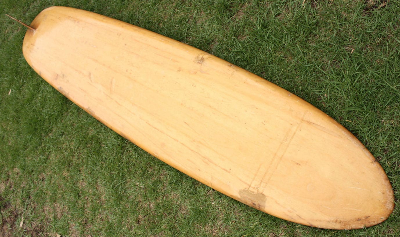
The 1930s welcomed numerous surfboard design innovations in the way of the hollow wood surfboards – the first mass-produced surfboard – and the skeg – the first variation of the surfboard fin. Both were introduced by waterman Tom Blake and strove to provide more control and responsiveness through turns. At this time, balsa wood was the material of choice due its light weight and mild flexibility.
However, the wooden planks wouldn’t reign for long, as technological developments driven by World War 2 allowed for surfboard manufacturers to experiment with polyurethane foam and fibreglass. In 1946, Joe Quigg and Bob Simmons constructed the first foam-core single-fin surfboard wrapped in resin-tinted fibreglass, and by the end of the decade, Simmons had begun applying hydrodynamic principles to his designs and experimenting with multi-fin options. This saw the surfboard sway away from its flat beginnings to become a curved plane from nose to tail. Even then, boards were rarely shorter than 10’.

- 1950s-1960s – Foam blanks and the shortboard revolution
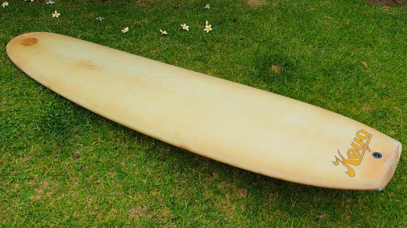
Californian surfboard designer and shaper Dale Velzy, crafted the “Pig” surfboard in 1955. The design marked a turning point in mainstream surfboard shapes, featuring a narrow nose and wide tail. However, the “Pig” was also one of the last developments in the balsa era because, at the same time, Hobie Surfboards – then one of the largest board manufacturers worldwide – was making immense headway in their search for a balsa alternative. They eventually settled on polyurethane foam cores strengthened by wooden stringers down the middle.
After optimising the foam blank at Hobie Surfboards, Gordon Clark began Clark Foam in the early 60s to produce them exclusively for board shapers. The company’s strong and light cores empowered thinner and more manoeuvrable longboards, and inspired a now never-ending quest for speed and criticality.
This newly realised vision of performance inspired designers such as Bob McTavish, George Greenough and Dick Brewer to firestart “The Shortboard Revolution”. This saw the average board length drop down to around 7’6”, tail shapes beyond the standard “thick, wide and blunt” explored and Simmons’ multi-finned experiments of the decade prior built upon. The surfboard’s bottom contours simultaneously became a point of innovation as hydrodynamic understanding grew within design communities.
- 1970s-1980s – More fins, less length
The 1970s was an exploratory era of surfboard design that saw fast, progressive and powerful surfing as the general indicator of “good” surfing. Shape-wise, this meant tail shapes became noticeably thinner to assist with manoeuvrability off the back foot, boards got even smaller to reduce drag and different fin options that allowed for more control and speed were explored.
Exemplifying this, the three-fin “Bonzer” was developed in 1970 by the Campbell brothers in California. It featured a single fin supported by two angled keel fins and a double concave bottom. In 1977, the previously underground twin-fin design shot to the mainstream, with Australian surf champion Mark Richards and Dick Brewer optimising the dual-ruddered board for smaller waves. It hovered around the 6’2 mark.
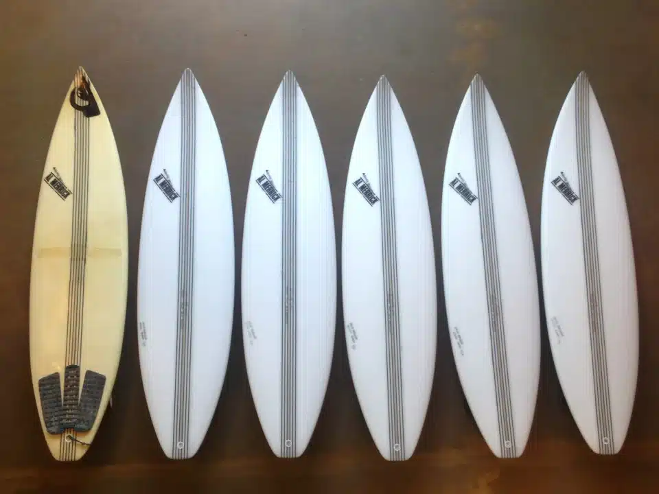
The 1980s saw the best things in surf design come in threes. First, Al Merrick of Channel Islands Surfboards optimised the concept of the tri-plane hull – a speed generating bottom contour design – and Simon Anderson created the “thruster” – a three-fin design combining the best of single and twin-fin setups. The thruster design quickly became the most popular fin configuration worldwide, which continues to dominate to this day.


- 1990s – The banana and computerised era
The boards of the previous decades could only be described as fat and flat when compared to the designs of the 1990s. Inspired by a technical level of surfing previously unforeseen – primarily by Kelly Slater – Al Merrick began decreasing the width and thickness of his Channel Islands boards, all while increasing their curve (rocker) significantly. The consequent “banana boards” were incredibly difficult to ride, but allowed for incredible performance – at least at the time.
While these toothpick boards were gaining in popularity, the world of longboarding surprisingly began to pulse once more. In fact, Clark Foam, which was still supplying the foam cores for a massive proportion of all surfboards on the market, said that the tail end of the 90s saw a 50/50 split of >8’ and <8’ blanks sold. The popularisation of a removable fin system from FCS was simultaneously increasing optionality for surfers to connect with different feelings and levels of performance.
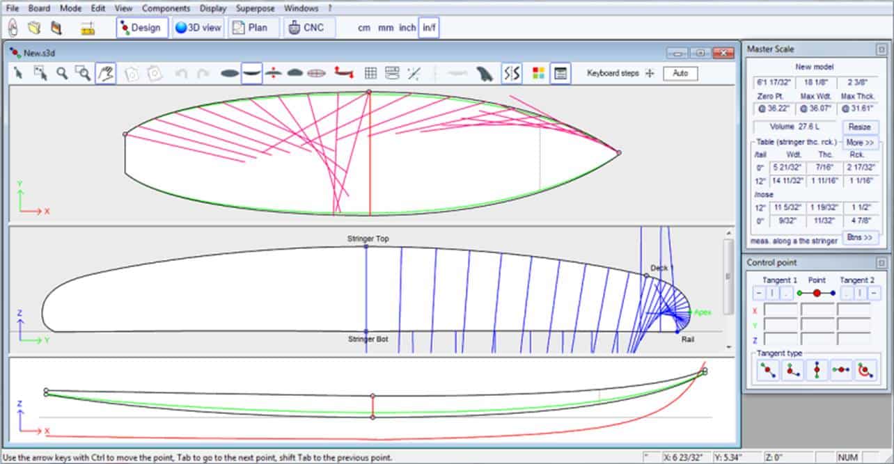
Computer Aided Design (CAD) and Computer Aided Manufacturing (CAM) in the mid-1990s opened the doors of innovation and creativity even further. These technologies greatly streamlined the surfboard design and shaping process, allowing for easier mass-production and innovation.
- 2000s – Short, fat, wide and wonky
Thanks to the ability of CAD software to accurately measure a large range of surfboard dimensions, the concept of water displacement and buoyancy came to the fore in early-2000s. This cemented the measure of surfboard volume. Although fairly self-explanatory, it clearly communicated to everyday surfers that boards of higher volume generally increased user-friendliness.
A greater knowledge of volume helped usher in a focus on shorter, fatter and wider boards for the general surfing population. It proved that designs packing more foam could still be small and manoeuvrable, and solidified that high performance surfing wasn’t necessarily exclusive to the nimble, potato chip designs of the decade prior. The broader designs suited the overlooked quad-fin setup that was introduced in the 80s to minimal hurrah.
Things got a little more experimental from there, as three American visionaries – Carl Ekstrom, Richard Kenvin and Ryan Burch – began to dive into designs that had only ever been toyed with in the past. Asymmetry became their bread and butter, theorising, designing and testing surfboards that were specifically suited to one’s surfing stance.
Then came the great Clark Foam crash of 2005. The world’s biggest polyurethane foam producer ceased manufacturing without warning and without explanation. Disrupting supply chains almost immediately, surfboard prices shot skyward, but an innovative crew of designers took the opportunity to explore more efficient and environmentally-friendly means of surfboard design and manufacturing. The modern era of epoxy/EPS was born, with surfboard companies such as Firewire leading the charge into the 2010s.

- 2010s-future – The past moulds the now
Into the second decade of the 21st century, EPS-based surfboards have continued to rise in popularity. They’re generally lighter and stronger, but also more flexible, meaning – in their current iteration – they can add a layer of unpredictability. This sees them used primarily in smaller waves where mistakes have less consequence, while polyurethane is still the construction of choice for bigger, more dangerous waves.
Shape-wise, short, fat and wide remain the prevailing indicators of a modern surfboard. Even then, a growing number of designs that flip the status-quo on its head are becoming popular, notably the designs of Ryan Burch, Daniel Thompson and Tyler Warren. Their designs dip in and out of the world asymmetry, idiosyncratic outlines and even more alternative materials. Who knows – maybe these shapes that seem a little “out-there” now will lead the future?

A true design journey
Modern surfboard designs build on over a century of innovations, mutations, set-backs and refinements. In fact, one look at a group of surfers anywhere in the world will reveal bits and pieces of every decade in their equipment.
Three things are for certain, however – the days of wood are over, surfboard designers are leading the way, and there’s clearly no one-size-fits-all path to performance.
A world of design waiting to be explored
Good Design Australia recognises and celebrates exceptional design on a global level every year. From everyday products and services, to research projects and works of art, there’s years of innovation ready to be discovered in the Good Design Index.
DIVE INTO THE GOOD DESIGN INDEX HERE