Word on the Sheets – LGBTQ+ Sexual Health, by and for the Community

good-design-award_winner_rgb_blk_logo
  • 2026

  • Digital
    Web Design and Development

Designed By:

Commissioned By:

ACON

Designed In:

Australia

Inclusive sexual and reproductive health information, stories, and services—created by and for LGBTQ+ communities. Word on the Sheets is a first-of-its-kind Australian resource, built with the people it serves, to address a gap that mainstream health design has long left unfilled. It’s our pleasure.
view website
Buy online

2.jpg
3.jpg
4.jpg
Aretha Brown
5.jpg
6.jpg
7.jpg
  • CHALLENGE
  • SOLUTION
  • IMPACT
  • MORE
  • LGBTQ+ women, trans and gender-diverse and their partners have long navigated a healthcare system built around heteronormative assumptions. Mainstream sexual and reproductive health resources rarely speak to queer experiences, and when they do, it's often as an afterthought.ACON, one of Australia's leading LGBTQ+ health organisations, wanted to change that by creating an online resource built specifically for these communities. The challenge wasn't simply to fill a content gap. It was to build something with enough cultural credibility, rigour, and genuine warmth that the community it was designed for would actually trust it, use it, and feel reflected in it.

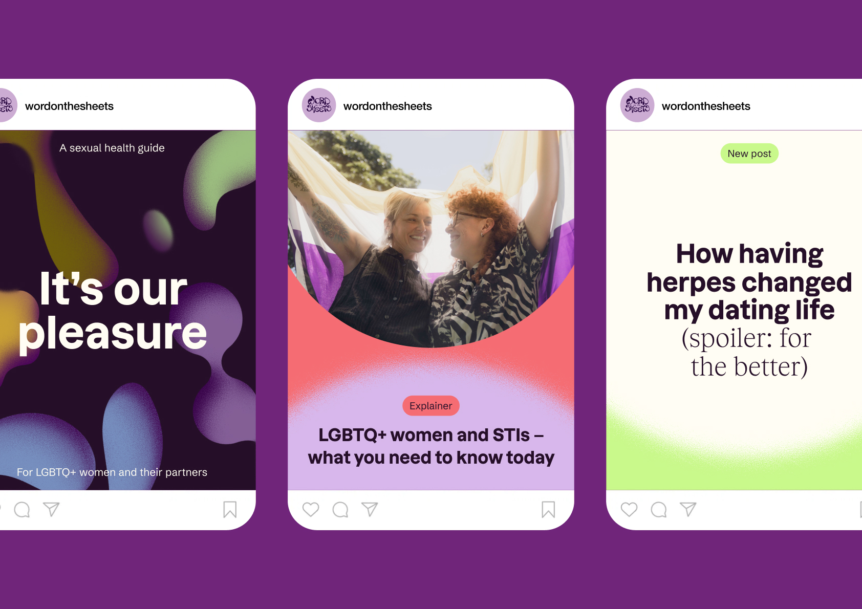
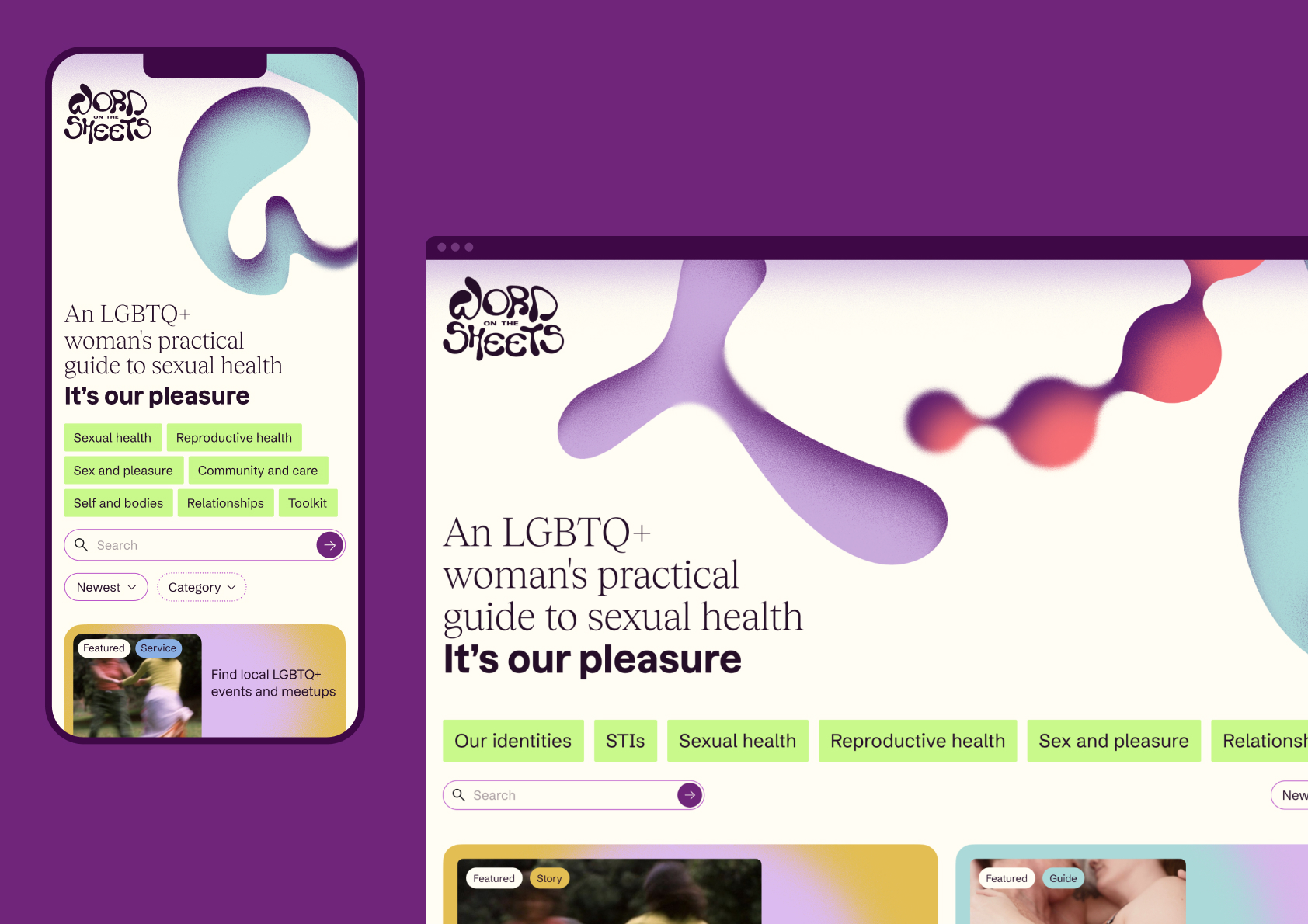
  • The name and logo were the foundation of our collaborative exploration: Word on the Sheets. They set the register for everything that followed: warm, knowing, slightly subversive, and unmistakably of this community.From there, a complete visual and content system took shape: key messages to guide content and tone, a palette that balances depth, lightness and vibrancy, a bespoke illustration language that plays with community objects, and an information architecture organised across seven content categories and four colour-coded content types. Each decision reinforced the same intent—to make a resource that felt made by, not made for.

  • Word on the Sheets is the first dedicated sexual and reproductive health resource of its kind in so-called Australia, created by and for LGBTQ+ women, trans and gender-diverse people and their partners.It won't be complete or perfect from day one. That's by design: the platform is built to evolve, with community feedback actively shaping what it covers and how it communicates. Health professionals and community members review content together. Over time, the resource is intended to grow with and alongside the communities it serves, responding to needs as they change, not as they were imagined at launch.

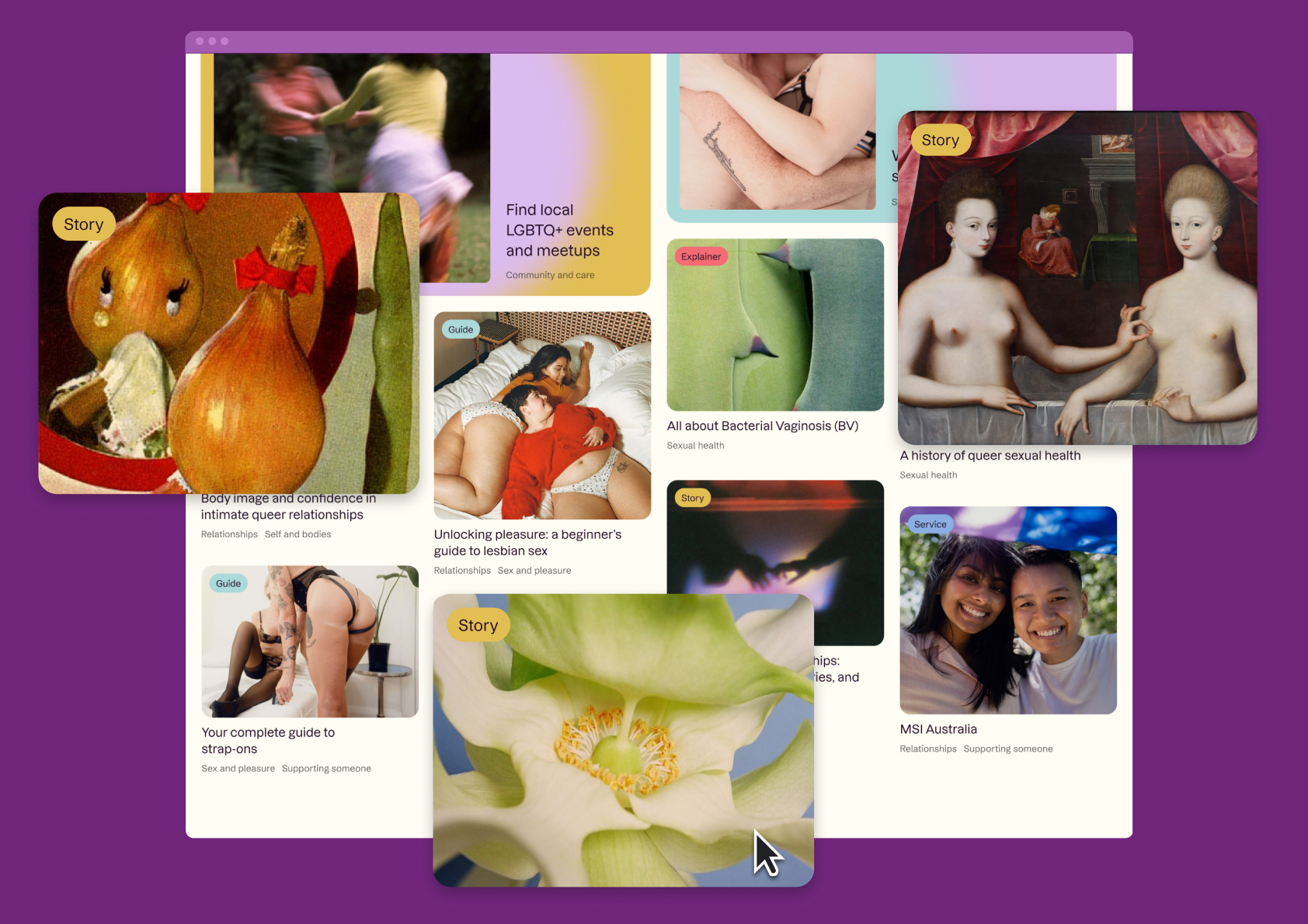
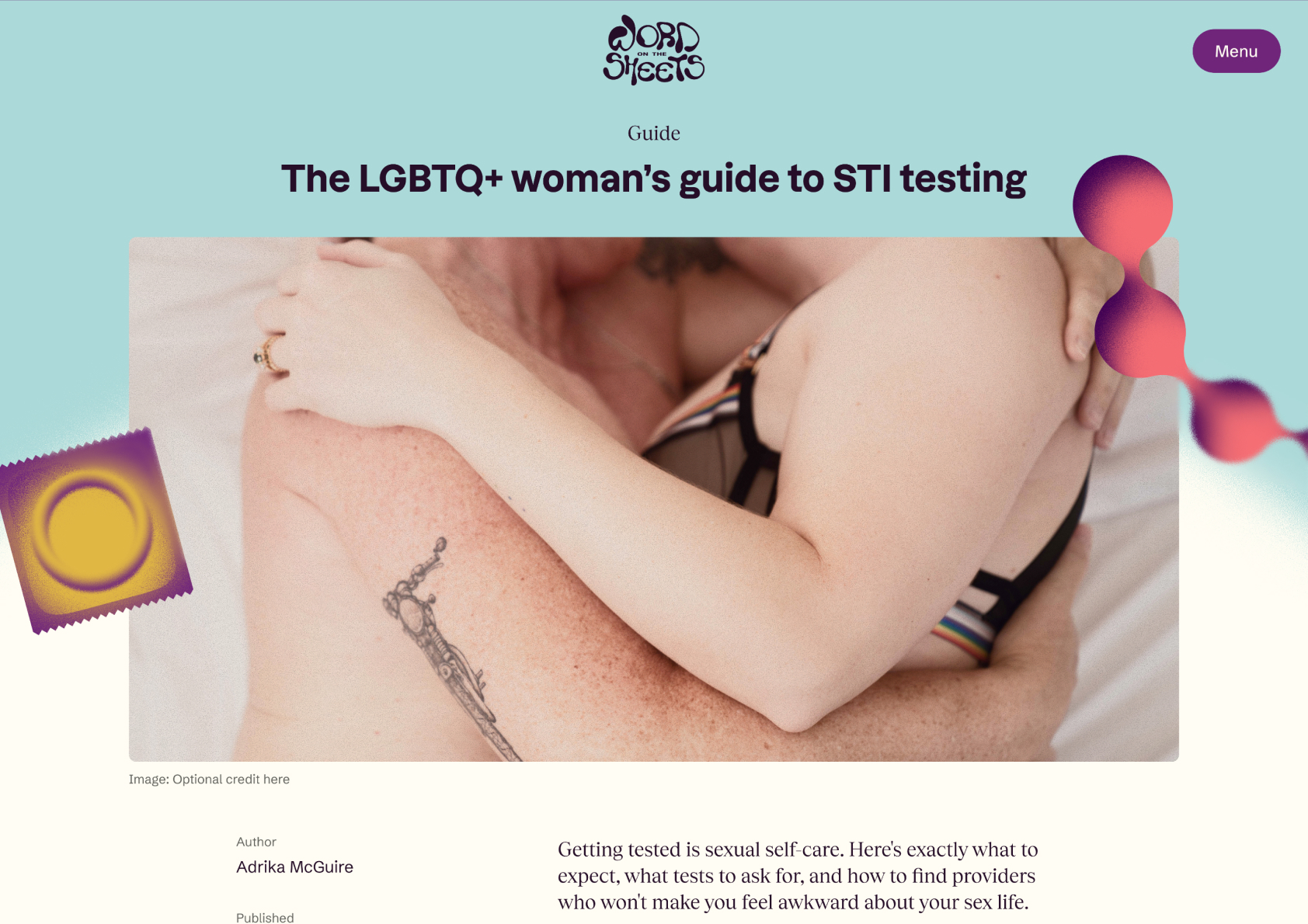
  • Content exploration that mirrors how the community seeks knowledge and gains confidence: Seven content categories (Sexual Health, Reproductive Health, Sex and Pleasure, Self and Bodies, Community and Care, Relationships, Toolkit) intersect with four colour-coded content types: Guide, Story, Explainer, Service. Each has its own visual language within a unified framework. Clinical information and lived experience sit at equal structural weight; neither is positioned as supplementary to the other.The homepage is openly exploratory. Content appears as an asymmetric grid where a clinical explainer sits beside a personal story beside a service listing beside a community event. Topics span body image, STI testing, strap-on guides, queer relationship dynamics, and sexual health history, all on the same surface. A first-time visitor and someone returning with a specific question are equally at home. The design enacts "all welcome" through its structure: every aspect of LGBTQ+ sexual and reproductive health deserves to be here, and wherever you enter is the right place to start.Custom illustrations combine flowing organic forms with recognisable sexual health objects in a textured, softly diffused style: condoms, pleasure products, abstract body references. They normalise what mainstream health design tends to erase, without over-explaining or aestheticising.