Volpara Analytics

good-design-award_gold-winner_rgb_blk_logo
  • 2022

  • Digital
    Interface

Commissioned By:

Volpara Health

Designed In:

New Zealand

Volpara® Analytics™ is a business intelligence tool that empowers imaging centres to optimise their mammogram quality for earlier detection of breast cancer. Using measures driven by artificial intelligence (AI), Analytics guides technologists on optimal positioning and compression techniques, resulting in a higher-quality screening programme and better personalised care for women.

view website

  • CHALLENGE
  • SOLUTION
  • IMPACT
  • MORE
  • Technologists know that one-size-fits-all breast screening programs cannot account for women’s diverse positioning and compression needs. Industry guidance is struggling to keep up with an ever-changing health environment, and technologists, who are under pressure to work quickly and maintain quality, are not always supported with objective guidance or feedback. Using our world-leading dataset of over 60 million images taken from over 2,000 technologists, our design challenge was to help technologists and the women they serve by improving mammogram quality, communicating deep learning insights, and delivering a best-in-class enterprise experience—in short, data-driven, personalised care.

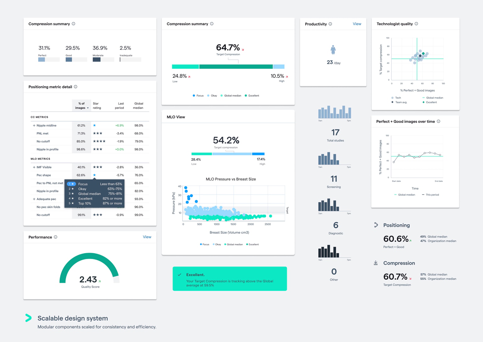
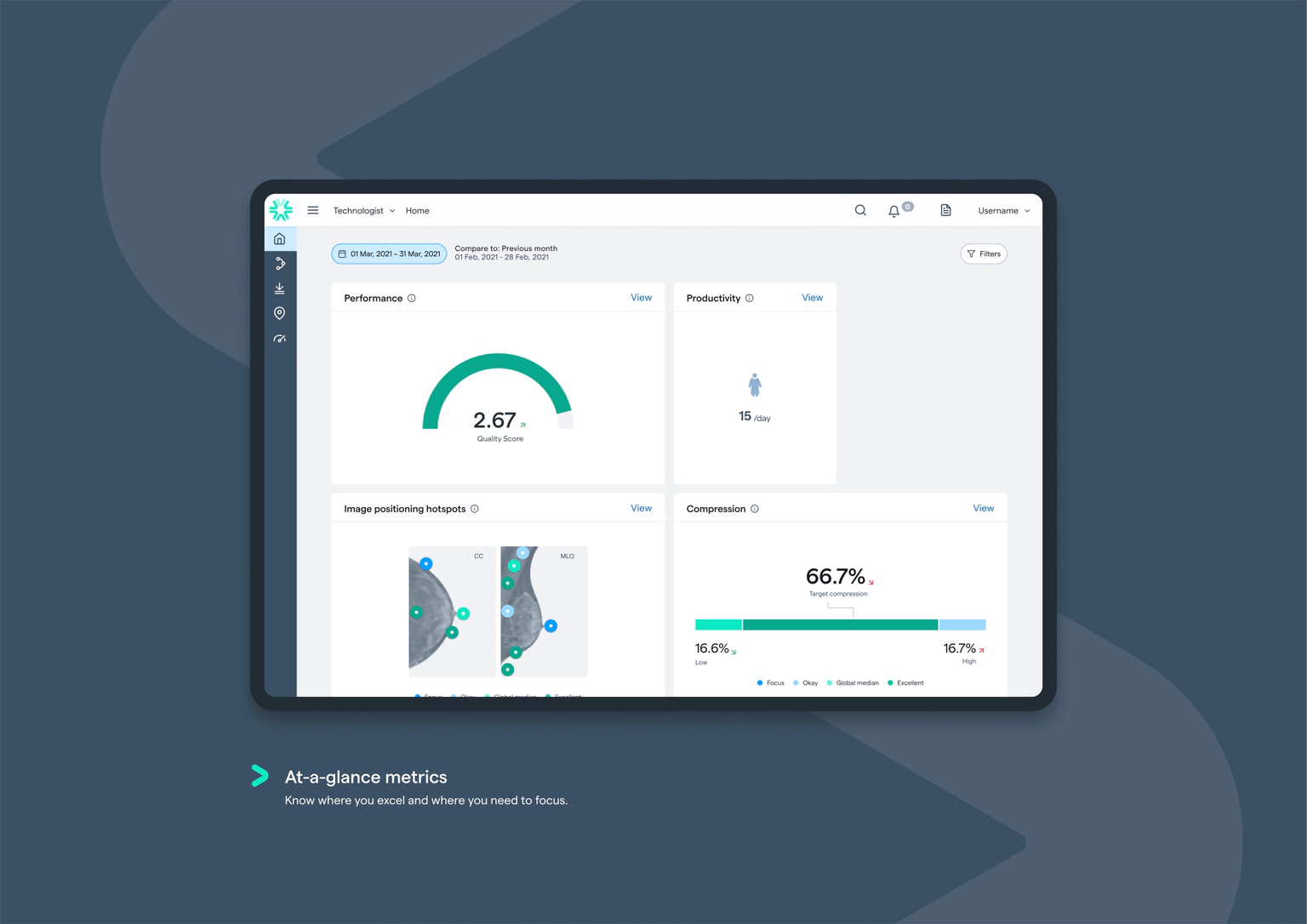
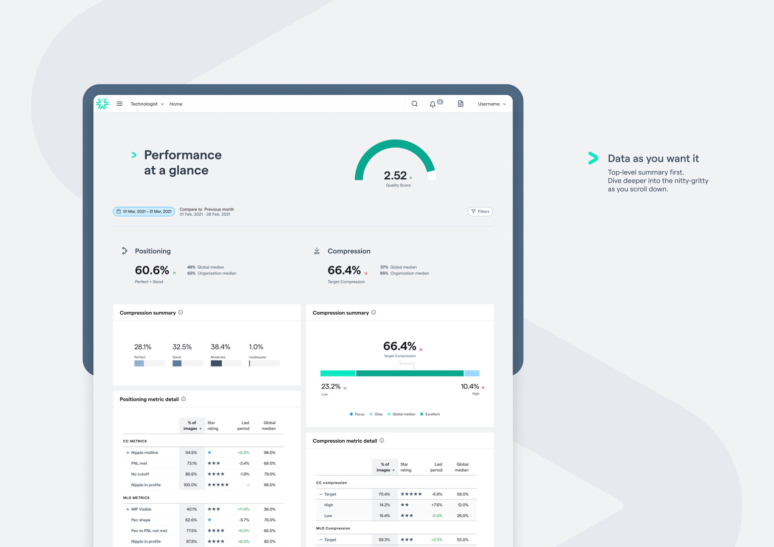
  • While shadowing technologists, we observed the desire for top-quality performance while under immense time pressures with hands-on care. Using our dataset, we created over 160 unique benchmarks, to produce new and innovative performance and quality thresholds. Design principles then helped to inform our communication approach: data would always be Actionable, Positive, and Transparent. In respect of technologists’ time, our solution quickly and effectively communicates insights at a glance with simple colour-coding (Actionable), consistently presents data through an encouraging lens (Positive), and uses redesigned interaction patterns to allow for deeper context and understanding (Transparent).

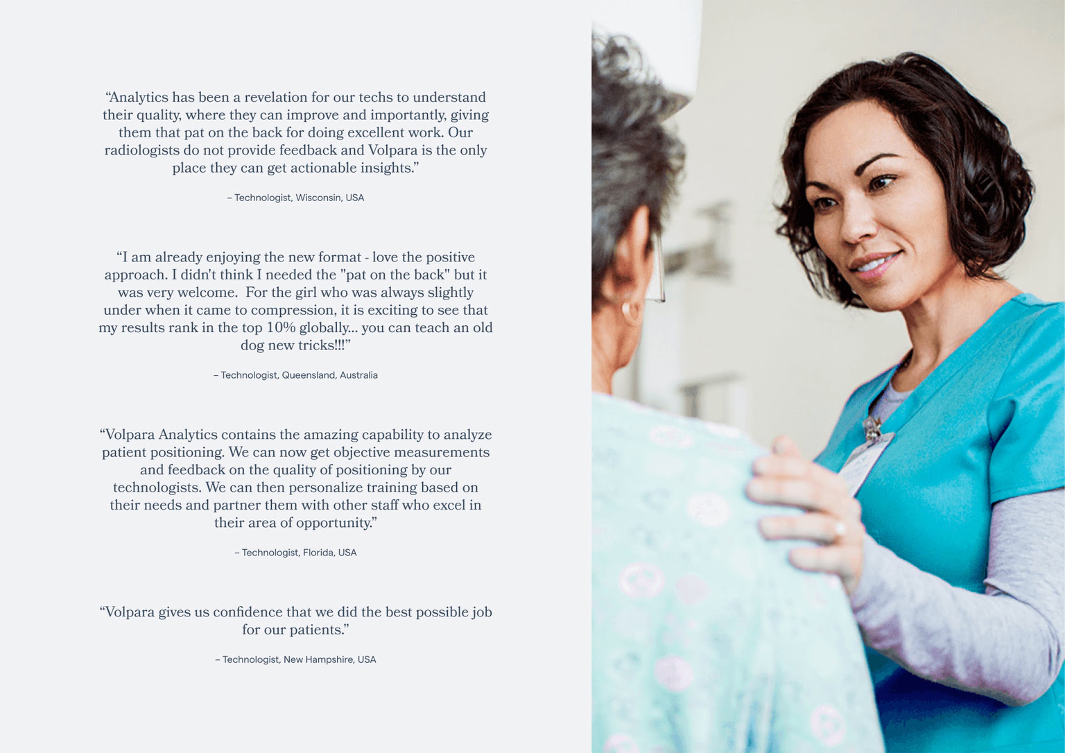
  • Across all technologists, we’ve seen a statistically significant increase in both Positioning and Quality Scores. Improvements like these directly reduce the amount of technical recalls offering a health benefit for women, and a financial benefit for clinics. Reframing Positioning in a positive way has made it consistent with the rest of our metrics, and the significant improvements we’ve seen already prove the value of this approach. Colour-coding has made the product easier to teach and learn, streamlining our onboarding process. We have also seen positive trends in engagement, with technologists more likely to check their scores and improve their performance.

  • Using the double-diamond design process, we kicked off the project with a week-long co-design sprint. This included key stakeholders from around the business (customer success, engineering, product management, and design) as well as customers (for our user testing sessions). Following this intensive and informative phase, we landed on three key design principles: Actionable, Positive, and Transparent. These principles were our guiding light through ongoing design and development decisions. One of the core features we developed was the natural-language algorithm for our insights. Data that met specific criteria would be ranked, parsed, and translated into simple terms for the user. We have seen this feature extend beyond the product, with breast clinics using it to give internal praise, or create external marketing opportunities, when achieving the top 10 percent ranking. The technical overhaul needed for this release should not be understated. Our slow-to-load MVC and Power BI pages created ongoing technical and usability limitations, which severely impacted the user experience. We modernised our solution with React, Syncfusion, and core benchmarking APIs. Our component-based approach allowed us to build out a design system, created new UX opportunities, and allowed for fast, consistent updates as we continue to learn and iterate.