The Women’s College

good-design-award_winner_rgb_blk_logo
  • 2026

  • Digital
    Web Design and Development

Designed By:

Commissioned By:

The Women's College

Designed In:

Australia

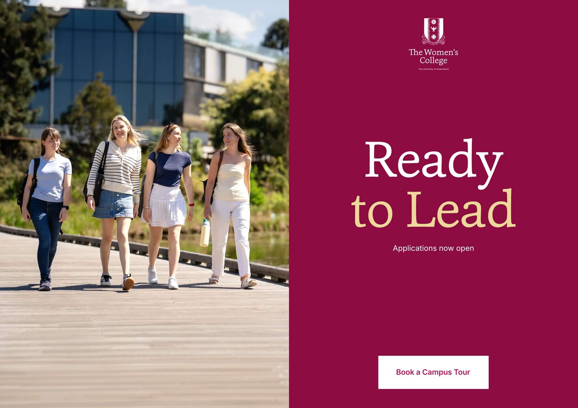
The Women’s College has supported young women at the University of Queensland since 1914. In its own words, the College is more than just a place to stay. Its new web experience set out to make that distinction visible online, not only on a campus tour.

view website

2.jpg
3.jpg
4.jpg
5.jpg
6.jpg
7.jpg
  • CHALLENGE
  • SOLUTION
  • IMPACT
  • MORE
  • For a young woman comparing Brisbane colleges from regional Queensland or interstate, the website is often the first decision point. The College needed one platform serving people at entirely different stages of their relationship with it: a 17-year-old researching options, a current resident checking next week's events, an alumna returning for an event. The previous site held all of these in tension and resolved none of them well. It also held sensitive resident data on infrastructure that had been compromised. The brief asked for a public site, resident portal and campus touchwall that worked as one place.

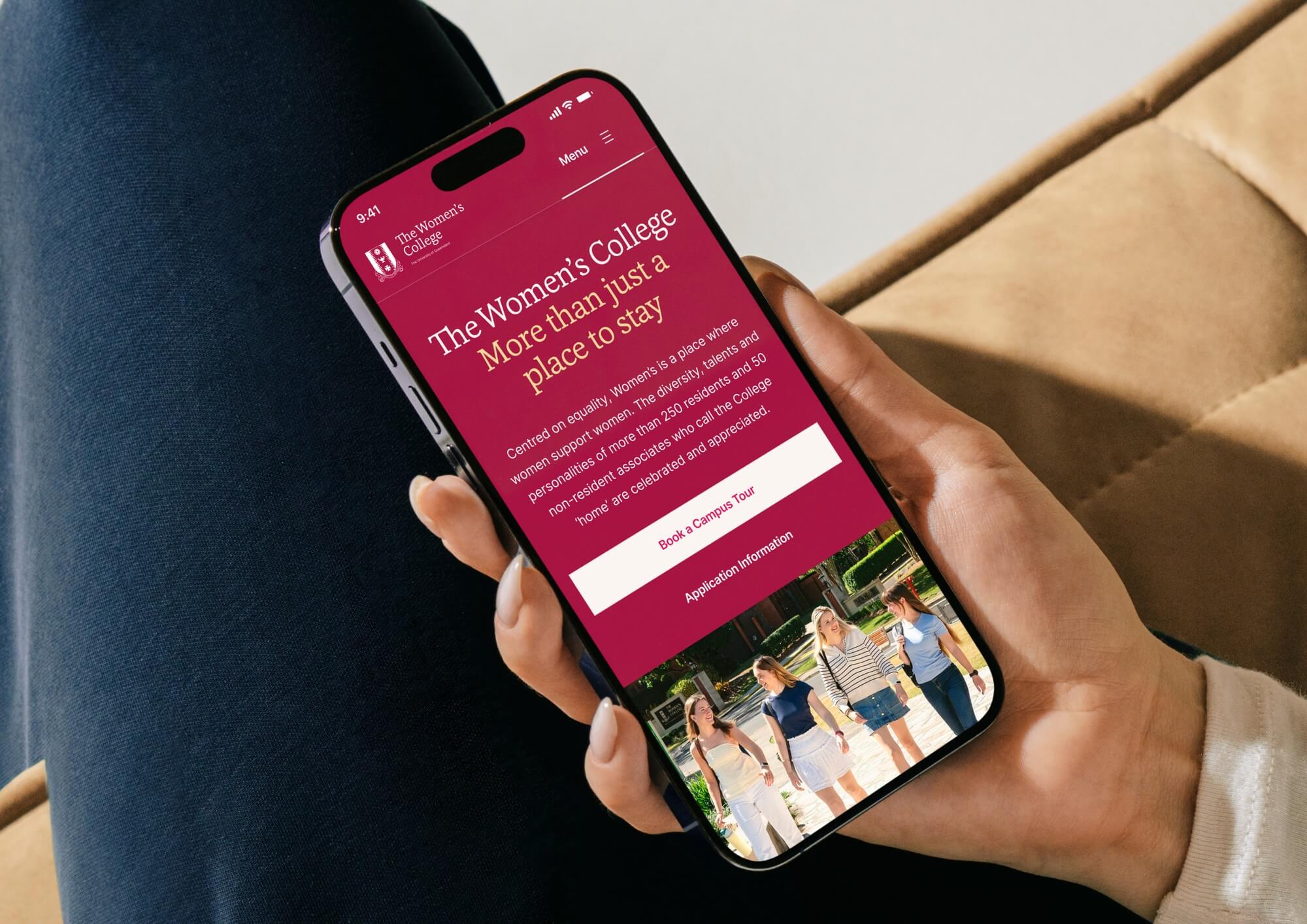
  • Spicy Web travelled to Brisbane for a campus tour to get a deep understanding of the project. That shifted the work from interpreting a brief to designing for a place we had walked through. The key breakthrough was a multi-select hero on the homepage, which lets the diverse website visitors declare what they came for and routes them differently from one screen. That decision freed every page to commit to one design language built around the College motto, Ready to Lead: confident typography, a rich palette, and current resident imagery.

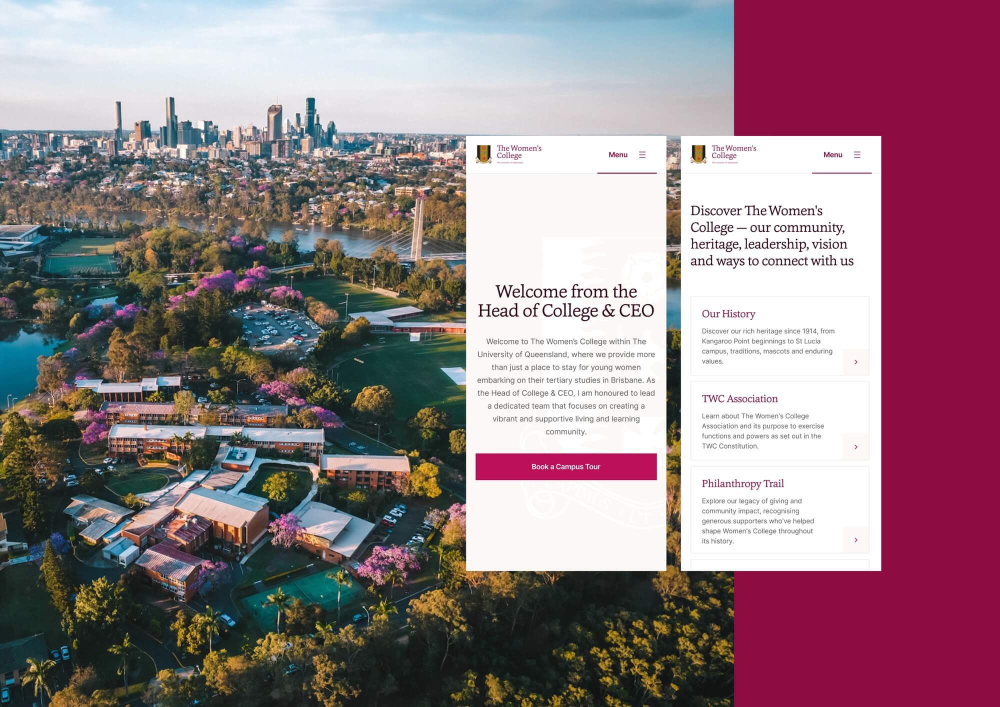
  • The new platform brings the College's digital presence into alignment with who Women's UQ is today, without losing the century of heritage that brought it here. The information architecture invites exploration and engagement: prospective residents, current students and alumnae each find their own path through the same site. Internally, the platform has been transformative for staff and current residents. The previous site frustrated everyone who touched it while the new one supports the day-to-day rhythm of College life.

  • The homepage hero is built around a multi-select CTA that lets the user identify themselves before any other choice is asked of them. It looks like a small interaction. In practice, it absorbs the difference between four user journeys that other college sites either flatten into one or split across separate landing pages.The on-campus touchwall extends the website's information architecture onto a large touch-first display in the College's main building. Building it inside the same engagement meant its visual system, content model and editorial voice carried across cleanly, rather than living as a parallel asset that a future team would have to maintain separately.Photography and video are drawn entirely from current residents — the social and intellectual life that makes the College more than a place to stay. The existing imagery was strong enough to lead with, which freed the design from filler and gave the typography its own room.The student portal sits on the same platform as the public site. The visual language stays consistent for residents moving between contexts. It also closes a real security gap: the previous infrastructure had been compromised, and the portal carries sensitive resident information. The design system was the deliverable.