Talbot Forest Cheese Co.

good-design-award_winner_rgb_blk_logo
  • 2022

  • Communication
    Packaging

Commissioned By:

Maja Szarmach

Designed In:

New Zealand

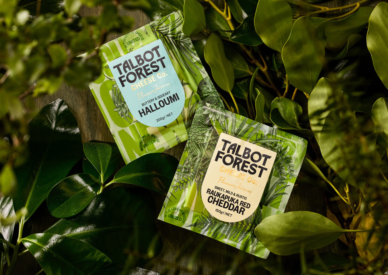
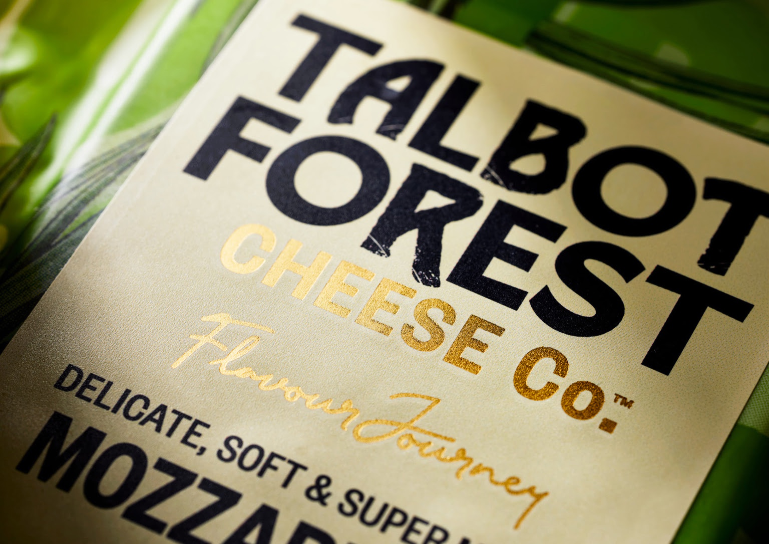
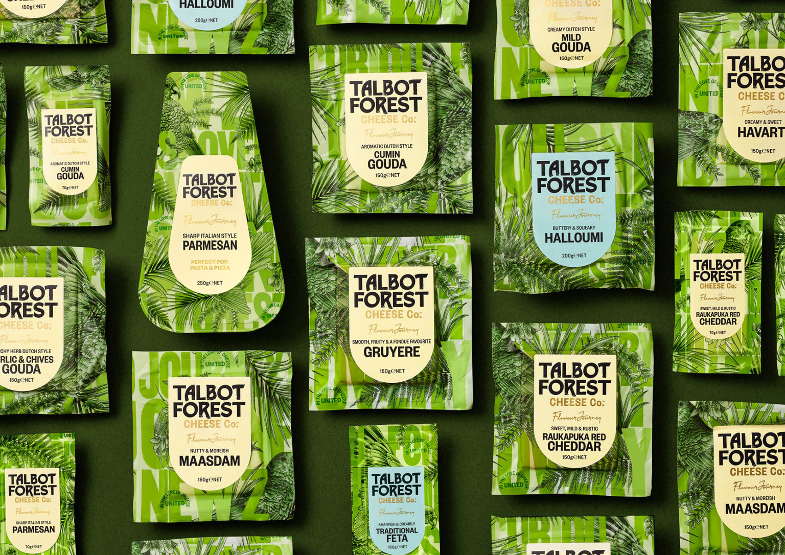
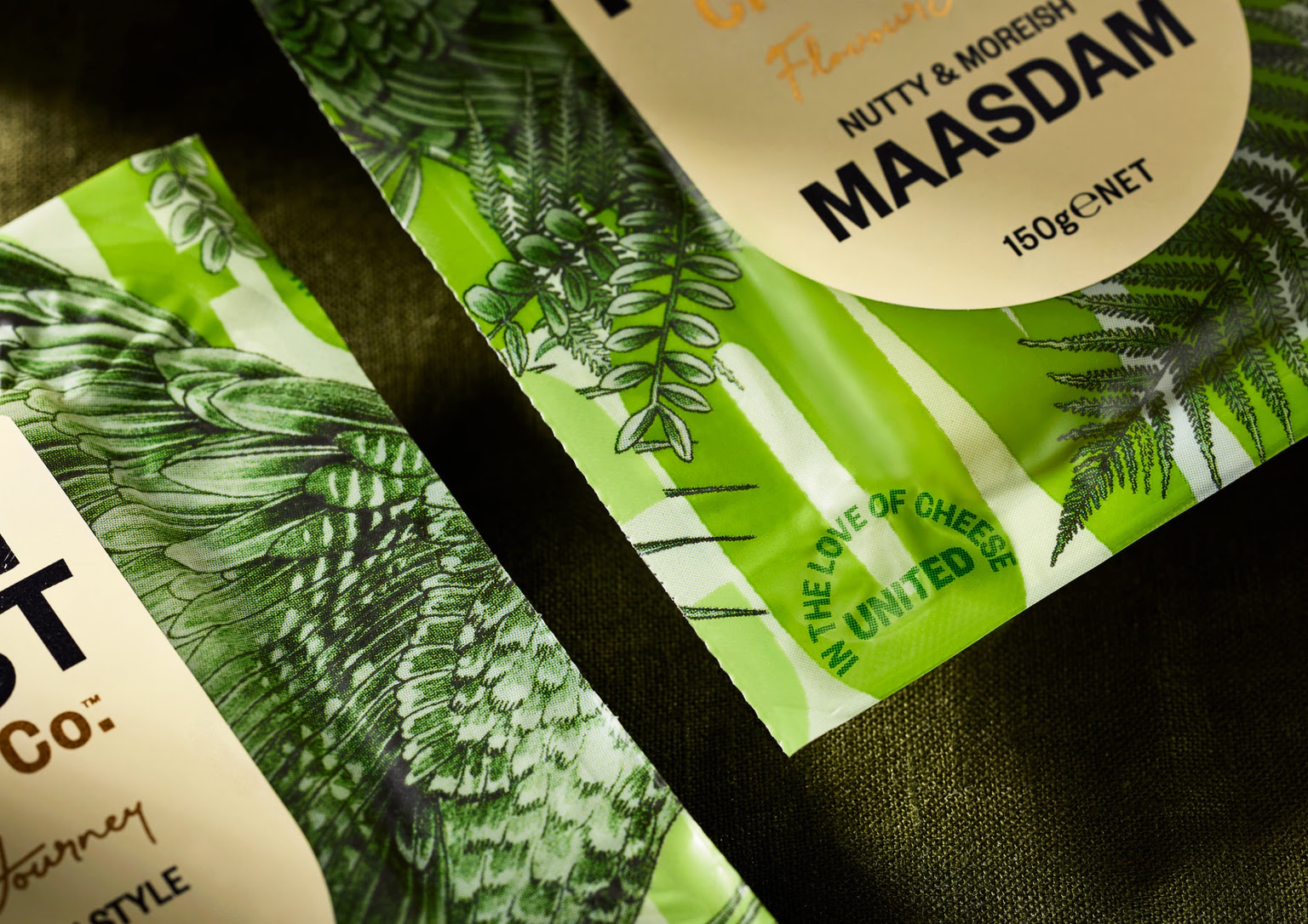
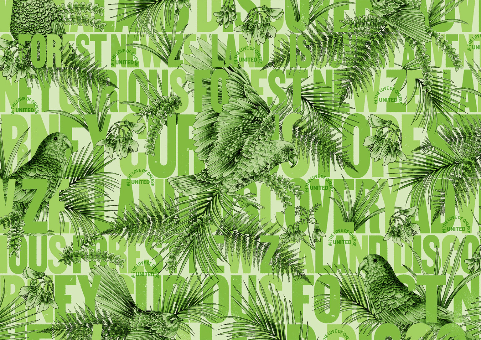
Our brief was to refresh the Talbot Forest Cheese speciality cheese brand. This included the overhaul of the retail packaging, new brand strategy, copywriting and digital presence. The aim was to relaunch it to be a truly iconic New Zealand brand, while also preparing it for export markets.


view website

Image: Hero shot
Image: Pack with typographic background
Image: Family range
Image: Typography pattern background
Image: Close up image - embellishments
Image: Close up image
Image: Lifestyle image
Image: Before and After
  • CHALLENGE
  • SOLUTION
  • IMPACT
  • MORE
  • The brand was started in 2000, on the edge of Talbot Forest in the South Island of NZ. While it had grown in production, the packaging had limited marketing spend which meant as of late 2021, it looked like a manufacturer brand, not a proud NZ brand, in comparison to the multitude of brands that flooded the market. The business strategy required a new brand that would disrupt in the market place, unlock growth at scale and maintain its price point against competitors. The client wanted a truly unique cheese brand.

  • Our solution reframes the idea of a 'New Zealand' speciality cheese brand. We intentionally stayed away from the common visual tropes in the category that suggested 'craft' and 'artisan'. While our label typography nods to these themes, we focused on the recreating the provenance in a unique way. Inspired by old woodblock typography, we took key words from the brand story and used them to mimic the forest/tree landscape. Interweaving botanical flora, fauna and native birds through the letters to create a dense forest landscape. Each varietal is has different crops of this to create a moving brand pattern.

  • Retail showed immediate interest in the packaging refresh - new packs were quickly distributed onto sleeve shelves and instore barges. In strong interest the brand is looking at expanding the offering. They current offer a wide variety of yellow and a selection of blues. This will expand out along with white and blue styles. The brand has similar had strong interest in Australian and SE Asian markets.

  • The main breakthrough with the rebrand was developing a top web print that was big enough to allow for multiple packs to be cut out of each one - this variation in crops allows for a constantly moving forest landscape brand block on shelves. Each one unique.