Public Transport Ombudsman

good-design-award_winner_rgb_blk_logo
  • 2026

  • Digital
    Web Design and Development

Designed By:

Commissioned By:

Public Transport Ombudsman

Designed In:

Australia

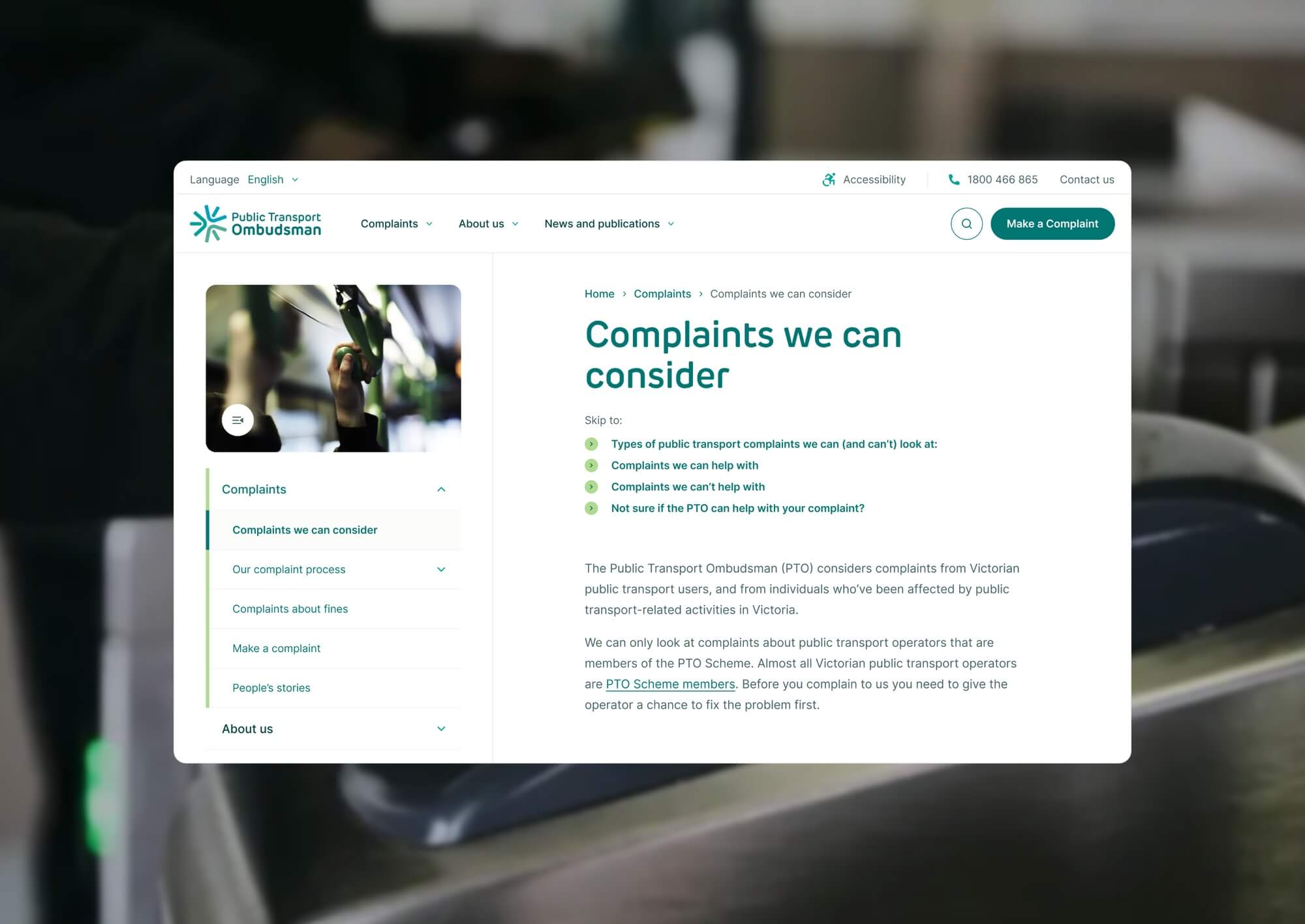
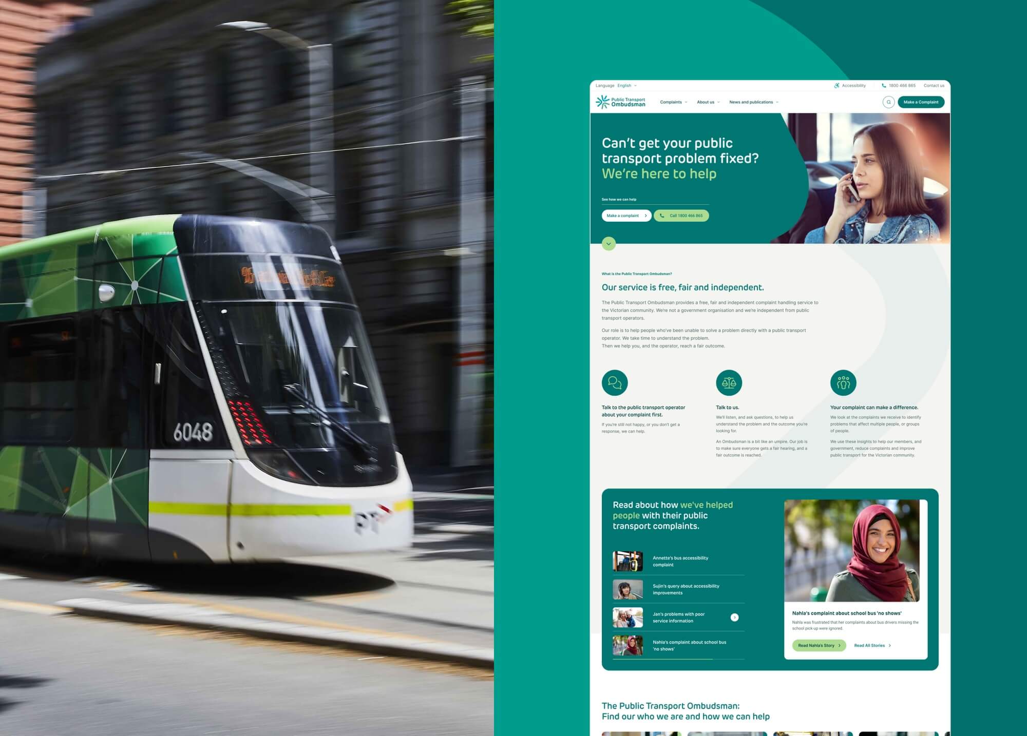
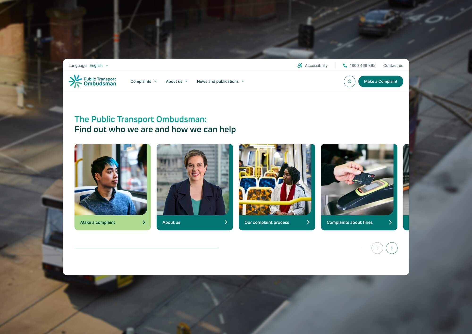
The Public Transport Ombudsman website is a complete digital rebuild for Victoria’s independent dispute resolution body. It is designed for people arriving in difficult circumstances, often unsure whether PTO can help. The site replaces a brittle process with one that treats every visitor as worth helping, eligible or not.
view website

2.jpg
3.jpg
4.jpg
5.jpg
6.jpg
  • CHALLENGE
  • SOLUTION
  • IMPACT
  • MORE
  • Anyone arriving at the Public Transport Ombudsman is rarely having a good day. They have been let down by their public transport provider, or they are unsure whether the problem they want resolved is one PTO can help with. The old website compounded that. It offered a single rigid complaint pathway, no clear explanation of eligibility, and nothing useful for users whose enquiry sat outside PTO's remit. So the brief was not really a redesign. It was a question of how a complaint process can validate the people who belong here without quietly turning away the people who don't.

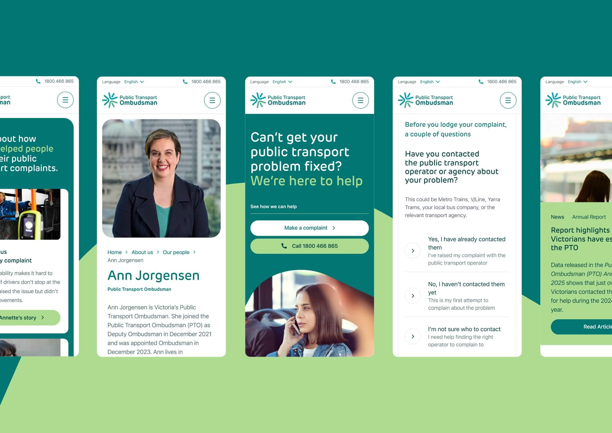
  • Spicy Web started where the user does: with content, before interface. The team mapped the full set of states a visitor could arrive in, including legitimate complainants, ineligible enquirers, people not yet ready to escalate, and people who were not quite sure why they were on the site at all. A multi-path form was built around those states. Eligible complaints get validated. Ineligible enquiries get routed somewhere helpful. Spicy Web also chose to refuse the accessibility overlay widgets common in the sector and build accessibility into the code instead. Trust is what came out of that work.

  • For someone arriving in a difficult state, the experience of the new site is unrecognisable from the old one. The information they need is on screen. Their options are stated honestly. If PTO cannot help, they leave with a useful next step rather than a dead end. The internal change for PTO is just as material: the previous platform was constantly breaking and the new one is stable enough that the team can manage it themselves. And for the broader sector, the project quietly argues that compliance is not the ceiling for accessibility work.

  • The multi-path complaint form is the centre of the project. Conditional logic moves the user through one of several journeys, depending on whether their complaint is eligible, premature, or sits with another body altogether. The tone shifts at each step. A user lodging a clear case gets validation. A user whose problem belongs elsewhere gets a name, a number, and a reason. Nobody hits a dead end.Accessibility shaped the build from the foundation. Underlined links work without colour. Reduced motion is respected for vestibular sensitivities. Form fields use real labels rather than placeholder-as-label patterns, and error messaging tells users specifically what is wrong. Font sizing follows the system. Skip links and properly defined search behaviour sit beneath every page. Annual reports come with text summaries and multiple download formats. Headings, alt text, and screen reader labels follow WCAG meaningfully, not minimally.The platform underneath is content managed. PTO can update policy, eligibility guidance and resources without involving developers, which the previous site never allowed. That alone has shifted what the team can do in any given week.