Paymark Insights

good-design-award_winner_rgb_blk_logo
  • 2017

  • Digital
    Web Design and Development

Designed By:

Commissioned By:

Paymark

Designed In:

New Zealand

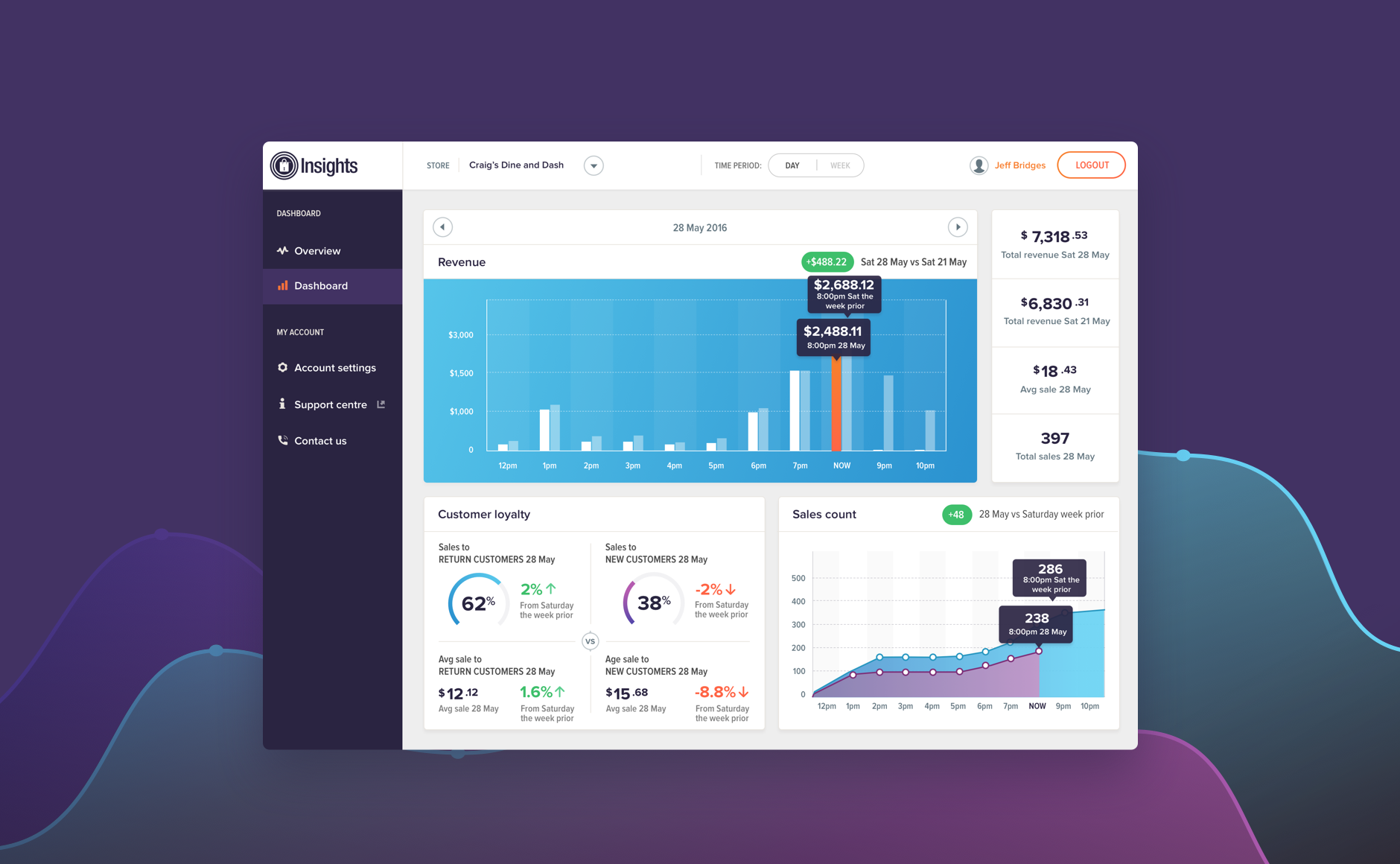
Alphero helped Paymark transform raw transaction data into beautiful and powerful visualisations delivering up-to-date sales, and transaction and loyalty data to the fingertips of their 80,000+ merchants via an easily accessible dashboard. The dashboard provides merchants with usable, insightful and contextual data, empowering them to make decisions in their business.
view website
view twitter

  • CHALLENGE
  • SOLUTION
  • IMPACT
  • MORE
  • Paymark Insights is a service that provides merchants with real-time transaction data. Merchants have access to a live dashboard that provides beautiful and insightful visualisations of revenue, sales and customer loyalty. From a design perspective, it was critical that the dashboard presented merchants with insights that provide real value. The branding system was also designed with growth and flexibility in mind so it could be replicated for other products in the future, offering consistency of identity.

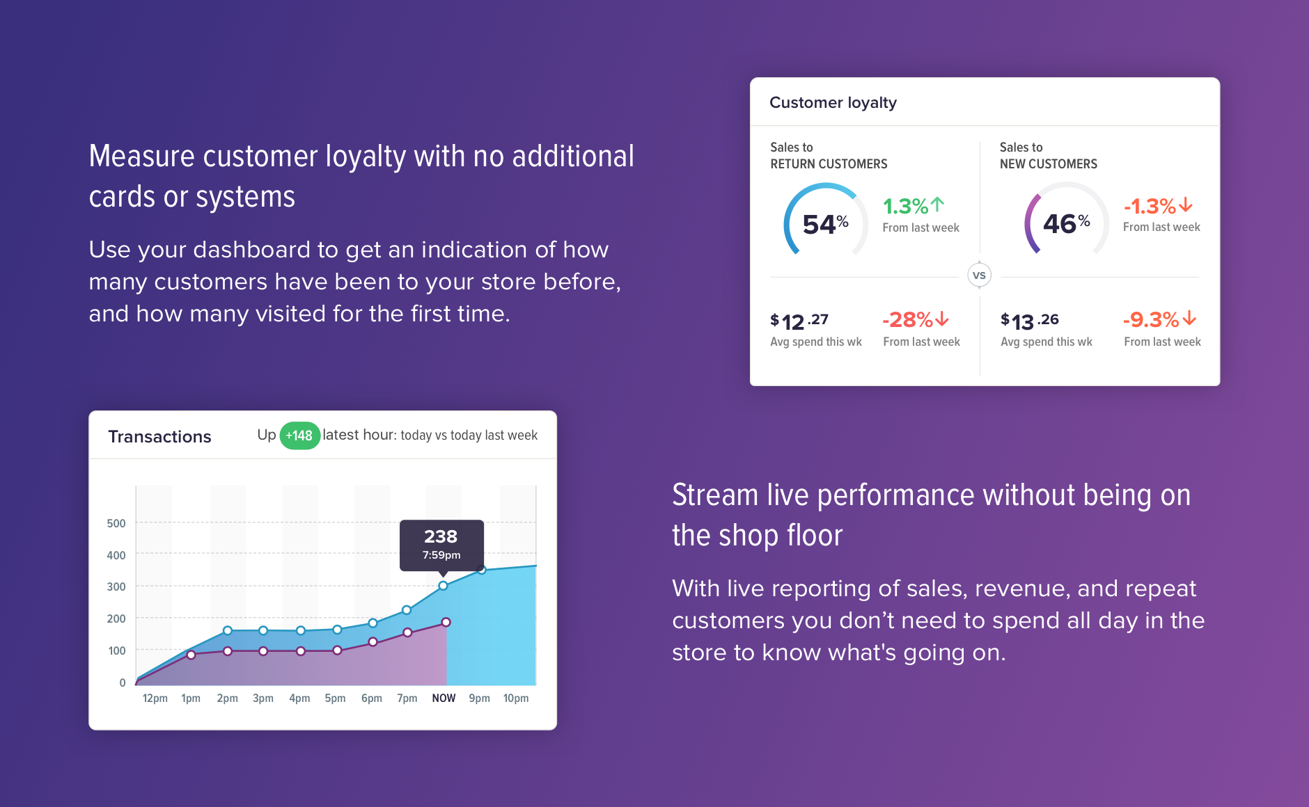
  • Insights' simple dashboards take the complexity out of understanding data. It's designed and built especially for busy store staff who need access to information quickly. They can use the summary to get a snapshot of how each store is doing for sales and revenue compared with the previous week. The store is able to get a baseline of repeat and new customers, and use it to measure how effective its loyalty programmes, promotions and advertising are. The real time revenue comparison gives insight so a store can turn around slow days before it's too late, and get the most out of the best days. Insights can be used to help focus on making each week equal to or better than the last.

  • Users of the insights dashboard range from store staff to retail chain managers - creating simplicity out of complexity was critical to its success given the diverse range of users. The UX/UI design process was tightly coupled with the technical design and development of the APIs. The UX designer's challenge was to work closely, and iteratively with the technical architect to make sense of the vast quantities of raw data. Together they explored ways to creatively visualise themes and insights from the data via different types of charts, graphs and infographics. The UX design impacted the architecture of the APIs and vice versa.

  • Design of the Insights tool was undertaken in full consultation with the target audience. The initial ideas were discussed with a number of retailers in a series of workshops where both Paymark and Alphero teams learned what insights are most useful for retail day-to-day operations. Additionally a beta program was run with a select group during the busy Christmas trading period. The feedback gained from that pilot was implemented into the final version of the software.

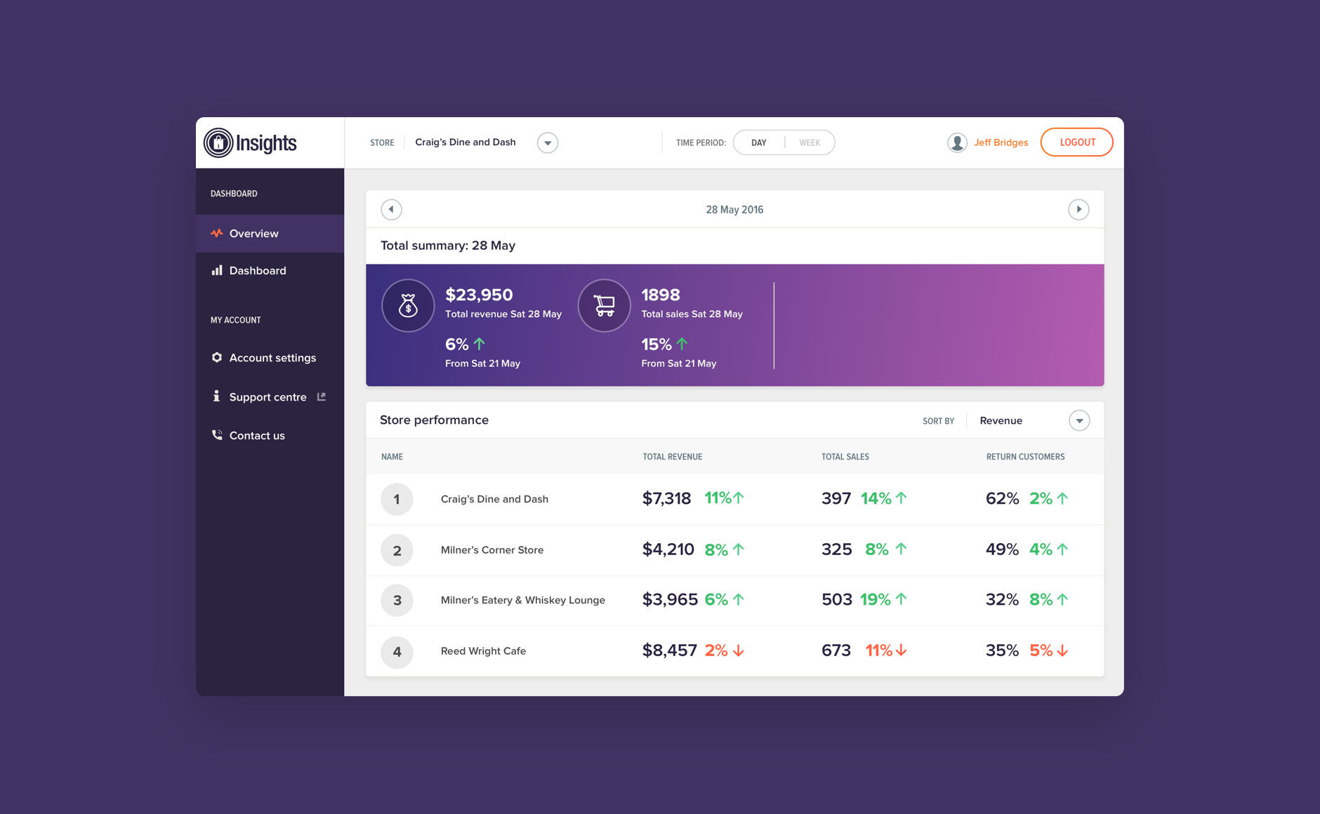
    Store managers are already juggling enough jobs without needing to pull together reports. Using the overview function on the insights dashboard provided a simple, live summary of revenue, sales and return customers that compared stores in a chain with each other. This helps store managers to identify where their focus should be.

    Paymark asked Alphero to extend the Paymark brand and develop a complementary visual direction for Paymark Insights. The objective was to establish a brand direction that fitted within the Paymark family and that could introduce subtle colour differences for each of Paymark's digital products. While designing for Paymark Insights the team at Alphero tested the proposed visual direction across a number of other products to ensure that a repeatable and sustainable brand framework was established. With the visual framework established Paymark are now applying the system to a wider set of digital products across the company.