MyWorldVision Portal Redesign

good-design-award_gold-winner_rgb_blk_logo
  • 2026

  • Digital
    Web Design and Development

Designed By:

Commissioned By:

World Vision Australia

Designed In:

Australia

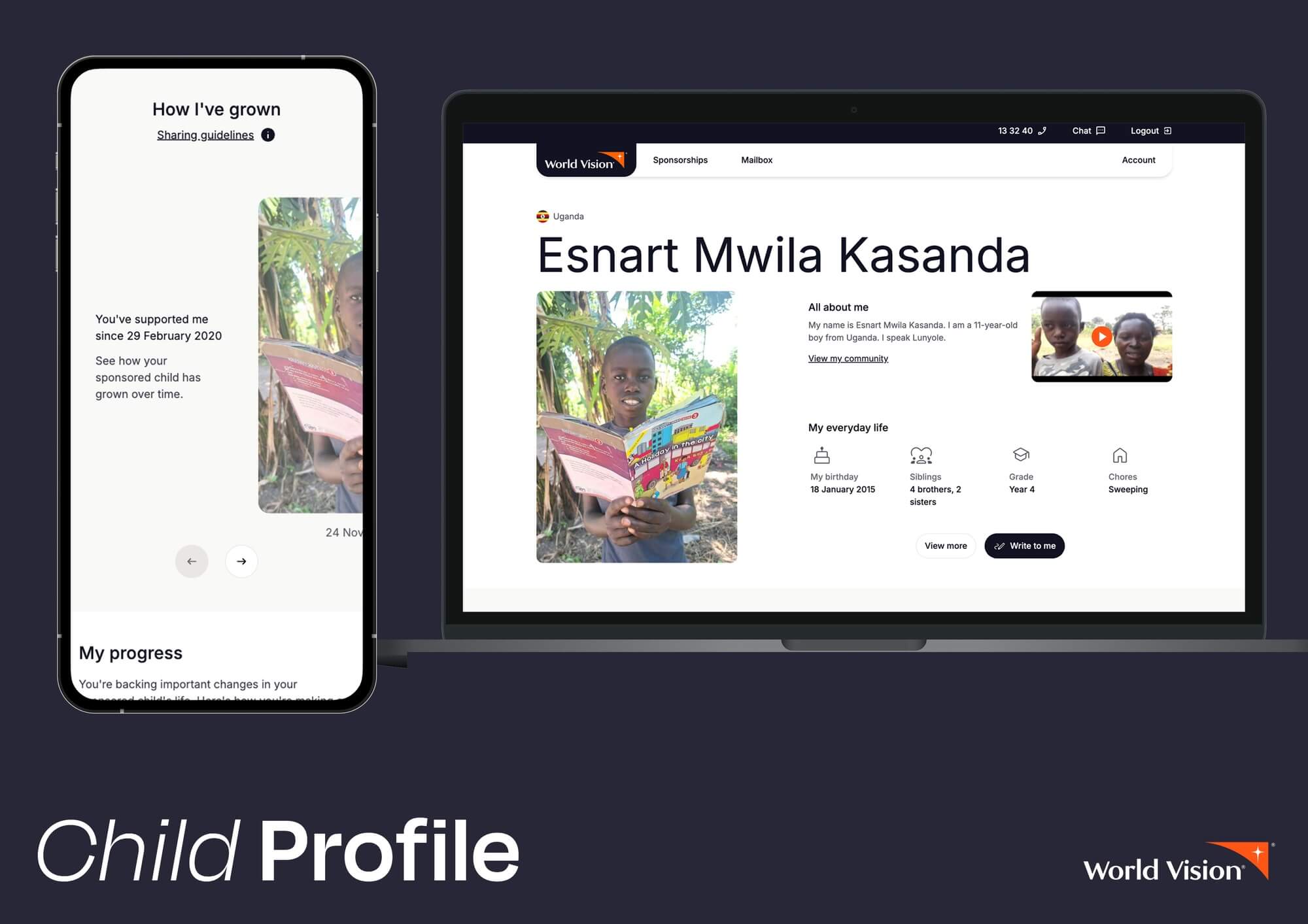
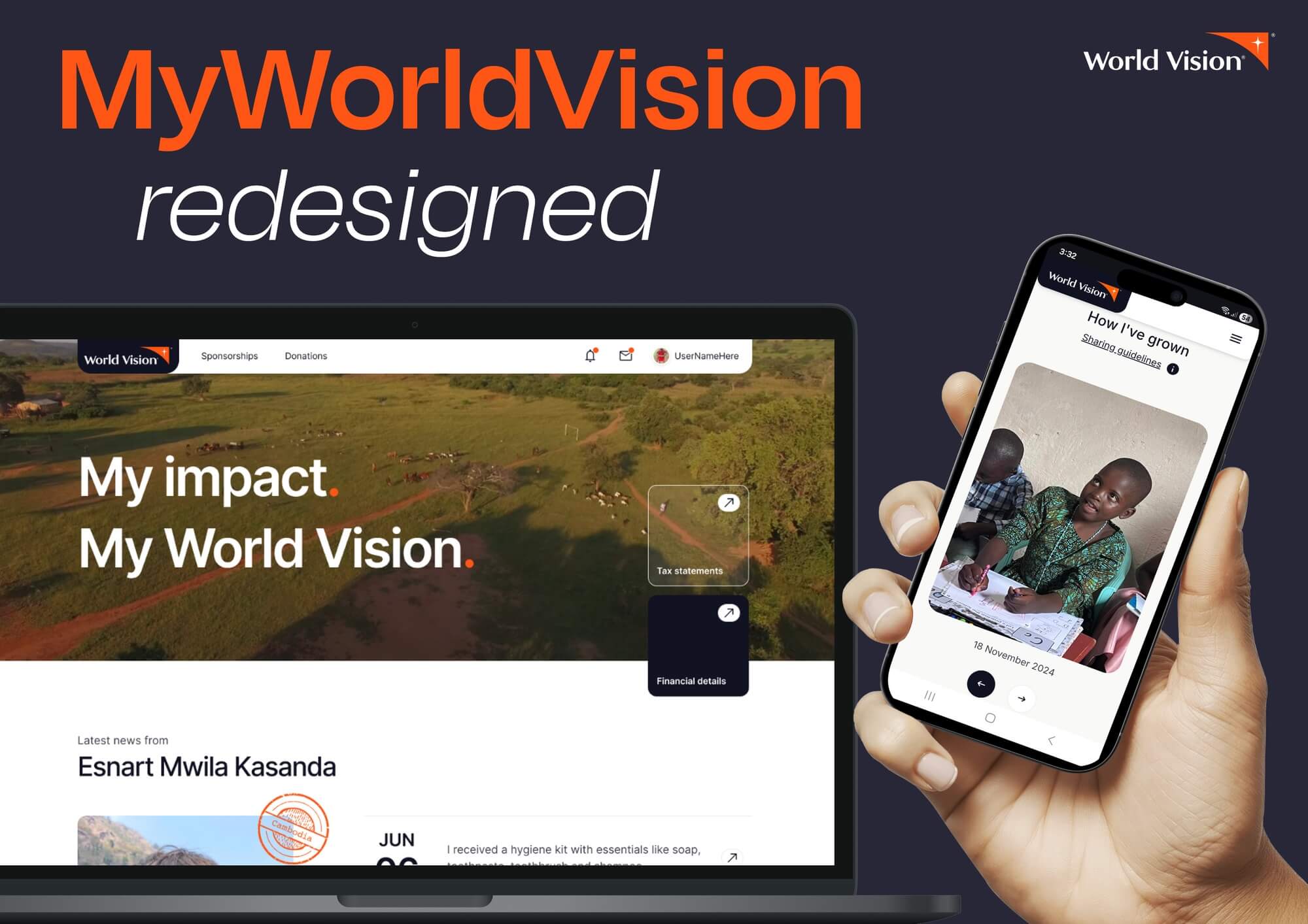
World Vision Australia’s sponsor portal is the digital home for child sponsors — redesigned as a content platform, not a login screen. Built for the returning supporter, it turns a monthly commitment into an ongoing relationship, delivering field-generated stories, progress updates, and moments of connection with a sponsored child.
view website
Buy online

2.jpg
3.jpg
4.jpg
5.jpg
6.jpg
7.jpg
8.jpg
  • CHALLENGE
  • SOLUTION
  • IMPACT
  • MORE
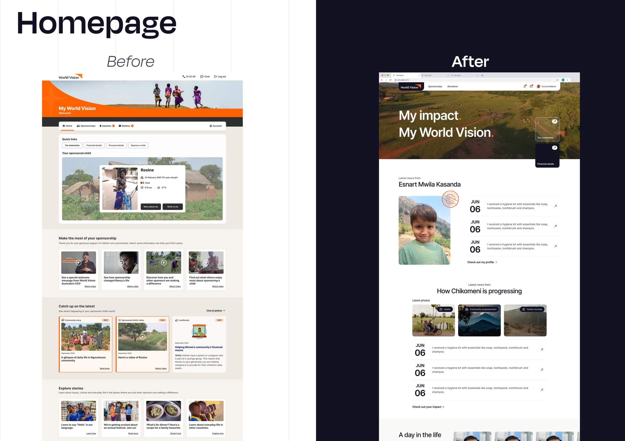
  • The previous portal was built for account management — a transactional tool for updating payment details and viewing occasional sponsorship content. Sponsors told the team the portal wasn't engaging and information felt overwhelming. Navigation was dated and not mobile-optimised. Long-form content updates had become the biggest driver of dissatisfaction — sponsors couldn't see the change or progress they were funding. New field-generated formats — vertical video, community progress, child walkthroughs — were emerging that the architecture couldn't carry. Underneath it all sat the real tension: sponsors weren't arriving to manage an account. They were arriving to feel connected to a child and a community.

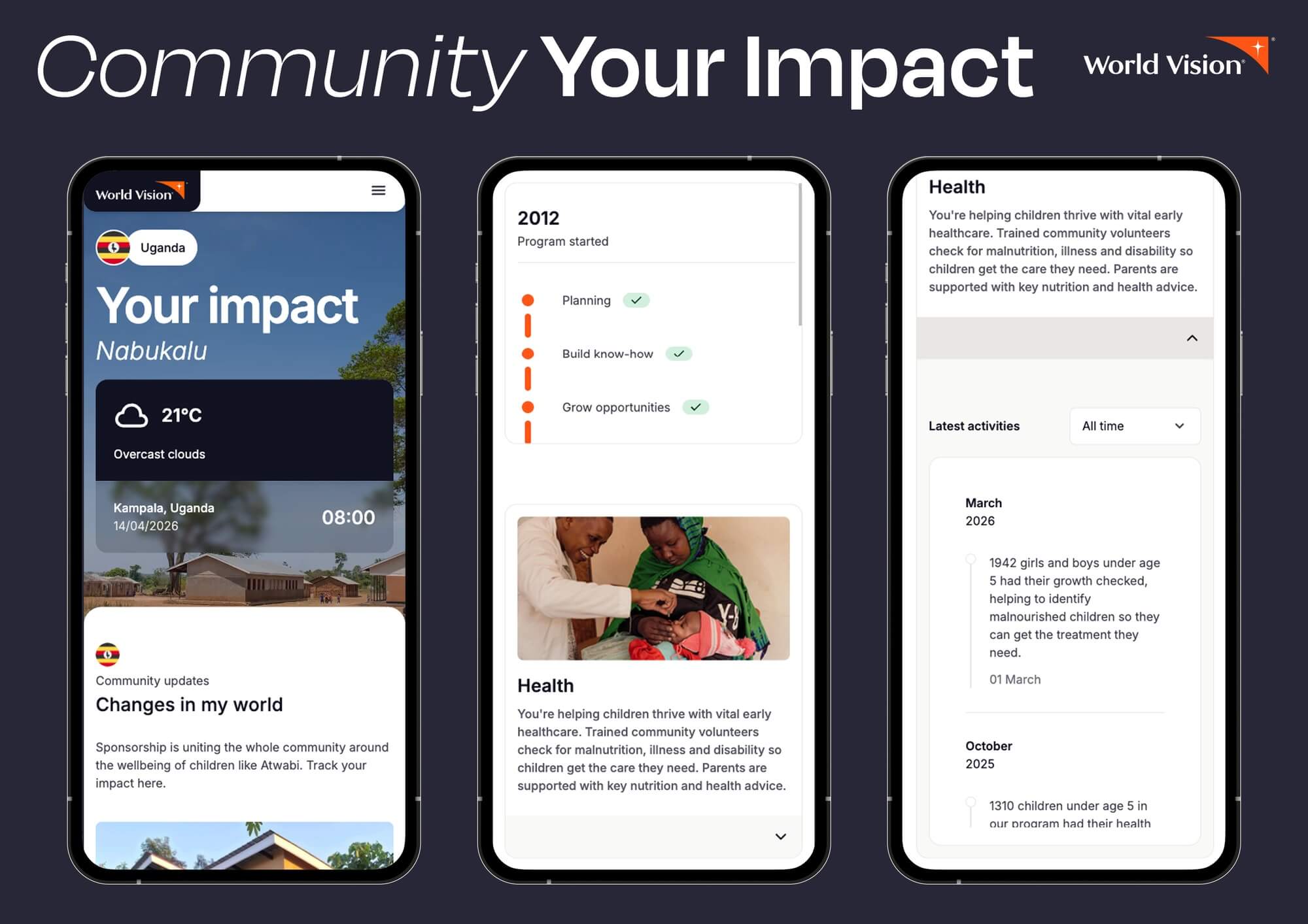
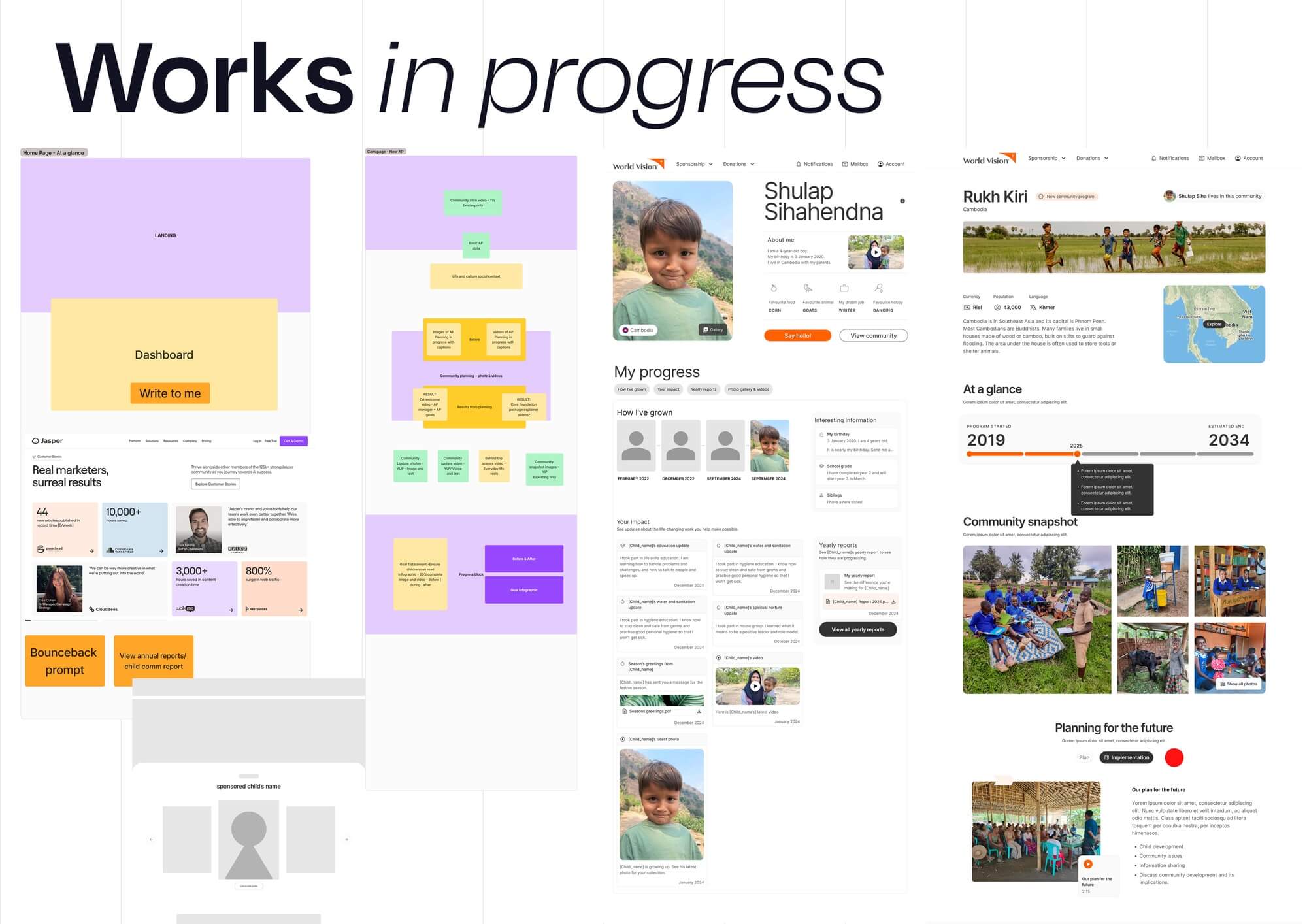
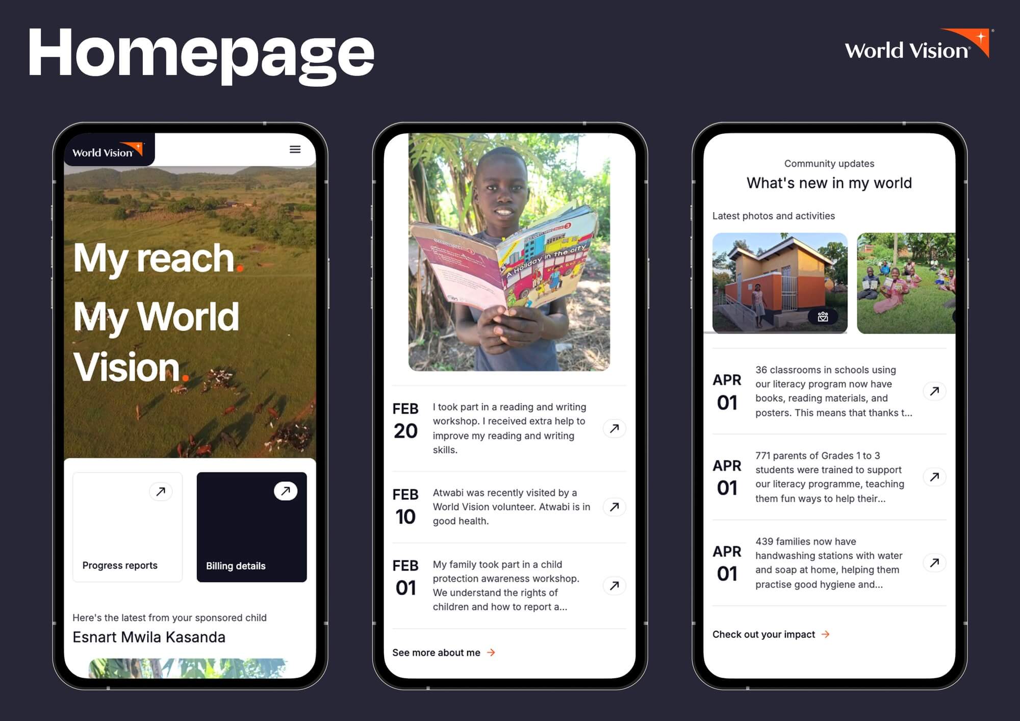
  • The team reframed the brief: a content platform, not a portal refresh. The interviews and usability testing with sponsors over the years confirmed what mattered to them — connection, transparency, proof of impact — was poorly served by an architecture organised around account functions. The portal was rebuilt around the child and the community, with a "Problems, Plans, Progress" storytelling framework, mobile-first information architecture, and a unified design system constructed from scratch rather than retrofitted. A surface-level redesign would have absorbed new content temporarily then broken within a year. Building the foundation properly required defending greater short-term scope.

  • Sponsors returned — not to manage their account, but because there was something worth coming back for. That shift from obligation to intention is the measure of the redesign's success: returning users grew 191.5%, engagement time rose 82%, video interactions ran ten times higher than text content, and bounce rate fell 30%. In testing, 70% of sponsors reported feeling more connected to their sponsored child, 87% rated the new homepage favourably, and 80% found the new videos highly impactful. The portal stopped being a place sponsors had to log in to. It became a place they came back to.

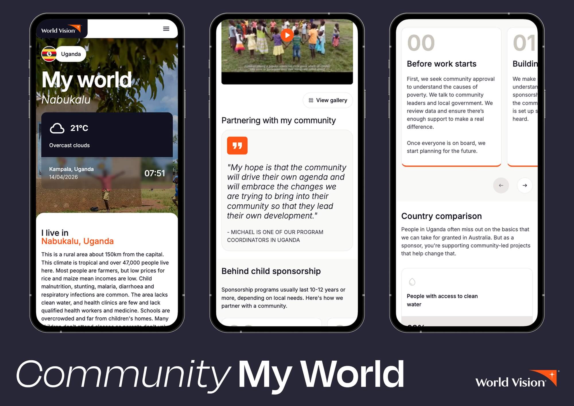
  • Three features define the redesign's commitment to connection over transaction."A Window Into Their World" — the redesigned homepage shows the sponsored child's local time and weather alongside contextual community details. Research showed sponsors struggled to picture the daily reality of the child they supported. The homepage closes that distance every time a sponsor logs in."Everyday Life Reels" — vertical 9:16 video content from the field, a format the not-for-profit sector had not yet adopted in this context. The decision to commit to mobile-native video anticipated where content consumption was already heading and built the architecture to receive it."Problems, Plans, Progress" — a new narrative framework for community development storytelling, replacing generic update copy with a structured arc that lets sponsors see what's being addressed, how, and what has changed. Validated through three-variant testing of the community progress page, this framework gave field offices a shared structure for content production and gave sponsors a consistent way to read it.Each feature was chosen against a less considered alternative. None catalogues what the portal can do; together they describe what the portal is for.