Kiwibank Brand Refresh
-
2022
-
Communication
Branding and Identity
Designed By:
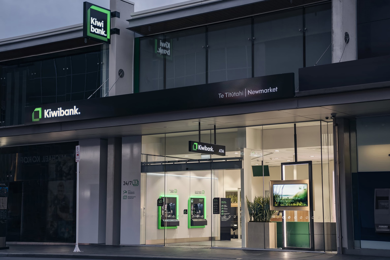
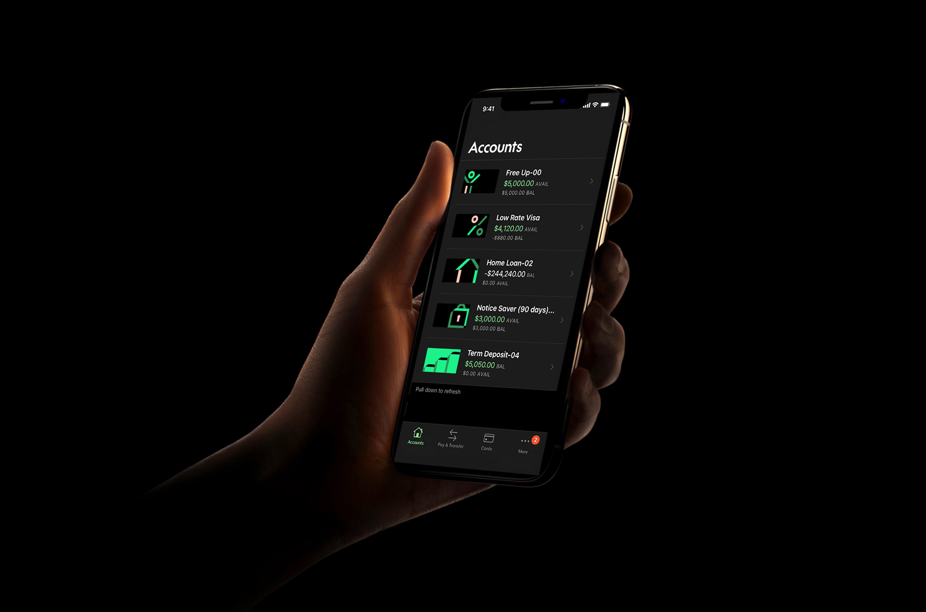
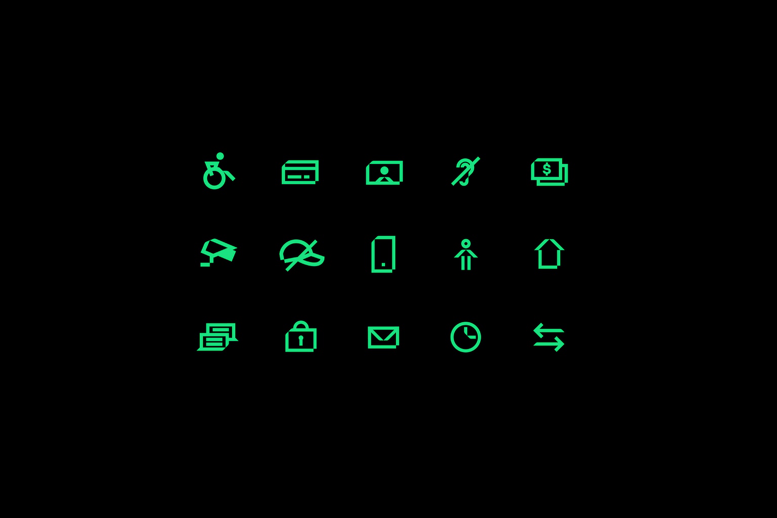
Kiwibank is the largest New Zealand owned bank. The brief was to reposition the bank to attract and retain a new progressive type of customer. The repositioning was to spearhead a transformation across culture, product and technology – ensuring the bank would be future fit for the next 20 years.