ING’s Information Space

good-design-award_winner_rgb_blk_logo
  • 2018

  • Digital
    Web Design and Development

Designed By:

Commissioned By:

ING Australia

Designed In:

Australia

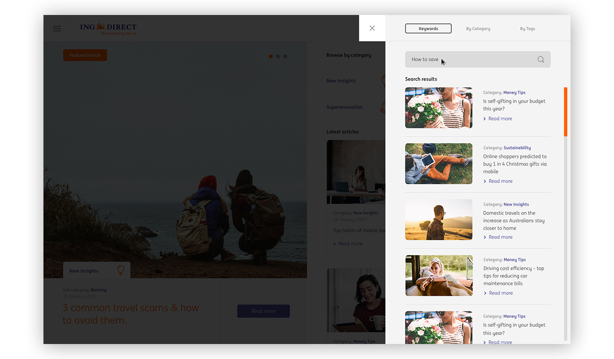
ING Information Space: a place where ING customers can find useful information regarding banking, savings and financial advice in the most intuitive way possible.


view website

  • CHALLENGE
  • SOLUTION
  • IMPACT
  • MORE
  • There are more than 250 articles for this platform and counting. We aimed to create an intuitive way for users to navigate and find relevant content. Catering for different user behaviour on desktop, tablet and mobile was the biggest challenge. Another challenge we faced was that article based websites have higher bounce rates. Because of the above challenges, our main goal was achieving consistent engagement and creating more page views.

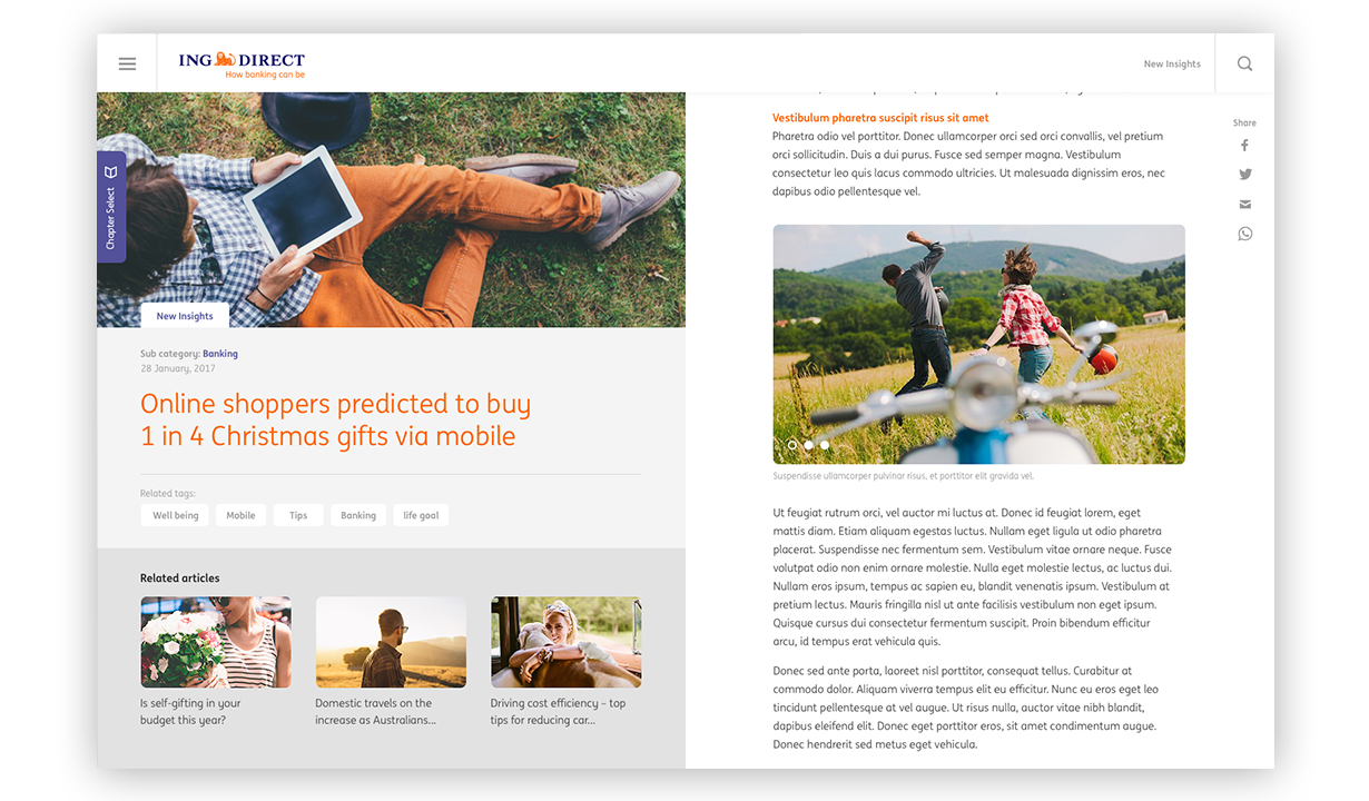
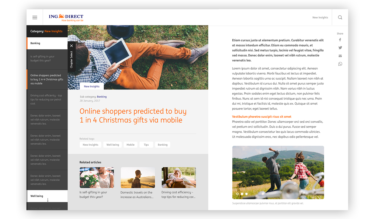
  • We introduced multiple UX/UI features to provide optimal user experience on any device. One feature we included was an infinite scroll where the user can scroll to the next related article without having to refresh the page. The next key feature was to introduce a chapter selection. This helps users understand which article they are viewing and gives them the control to skip to the most relevant article with ease. From a UI perspective, rather than creating a typical blog page, we created a platform that is similar to an app in order to increase engagement and readability.

  • As a result of our extensive UX/UI research, the page views, page duration and bounce rate all have improved dramatically. We had more than 3.5 pages views per user, with an average of a 2 minute duration and with less than 50% bounce rate. For a blog page, these numbers are far above the average. This shows how quality content coupled with unique UX/UI that caters around users have enhanced overall engagement.

  • **Make it even more relevant** We implemented an algorithm based on keywords and tags to generate the most relevant articles for the user. **Intuitive search panel** This feature enables a user to search and have refined results displayed without having to refresh or leave the page, making it a seamless experience for the user. **SEO** As part of the infinite scroll feature, we had to implement a system that can automatically change the URL as the user scrolls to another article. This is also contributed by a crawler friendly rendering system to make sure that implementation of key UX features didn’t affect the SEO visibility. **Not your typical blog platform** We created a completely different UI approach where the website feels more like an app. This allowed us to introduce the chapter panel without intruding the user’s behaviour. Also, through this approach, we were able to clearly differentiate the content and title area making the platform feel more like a digital book.