Global Sisters

  • 2017

  • Design Strategy

Designed By:

Commissioned By:

Global Sisters

Designed In:

Australia

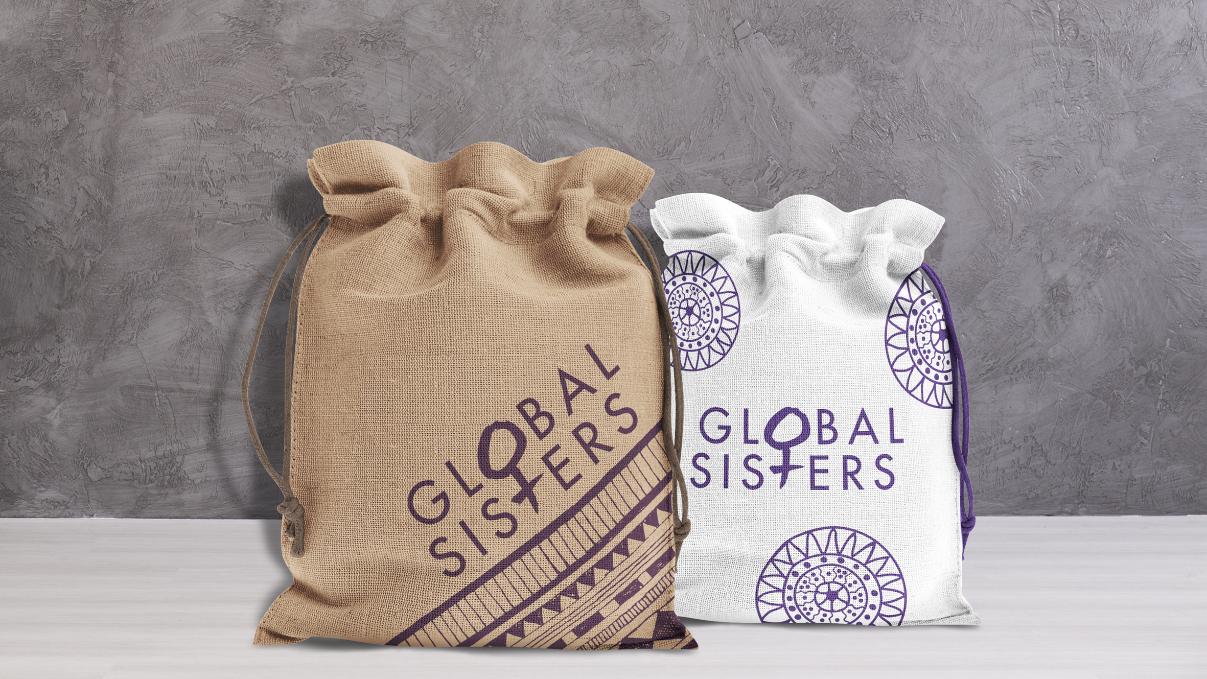
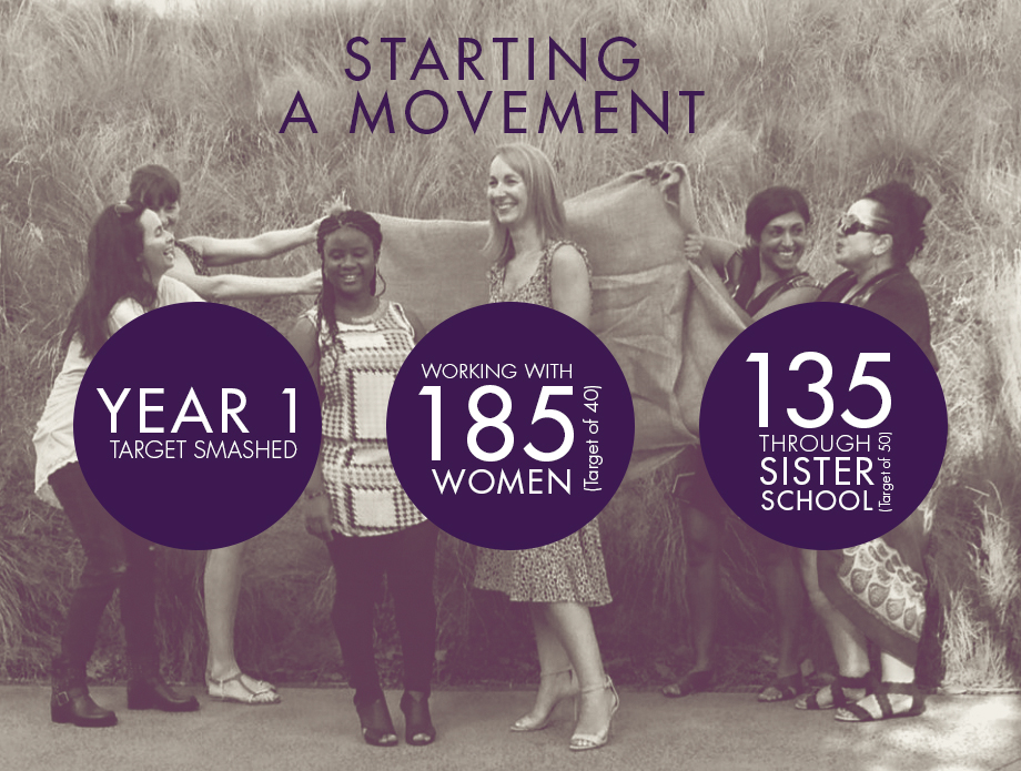
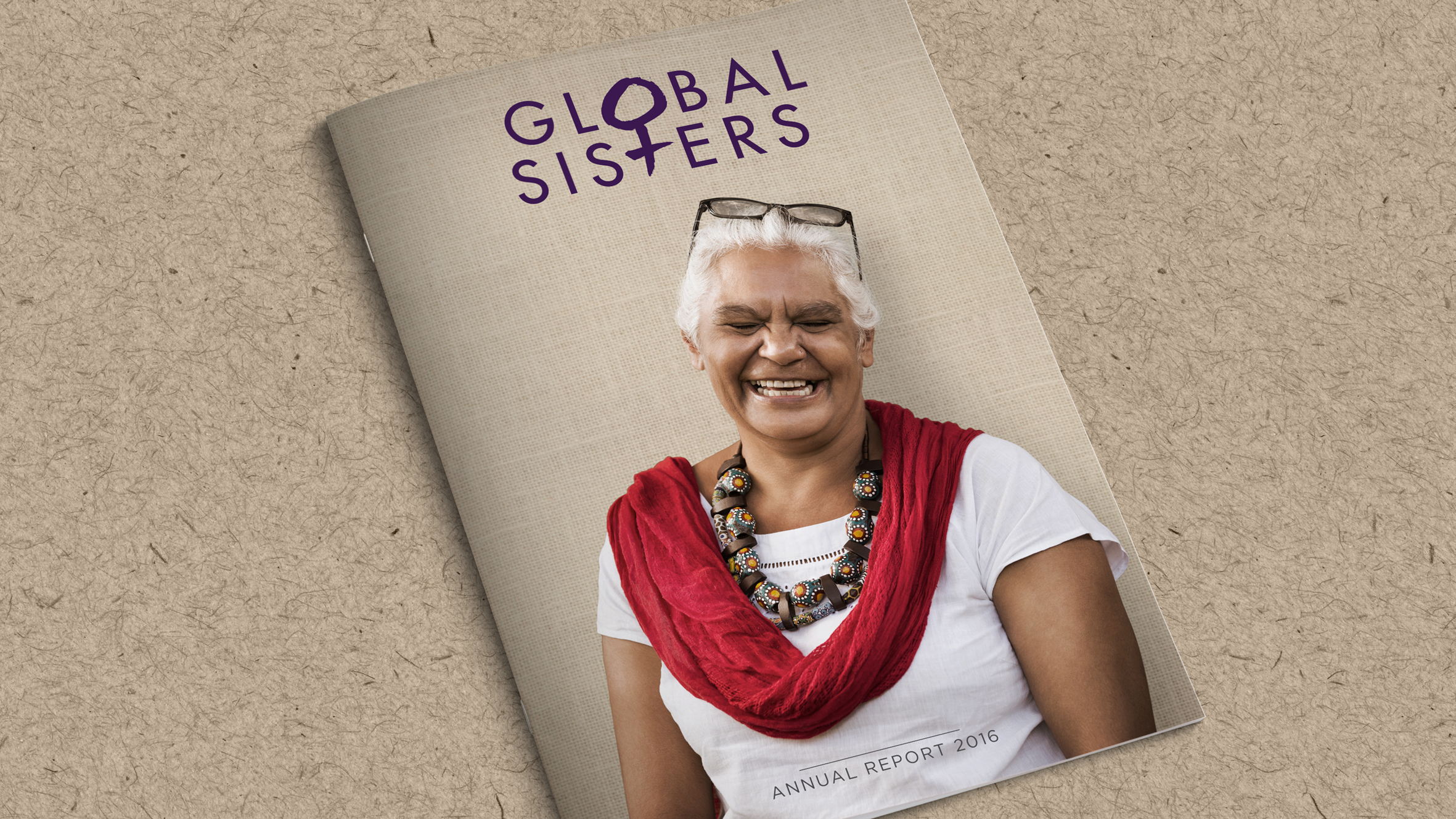
Global Sisters is a not-for-profit that provides women with mentorship, business advice and an e-commerce platform to harness their potential and accelerate an idea into a thriving business. We gave this collective a look worthy of its inspiring social cause led with a brutally simple wordmark and journalistic photography.
view website
view facebook
view twitter
Buy online

  • CHALLENGE
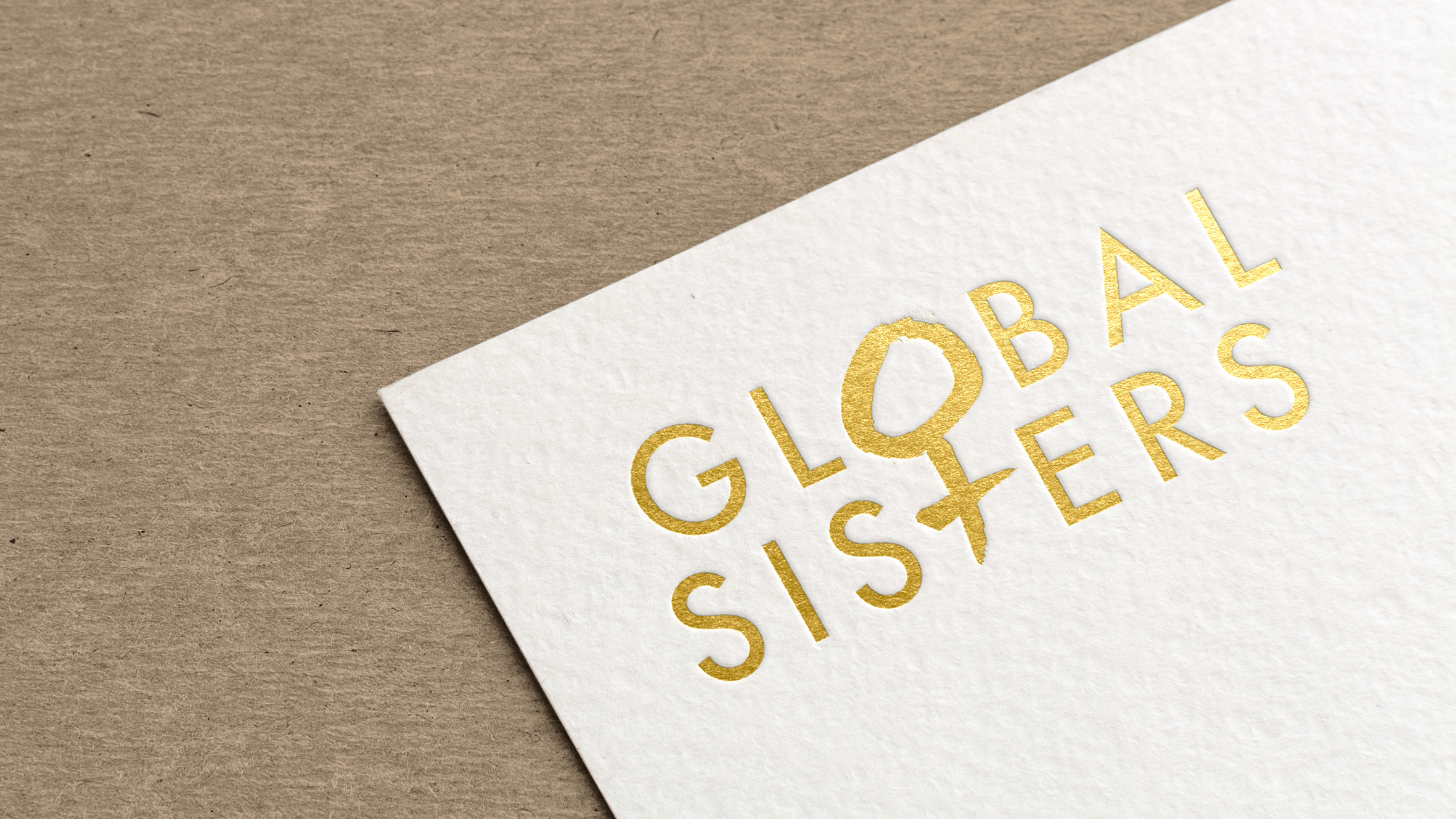
  • The strongest logos tell simple stories. By fusing a hand-drawn element with a clean sans-serif typeface, we were able to achieve several objectives: 1. Reflect the hand-made products created by the Sisters as well as the boutique feel the client was looking for. 2. Overcome language barriers with the globally-recognised symbol for woman. 3. Replacing the 'O' of 'Global' and the 'T' of 'Sisters' with more graphic iterations. The logo was soon adorned by raw portraiture, organic textures and cultural patterns reflective of the rich stories of the Sisters. What resulted was a brand Global Sisters can call their own and an empowering banner under which they can transform lives.