FiGo

good-design-award_gold-winner_rgb_blk_logo
  • 2017

  • Digital
    Apps and Software

Commissioned By:

Globetouch Inc

Designed In:

India

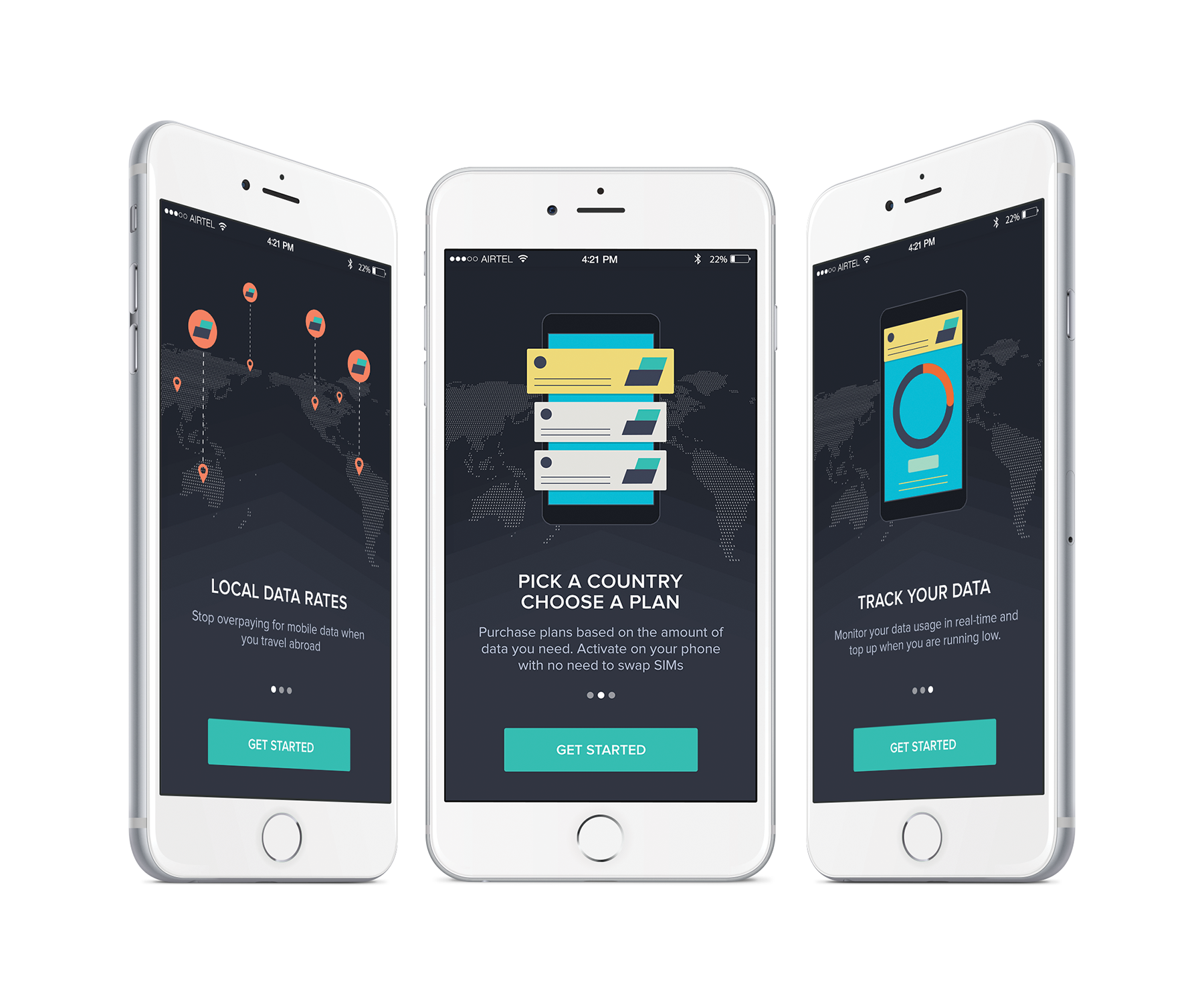
Globetouch is a global connectivity solution for businesses worldwide with its network providing connectivity for a wide range of devices and operators. International roaming is now up for disruption, with Globetouch pioneering it in the form of its app based solution, FiGo.

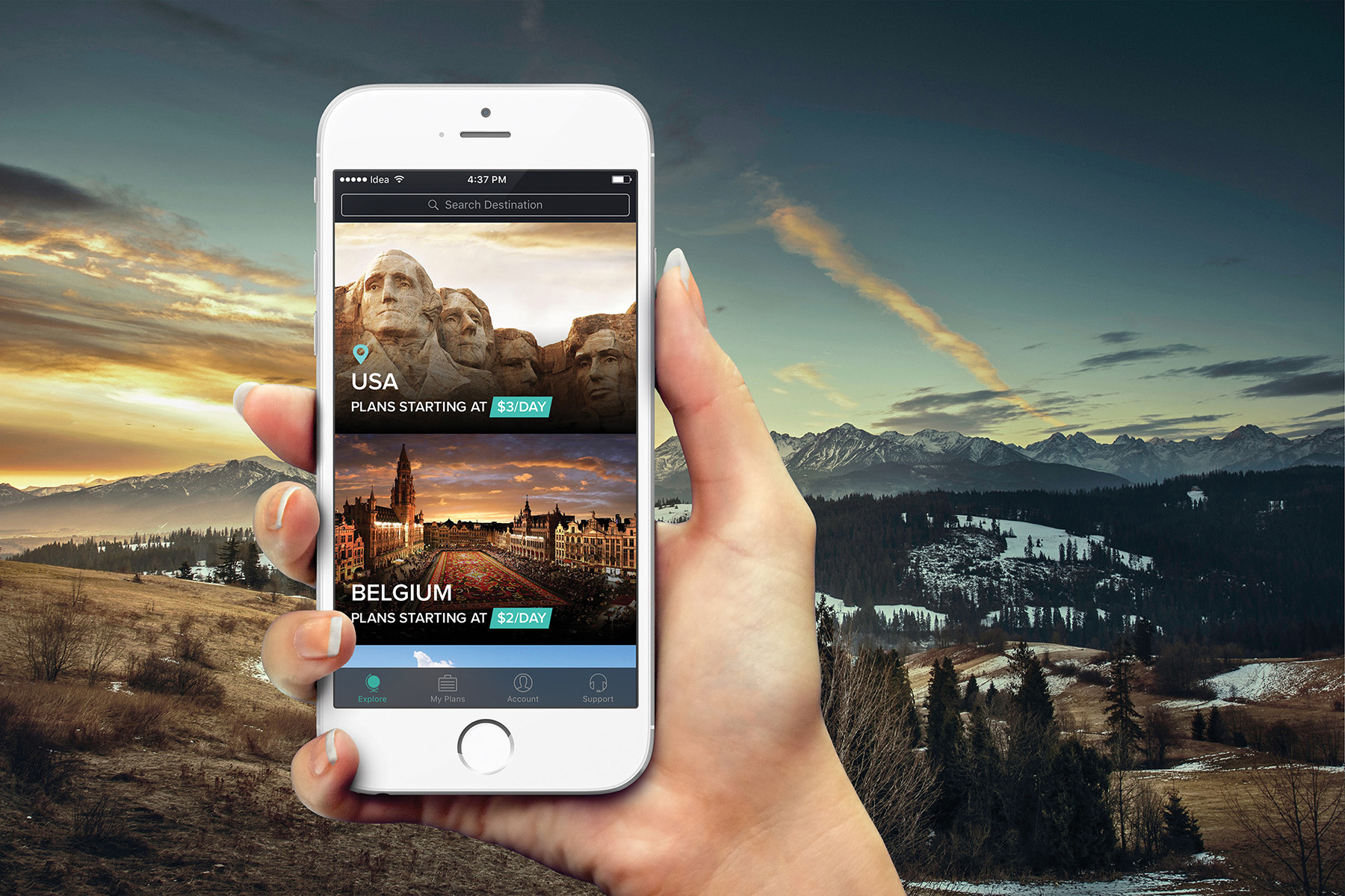
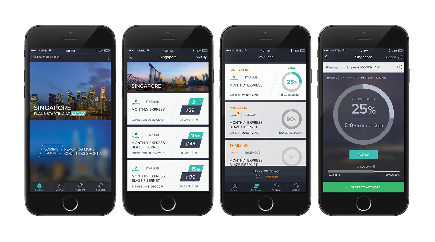
Travelers can now purchase international roaming data for as low as $1/ day. FiGo provides this through a app based interface, where users can browse various plans based on selected country they are traveling to and pay online to start using roaming data.
view website
view facebook
view twitter
Buy online

  • CHALLENGE
  • SOLUTION
  • IMPACT
  • MORE
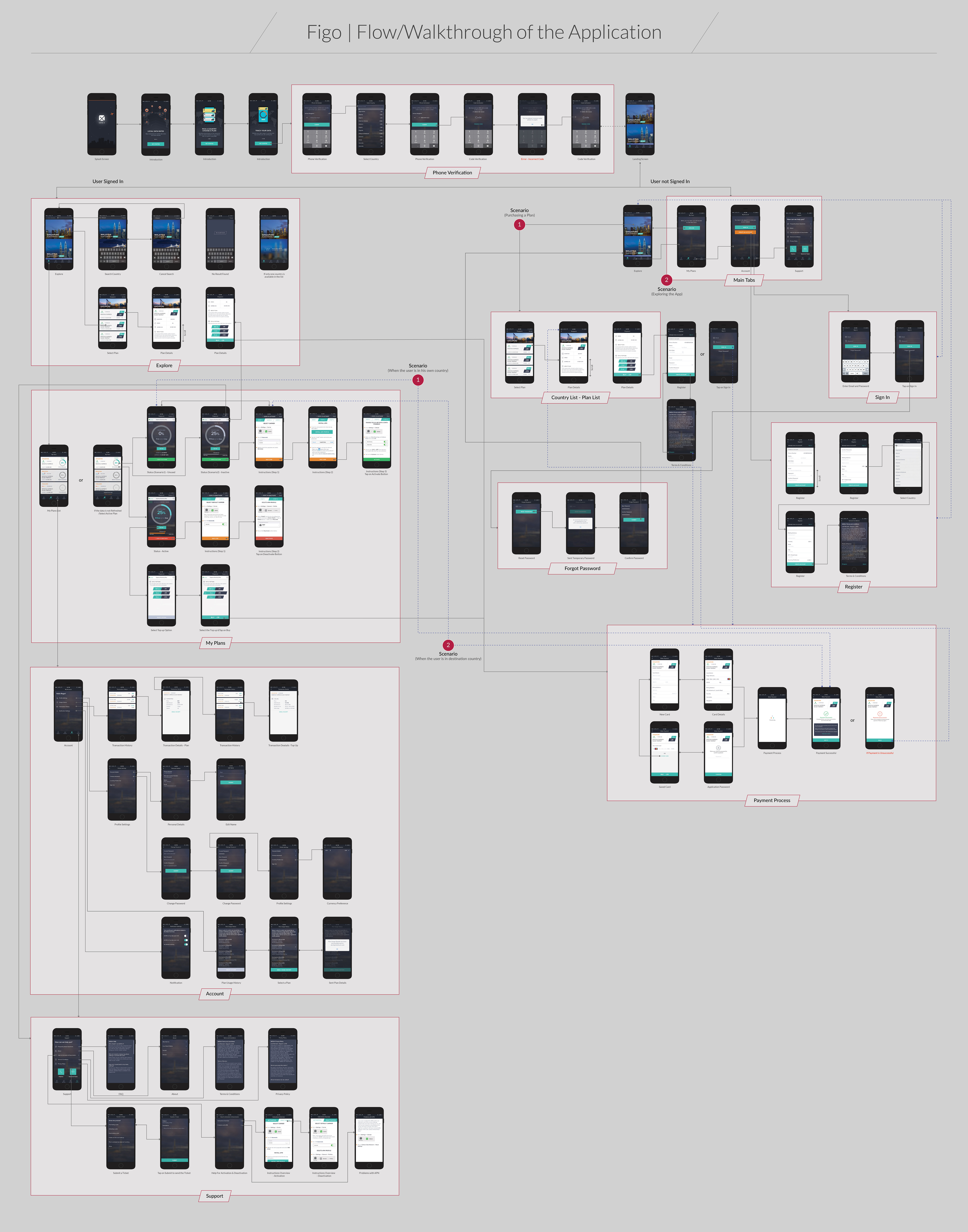
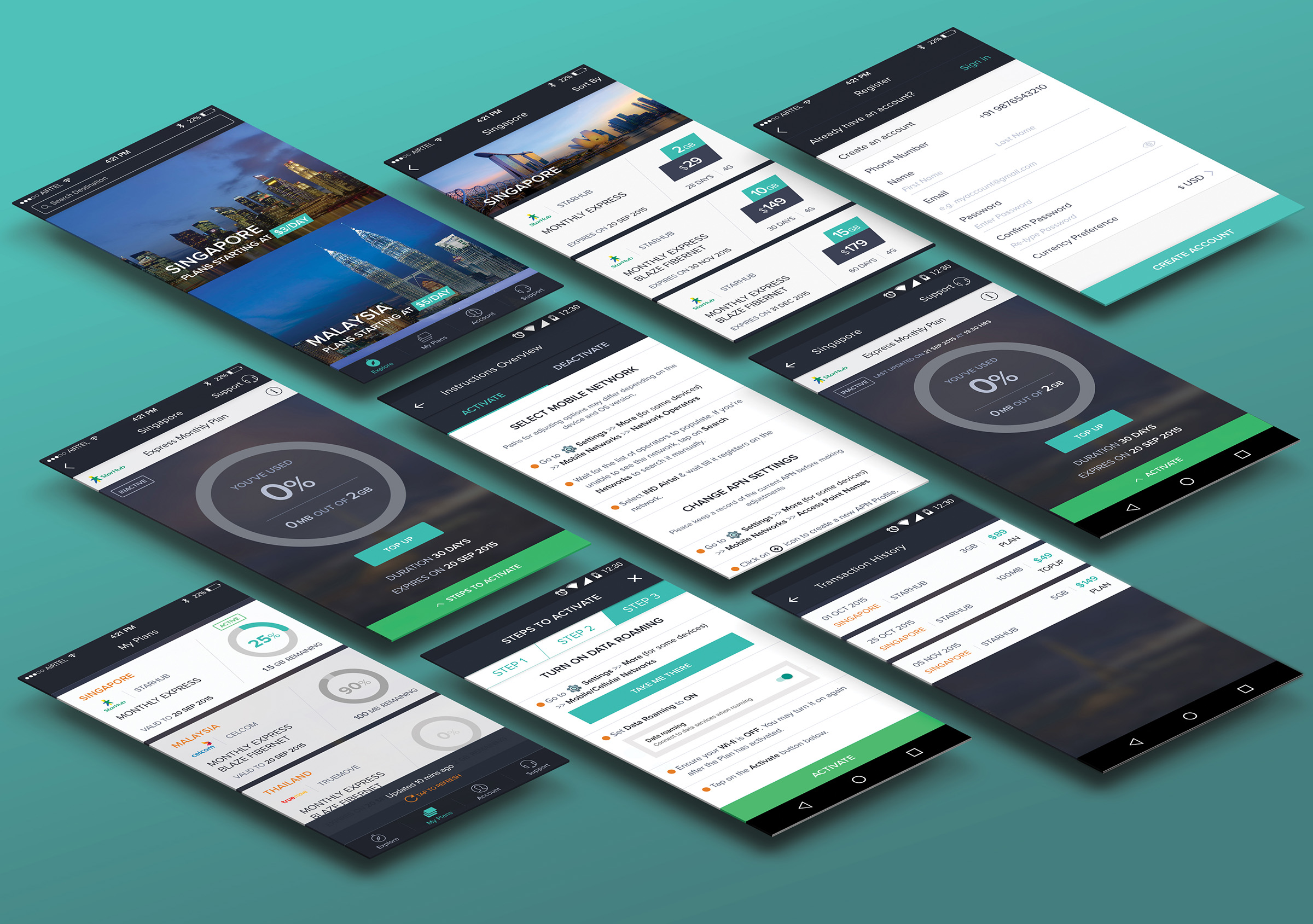
  • It is as simple as it can be. In order to make it easy for the users to understand and purchase plans, it was very important to make the interface very simple to comprehend. We thus followed the pattern of e-commerce and hotel booking apps to make it ridiculously easy for its users to decide and buy. Ease of use also came from making user flows friction free and well-guided at every step of usage… the approach was to miminize features/ functions and provide a single major call to action per screen. The user thus, is not bombarded with information and decision making loops; instead s/he can focus on what s/he wants to get done; and finish the transaction in a matter of minutes.

  • Since every plan comes with a usage limit and certain other conditions, we made it important to make usage very transparent to its users. After several iterations, prototypes and test cases, we zeroed in on the most intuitable interface for the usage status screen. Further, primary and secondary call to actions were clearly separated through visual hierarchy and use of color. Interaction design approach focused on positive feedback to user actions. Thus, the approach was to make the experience pleasant and gain users' trust through the app usage.

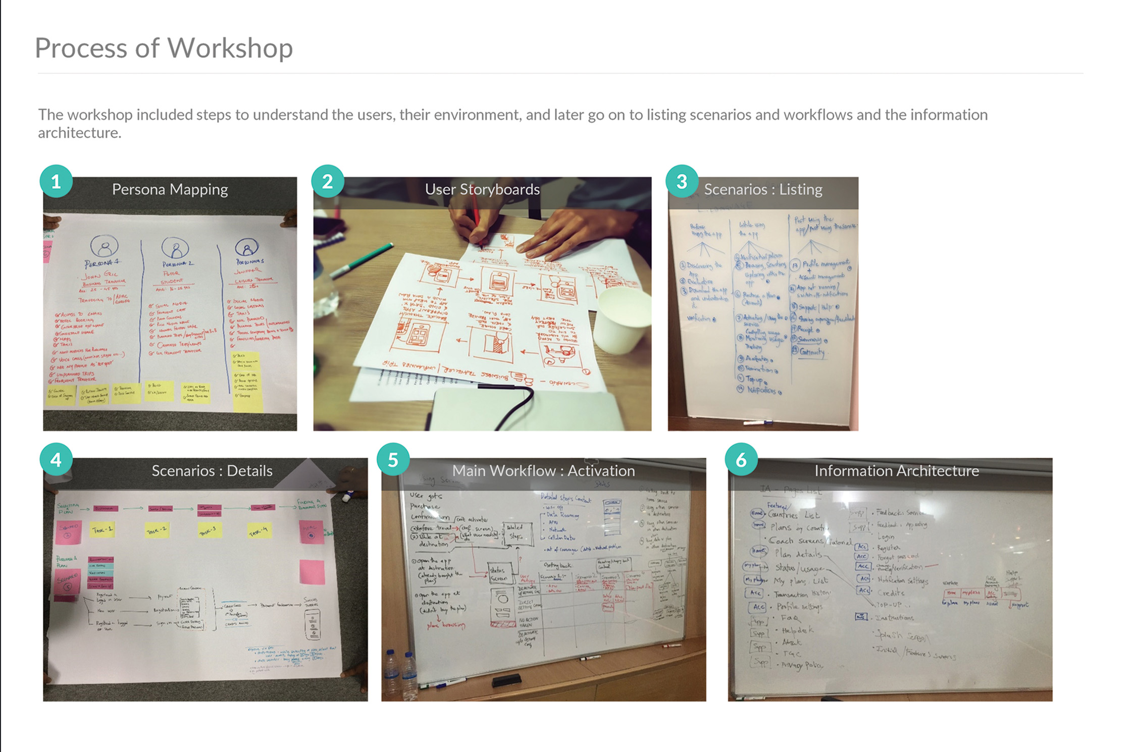
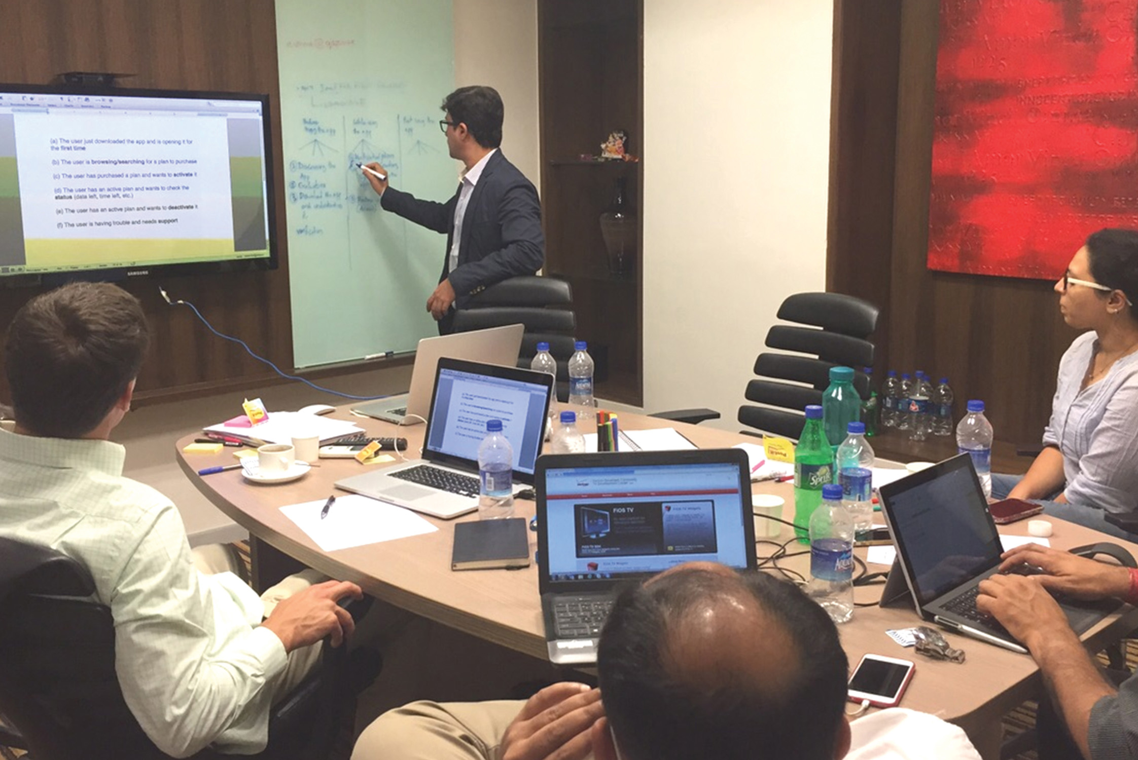
  • Notifications and alerts were of critical importance in user journey. We took a deep dive into user stories and use cases in order to visualize occasions of anxiety or frustrations for the user. We avoided them early on by sketching the kind of notifications users might want at each occasion. All that the user has to do now is, buy the plan and relax. FiGo's notification center would automatically alert user upon reaching his destination, to start using the plan s/he purchased. By constantly working in the background and providing information to its users when necessary, FiGo renders itself invisible yet credible.

  • It is absolutely fine if users have projected their usage wrongly. We understand that everyone isn't great at math and hence, we provided users with an option to continue using their plans without hassle. Top-up was a feature conceptualized just for this purpose. If a user runs out of data limit or time limit, they have an option on the status screen to top-up their plans.

    As FiGo was a new product and a brand of its own in the making, it needed a well articulated visual brand identity and interaction design that compliment each other as well as stand differentiated in the market place. FiGo thus got a edgy and crisp visual identity while the color depth was chosen to be indicative of travel. Interaction design in the form of action feedback, screen transitions, animations and live updates/ notifications got a professional, tad serious and predictable finish. As the primary target segment was business travelers, it was important to take this stance.