Emerald Hill Residence

  • 2016

  • Communication
    Branding and Identity

Designed By:

Commissioned By:

CaSPA Care

Designed In:

Australia

Emerald Hill Residence is an aged care facility located in South Melbourne.

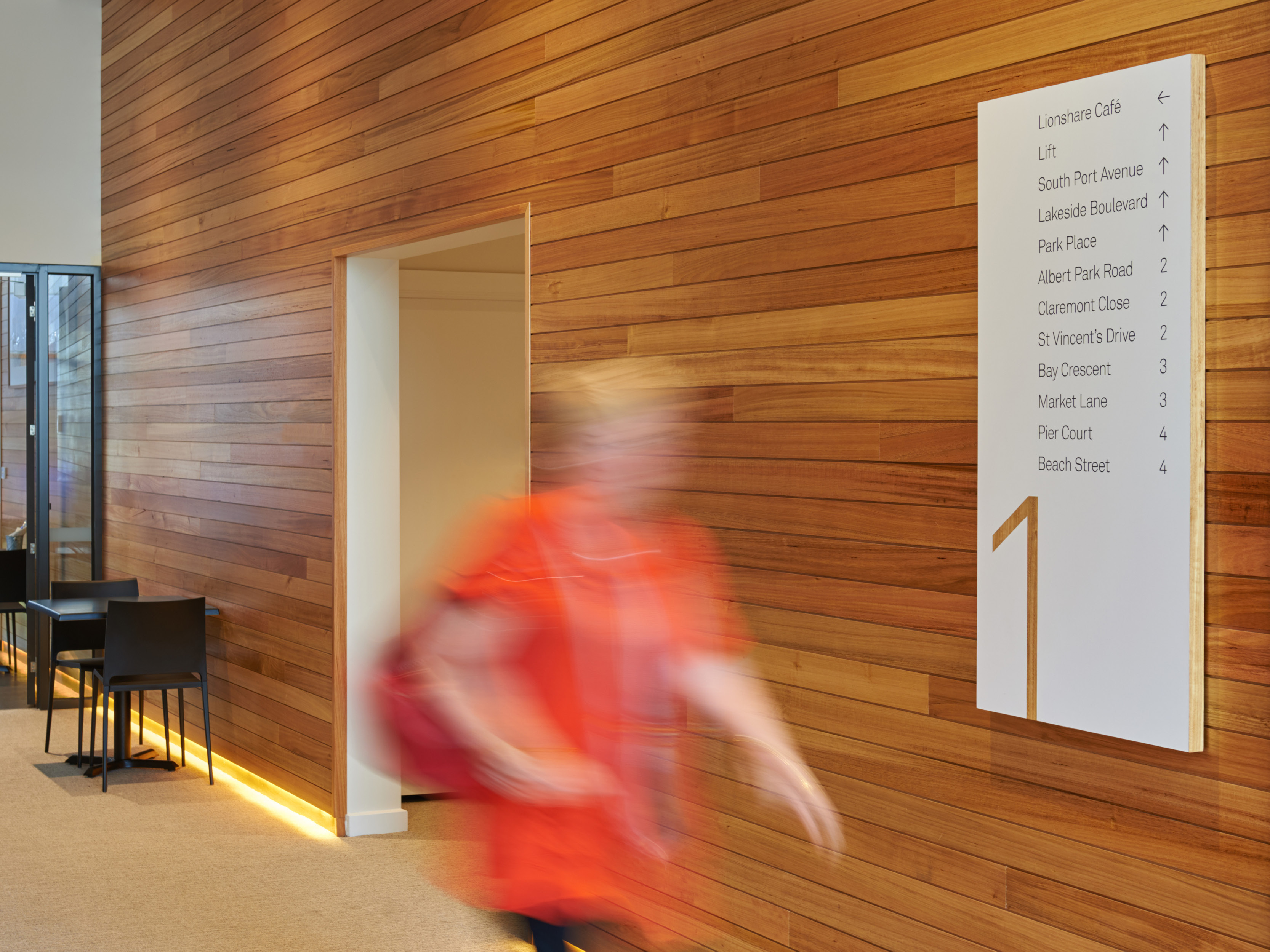
Principle Design was engaged to create a branded graphics package that detailed the residential building and encompassed way-finding signage, room identification, privacy decals, cafe branding and a bespoke totem sign for the entrance of the facility.
view website
view twitter

  • CHALLENGE
  • SOLUTION
  • IMPACT
  • MORE
  • Our focus was to create a cohesive visual language that would be used throughout the residence and would work harmoniously with the architecture and environment. After considering introducing a conventional brand or identity we decided that a logo was too reminiscent of institutions. Instead we chose to craft a language of shapes, typographic styles and colours and a defined direction for materials and texture that created an overarching tone for the residence without appearing sterile or institutional. In extending a distinctive yet elegant brand language throughout the residence we created a brand that residents would like to live with.

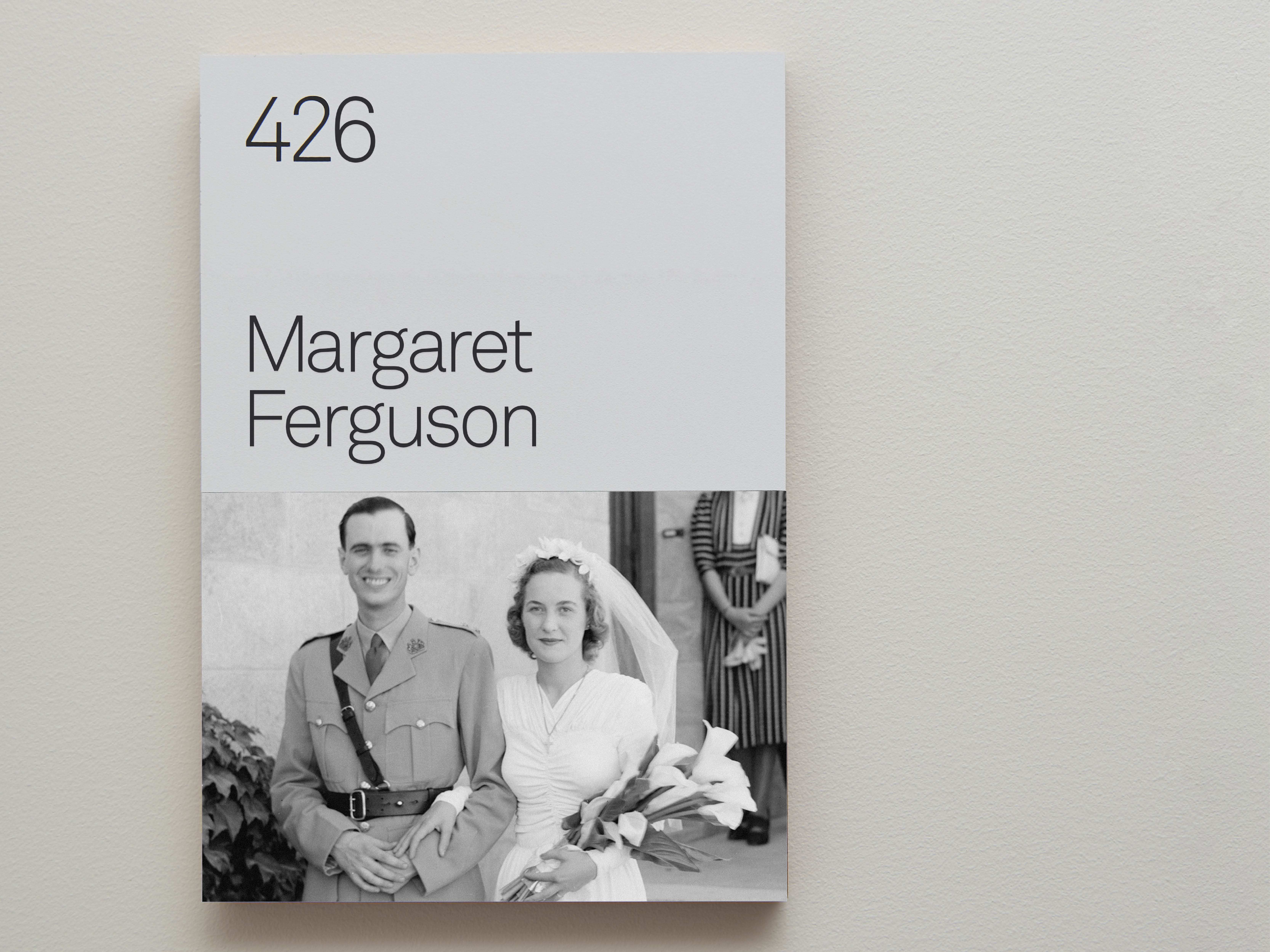
  • While developing the signage system for the residence special attention was given to the dementia wing. Principle developed an experiential signage system to assist dementia sufferers in identifying their rooms. Our research showed that dementia residents could recognise their past self, which informed our design solution. The system consisted of 3 boards attached to a backing plate magnetically. A resident's photograph not only assisted in room identification but also created a more sustainable and cost effective system. The use of personal photographs not only aids residents practically; it also creates an environment where users feel their individual histories, personalities and needs are understood.

  • With over 120 years of combined experience in aged care, Emerald Hill's design solution needed to reflect the prestigious history of the organisation. We were resolute that the residence be future focussed and reference Emerald Hill's prestige and progressive approach with a clean, refined and contemporary design. Throughout this project, the ways in which the design could assist the residents were constantly reviewed and refined. Whilst some of the design decisions involved assisting the residents physically, such as the elegant yet highly legible typography used throughout the facility, others were intended to improve resident's moods and mental health by creating a beautiful environment for them to live in.

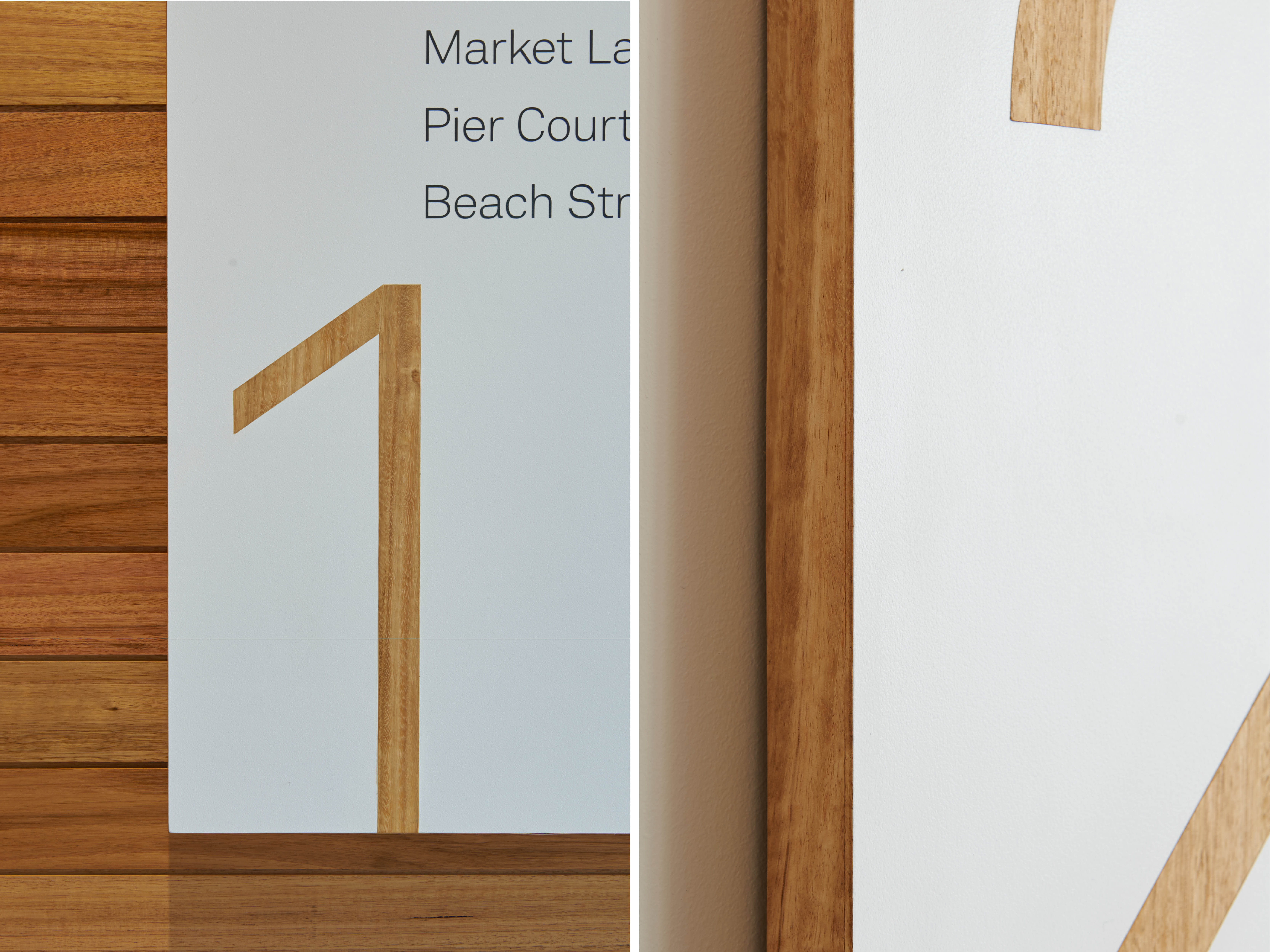
  • Consideration of natural materials was essential to this project. Natural timber is layered with white acrylic and used throughout the signage system to work harmoniously with the architectural finishes of the residence and to provide a critical link between residents and the outdoors. A different type of wood was used for the signage on each of the four floors, from a light birch through to a deep walnut; the distinctive grains add warmth and an individual character to each floor within the building.

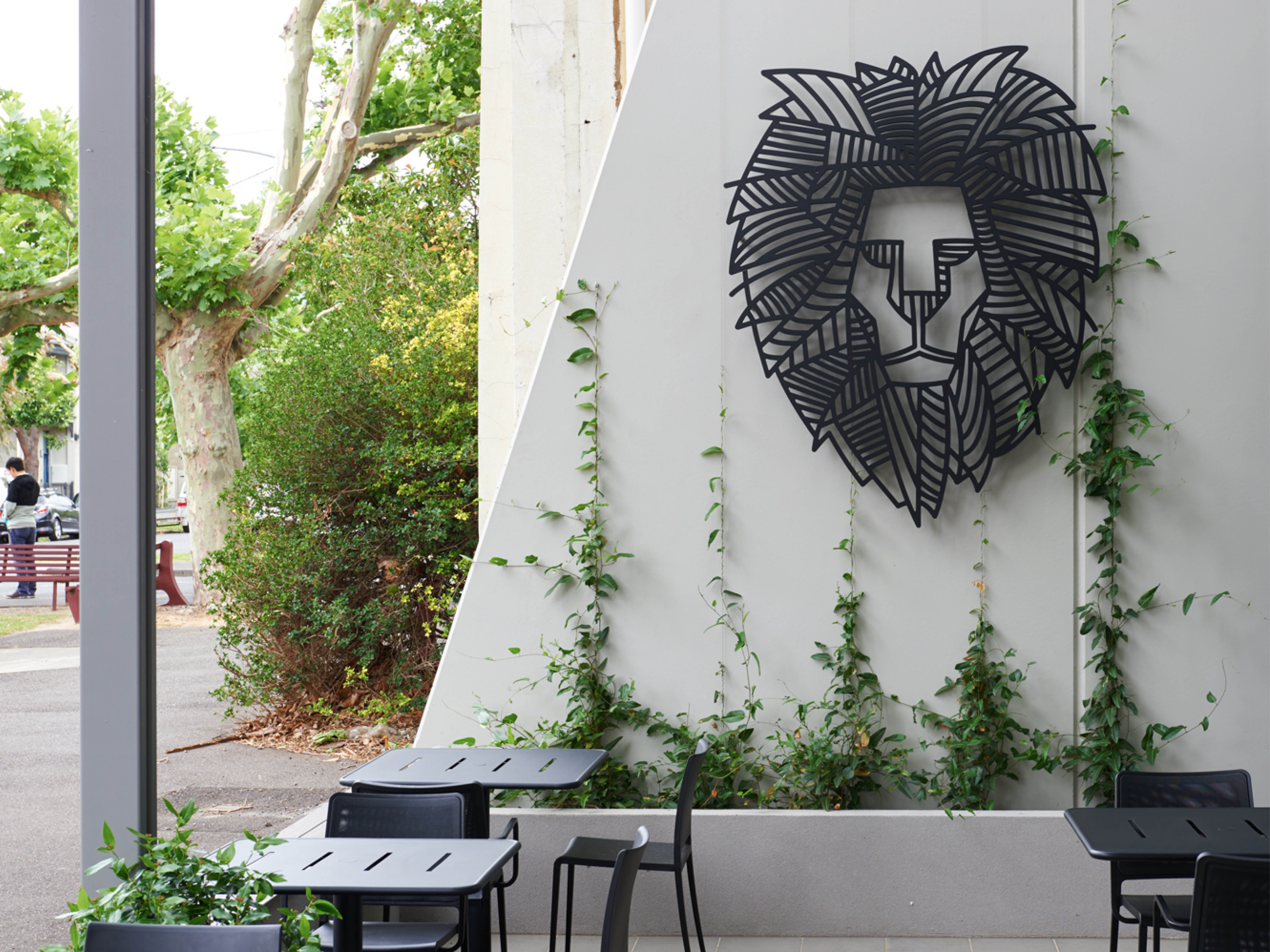
    Housed within the Emerald Hill Residence, our challenge in branding the open-to-public Lionshare Cafe was to find a solution that worked cohesively with the Residence whilst being visually detached enough to welcome non-residents. Under the directive of the Lions Club and CaSPA Care, Principle Design assisted in the naming of the cafe and developed a bold, contemporary brand that would appeal to the public whilst creating a friendly, inviting and accessible atmosphere for Emerald Hill Residents. The bold linear mark was used to create the large black acrylic external signage that is easy to identify and inspired by intricate metalwork. This was extended across branded coffee cups and napkins.

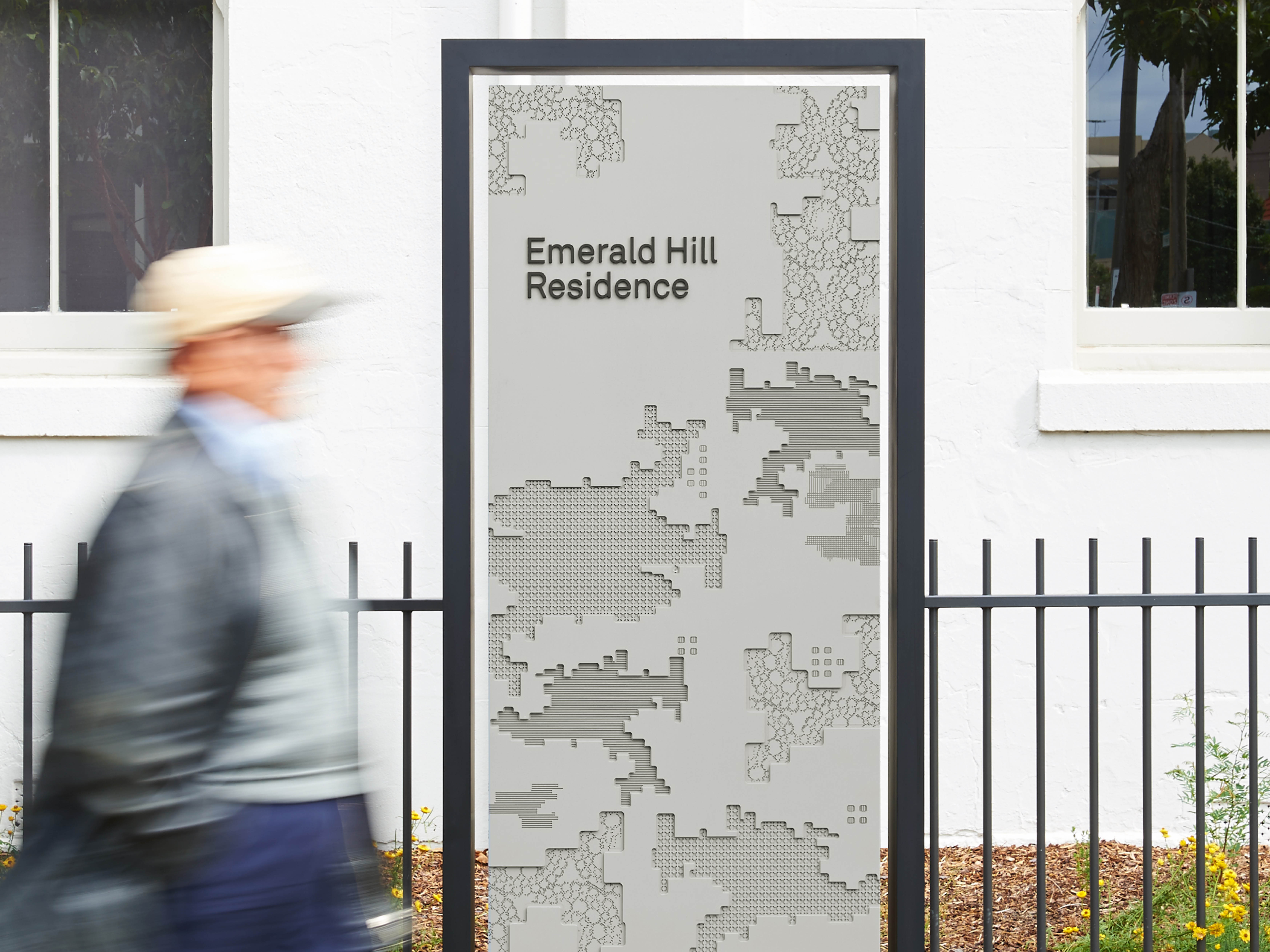
    The textured external totem signage that welcomes visitors and residents to the Emerald Hill facility was inspired by textures of the Spanish tiles that adorn a wall in the interior of the residency. Differing levels of depth and alternating textures were CNC Routed into acrylic to create the unique and highly tactile sign. The intricate, lattice-like textures create a rich and absorbing visual experience. Our aim was to make residents and visitors feel that their presence within the facility was valued by welcoming them with something unique and beautiful. A matte black steel border frames the sign and offers a narrow view of the wildflowers that grow behind.

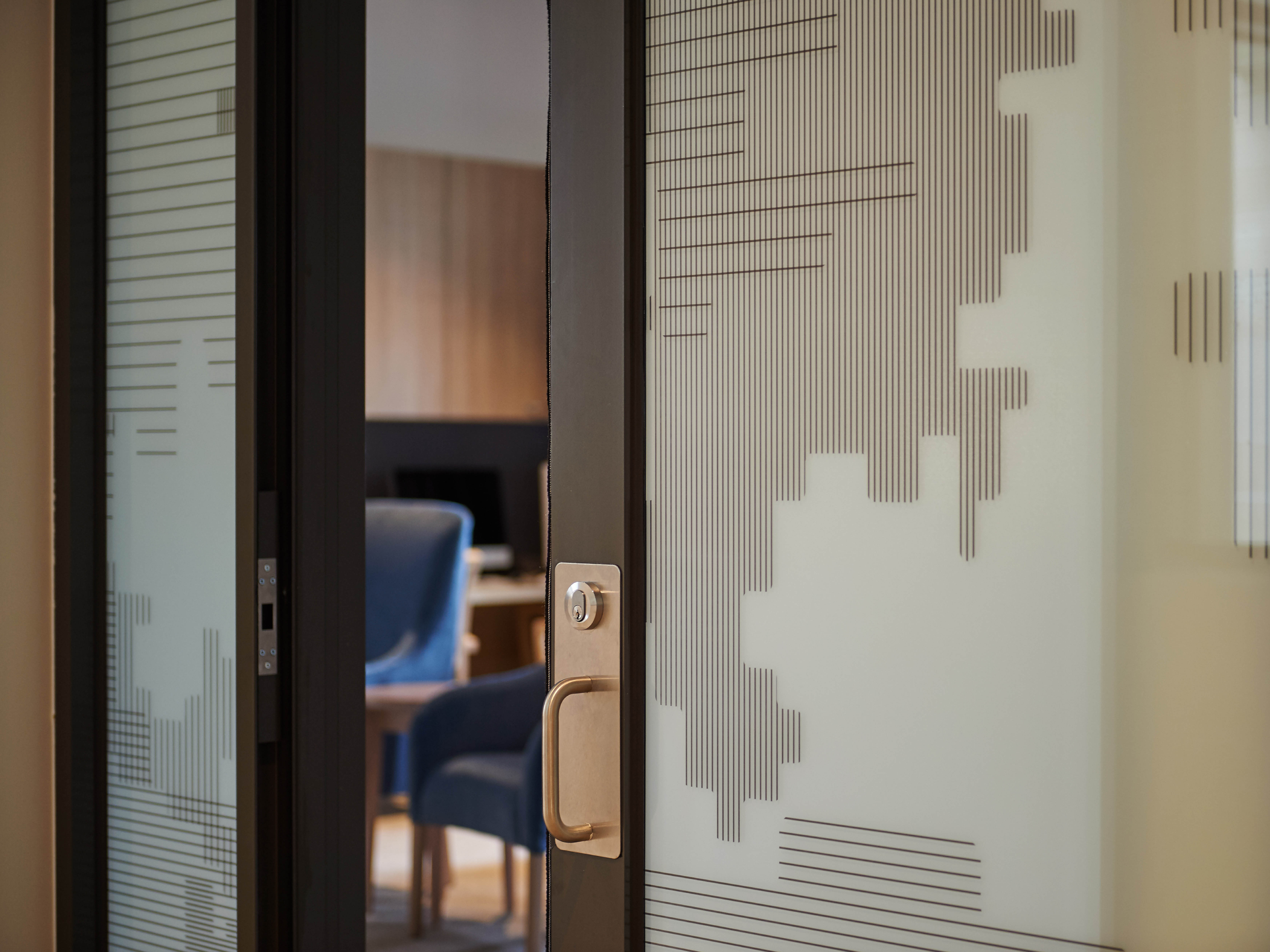
    It was extremely important that some areas within the residency offered privacy whilst also maintaining the light, open ambiance of the communal spaces within the building. The window decals introduced a pattern inspired by the textures of the Spanish tiles. Applying the pattern to clear glass allowed for partial privacy whilst it could be applied to frosted glass to create areas of full privacy where required. The crosshatched pattern added the impression of depth and texture whilst allowing light to enter the rooms.