Brother Design – Tatua Packaging

good-design-award_winner_rgb_blk_logo
  • 2020

  • Communication
    Packaging

Designed By:

  • Debbie Hyde

Commissioned By:

Tatua

Designed In:

New Zealand

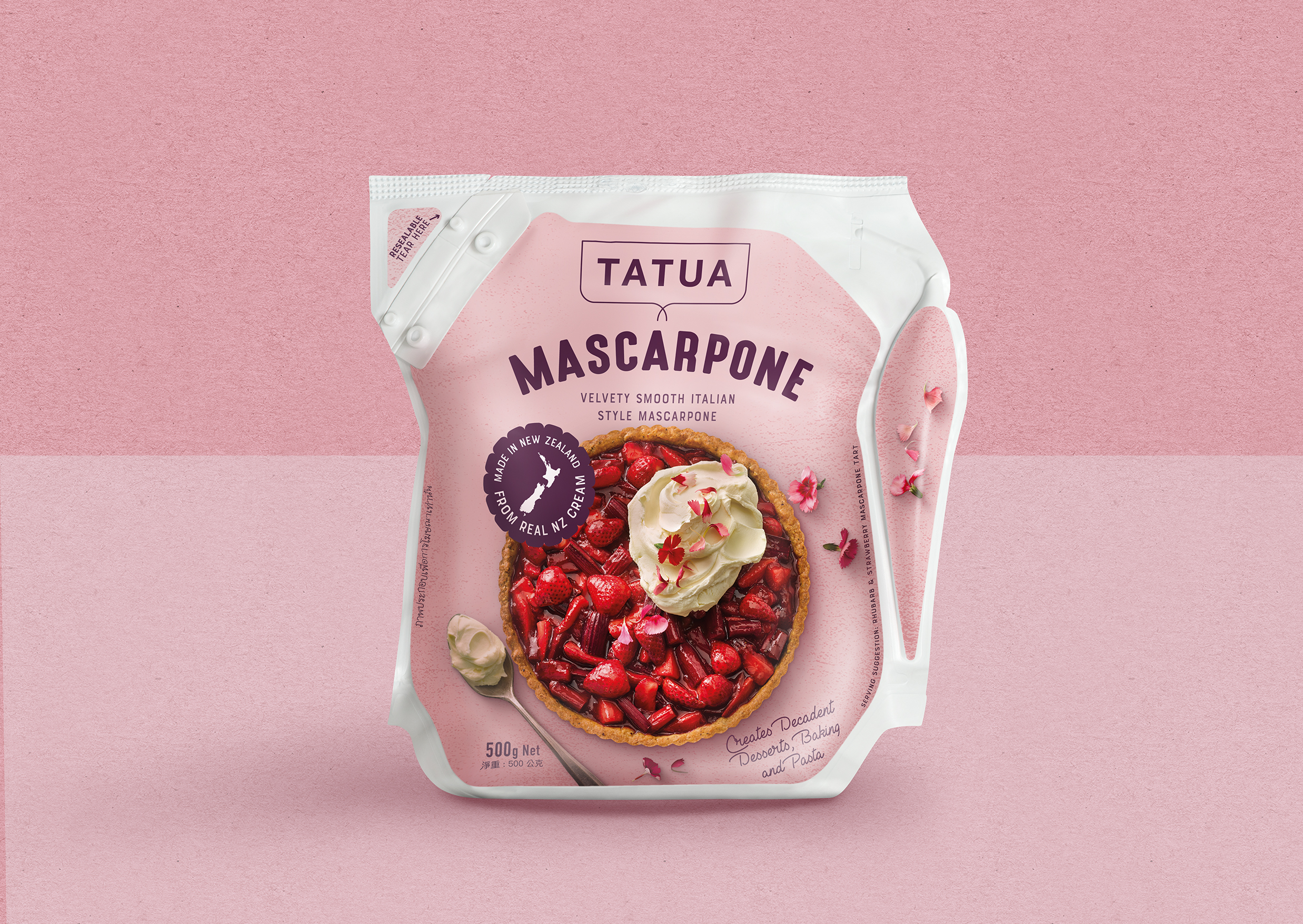
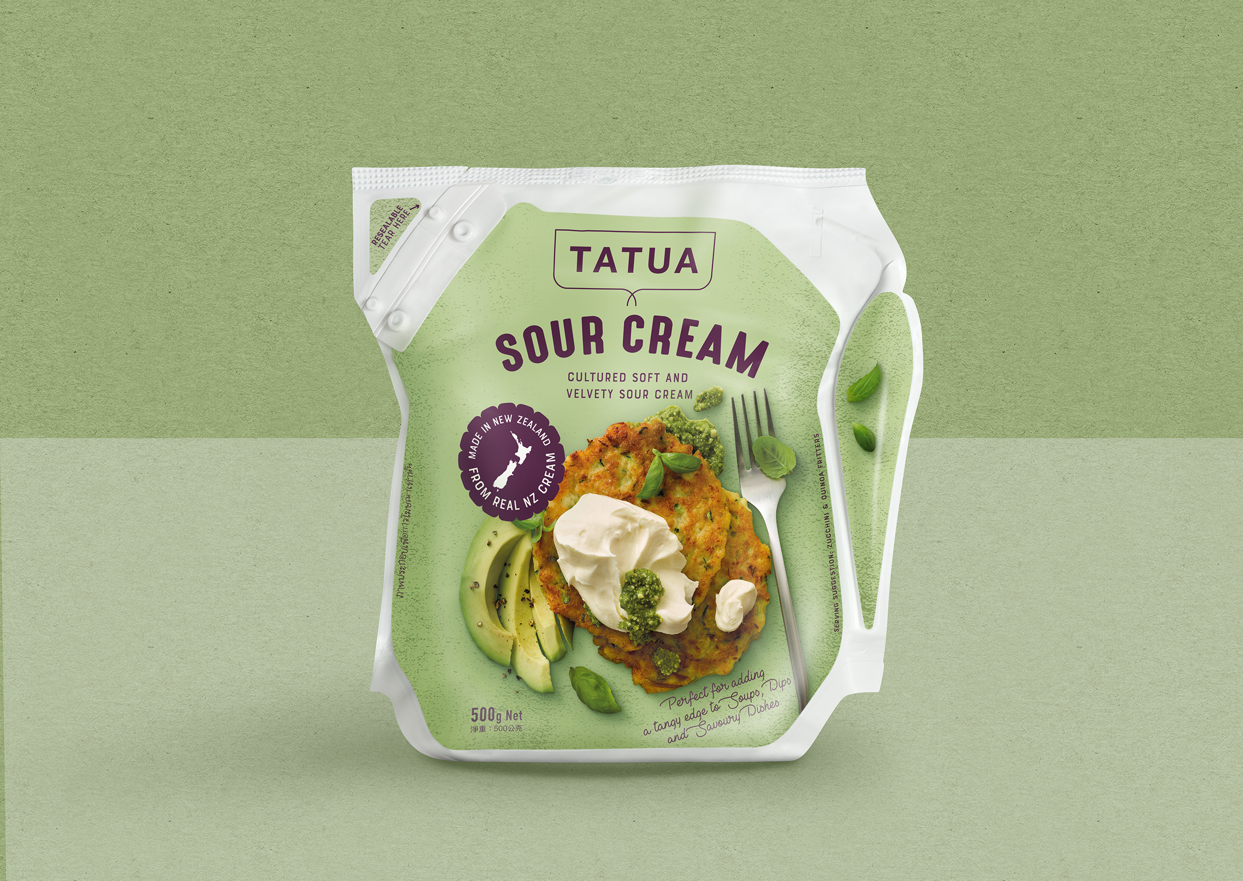
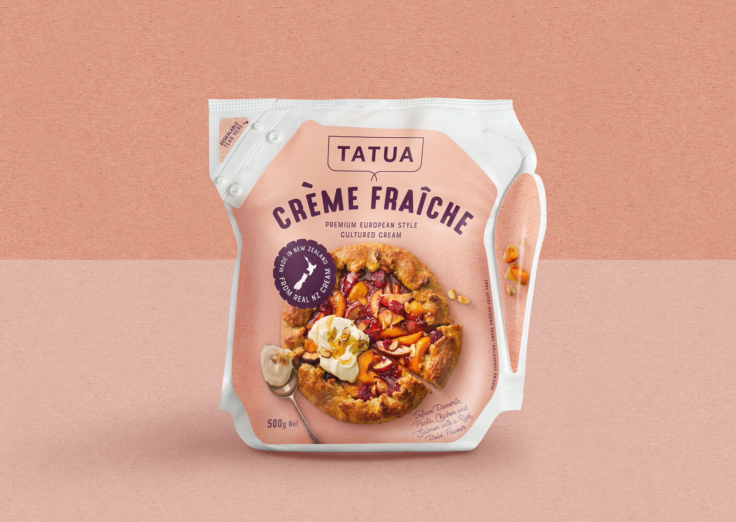
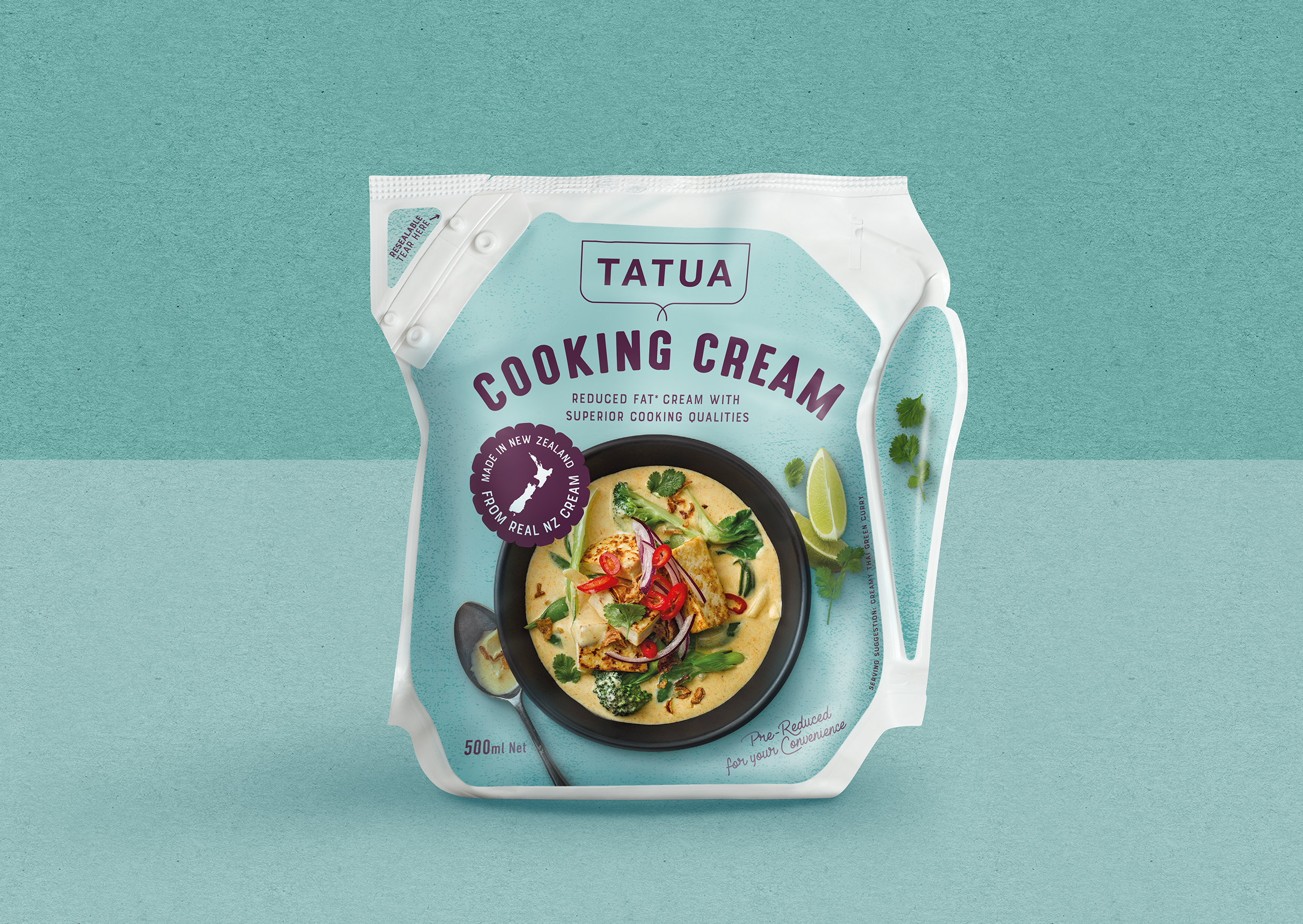
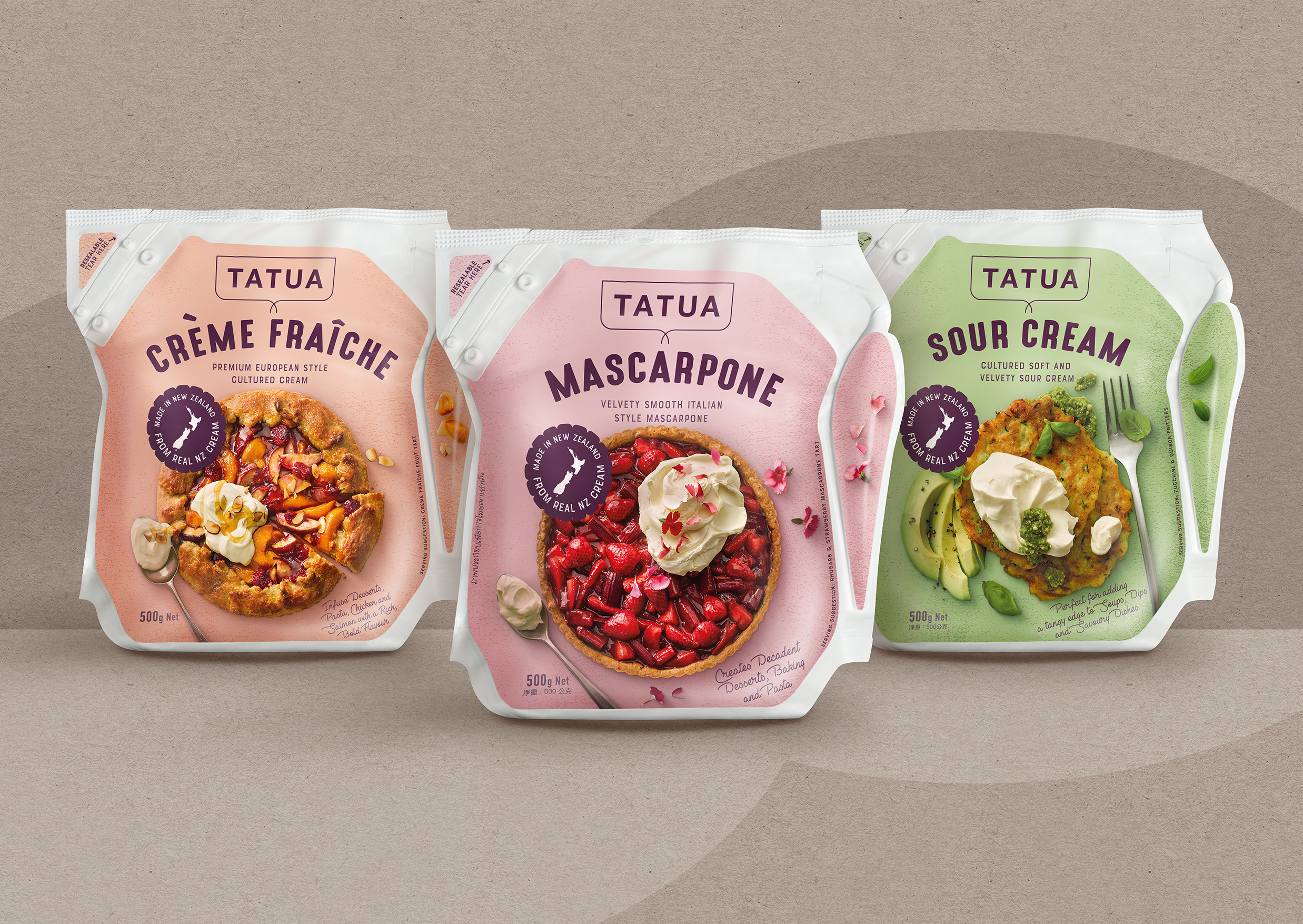
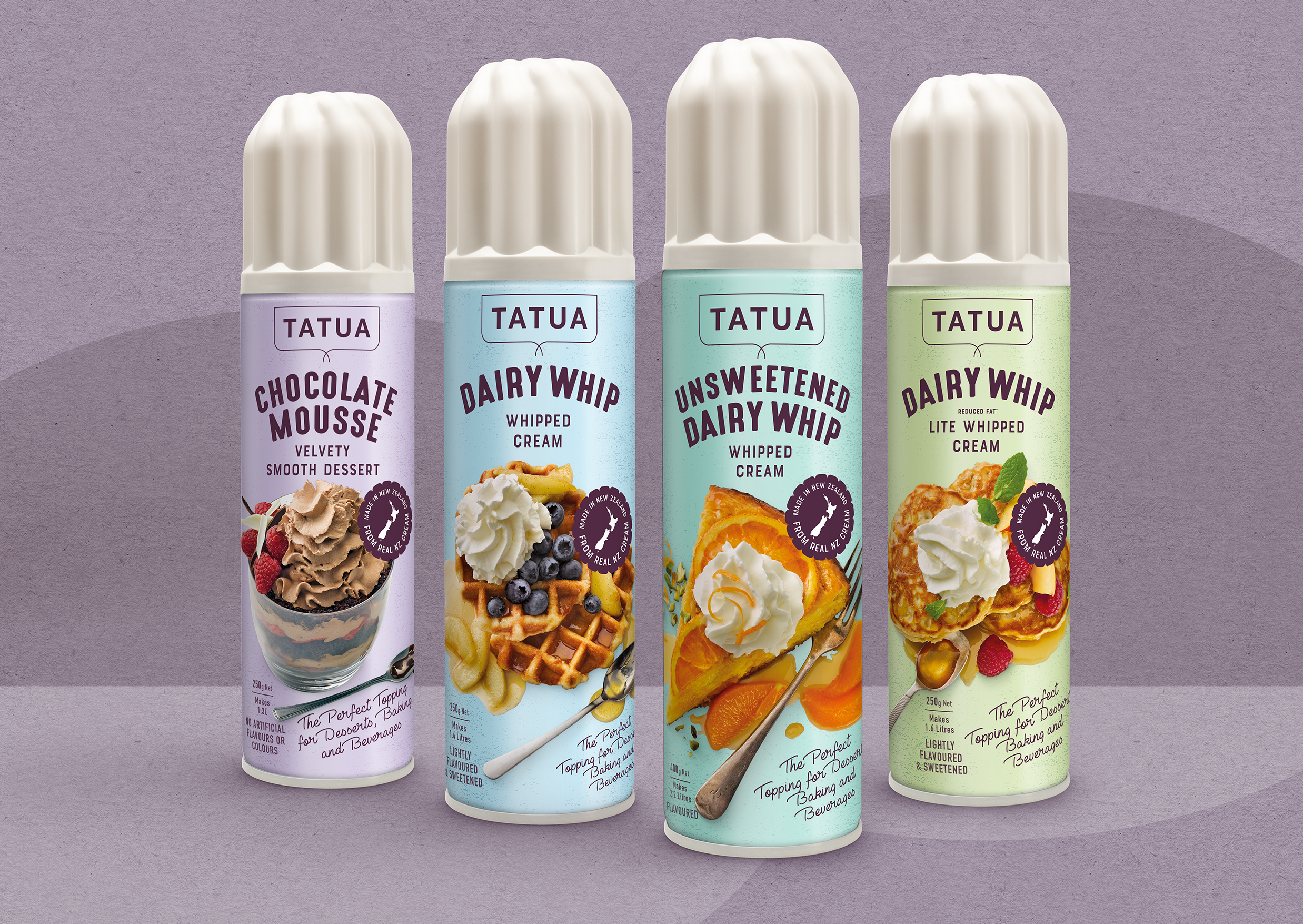
Tatua Premium Cream Products – Devising a coherent, mouth-watering look that delivers amazing stand out in the dairy chiller, and instant appeal with consumers.


  • CHALLENGE
  • SOLUTION
  • IMPACT
  • MORE
  • Create stand out packaging for a range of premium cream products for the domestic and export markets. Apply the design to a new resealable pouch format which easily stands up on shelf and is even easier to use, and also bring Aerosol ‘Dairy Whip’ cans into the same look.

  • The previous packaging had been created with more of a focus on foodservice buyers, our plan was to create packaging that would appeal to foodservice and retail consumers alike and work equally as well in the NZ market as it would overseas. What better way to inspire consumers than delectable food shots that also demonstrate usage of the products. We commissioned a food stylist to create recipes that were easy to make, but also had a small twist ie: Strawberry and Rhubarb Mascarpone Tart with a Hazelnut Spiced Crust. The recipes appear on back of pack and their website.

  • We knew getting maximum shelf stand out in a very busy category we needed to keep things simple. Therefore we created packs that were beautifully minimalist in a range of soft pastel ‘dairy’ colours that complimented the relaxed food shots that sat upon them. The addition of spoons and other utensils plus loose ingredients adds to the ‘real food appeal’ and makes the packs simply irresistable.

  • Irresistibly strong taste appeal is what makes this design a real winner with consumers.