NSW Government Branding

good-design-award_winner_rgb_blk_logo
  • 2023

  • Communication
    Branding and Identity

Designed By:

  • For The People

Commissioned By:

NSW Government

Department of Customer Service

Designed In:

Australia

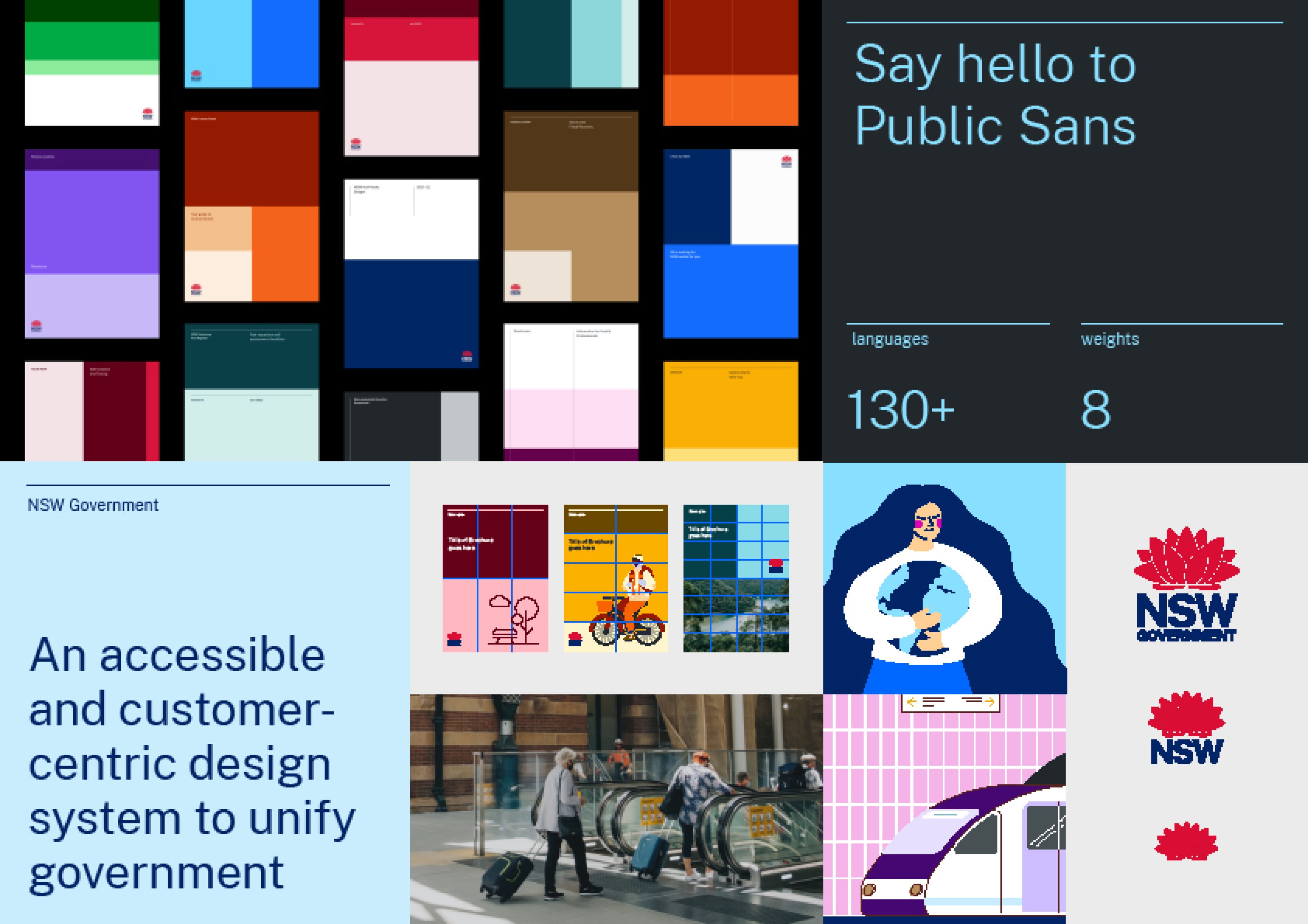
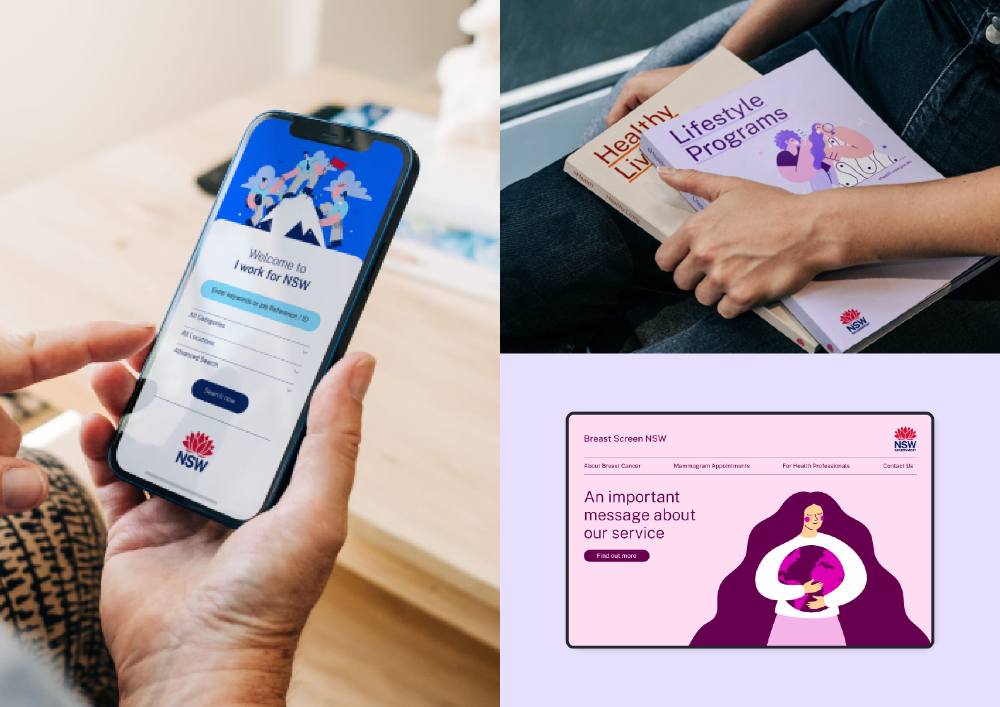
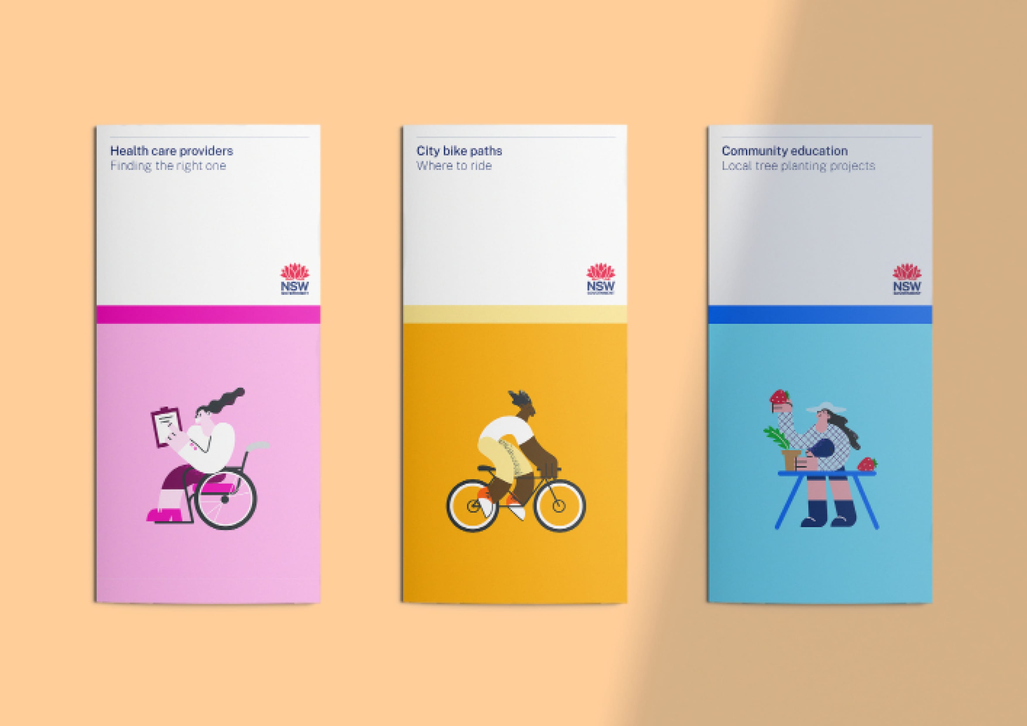
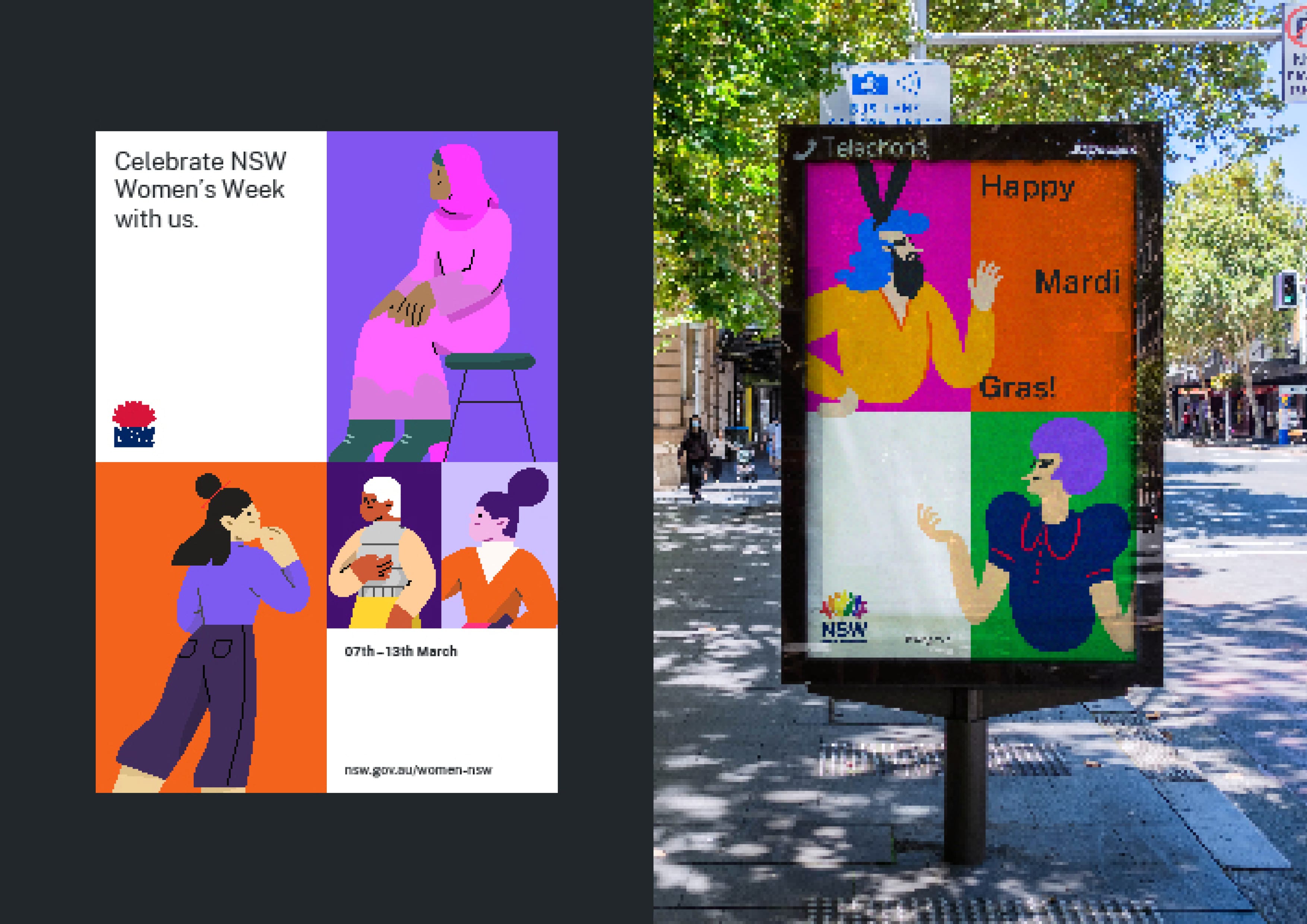
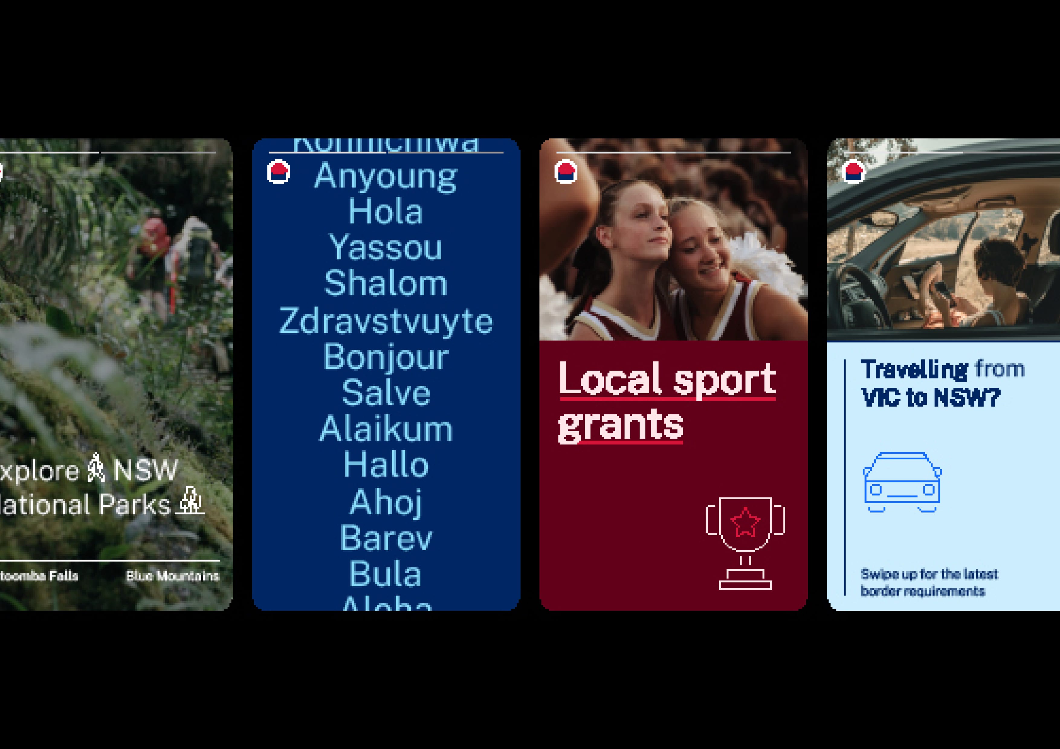
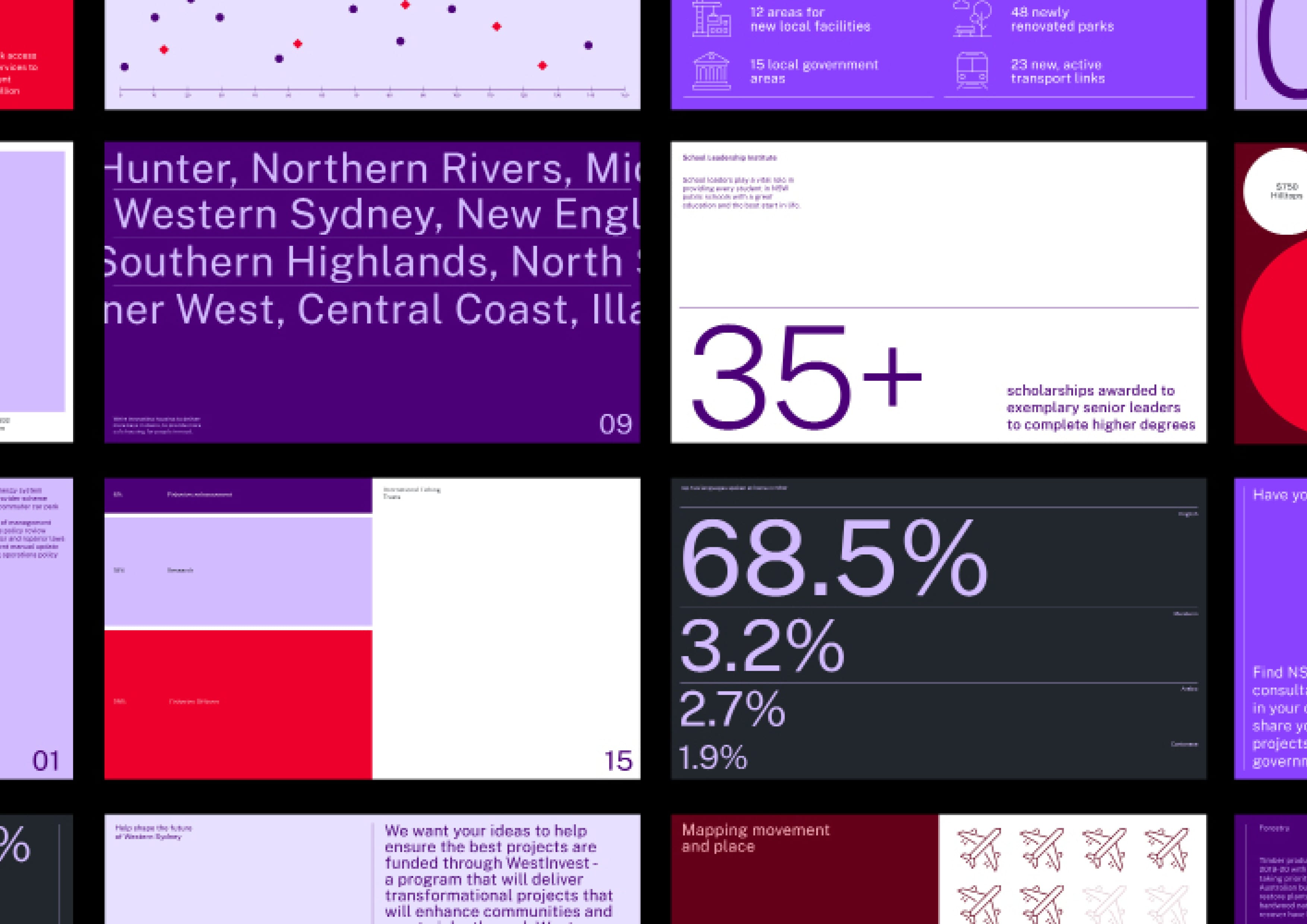
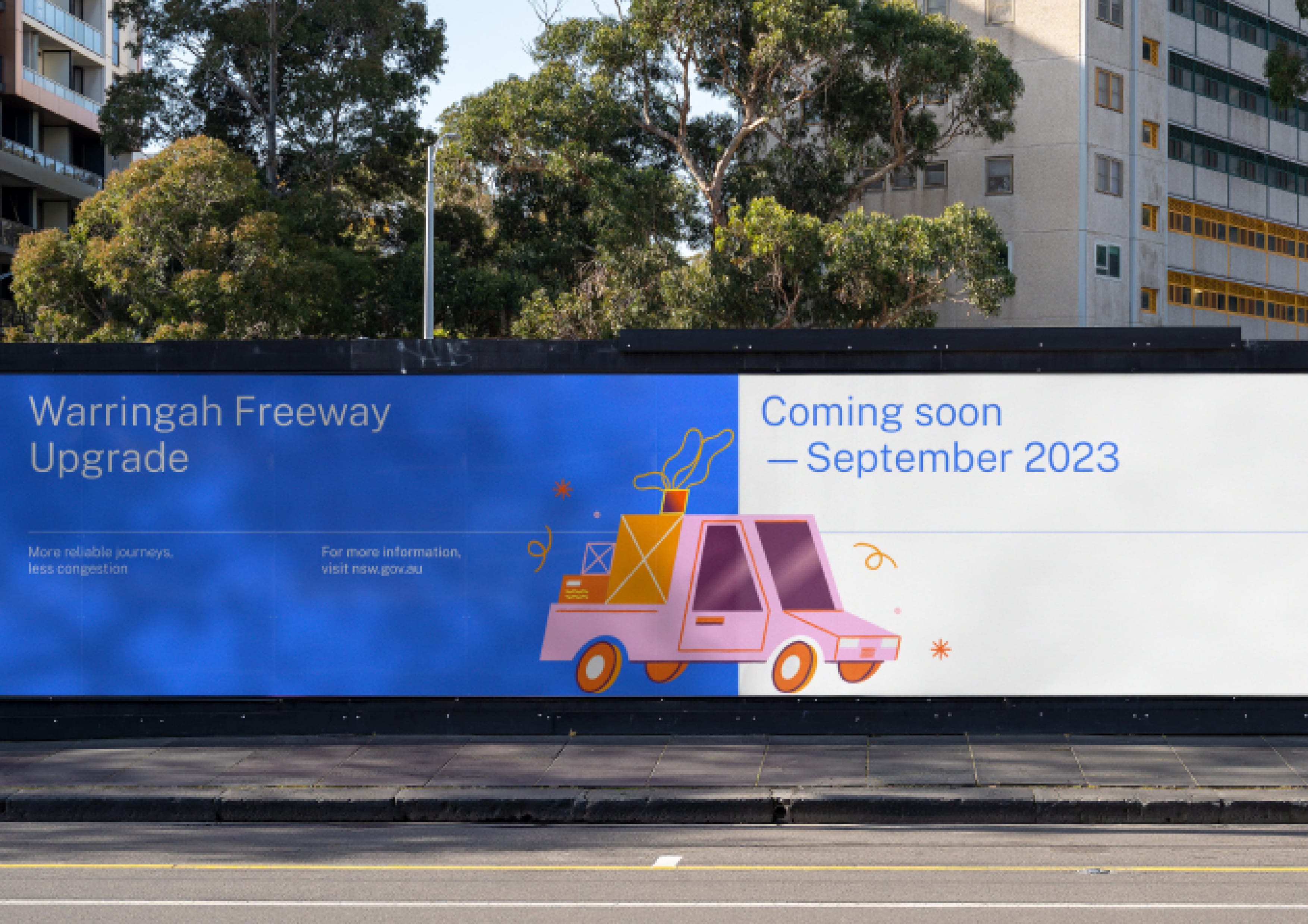
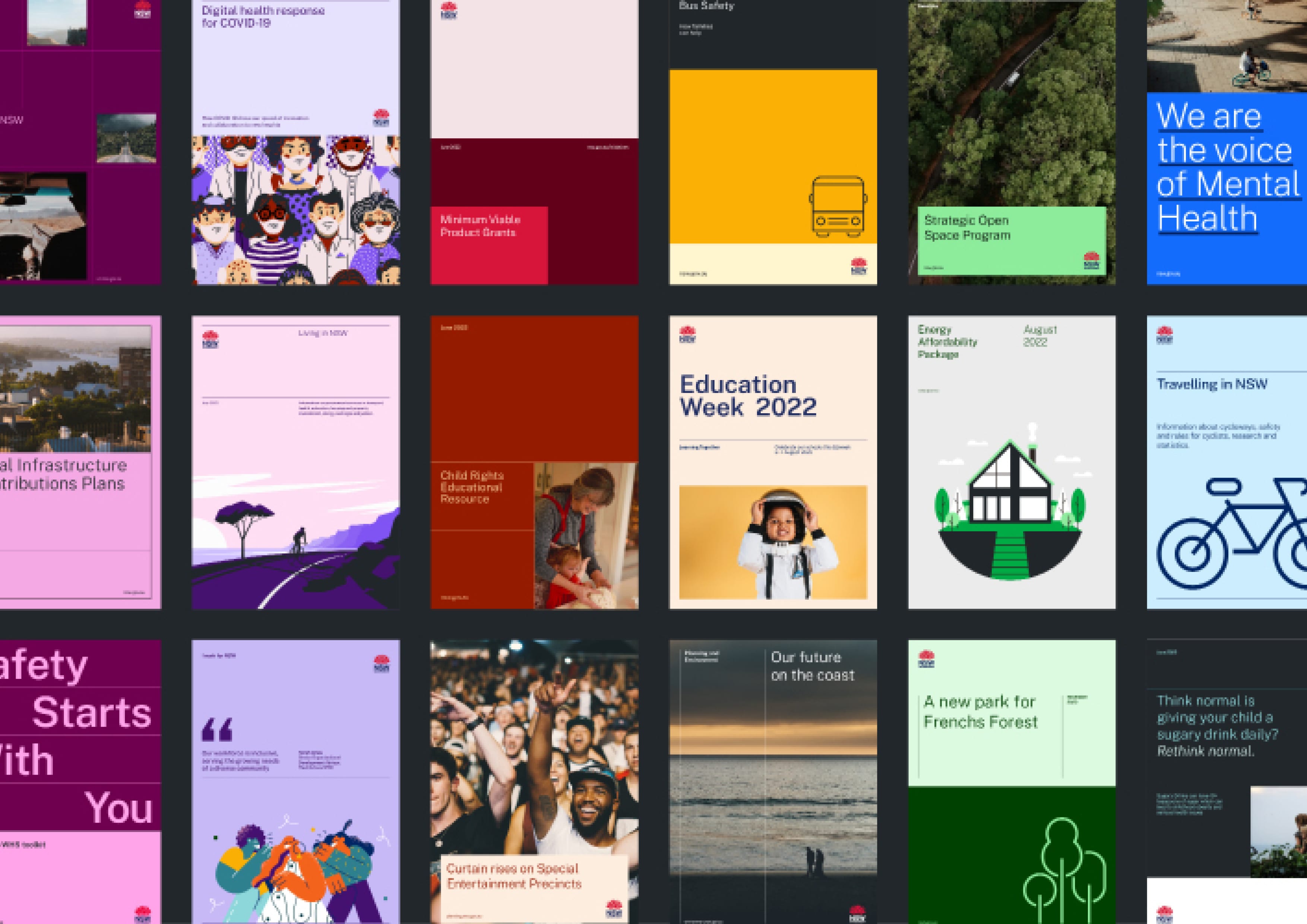
As the largest organisation in Australia, NSW Government manages a range of services and responsibilities across the state. A holistic identity system was designed to reduce complexity and drive equity across Government communications. The outcome is a simpler, more flexible and accessible approach that meets the needs of every citizen.


  • CHALLENGE
  • SOLUTION
  • IMPACT
  • MORE
  • The NSW Government has over 8 million customers and more than 800 external-facing brands. With the adoption of a masterbrand strategy in 2020, the Government aimed to bring greater purpose to how they communicate their priorities and engage with the public. Prior to this transformation, the NSW Government was responsible for managing a large portfolio of departments, brands, sub-brands and initiatives each with a multitude of individual brand systems. The shift was intended to increase attribution and understanding of the services NSW Government provides, whilst reducing the complexities typically associated with Government interactions.

  • A comprehensive identity system supports the needs of NSW Government and its citizens, with accessibility the driving factor behind each decision. The brand architecture model uses a typographic descriptor as a navigational device, removing the need for new, disparate brands. This eliminates the cost of bespoke logo creation and prioritises customer needs when identifying entities. A flexible framework creates recognisable structure and hierarchy across communications, while encouraging the modulation of brand assets to suit any subject. The adoption of Illustration, a powerful tool for conveying complex or intangible concepts, ensures a diverse reflection of people, locations, and services across communications.

  • In the truest spirit of service, NSW Government needed a system that communicates without compromise. This meant creating an approach that was inclusive by design and efficient in its delivery. By putting accessibility at the core of our system, NSW Government is an example of what an inclusive design system should be. The new identity has delivered on accessibility, customer-centricity, efficiency and flexibility. Since launching, it has been: – Embraced by the whole of Government – Placed in the hands of over 4,000 people – Implemented across hundreds of departments, services and initiatives – Heavily reduced costs associated with licensing, commissions and agency fees.

  • The primary function of Government is to represent, serve and support the diverse community of NSW. To assist them in fulfilling this role, the NSW Government brand must also work for everyone — regardless of their ability or the diversity of their needs. We created a design system that prioritises inclusion and accessibility, ensuring each and every citizen can access services and engage with their Government. With over 13 million Australians living with a long-term vision impairment, readability and legibility were of primary importance. Coloured text combinations were tested against the WCAG Guidelines to ensure they met AA and AAA standards. The open-source typeface, Public Sans, delivers on key accessibility requirements — from larger ‘x’ heights, to more open counters, and clear differentiation between similar letter forms. New infographic styles were also created, with added requirements such as colour contrast, patterns and labelling to improve visibility of information for all readers. Additional components were also updated for greater accessibility in the design system. Adjustments were made to the Waratah logo, improving responsiveness and legibility of the lettering across all sizes and media platforms. Together, these changes allow NSW Government to deliver on the right to communication, without compromise.