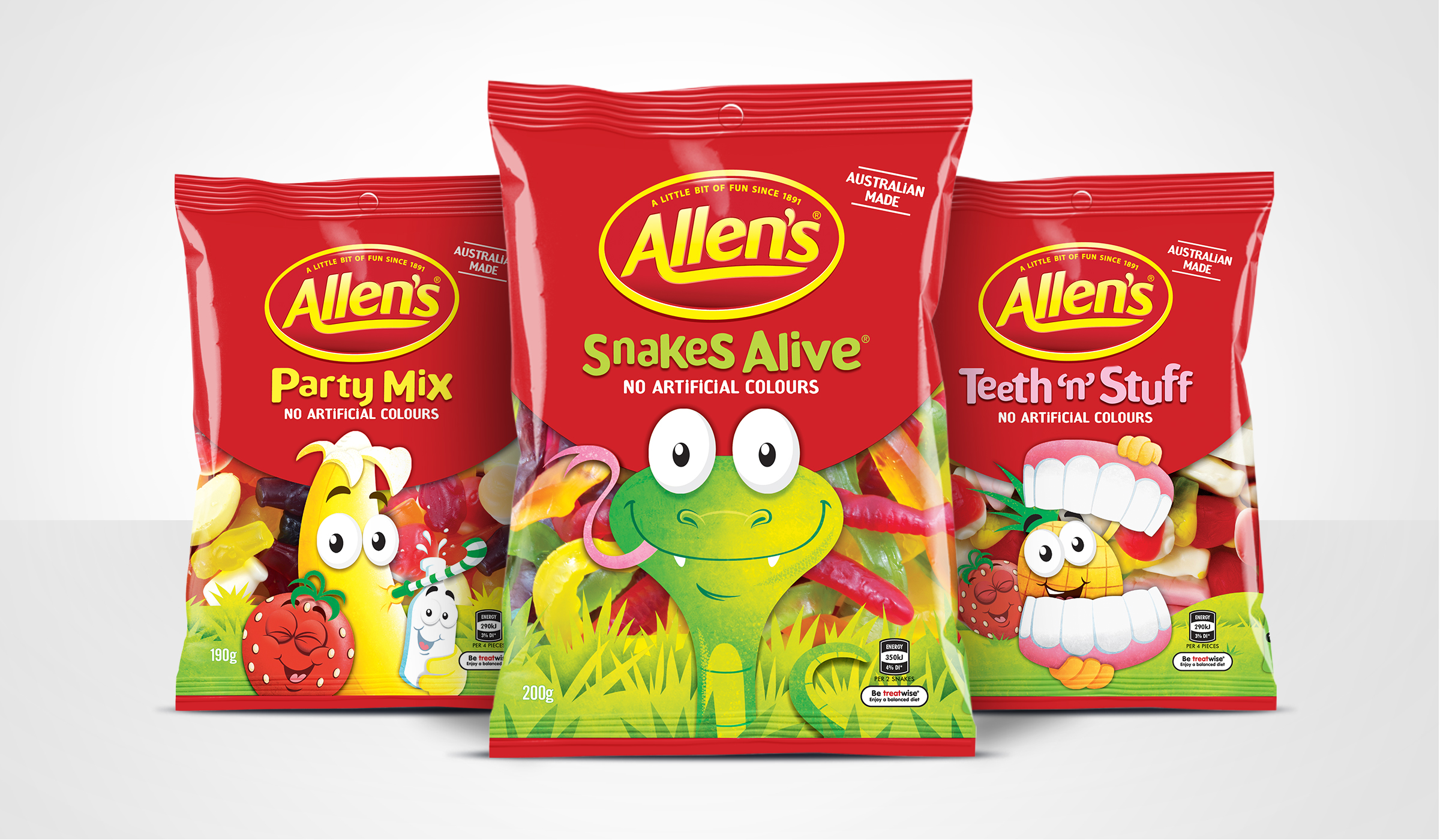
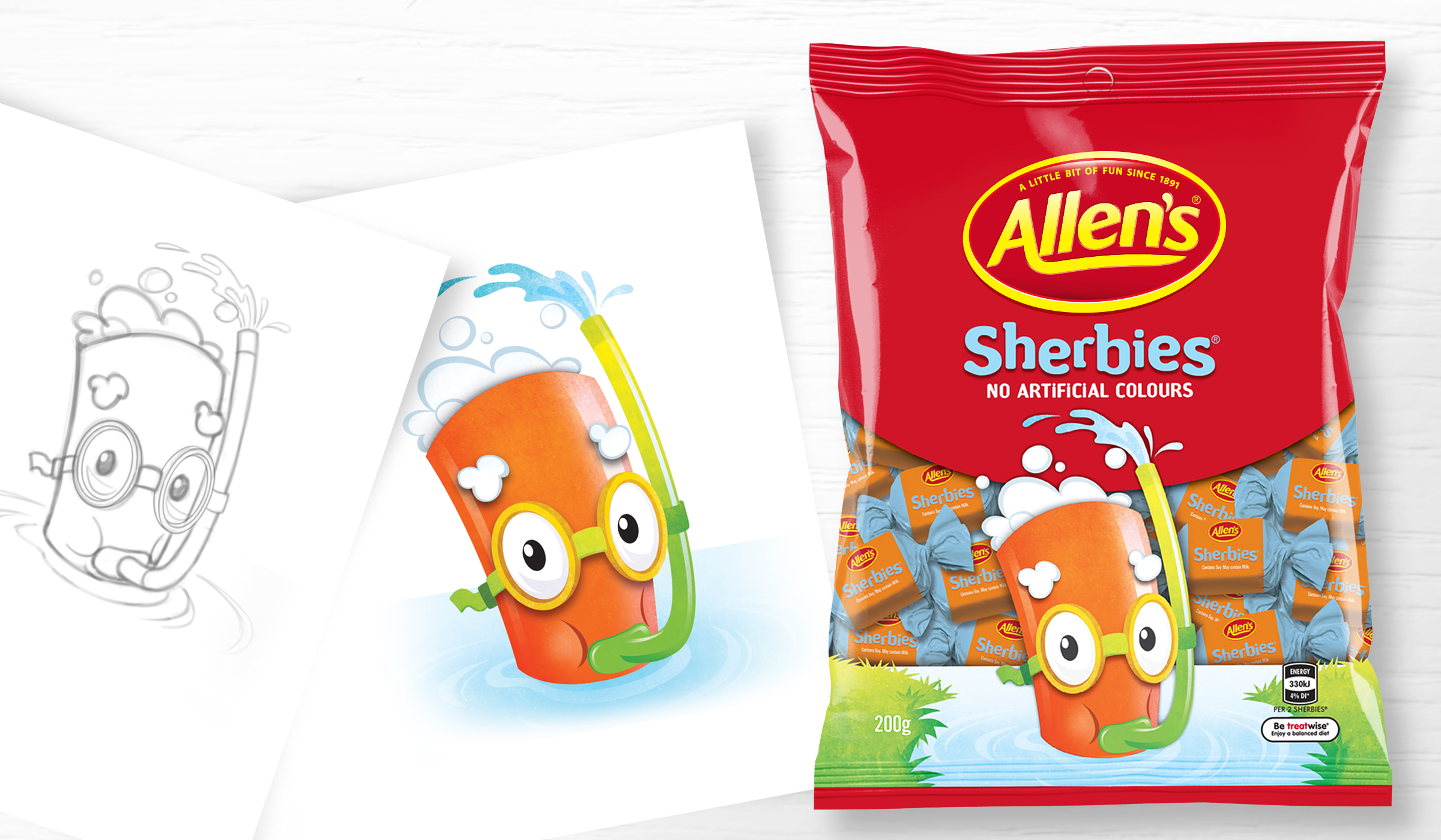
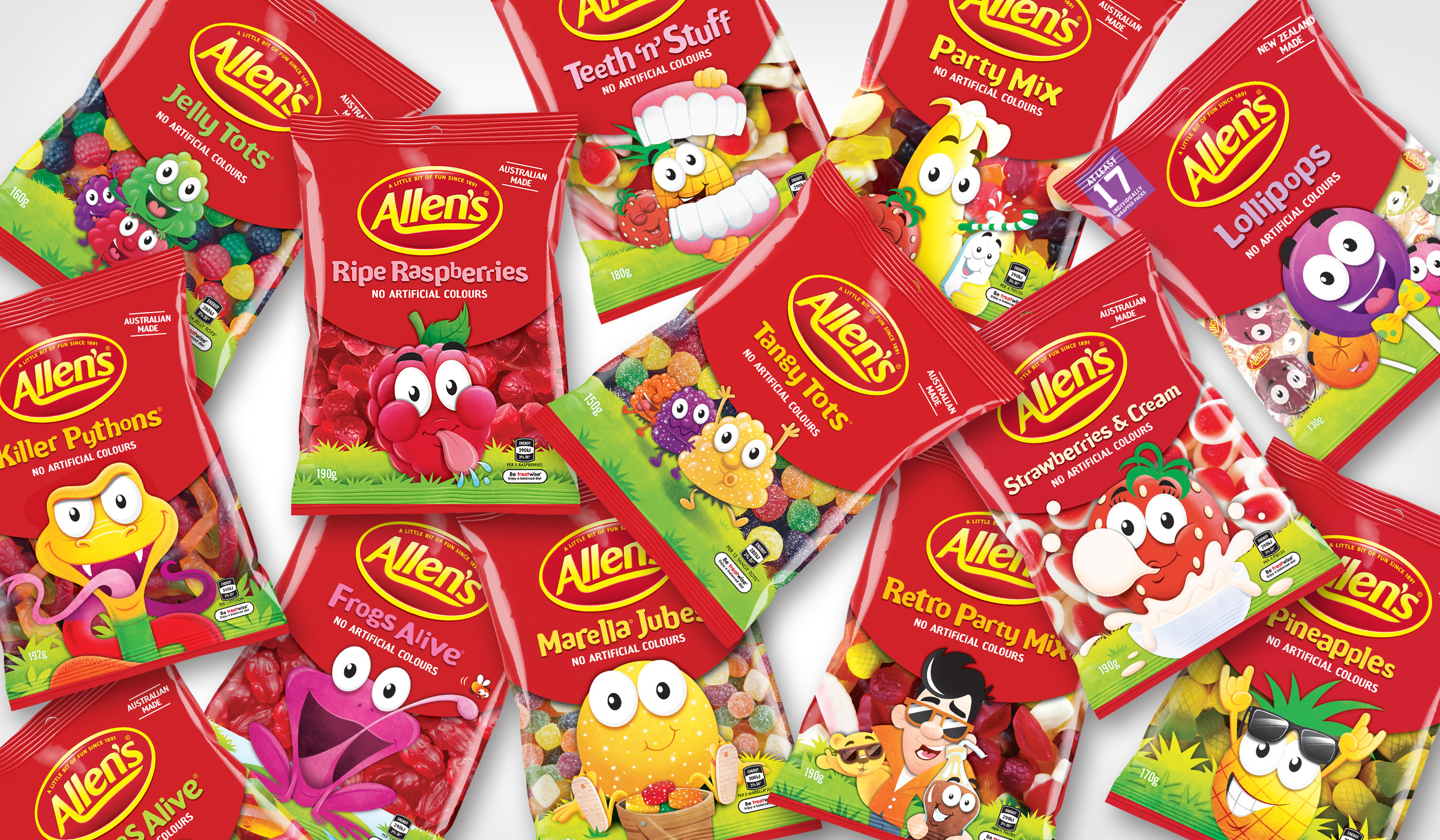
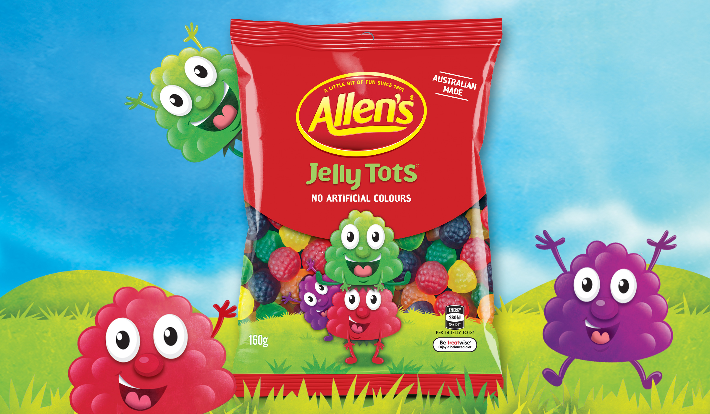
Allens Range

  • 2016

  • Communication
    Packaging

Designed By:

  • Austin Marsden - Executive Creative Director
  • Stuart Robson - Design Director

Commissioned By:

Nestle Australia

Designed In:

Australia

Reinvigorate the Nestle Allen’s brand to be the stronghold driving force within the confectionery category, by repositioning and evolving the packaging design, whilst tackling head on, growing consumer awareness around sugar and artificial colours & flavours.


view website

  • CHALLENGE
  • SOLUTION
  • IMPACT
  • Not only was it critical for us to attract the shopper at point of purchase, we needed to engage with them, especially in light of growing consumer awareness around sugar and artificial colours and flavours. Our solution was the use of simple naïve illustrations and a typography style that helped create more natural themes in a compelling way.

  • The other main focus for the packaging design, if we were to succeed against a strong competitive set, was to highlight the important key message of “no artificial colours”, an initiative from Nestle to move to 100% no artificial colours across its entire range, giving consumers certainty that all of their Allens lolly favourites include only naturally derived colours. The change in focus around these elements on pack also increased the importance of the products permissibility whilst still remaining true to the Allens tagline - A little bit of fun since 1891.

  • Retaining its bright and colourful look, the new Allen's packaging evolution has connected on a emotional level, yet is now seen as a more relevant choice for today's Aussie parents & kids continuing to create smiles for the whole family.