A Sound Life Rebrand

good-design-award_winner_rgb_blk_logo
  • 2022

  • Communication
    Branding and Identity

Designed By:

  • Toben

Commissioned By:

A Sound Life

Designed In:

Australia

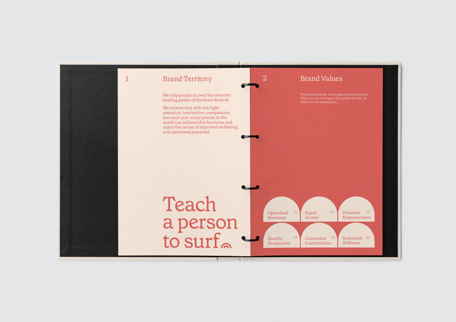
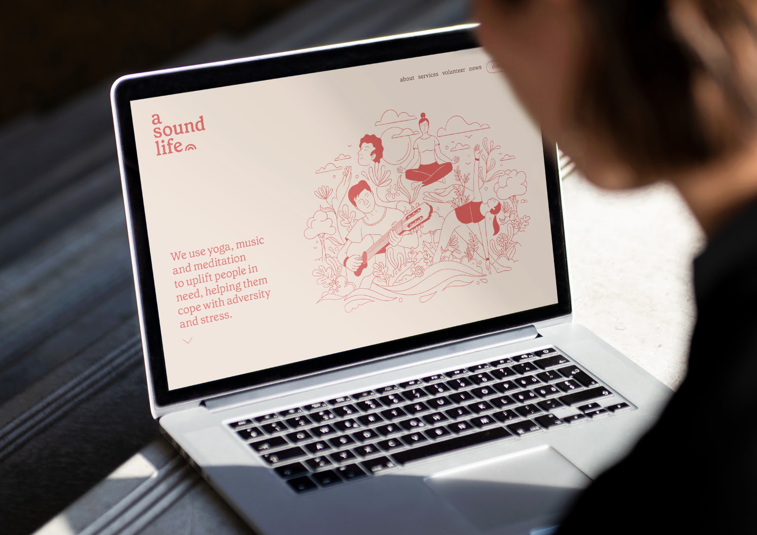
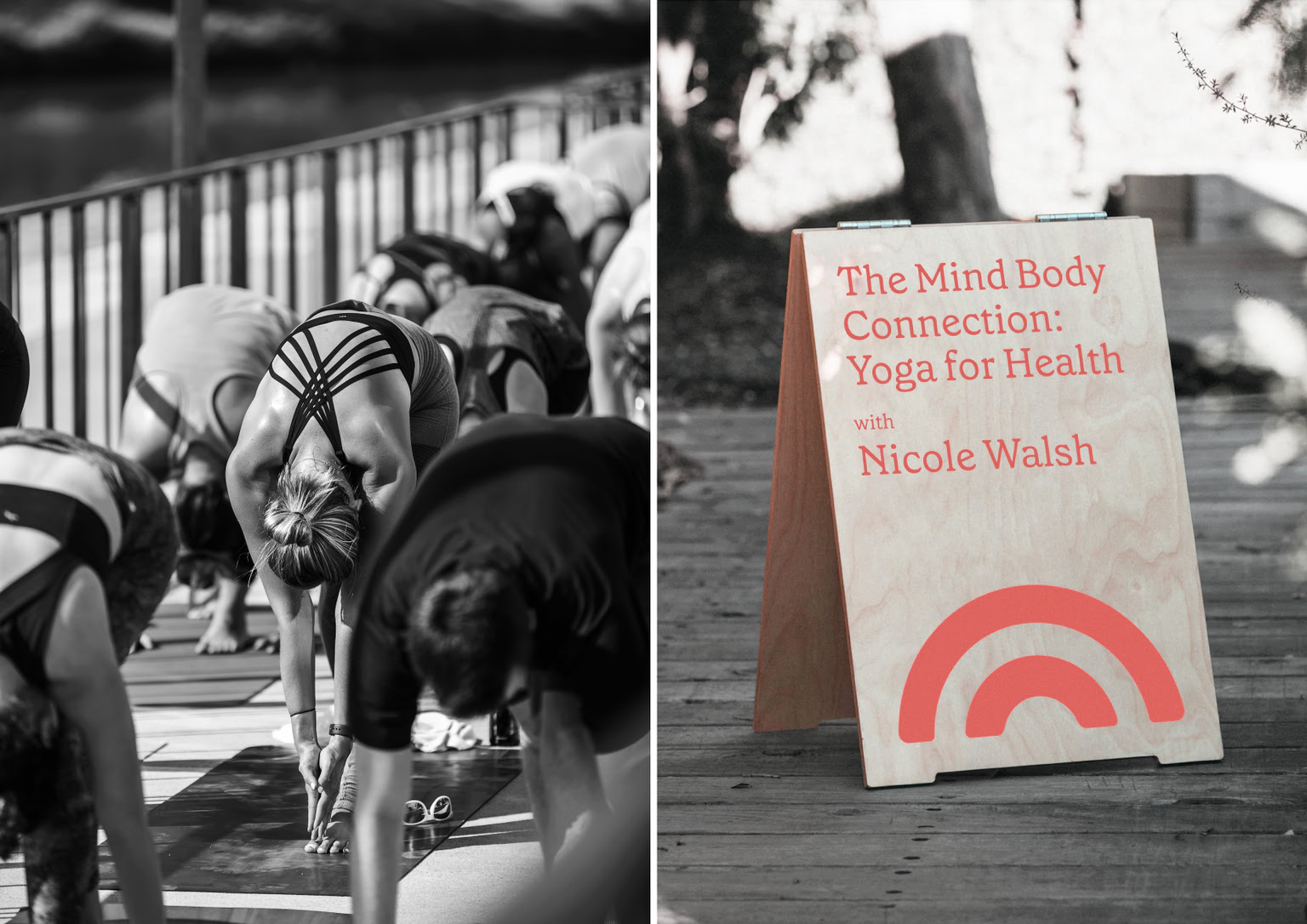
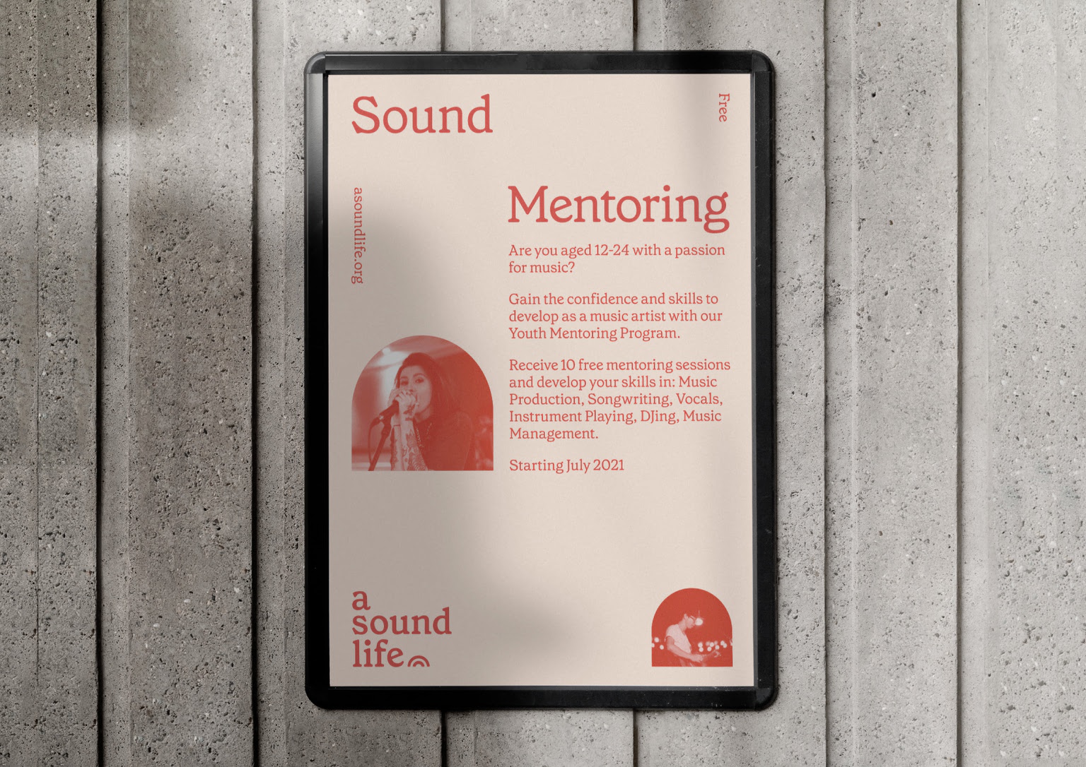
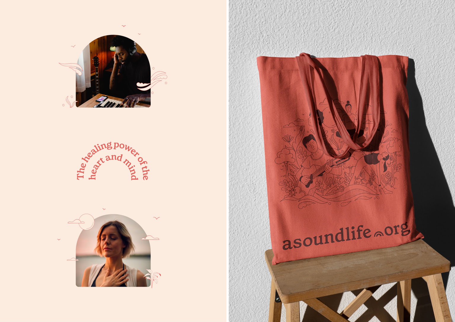
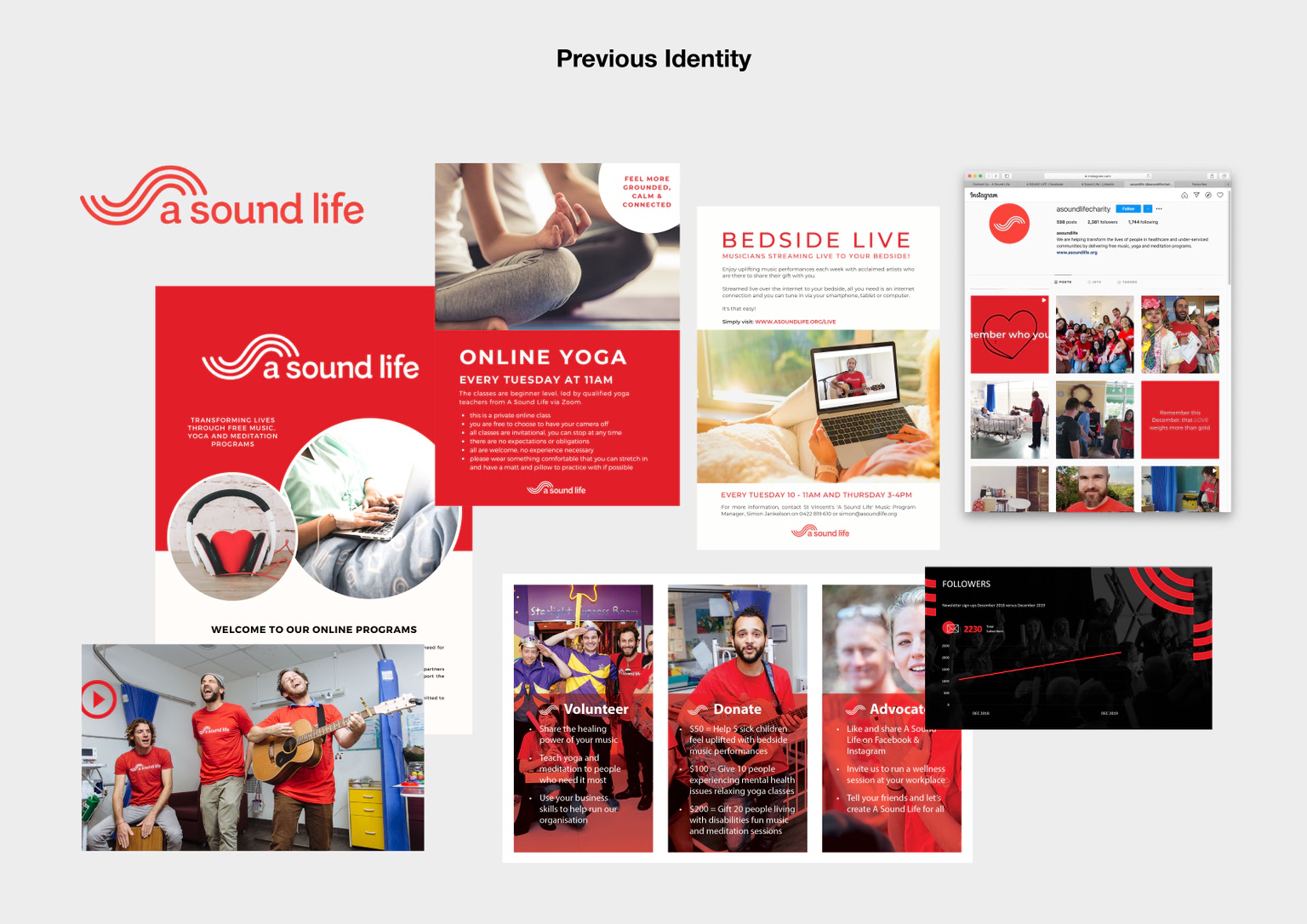
A Sound Life is a charity focused on uplifting people in need by helping them to cope with adversity and stress through the positive practices of music, meditation, and yoga.


view website

  • CHALLENGE
  • SOLUTION
  • IMPACT
  • MORE
  • A Sound Life approached Toben to help refocus and redesign their brand through considered strategy and honest, authentic design. The organisation found itself in a position of incredible growth and flourishing support, yet there was a lot of confusion – internally as well as externally – around the organisation’s true purpose. Due to a multitude of services (music, yoga and meditation) as well as audiences, the brand had become fragmented. It urgently needed to sharpen its messaging into a single concept to galvanise the organisation and propel it forward. It became clear that it needed to rediscover its unifying underlying purpose.

  • The strategy unearthed the underlying connective purpose of A Sound Life: to not just help people to heal, but to empower them to heal through the introspective healing power of the heart and mind. “Teaching a person to surf” guides those in need to live a more resilient and fulfilled life. The brand name was maintained, and the logo mark adapted from the original sound wave to a holistic, cause-led, ray symbol. The visual brand was shifted towards a warmer and more soothing tone. The brand illustration reflects the organisation’s three deliverables, with photography focusing on the personable, grass-roots foundations.

  • By shifting from a ‘practice lead’ organisation to a ‘cause lead’ organisation, the new brand sets A Sound Life on its journey from charitable organisation to a valuable social enterprise. The clarity of the new brand strengthens the organisation’s purpose and support both internally and externally, across volunteers, participants and donors. The new visual identity is single-minded and strongly recognisable in the landscape of charities; and works seamlessly in the context of music as much as meditation, for a very diverse audience.

  • Given the growing support of A Sound Life, Toben opted to maintain as much continuity with the previous brand identity as possible, and was adamant to change as little as possible, and only as much as needed to support the new brand strategy and purpose. The name was therefore a fundamental element that was to remain. However, given the organisation’s origin as a music charity (playing in children’s hospitals), the focus on music was much too prominent as a combination of the name and logo mark (sound wave). The new mark gives a nod to the original mark, but turns the waves into rays – a holistic idea that speaks to wellbeing. A similar approach was taken to the colour scheme, with a shift from the previously prominent red key colour to a warmer and less contrasting palette around the original tone.