World Masters Games NZ Office Interior

good-design-award_winner_rgb_blk_logo
  • 2017

  • Communication
    Branding and Identity

Designed By:

  • 485 Design

Commissioned By:

World Masters Games 2017 Ltd

Designed In:

New Zealand

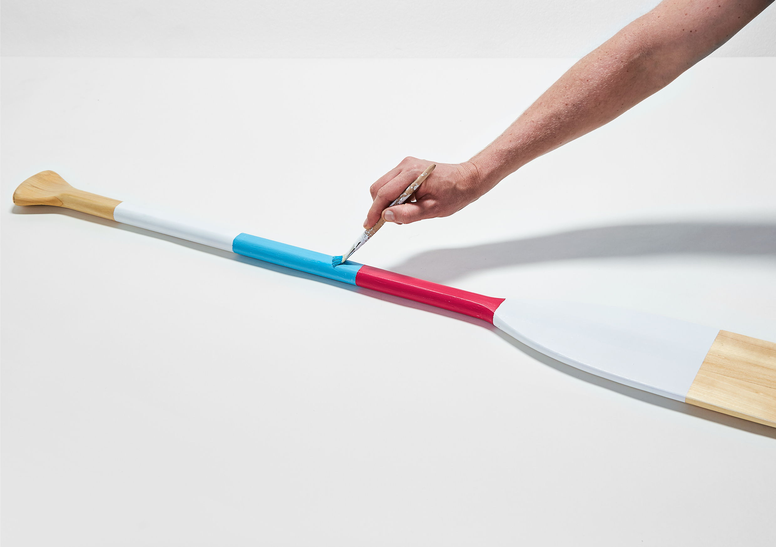
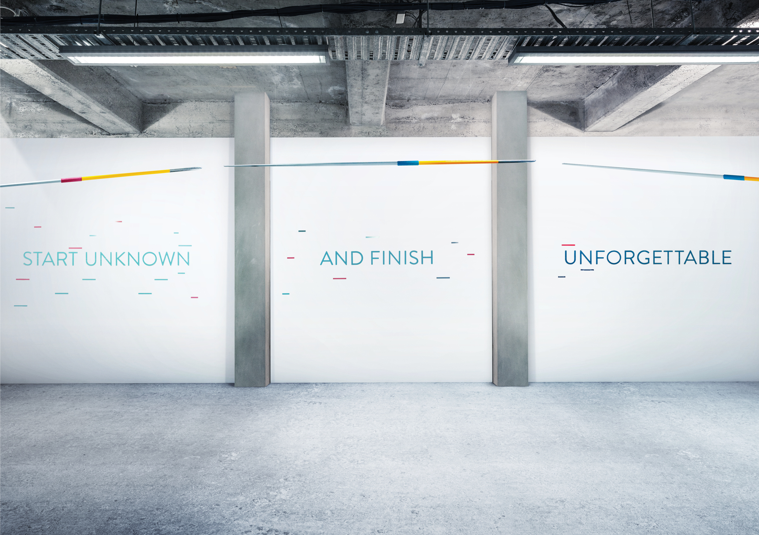
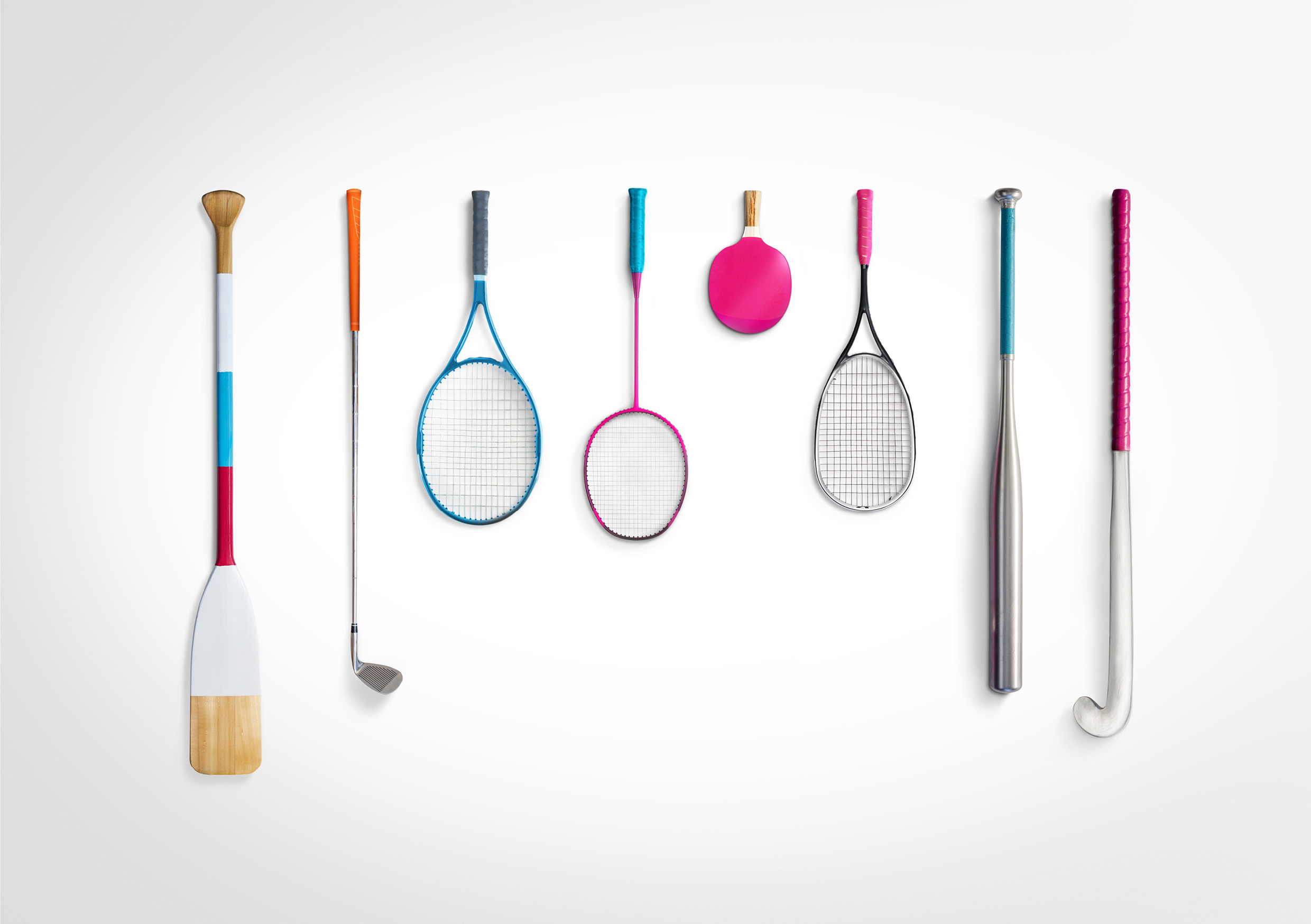
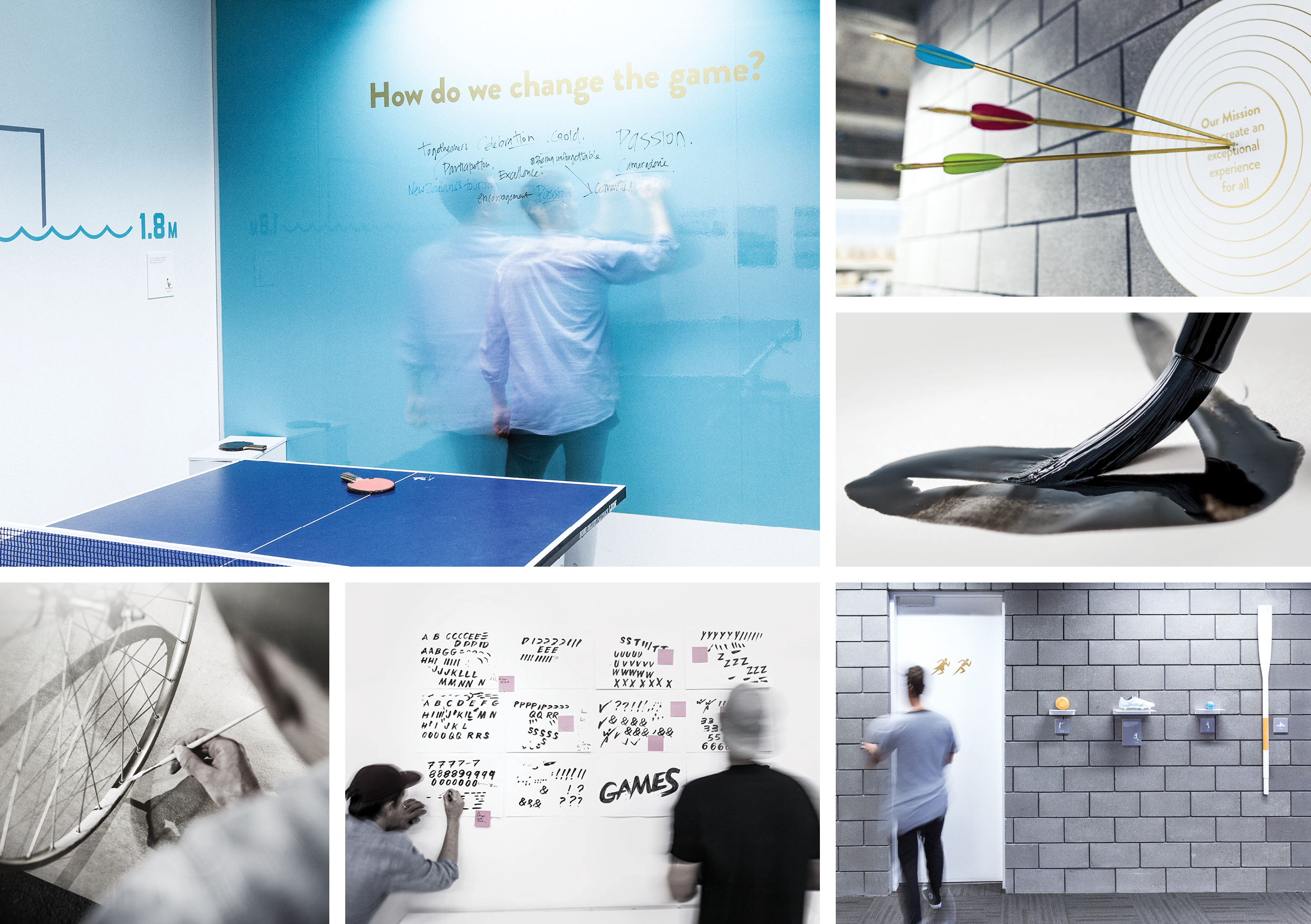
Sport is an art-form highlighting skill, craft and genius – the Master Stroke.
Through this expression we applied expressive paint to 28 sport objects and installed them throughout the office as works of art. Each one carried a story of an unforgettable sporting moment. An interior celebrating the ‘love of sport’.


view website
view facebook
view twitter

  • CHALLENGE
  • SOLUTION
  • IMPACT
  • MORE
  • The office environment is a visual manifesto of what it means to be unforgettable, to be a contestant in The World Masters Games. Sporting equipment for each of the 28 sports was integrated into the office, turning them into works of art. Featured underneath were short, inspiring stories of sporting moments from the Masters. For example the javelins mounted from the ceiling, captured in mid-flight, carried the incredible story of the furthest throw by an 89 year old competitor. It needed to be about more than just winning, but to embrace the joy of taking part - in other words 'For the Love of Sport'.

  • Like an art gallery of full of interesting sculptures, the 28 sporting objects are integrated in the office environment so they can be discovered and enjoyed. There are playful and unexpected moments that celebrate each sport. From the golden glove at reception containing complimentary mints, to the grandstand seating where guests can wait for their meeting. Basketball nets hang suspended over rubbish bins, actual weights act as door stops and the boardroom table is a table tennis table.

  • Wherever people looked in the office, no matter where they sat or stood, we sought to remind and motivate them about by the mission of the games. “To start unknown and finish unforgettable'. By using the sporting objects themselves to interact with, displayed in a way they have been captured in time, creates a space that is engaging and fun to work in. This truly reinforces the brand essence 'For the Love of Sport'. The brand colour palette is vibrant and energetic and helps break up the traditional office environment.

  • Our small budget meant we had to be resourceful. The 28 sporting objects were collected and donated from each of the key sporting bodies. These were then hand-painted in our key brand colours and displayed in a trophy-like manner. We collaborated with a engineering production company to professionally install the sports objects.

    The office is a vibrant place that is enthusing staff and visitors alike. Each of the 28 sporting bodies are proud to be represented in such a dynamic way. The importance of reminding staff of why they are slogging hard working up to an event is important. The typography that greets them on the gold front doors 'For the Love of Sport' is a daily reminder of why they are there.