Here – ACON’s Suicide Prevention Hub

good-design-award_winner_rgb_blk_logo
  • 2023

  • Social Impact

Designed By:

Commissioned By:

ACON

Designed In:

Australia

In 2022, ACON (previously Aids Council of NSW) was funded to build an online resource for the LGBTIQ+ community by the NSW Ministry of Health Towards Zero Suicides initiative, which aims to reduce the rate of suicides. In Australia, suicide is the leading cause of death for people aged 15-44.
view website

  • CHALLENGE
  • SOLUTION
  • IMPACT
  • MORE
  • The LGBTQ+ people experience higher rates of mental illness, mental distress, suicidality, planning, and suicide attempts than the general Australian population. Statistics show that one in three LGBTQ+ individuals will have attempted suicide at some point in their life and, approximately one in twenty will have attempted suicide within the past year. We were tasked with the creation of an online resource to help reduce this statistic and provide information tailored to our community to those in need, or their family and friends.

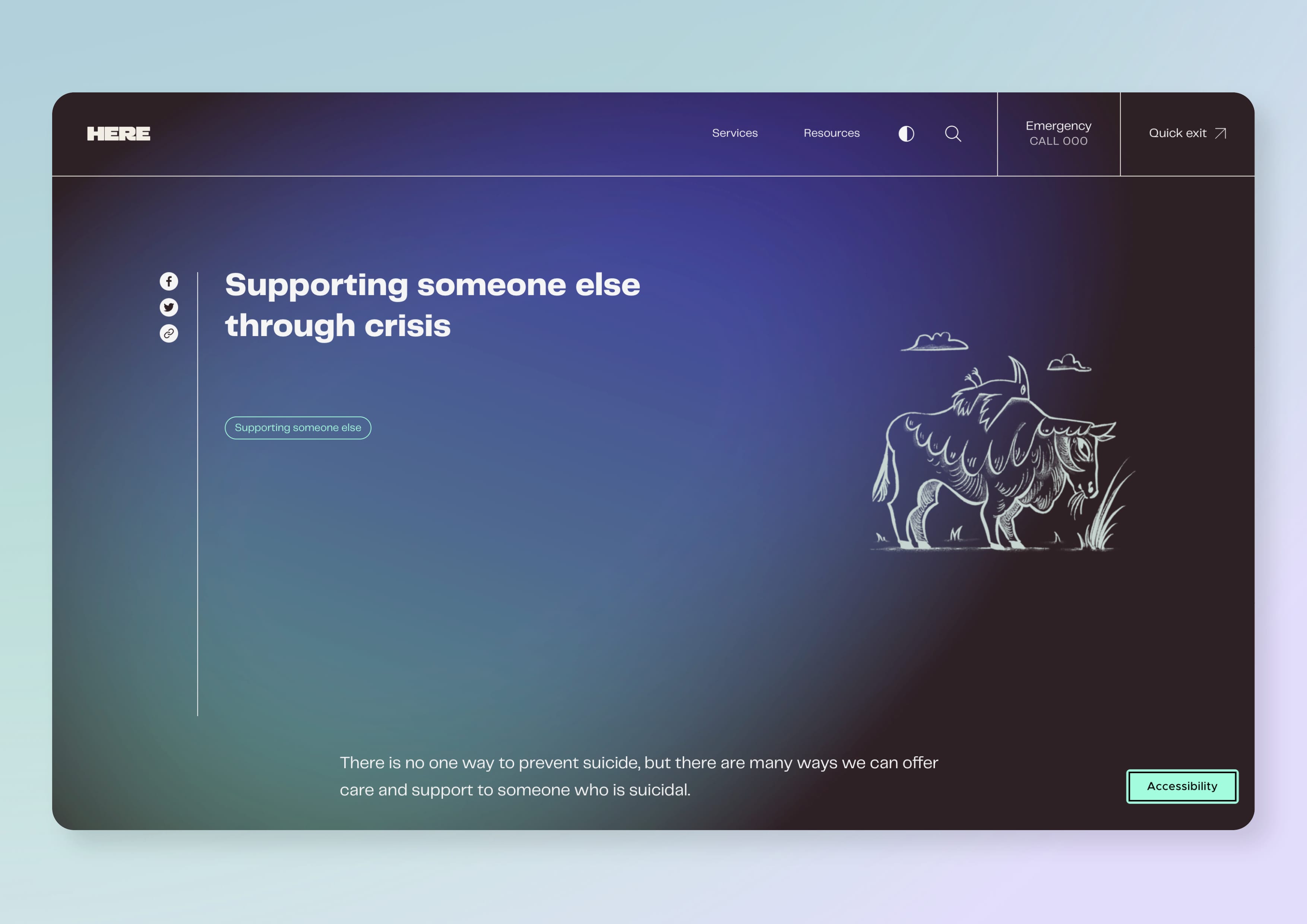
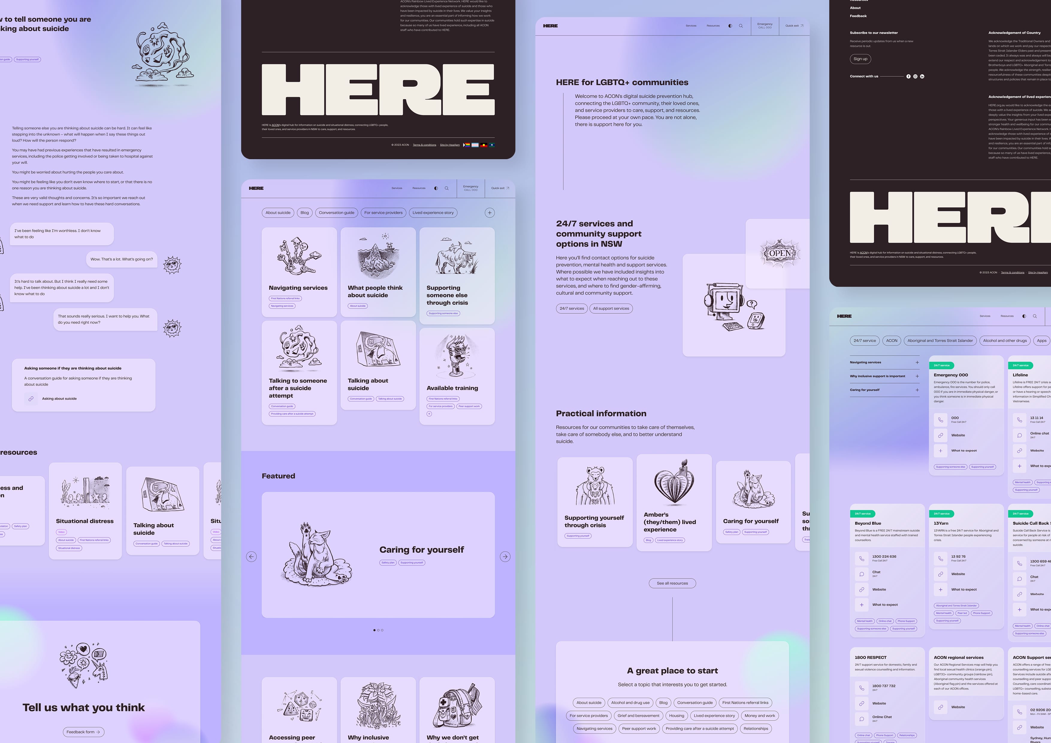
  • The project was co-designed with our community, for our community. We generated insights from a range of peer-reviewed literature, program evaluations and consultations with people who have lived experiences of suicidality. Through the consultations we learnt what to avoid – words like hope and resilience, fractured imagery, clinical white backgrounds – and what to lean into – connection, community, pride, gradient colours, illustration. The site needed to bring strength, the tone needed to be deeply accepting.

  • Here.org.au is the first resource of its kind for the LGBTIQ+ community in NSW, and the response so far has been very positive. We asked our community what they thought and gathered valuable qualitative data from users who could choose to remain anonymous if they wanted. Overall, the feedback received from the community was very positive. Of the users who provided feedback, 80% expressed their gratitude towards ACON for providing an essential resource to the community. Furthermore, 10% of users commented positively on the website's usability and design, while the remaining 10% provided suggestions on what could be improved.

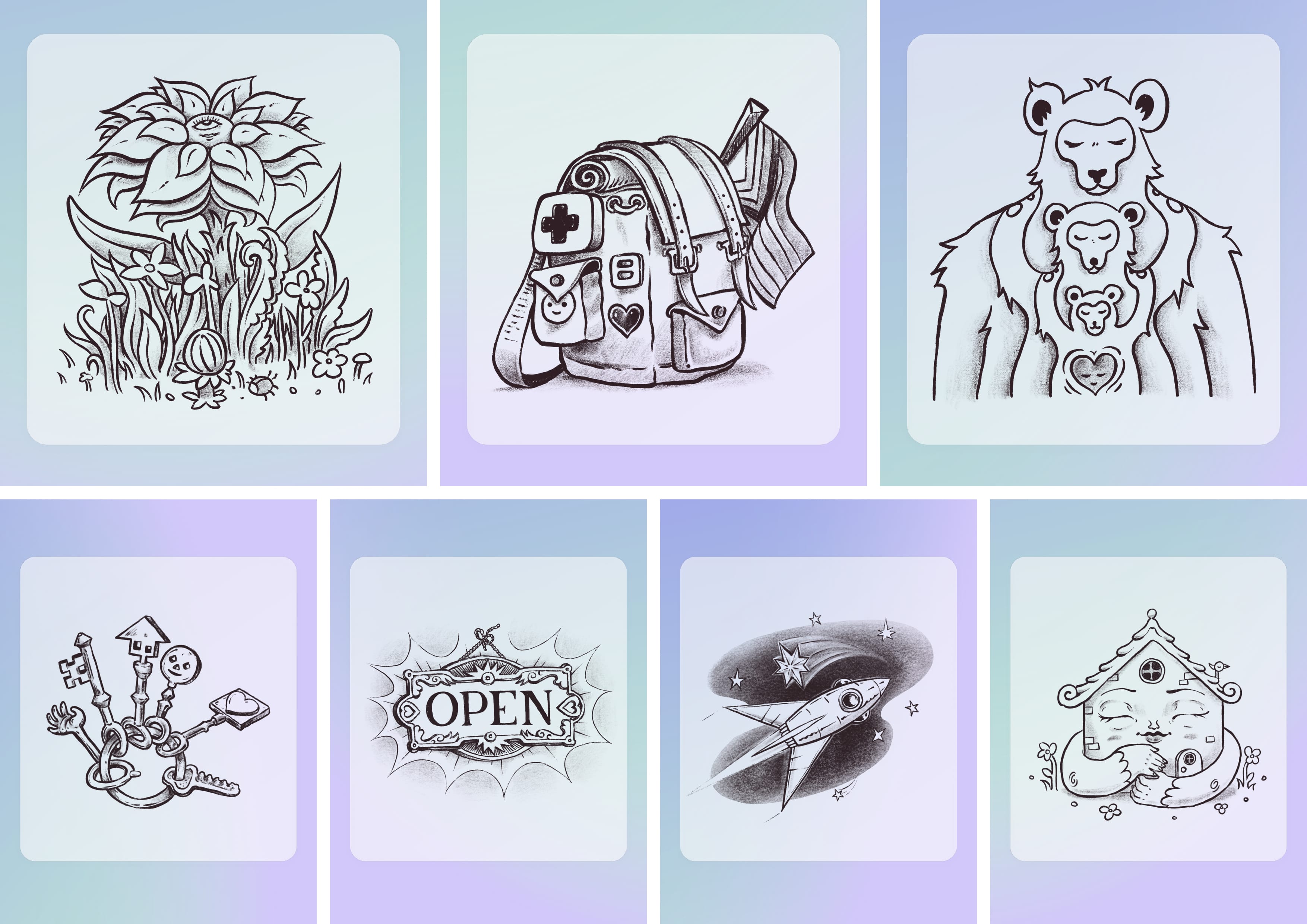
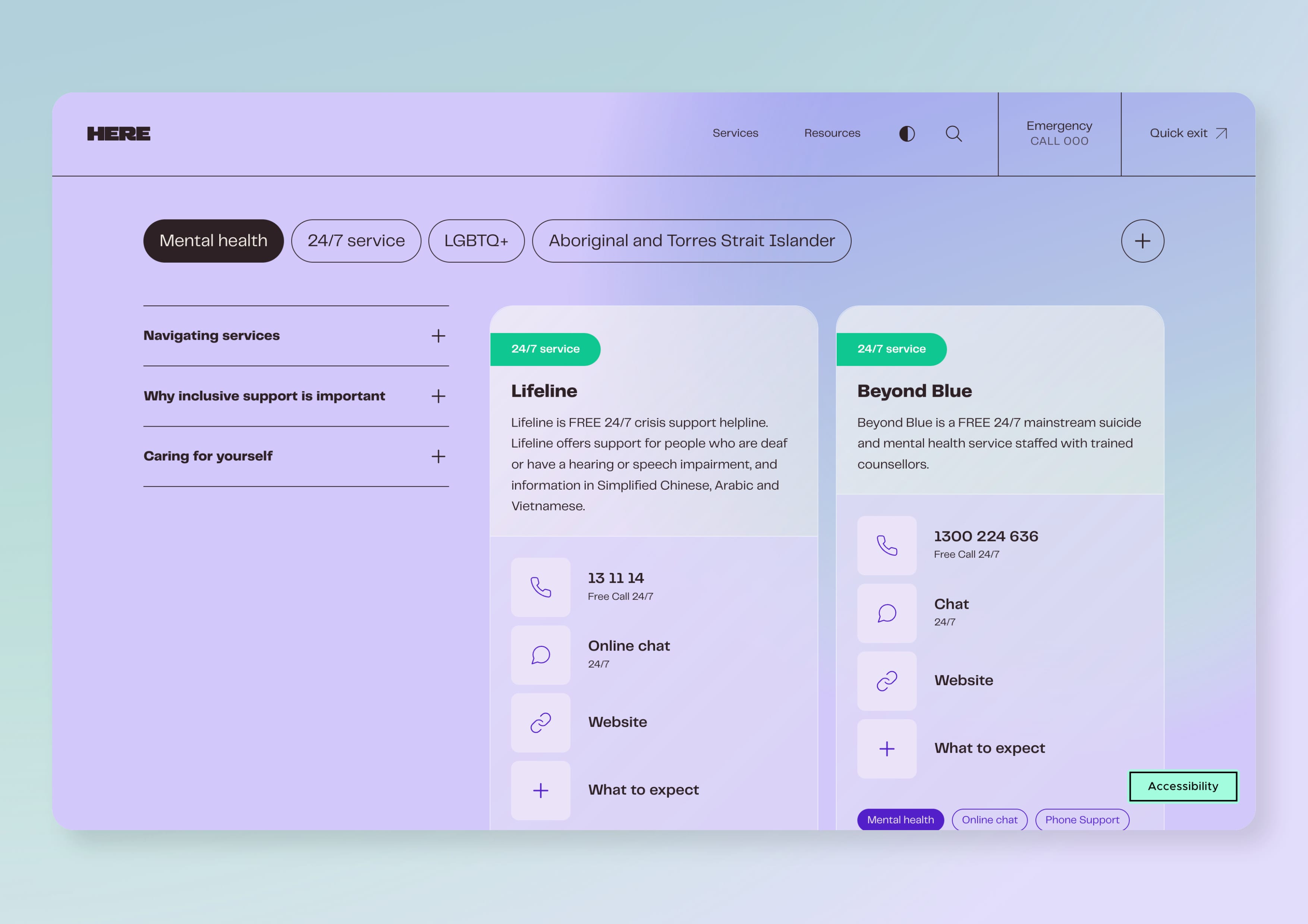
  • Naming: The name for the campaign was critical and one of the hardest elements to get right. We wanted to find a name that stated the strength of the community and held no judgement. We chose and successfully tested the name 'Here', representing that no matter where they are right now in their journeys, there is one fact that is true – we are glad they are ‘Here’. Illustrations: We selected illustration as our preferred style of imagery because of its potential in addressing difficult issues in a captivating manner. We chose not to use human figures and instead used shapes, animals, and objects to represent human experiences. We engaged the talented, queer non-binary illustrator Seb Berto to create hand drawn illustrations with a limited colour palette of just one colour to avoid competing with the gradient palette of the brand. Website: Accessibility was a top priority, and users can make adjustments while using the website, including changing the text size, contrast, and using dyslexia-friendly fonts. With light and dark modes available, everyone can customise their browsing experience to suit their individual needs.