Active Armadale

good-design-award_winner_rgb_blk_logo
  • 2019

  • Communication
    Branding and Identity

Designed By:

Commissioned By:

City of Armadale

Designed In:

Australia

The City of Armadale needed an identity for its new fitness and aquatic centre. Rather than create a brand for a building, we positioned the iconic structure as the cornerstone for change. A community first approach encouraged a new outlook and vision quickly becoming one of the country’s fittest cities.
  • CHALLENGE
  • SOLUTION
  • IMPACT
  • MORE
  • Originally briefed to create a new identity for the City’s new Fitness and Aquatic Center, the initial challenge involved onboarding the council and its multiple departments to embrace a wider reaching strategy. In addition, a predominantly low socio-economic demographic, coupled with an increase in fast food consumption across Perth’s outer suburbs, made the perfect recipe for an unhealthy lifestyle across the community. However, by tapping into the pride residents felt towards their city and community, we were able to encourage them on a new outlook and vision, encouraging them to become the fittest city in Australia.

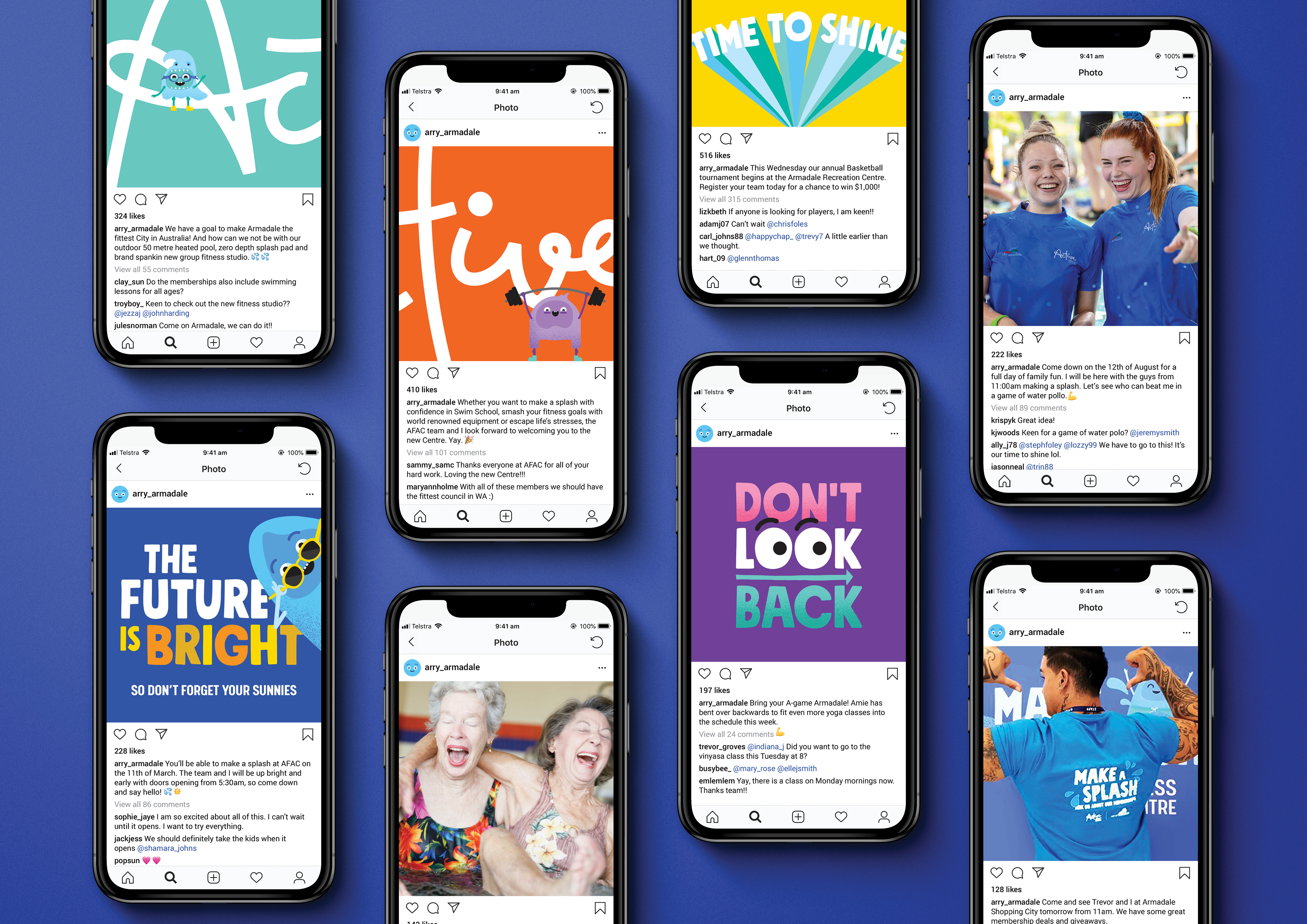
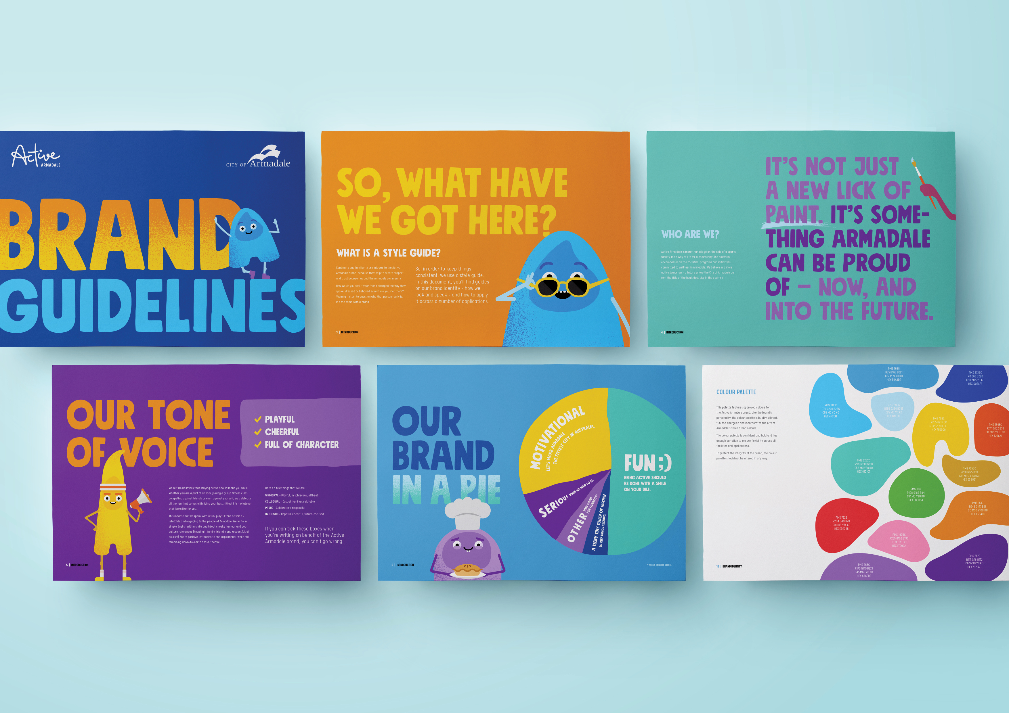
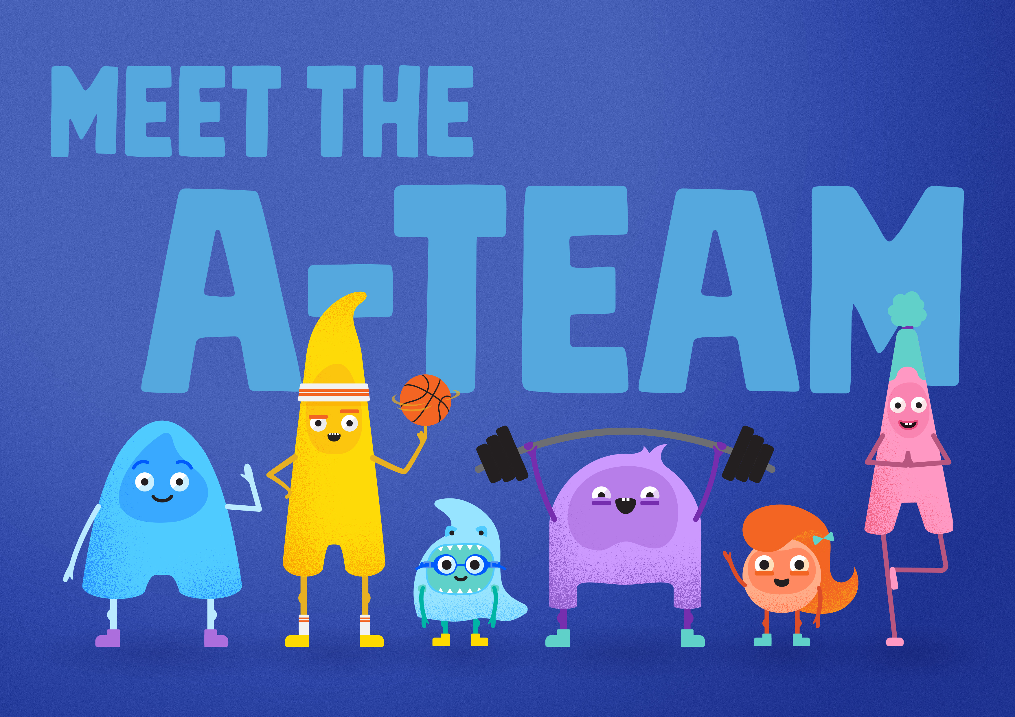
  • Why can’t a logo be more than a symbol on the side of a building, but a symbol for change? We wanted to think bigger and give the community something with a personality and character truly unique to Armadale. A strategic direction encouraged the entire community to become Australia’s fittest city. Its brand platform was designed as an active movement, incorporating all facilities, programs and initiatives, encouraging the community to live healthier and happier lives. A team of mascots, known as the A-Team, were designed to spread the message into the community, each with their own character, personality and voice.

  • Creating a brand that is flexible, unexpected and full-of-character has largely impacted the successful launch of Active Armadale. In addition to high memberships sales for the new Fitness and Aquatic Centre, visitations exceeded original forecasts with residents lining up to be the first through its doors. Within the first week, thousands were engaging with the brand via social media. The largest impact, however, has been around the community, converting many into true brand advocates who are leading healthier lives. They have risen to the challenge of become Australia’s fittest city where, within three weeks, had achieved the number five position.

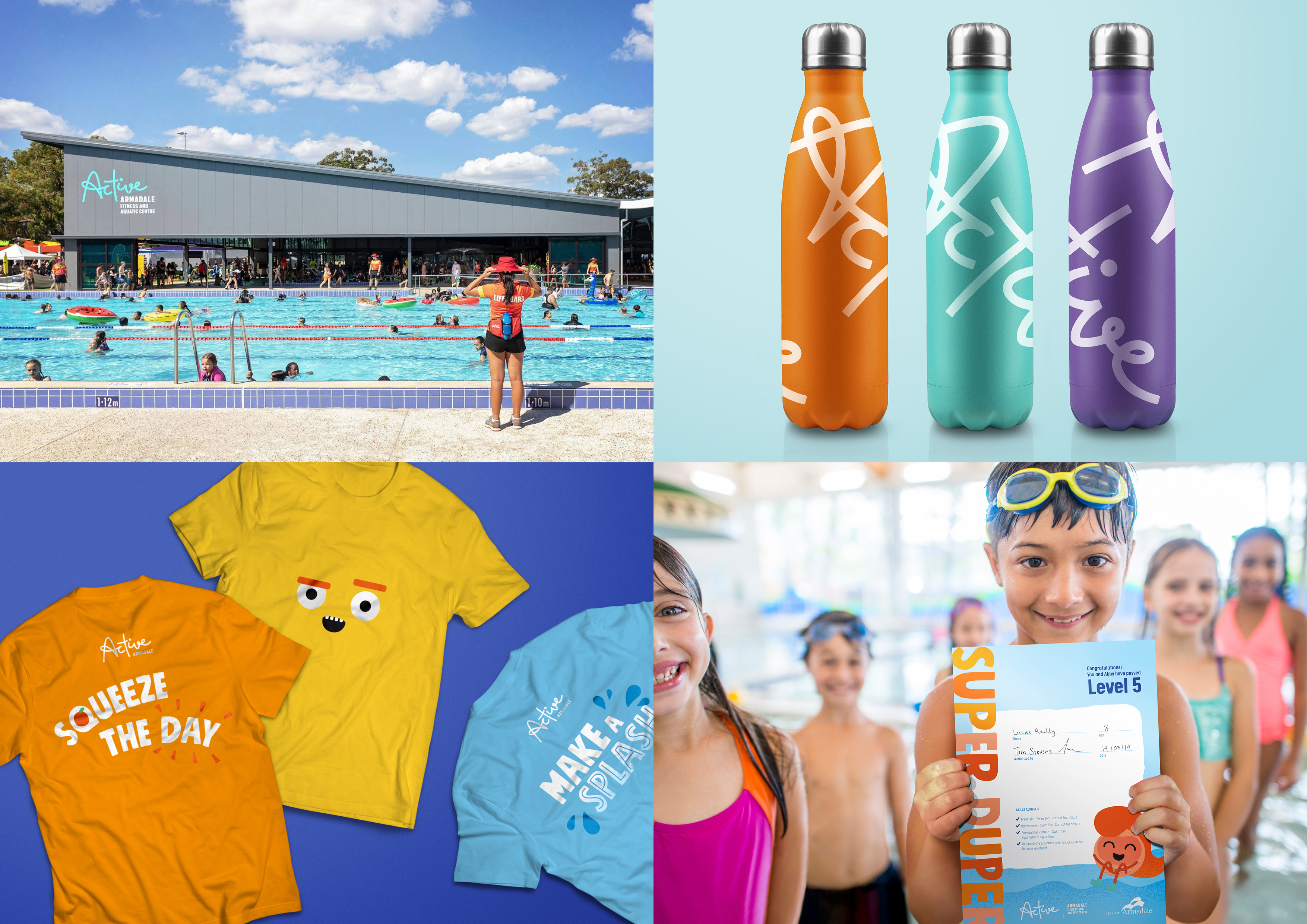
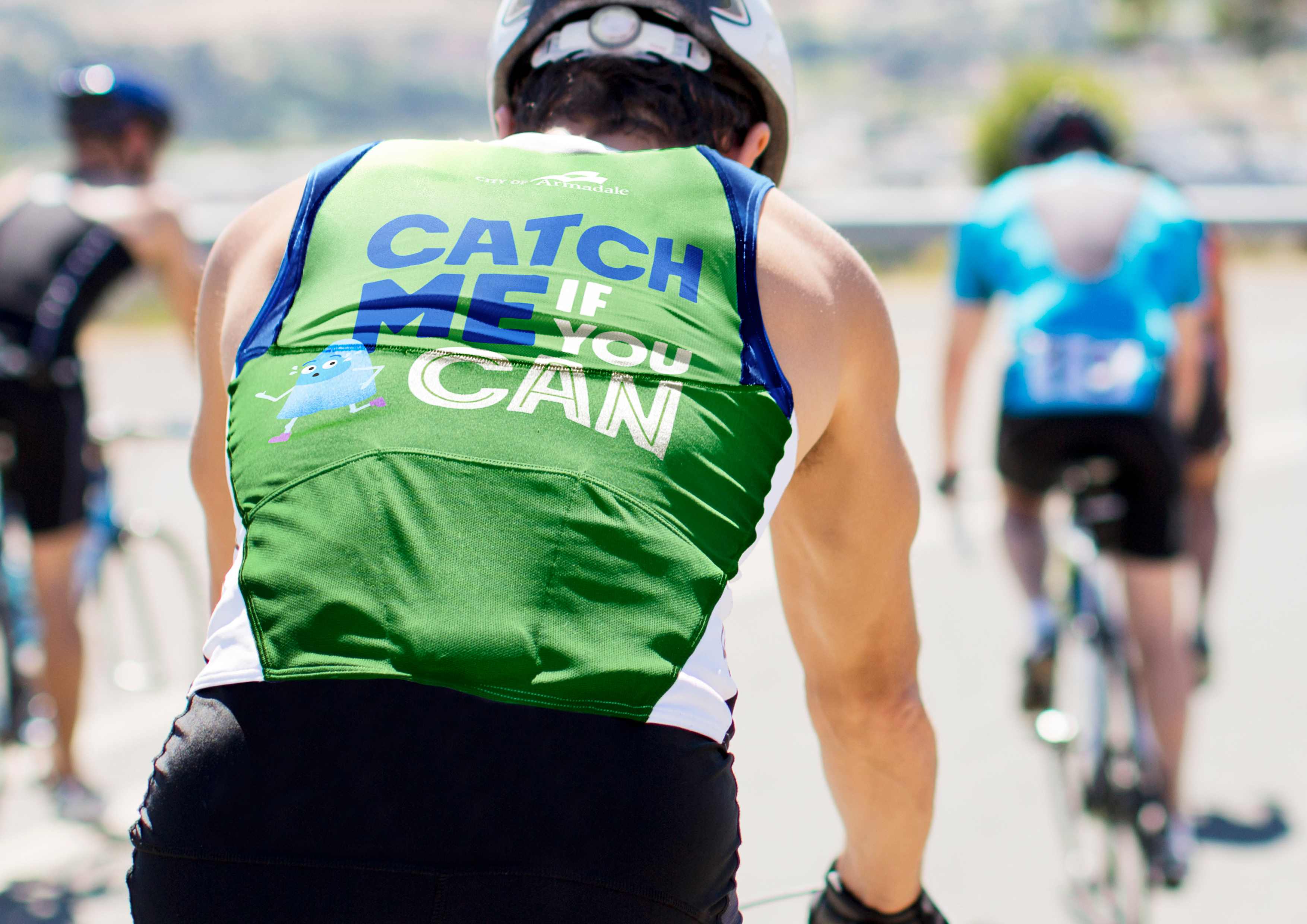
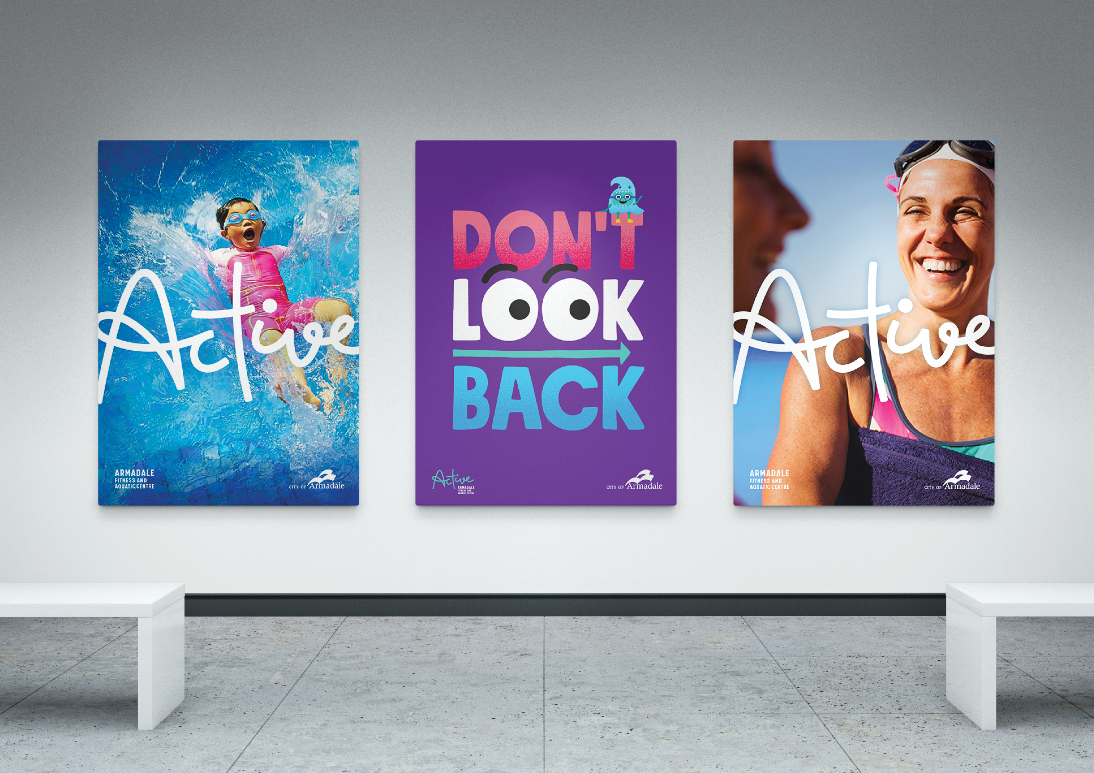
  • Why can’t a logo be more than a symbol on the side of a building, but a symbol for change? We wanted to think bigger and give the community something with personality and character truly unique to Armadale. Active Armadale was designed as an active movement. A platform for all facilities, programs and initiatives that encourages the whole community to live healthier and happier lives. It’s a brand that extends beyond the walls of the Fitness and Aquatic Centre, into the hills, throughout the city, and into the hearts of the community. The A-Team mascots were designed to help spread the message into the community, each with their own character, personality and voice. Led by the fun-loving Arry, they highlight the many ways residents can lead an active lifestyle, and also help make fitness fun again. Each application was designed to be cheerful, energetic and representative of the true Armadale. It had to be very human. While we developed a full suite of collateral incorporating bespoke typography, custom illustration and motion graphics, we focused heavily on creating a tone-of-voice that would resonate with the people. Something truly unique for this sector. It had to be playful, enthusiastic and full-of-character.