Pentridge Prison Tours

good-design-award_winner_rgb_blk_logo
  • 2023

  • Communication
    Branding and Identity

Designed By:

Commissioned By:

The National Trust

Designed In:

Australia

Pentridge is a place that is deeply connected to the cultural fabric of Australia. A place to learn and reflect, but it’s also a place to feel inspired. Through its revival, Pentridge Prison Tours can shed light on a new history.
view website

  • CHALLENGE
  • SOLUTION
  • IMPACT
  • MORE
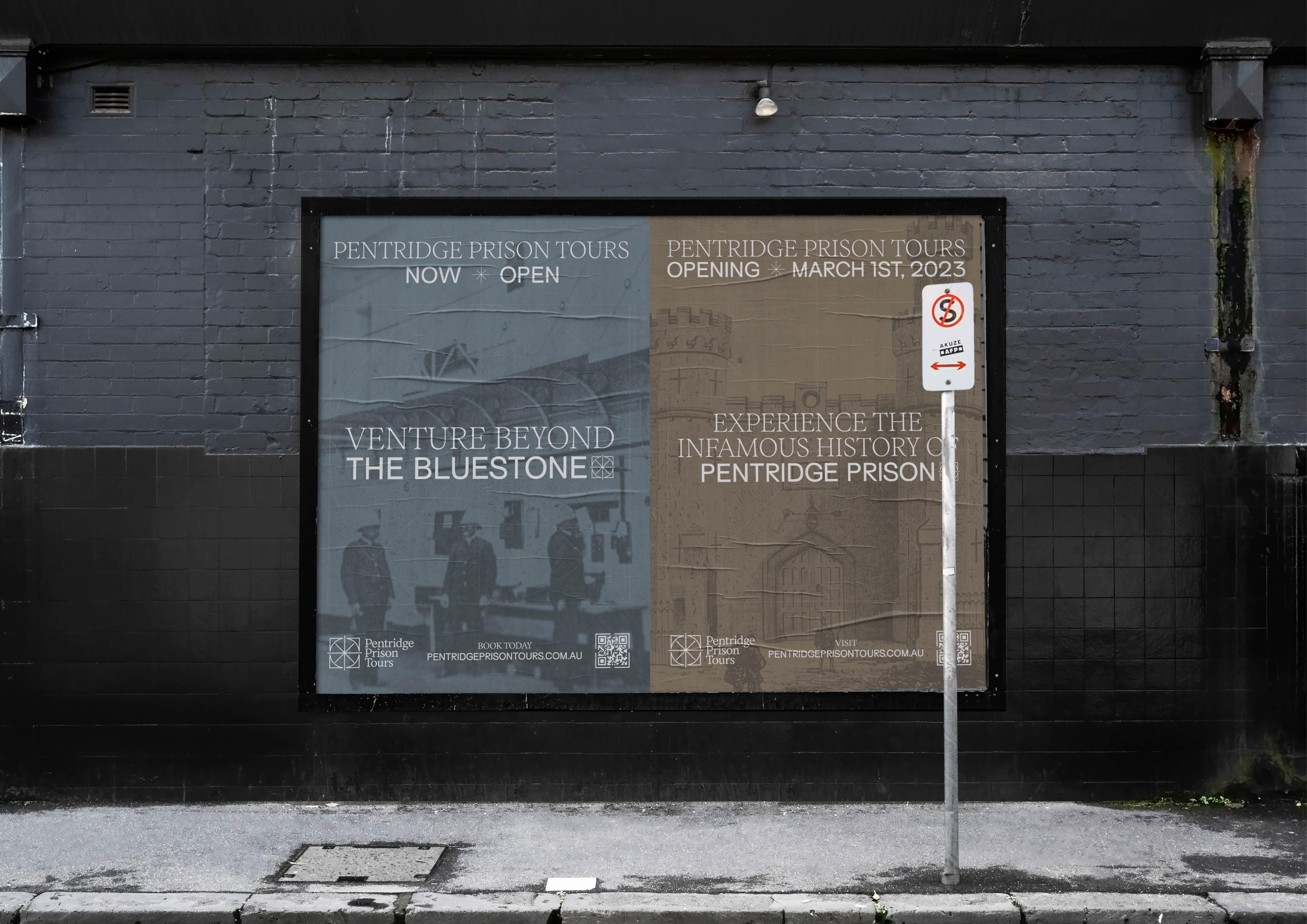
  • To find a link between Pentridge’s past and it’s future. To create a visual identity that represents tourism products whilst remaining respectful of the prisoners who suffered within. Working in collaboration with the experience design experts at Art Processors to gauge an understanding of what the final immersive offerings from the tours would be. The Pentridge Prison Tours brand hones in on the essence of the physical experience’s uniqueness and the importance of sophisticated, cutting-edge experience digitally.

  • An invitation for curious minds to learn about a history that is confronting to discover, yet crucial to not forget. Reframing modern, dark history. Authentically, with a commitment to truth telling and always paying respect to what is here now and what came before. Sparking curiosity, inviting our audiences to engage with a compelling history. Educating,, with factual information that is easy to find and clearly articulated. Designing a solution with inclusivity and a deep understanding of our audiences locally and abroad. A visual identity that enables audiences to be a part of our ongoing dialogue.

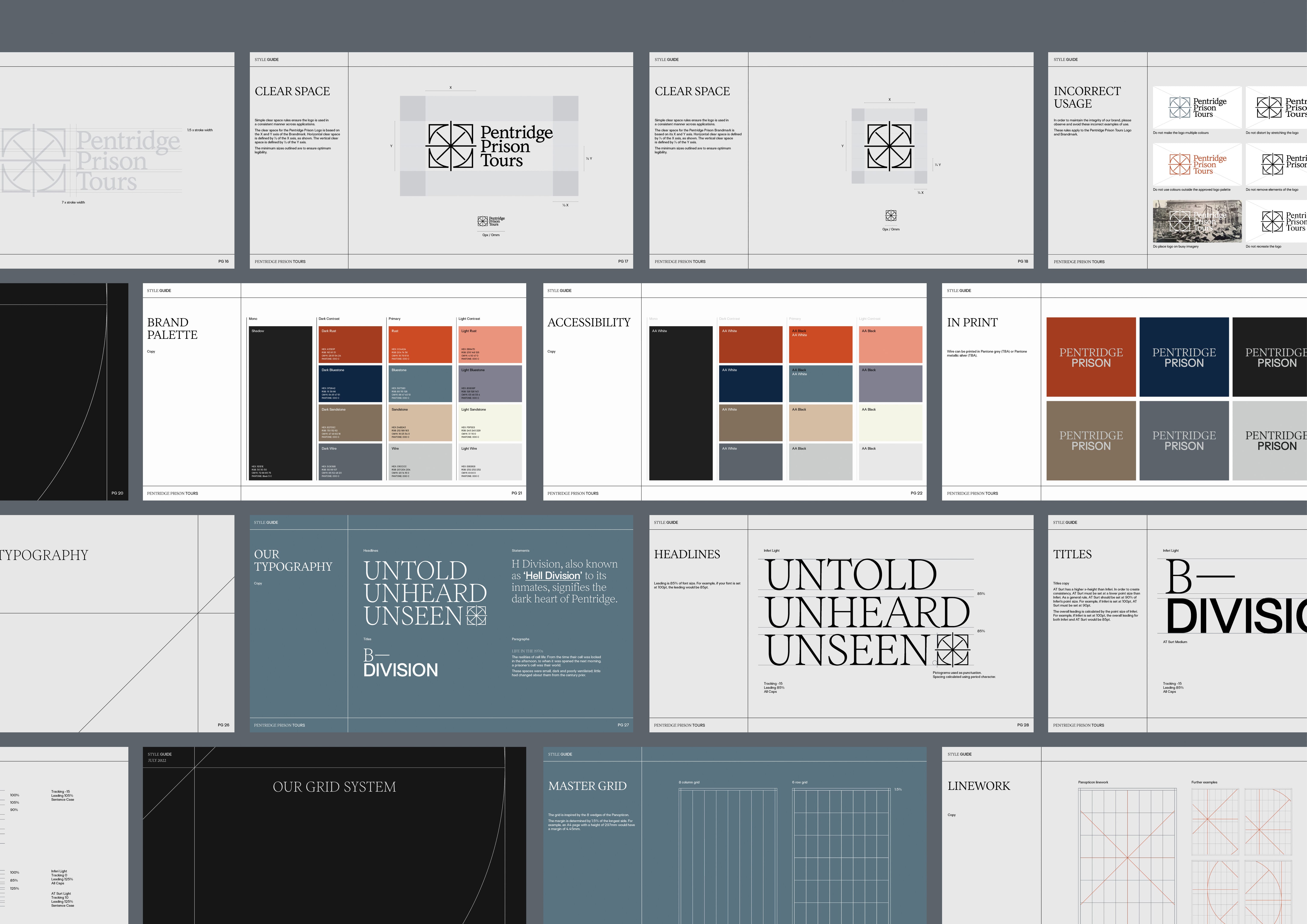
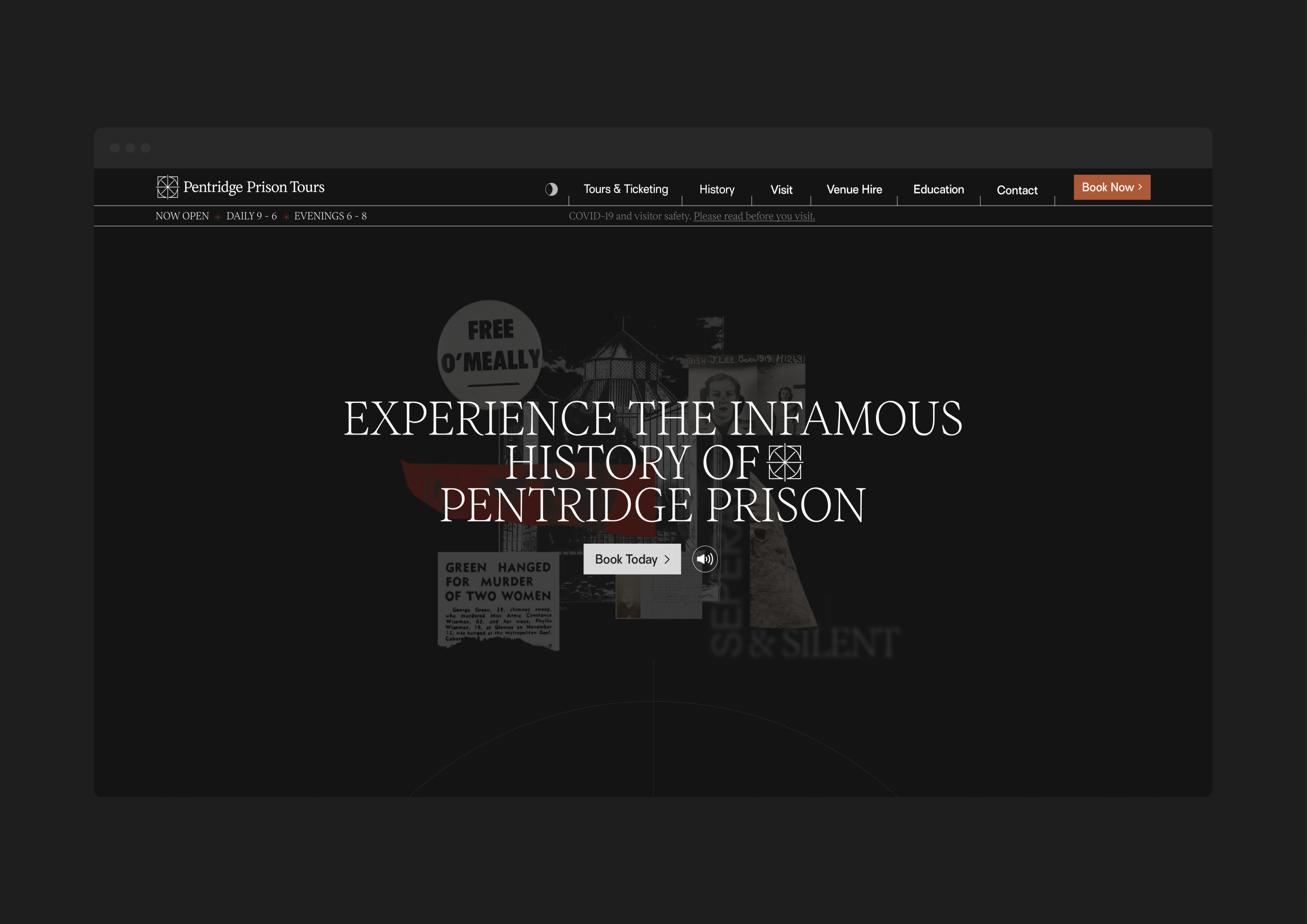
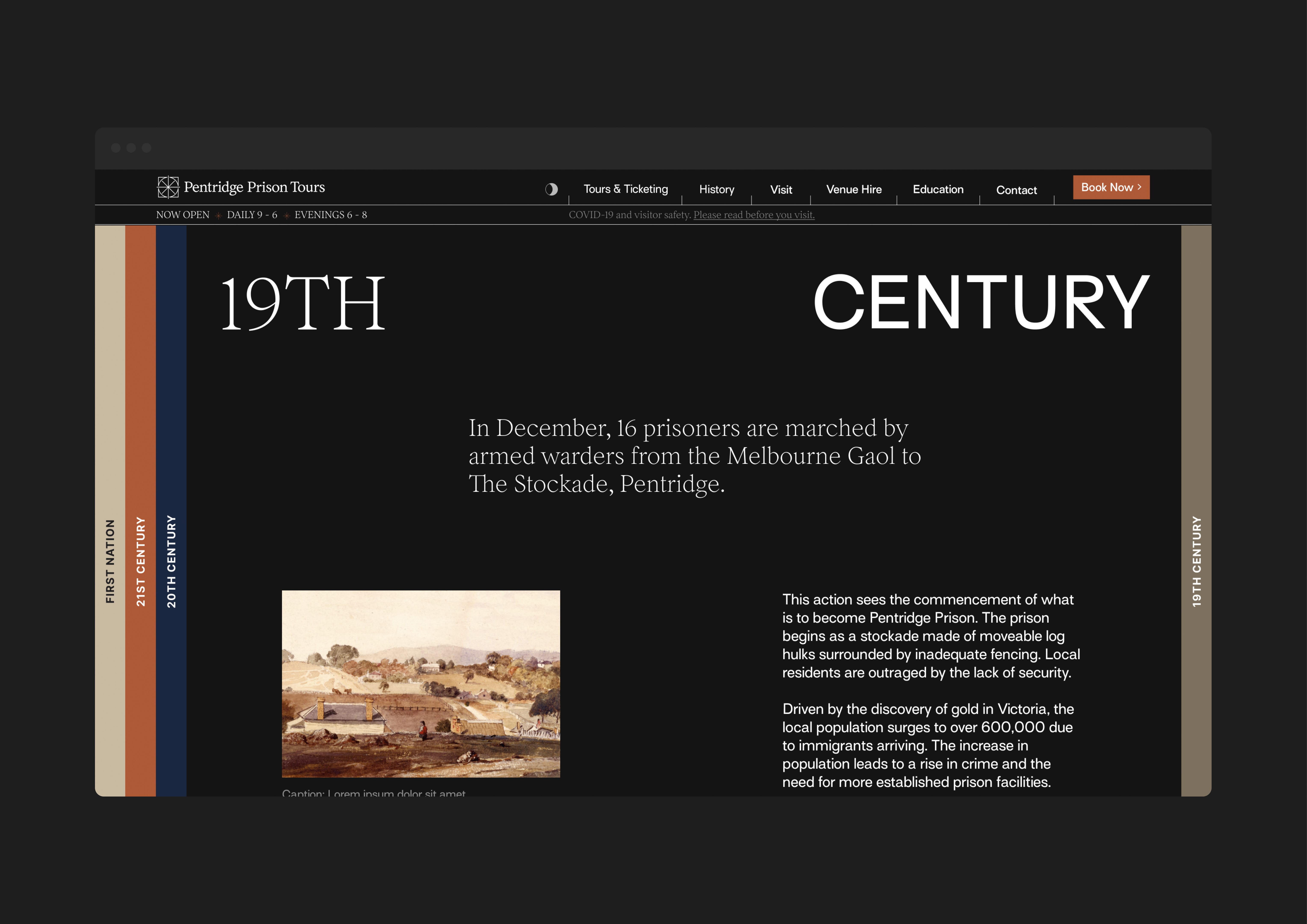
  • From silence and isolation to reflection and community. An intricate blend of historical architecture with modern design elements to create a distinctive brand identity. Pentridge Tours strikes a balance between the past and the future — with the design approach championing the Panopticon. The collage style design and color palette selection captured the essence of Pentridge's history while positioning the brand for digital experience and reflection.

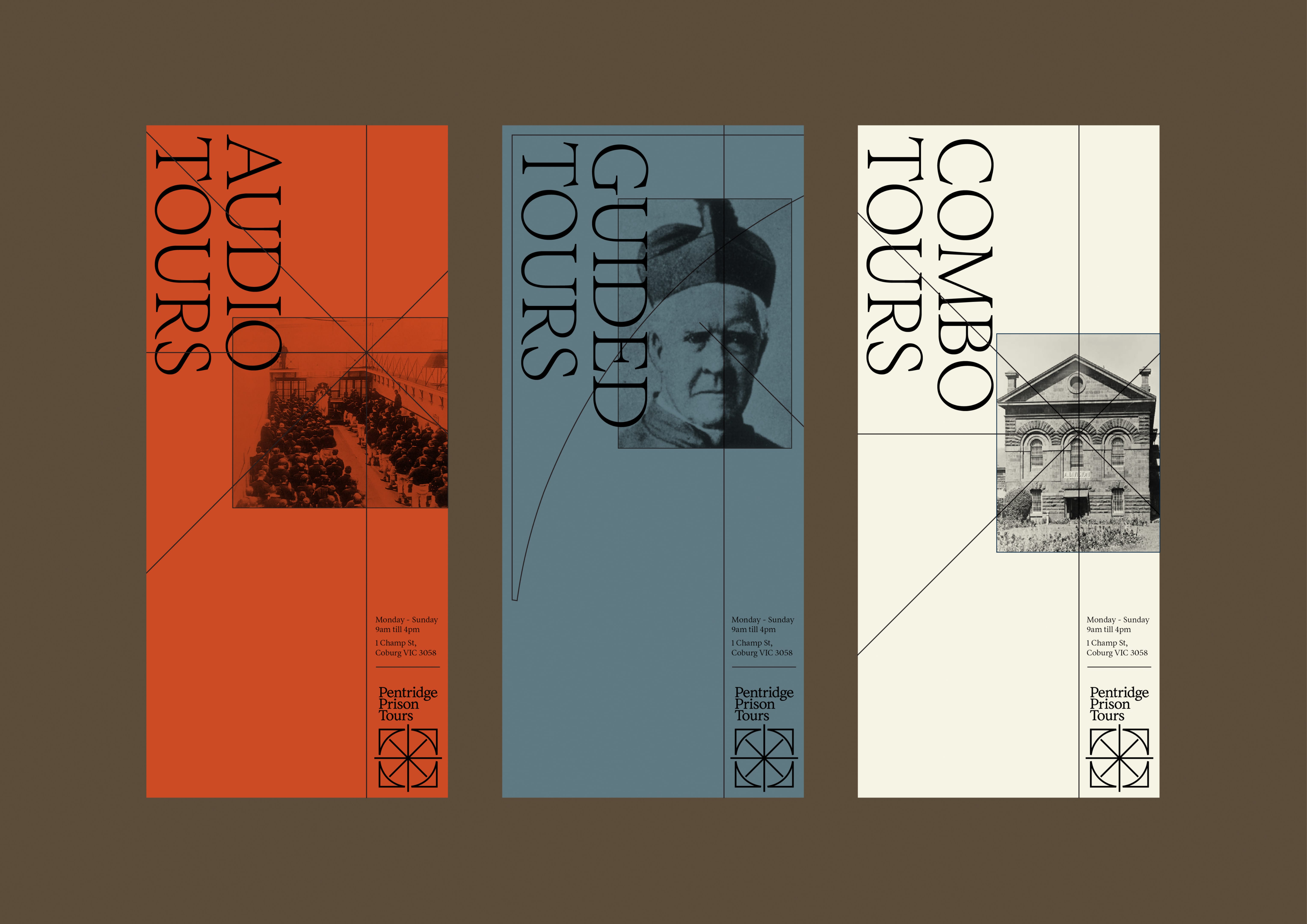
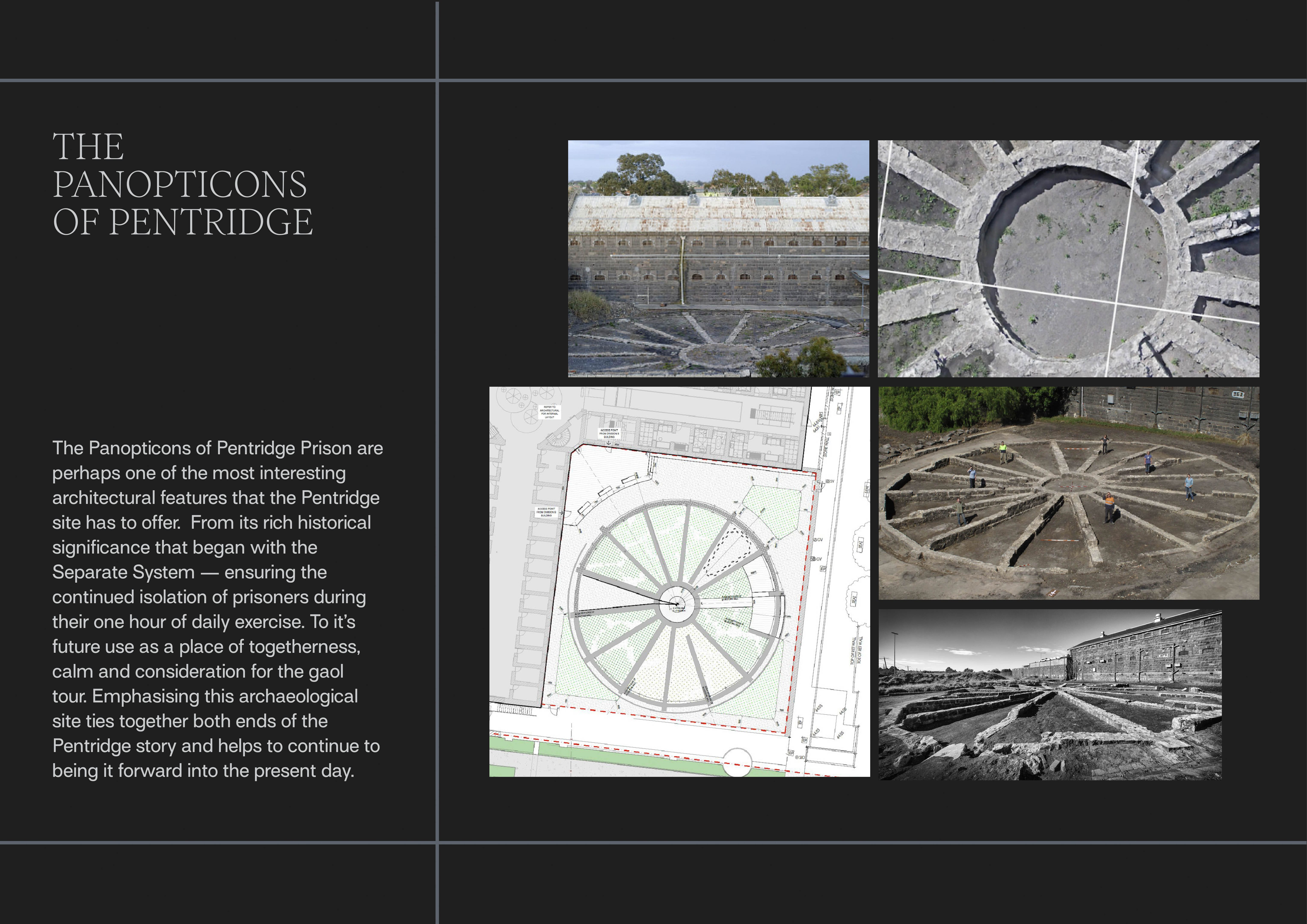
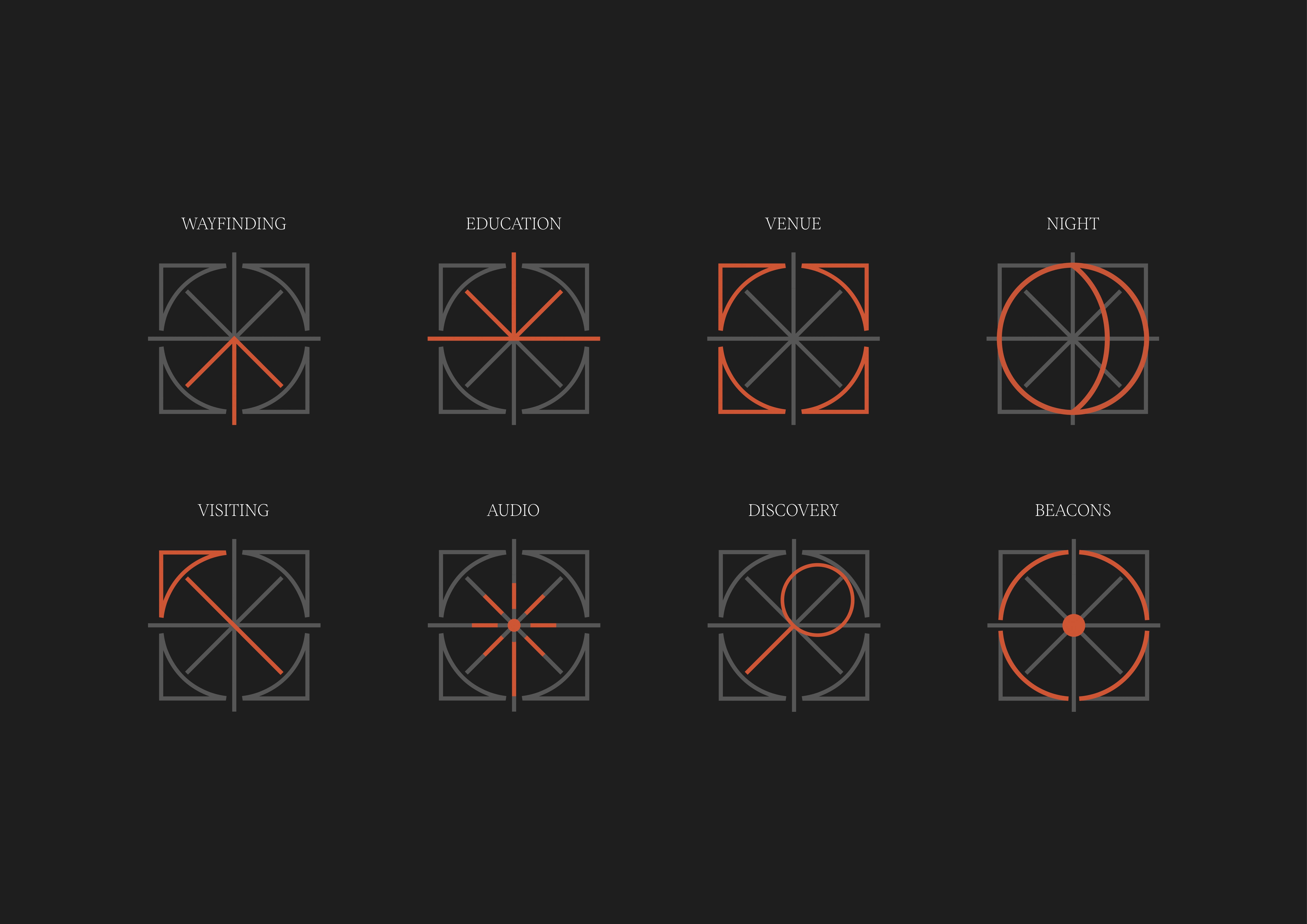
  • The solution draws inspiration from place. The brand mark represents the physical experience. During the restoration period, archeologists unearthed remains of an old panopticon at Pentridge, initially used to keep prisoners isolated. As part of the tour experience design, the panopticon serves as a reflection garden. Stripping this panopticon back into vector artforms, created the base for a concept. The colour palette is also inspired the Pentridge’s site and surroundings, with the iconic bluestone creating the base. Earthy colours with nods to history through darker, somber hues helped convey the tone. For representing archival materials, a distinct collage style, along with specific graphic iconography shaped the future of the brand and website concepts.