MOST

good-design-award_winner_rgb_blk_logo
  • 2023

  • Communication
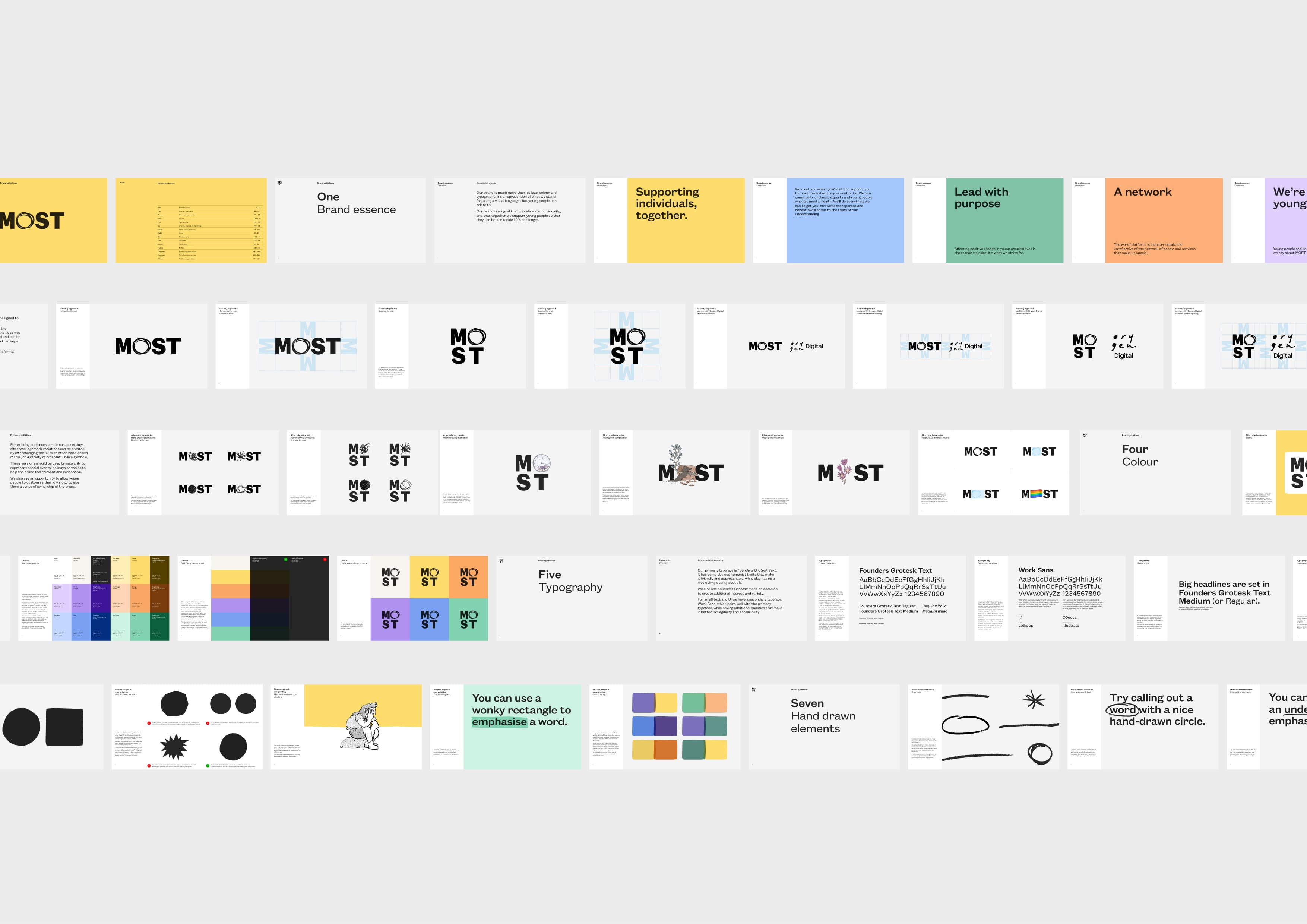
    Branding and Identity

Designed By:

  • Tim Kotsiakos - Creative Direction
  • Marty Coghlan - Design Direction
  • Denny Louis - Design

Commissioned By:

Orygen Digital

Designed In:

Australia

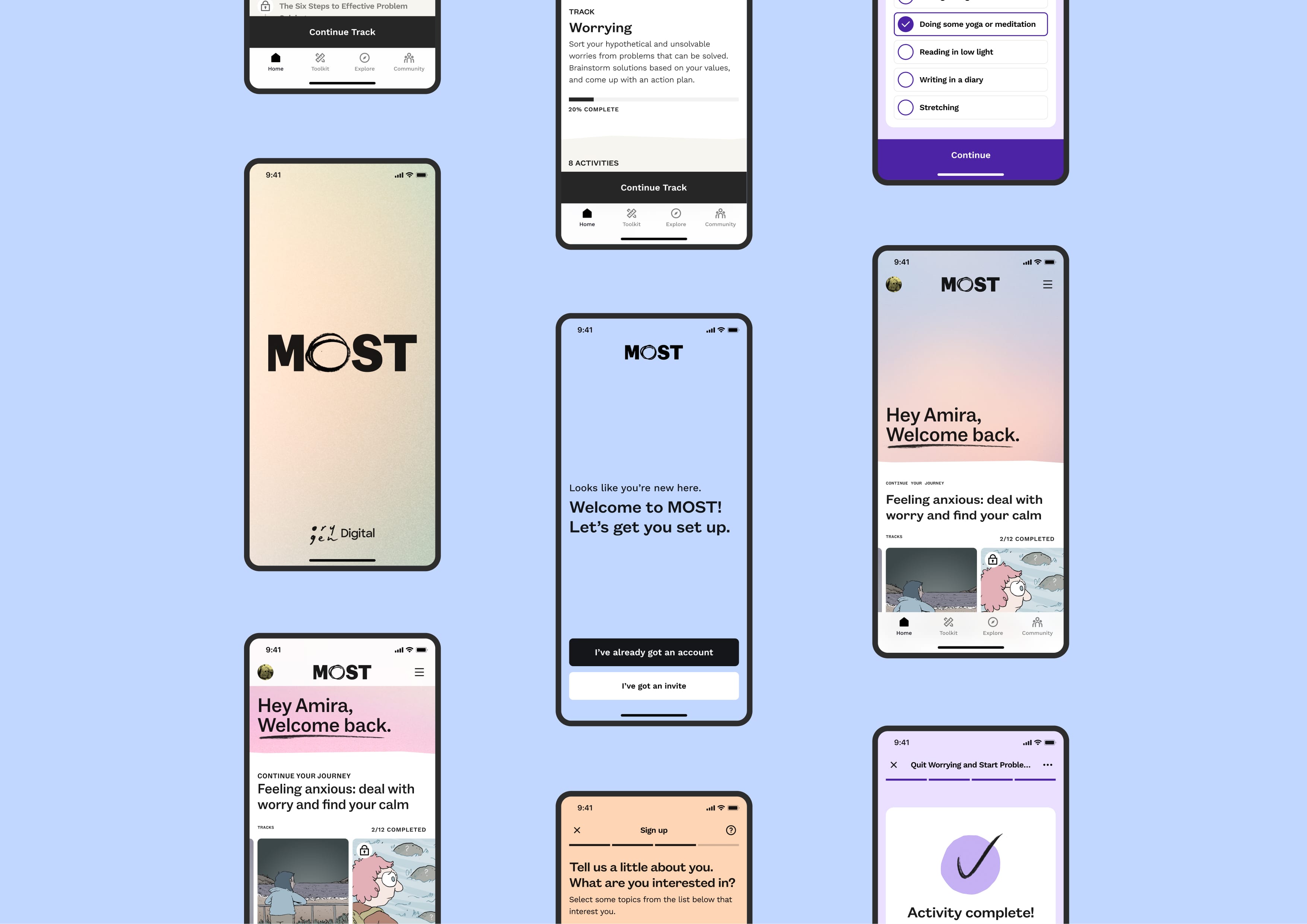
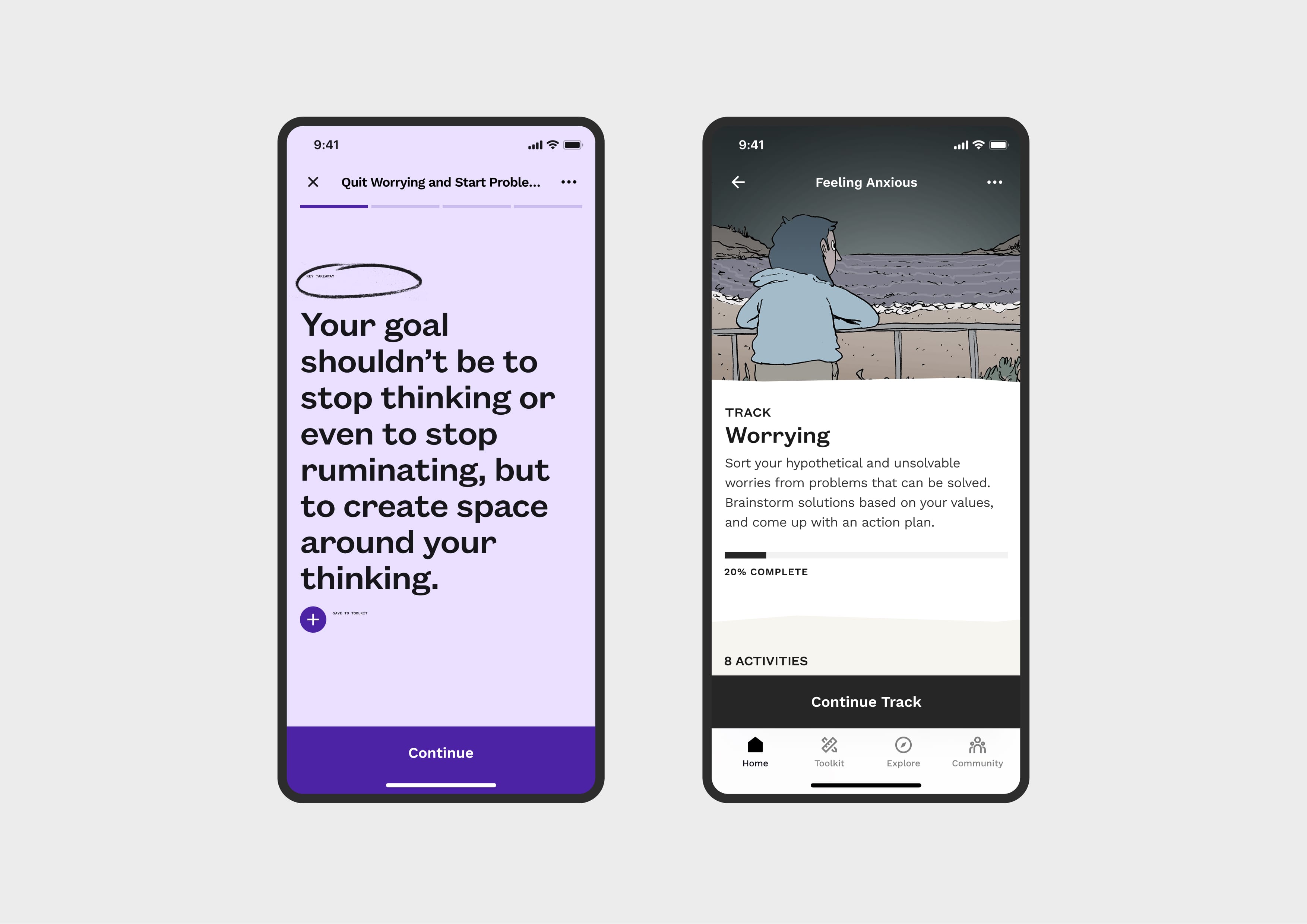
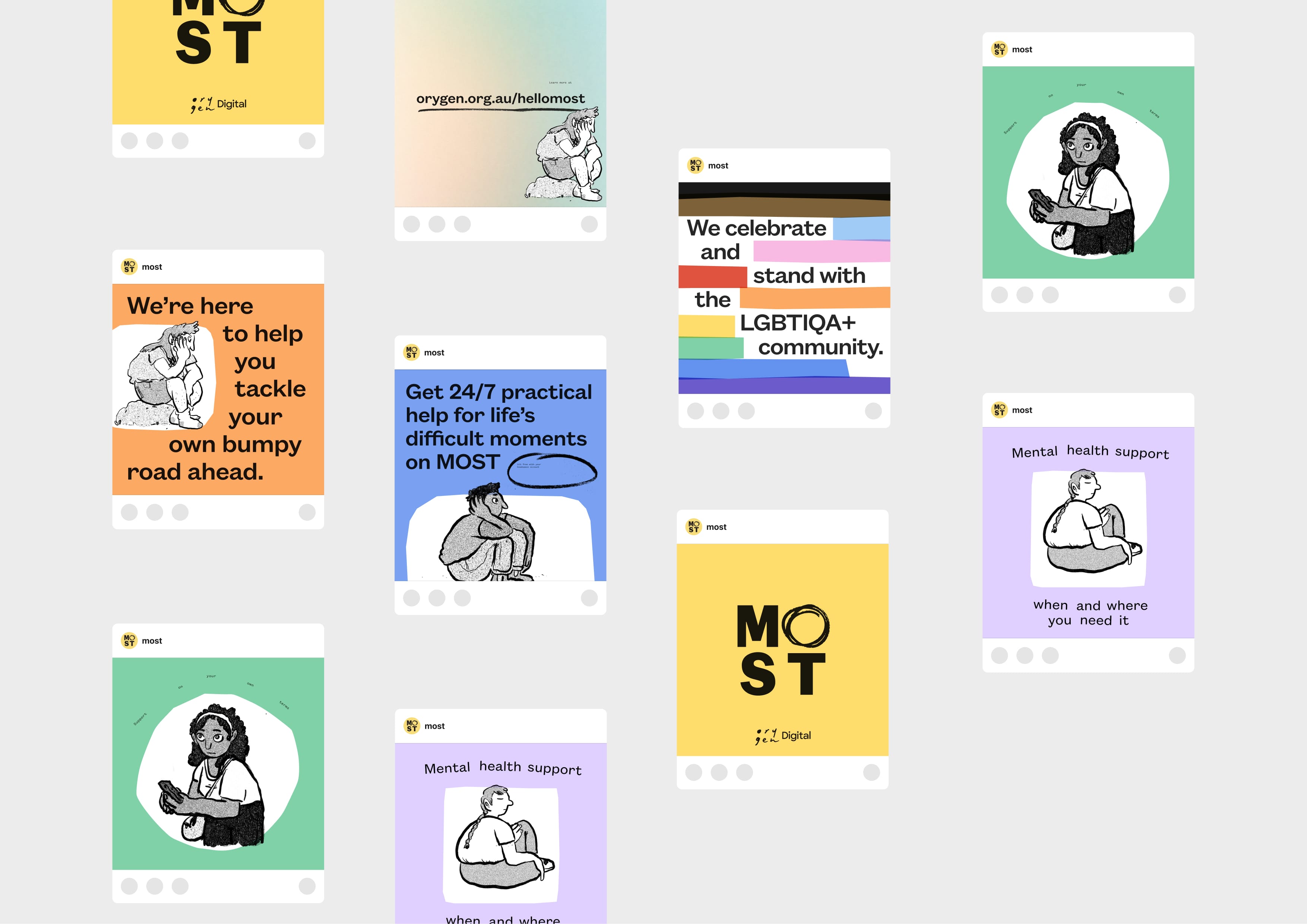
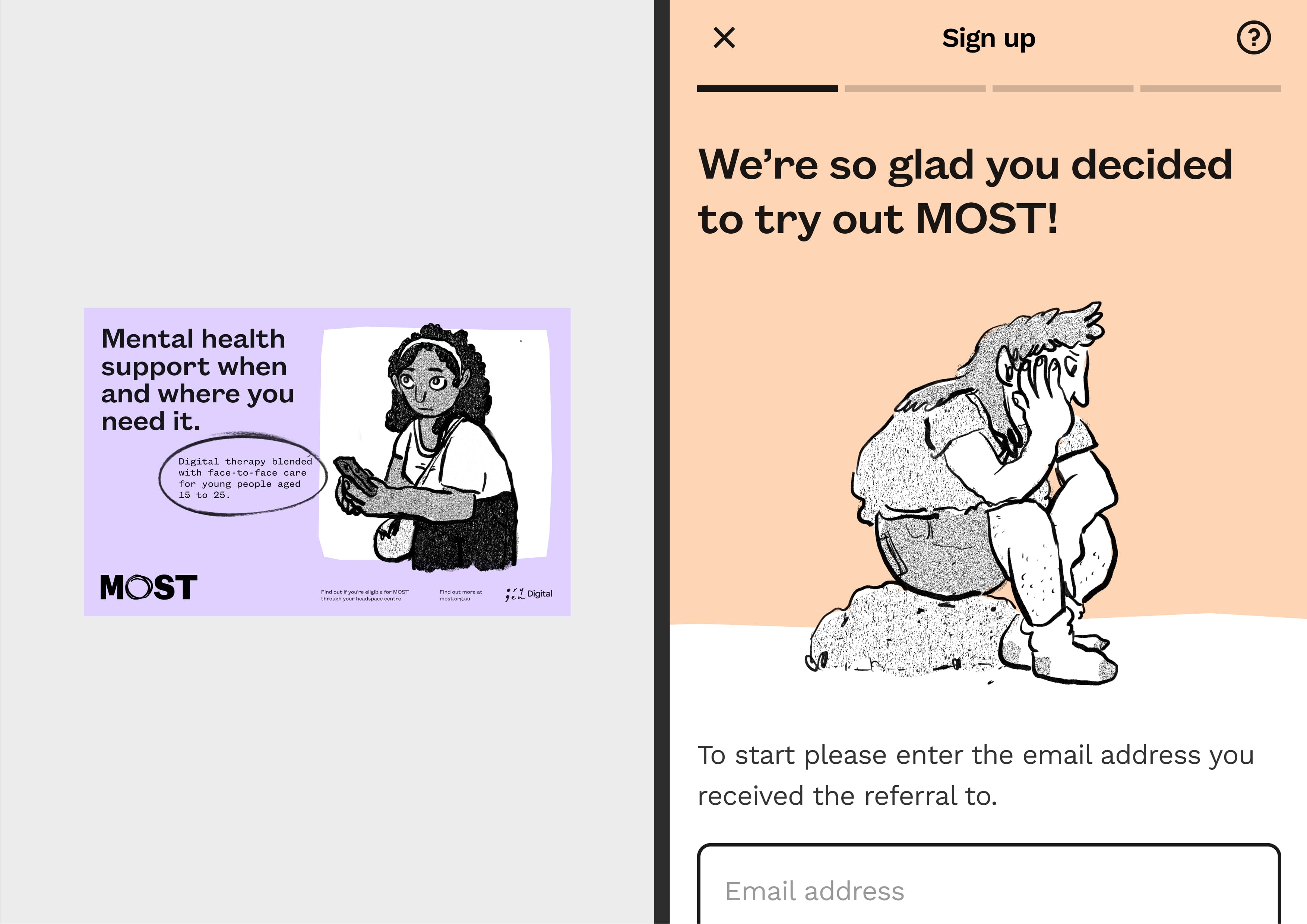
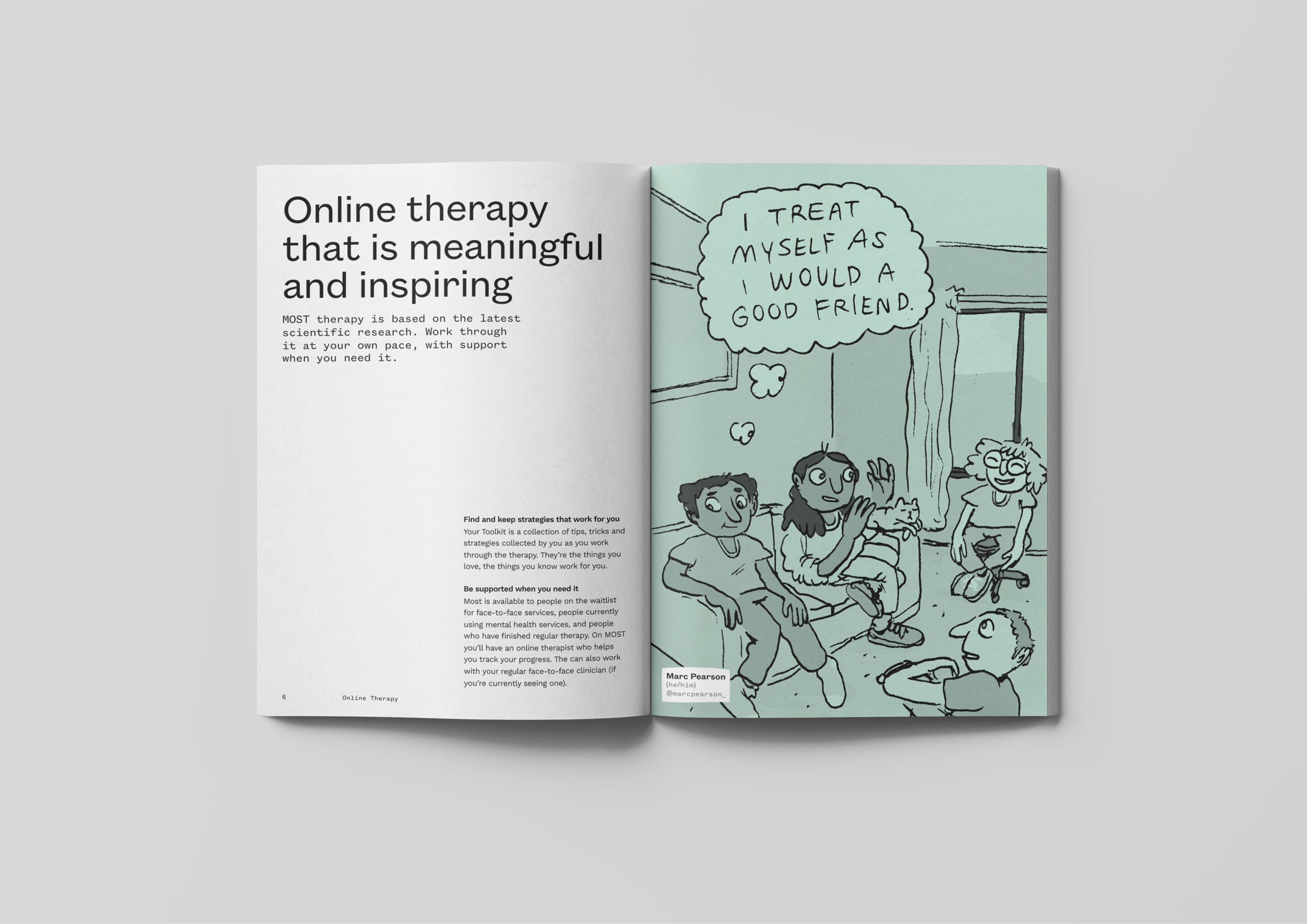
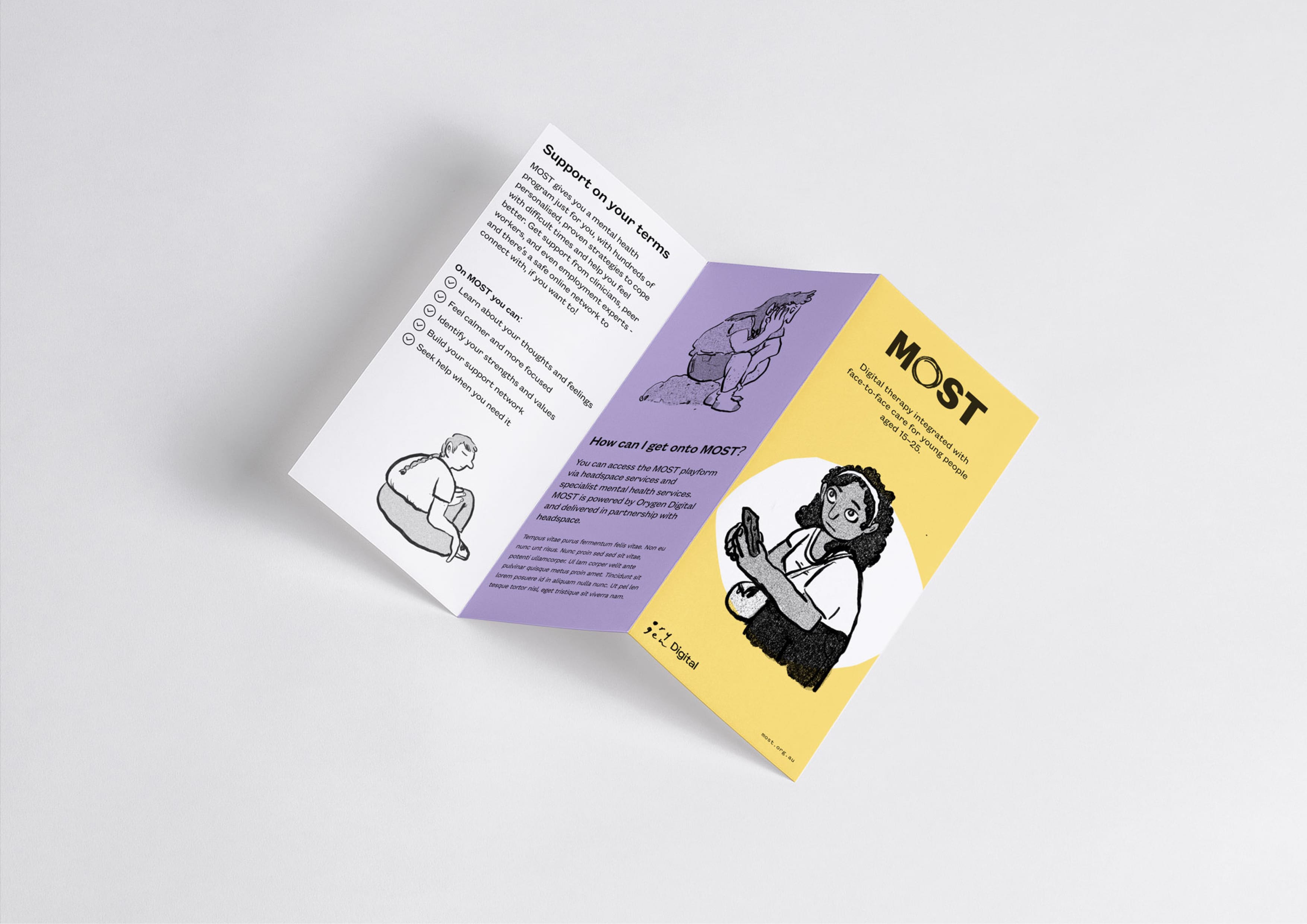
The pandemic has impacted mental health. In response, Orygen Digital asked MASS to create a new strategic positioning and visual identity for MOST, their new digital platform that provides continuous, integrated face-to-face and digital care to people aged 12 – 25.


  • CHALLENGE
  • SOLUTION
  • IMPACT
  • MORE
  • To help the young and often apprehensive audience feel safe, we needed to design a brand that felt authentic and true, as well as inclusive, accessible, and committed to accepting the involvement of its audience. The brand had to be digitally led and needed to inform the subsequent redesign of the platform and marketing applications. It needed to complement the existing Orygen brand and fit comfortably within their visual landscape of products. Most importantly, it needed to resonate with users of the platform.

  • Through a participatory design process, we learned that the audience is diverse, searching for safe ways to express themselves, and going through hard times. We had several consultations with the audience and defined irrefutable truths and ambitious goals with the client to help keep us centred, ultimately settling on the brand narrative ‘Supporting Individuals, Together’. We paid close attention to the role of colour, type and illustration to come up with a brand that embraces uniqueness and individuality, subtly demonstrated by the changing logo mark as well as the use of cut paper style shapes and hand-drawn visual assets.

  • The strong partnership and collaboration between MASS and Orygen contributed to an outcome we are immensely proud of. Together, we have helped the platform give young people a strong sense of ownership of the brand, ultimately leading to enhanced user satisfaction and advocacy. The project has produced a resource that is current, trusted, understood and, most importantly, accessible. Young people now have safe and greater access to evidence-based therapy and clinical support, without judgement, and on their own terms.

  • - A purposely extensive work-mark, featuring an interchangeable letter ‘O’ - A systematic approach to the application of colour based on its context - Posters, leaflets and other marketing material appear more colourful and attention-grabbing - Platform screens are a little bit more subdued, using mostly white with sporadic moments of colour and subtle gradients - Championing Marc Pearson’s illustrations - all of which are truly sincere and genuine, representative of the content on the platform