Heide Museum of Modern Art

good-design-award_winner_rgb_blk_logo
  • 2023

  • Digital
    Web Design and Development

Commissioned By:

Heide Museum of Modern Art

Designed In:

Australia

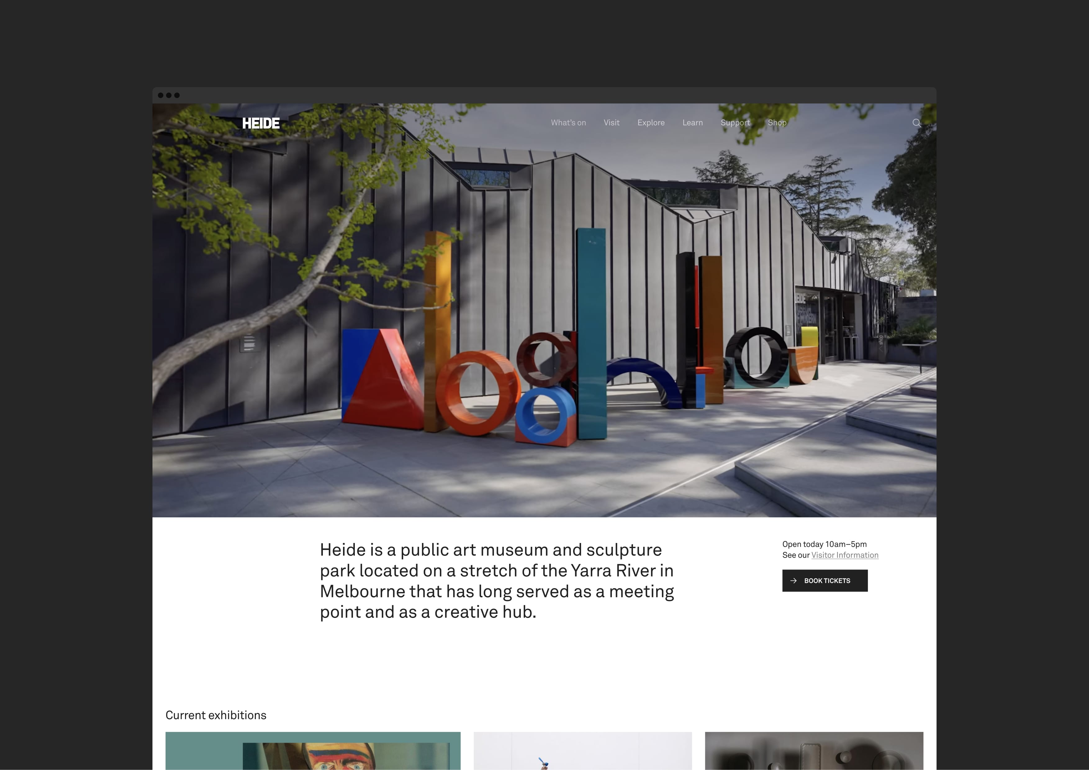
Heide is a public art museum and sculpture park located along the Birrarung/Yarra River. We were asked to create a new website that better reflected the museum experience and brand, that would help increase ticket sales, donations & memberships and most importantly compel people to visit the museum in person.
view website

  • CHALLENGE
  • SOLUTION
  • IMPACT
  • MORE
  • The main challenge for us was to create a sophisticated and easy-to-use website that appealed to a large demographic. The website needed to be able to demonstrate what makes Heide special and different - its art, architecture and landscape - and be able to convince people that it’s somewhere worth travelling to.

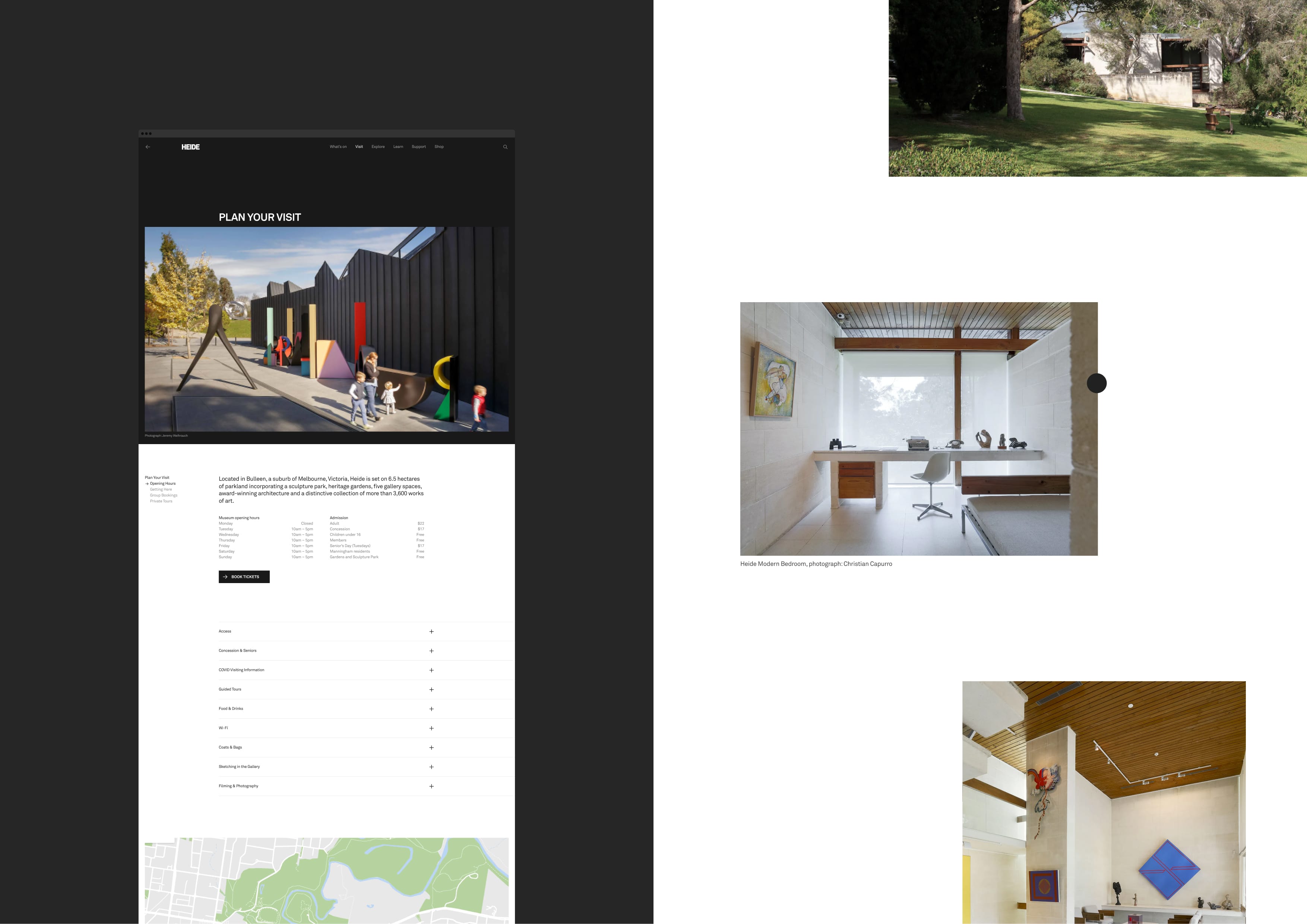
  • We restructured the website to improve usability and better highlight the benefits of Heide; the art, the architecture, and the landscape. We worked closely with the team at Heide to design the content for each of the three areas, focusi6+ng on making key pieces of information easy to find while also surfacing key brand messages and related information throughout each page. We developed a user experience that best reflected the balance between discoverability and usability.

  • The website is a significant part of the museum’s marketing strategy. The design process has helped inform other marketing activities as well as solidify the new brand. We are pleased to be able to provide the flexibility to add content as required so that the museum can communicate more effectively with its various audiences and make timely announcements when needed and without massive overhead. Since the launch, we have already seen an increase in user engagement and in ticket sales. The client is thrilled with the results as are the website's many users.

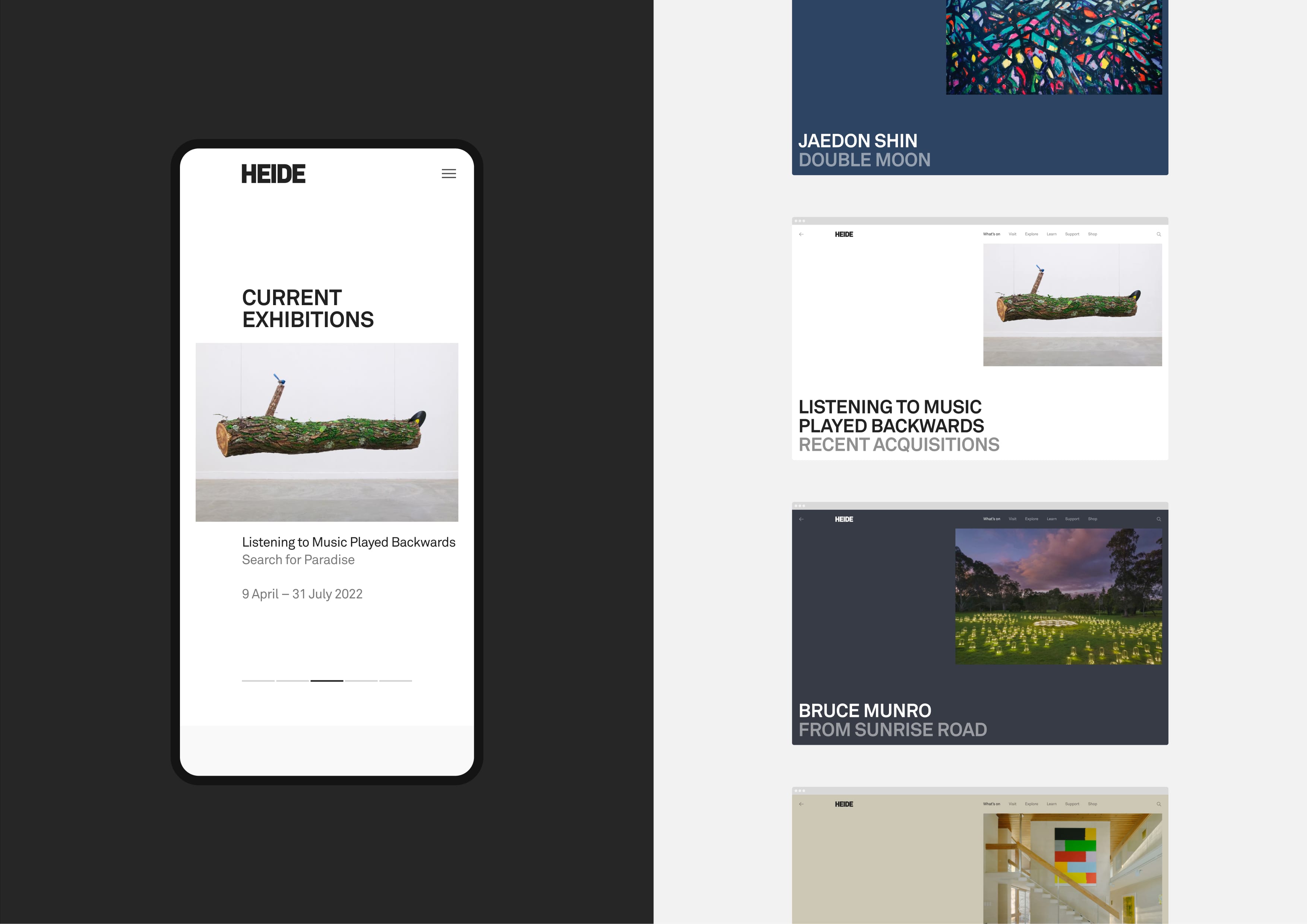
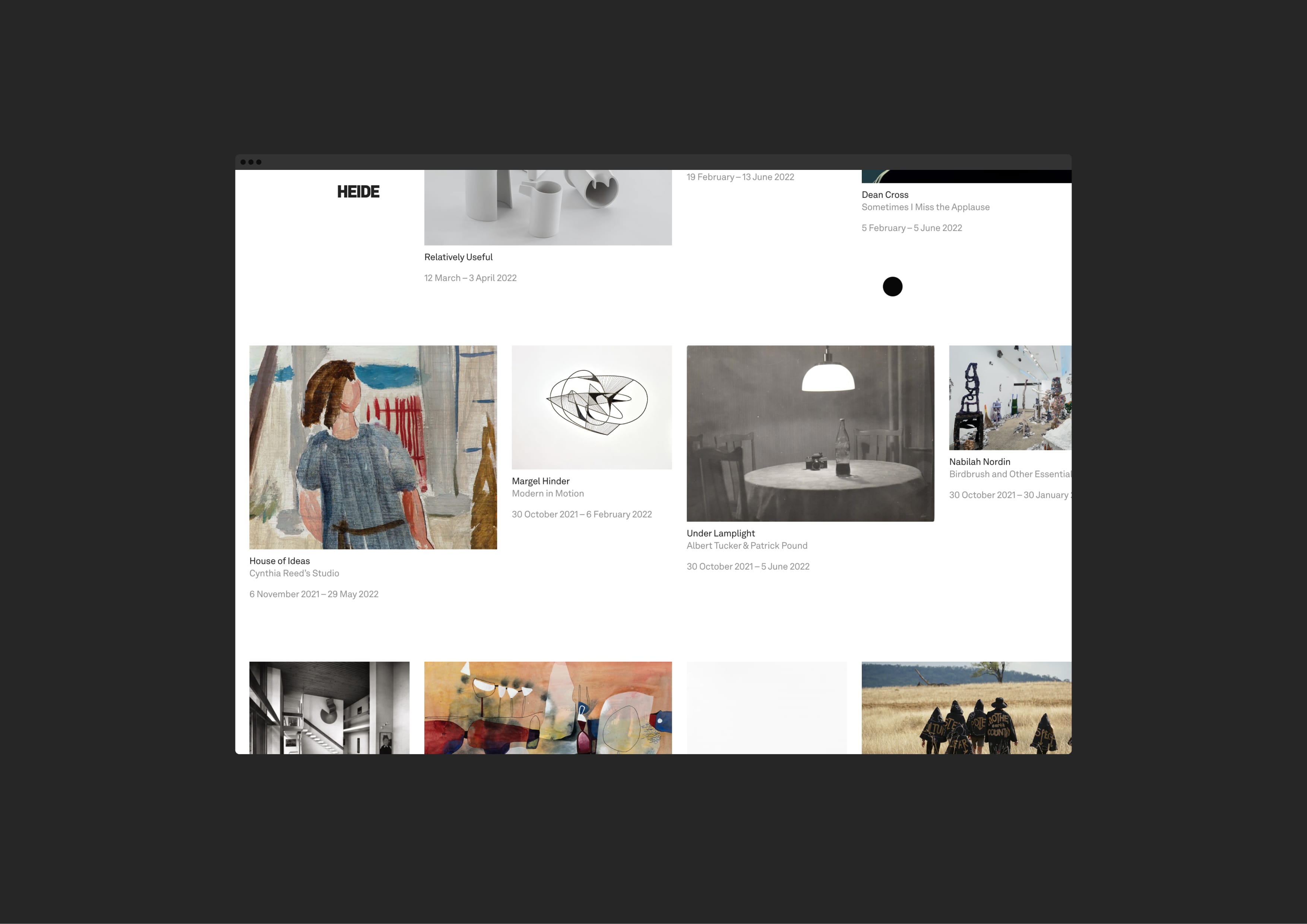
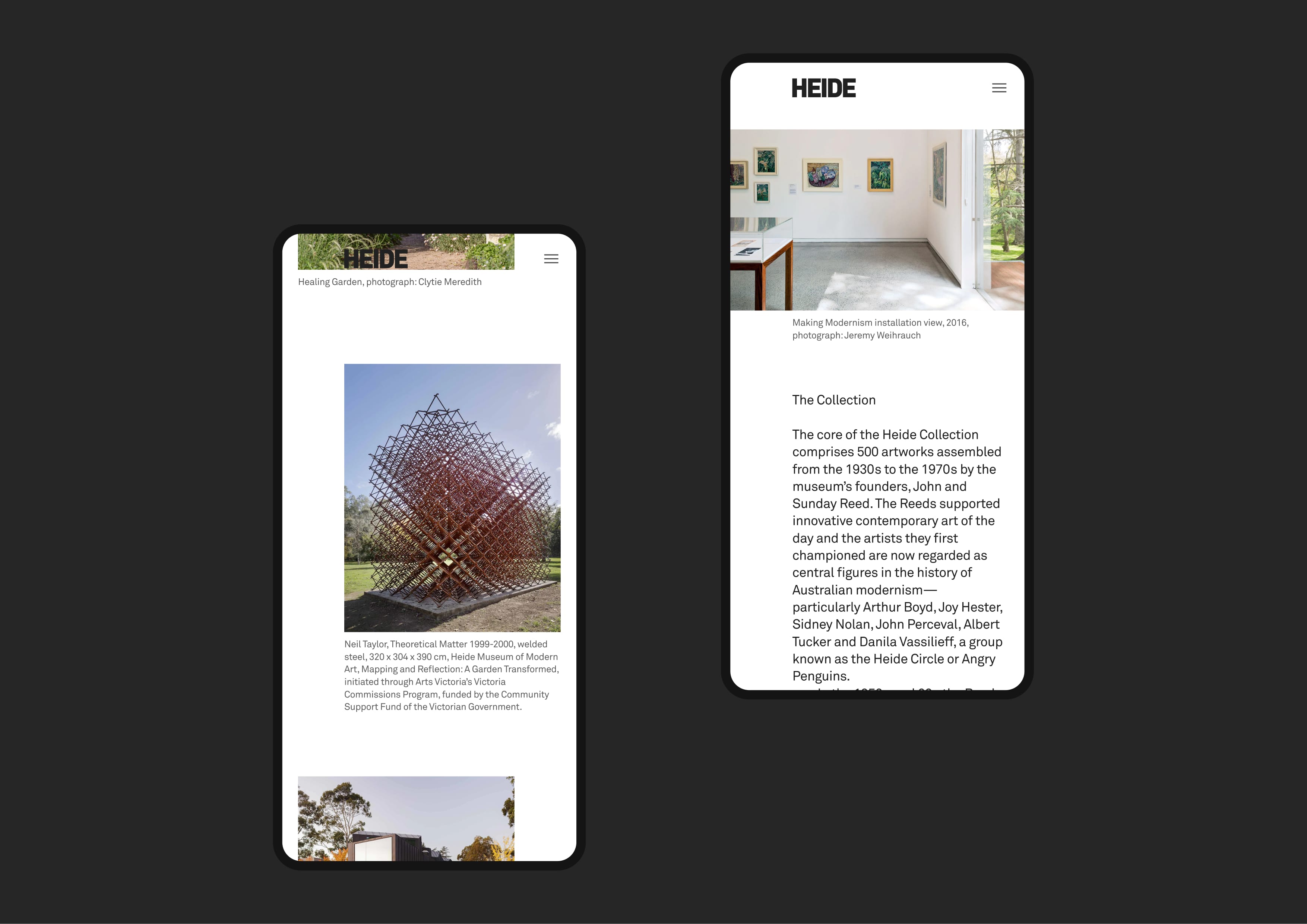
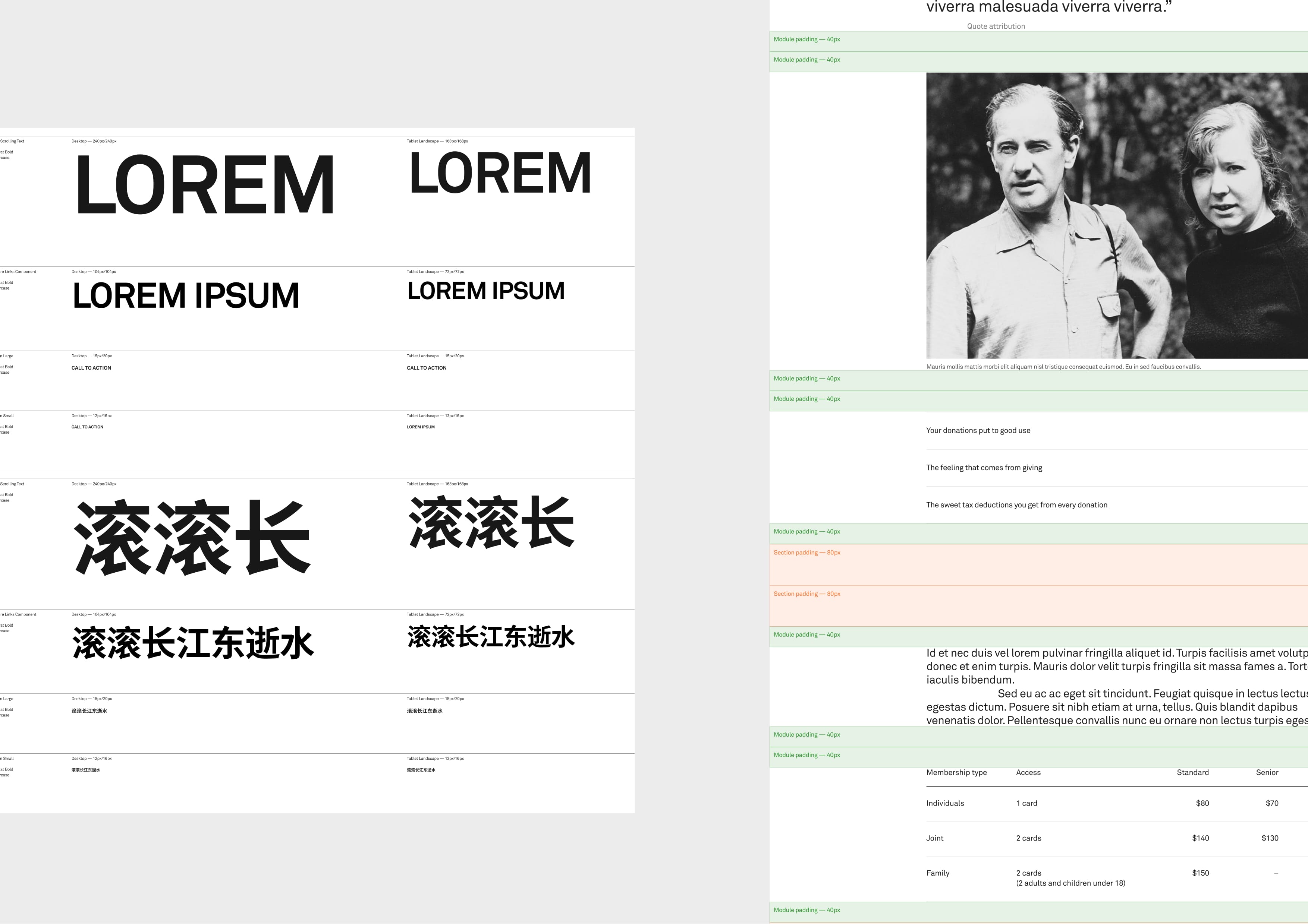
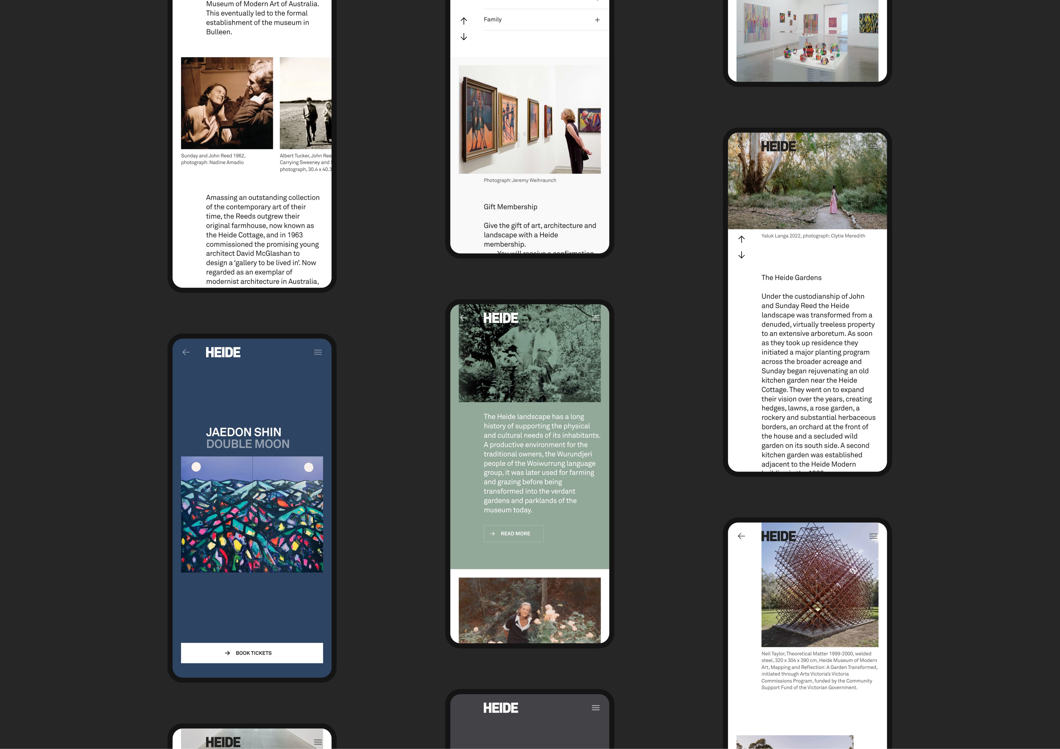
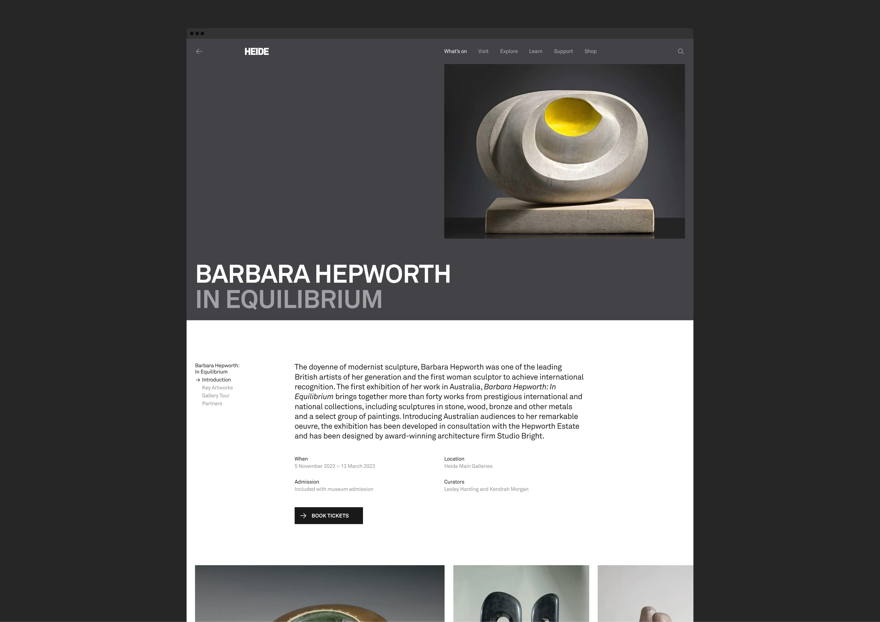
  • In many ways, the website design follows typical interaction patterns. The uniqueness is subtle and can be found in the off-centred grid and in the way elements interact on scroll. In-page navigation remains in a fixed position but fades on and off to make room for content. The Heide logo remains in a fixed position as content scrolls neatly past, and the menu appears and disappears as required and when opened, obscuring only part of the page leaving the logo clearly visible. We created an innovative solution for exhibition pages, where the client can select a colour and upload an image, and the hero graphic is automatically configured in such a way that the composition ensures images are never cropped, exhibition titles aren’t truncated and the header fills the entire viewport on any and all devices. These small details combine to create a sophisticated but familiar user experience.