Chapter2 Bikes

good-design-award_winner_rgb_blk_logo
  • 2019

  • Communication
    Branding and Identity

Designed In:

New Zealand

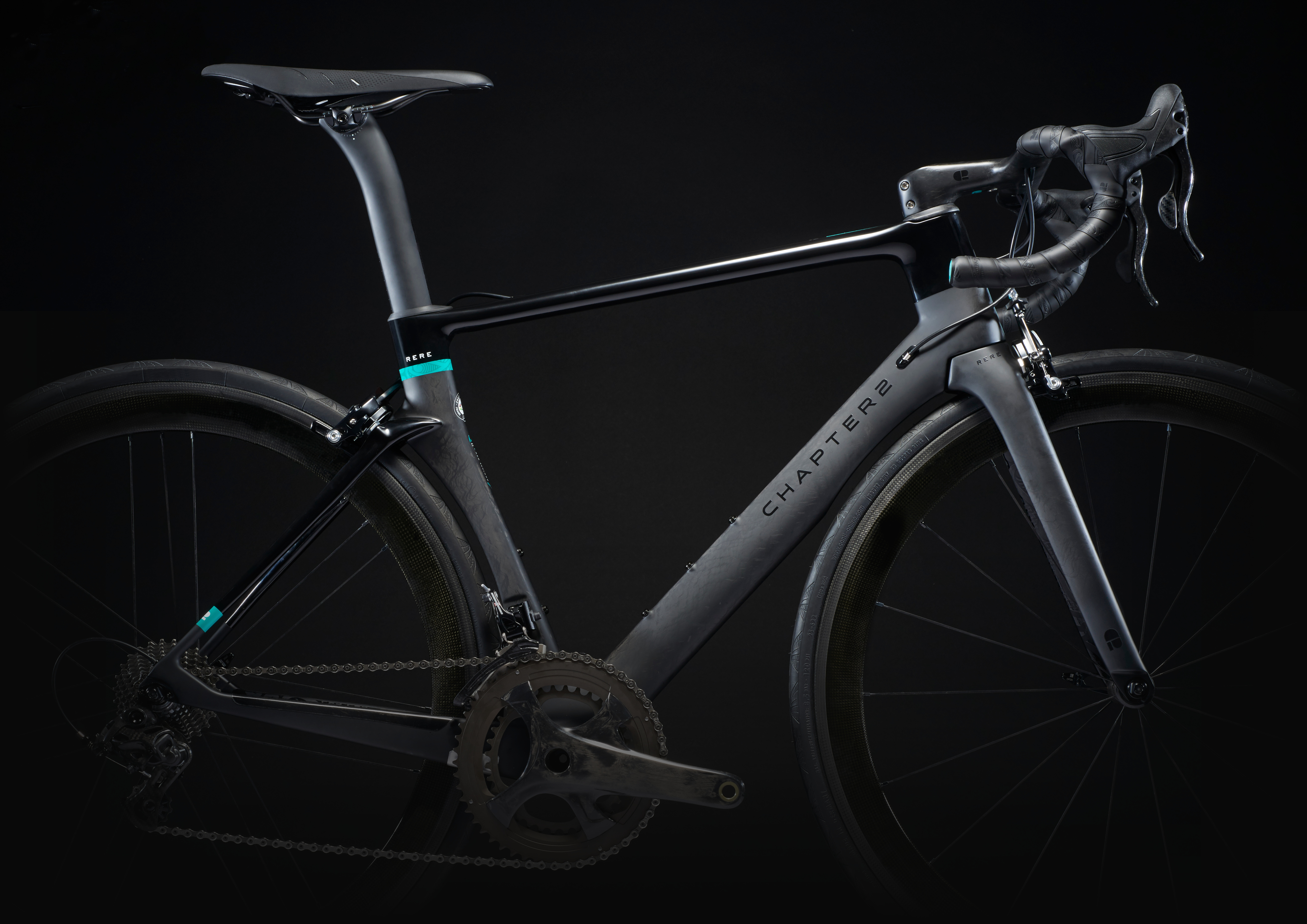
Highly regarded, designer, architect and bike racer, Michael Pride opened the next chapter of his professional life with the birth of a brave new bike brand Chapter2.


view website
view facebook
Buy online

  • CHALLENGE
  • SOLUTION
  • IMPACT
  • MORE
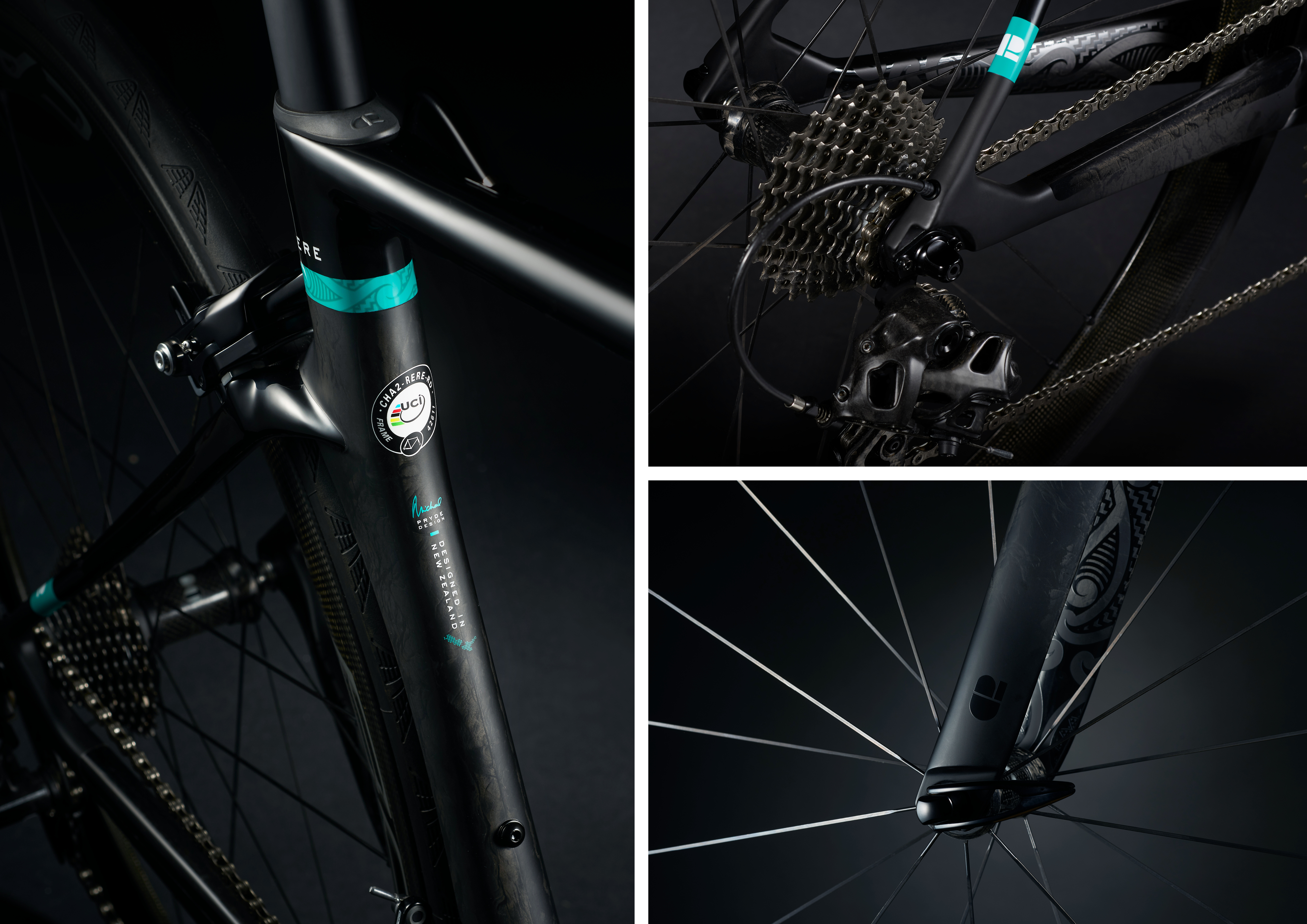
  • Create a cut-through brand identity that stood out in a highly competitive market. It needed to instantly resonate with dedicated racers, fashionistas and hobbyists alike. Many serious cyclists are very brand loyal so we needed to create intrigue and give the brand instant kudos through striking branding and bicycle graphics.

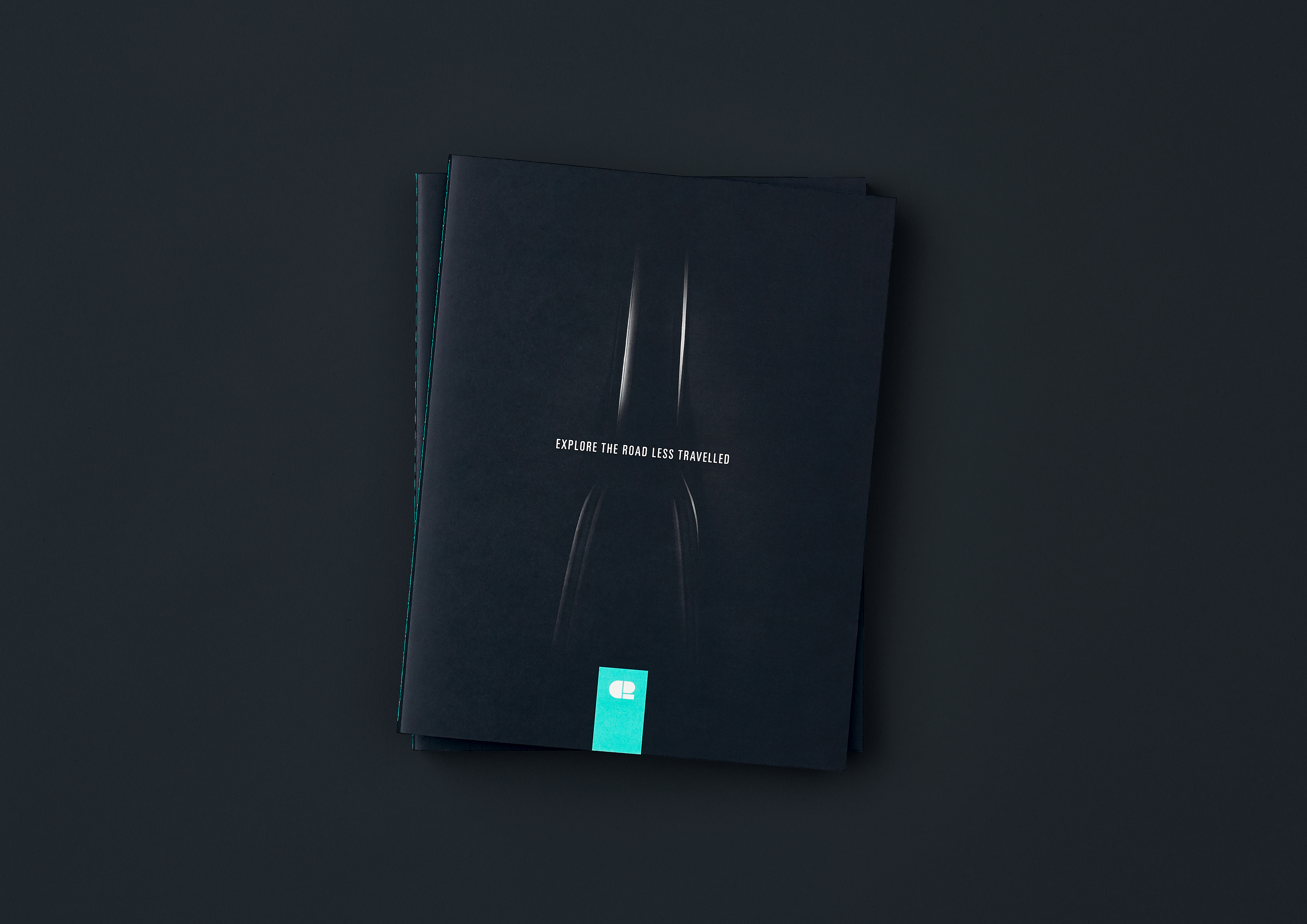
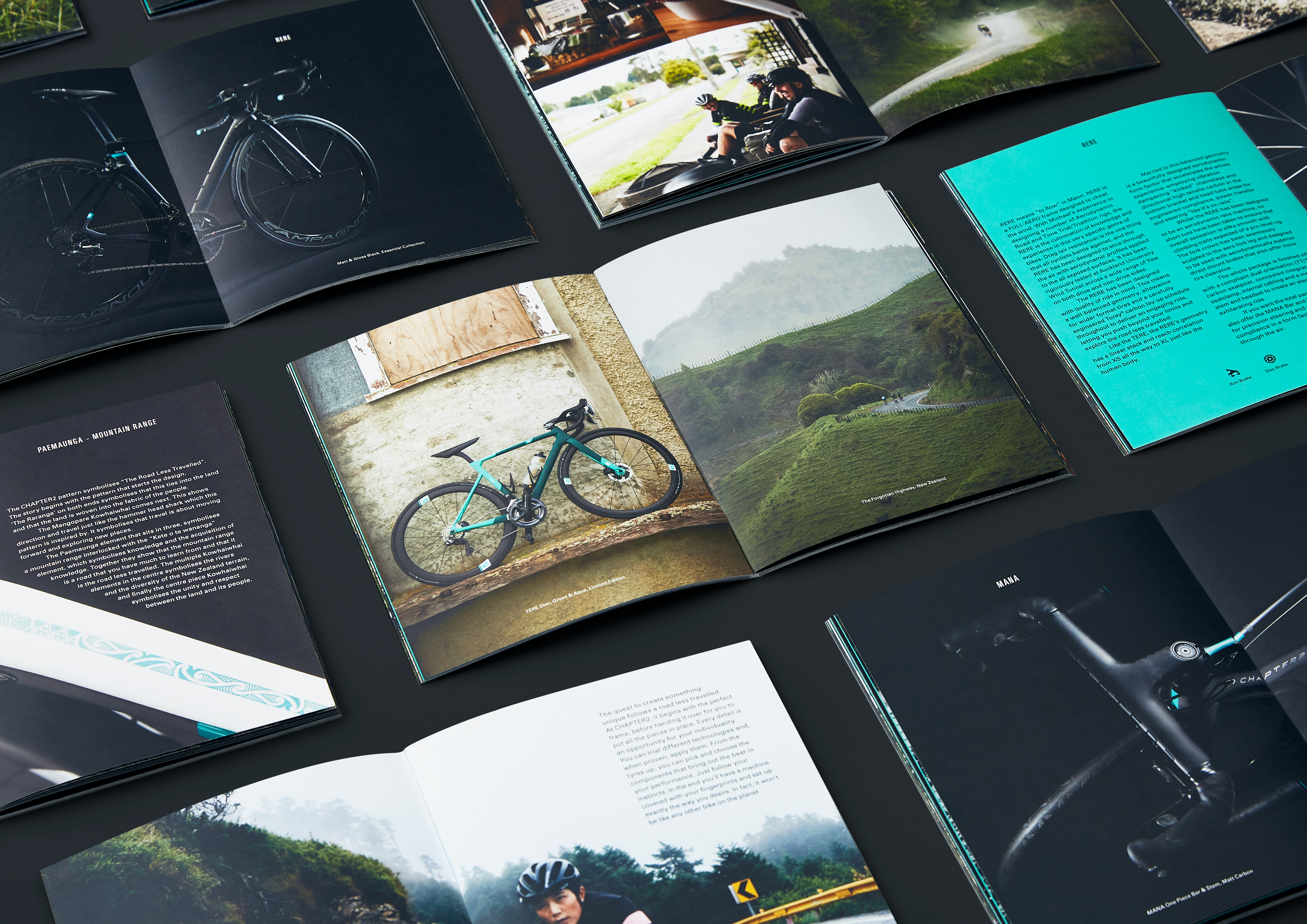
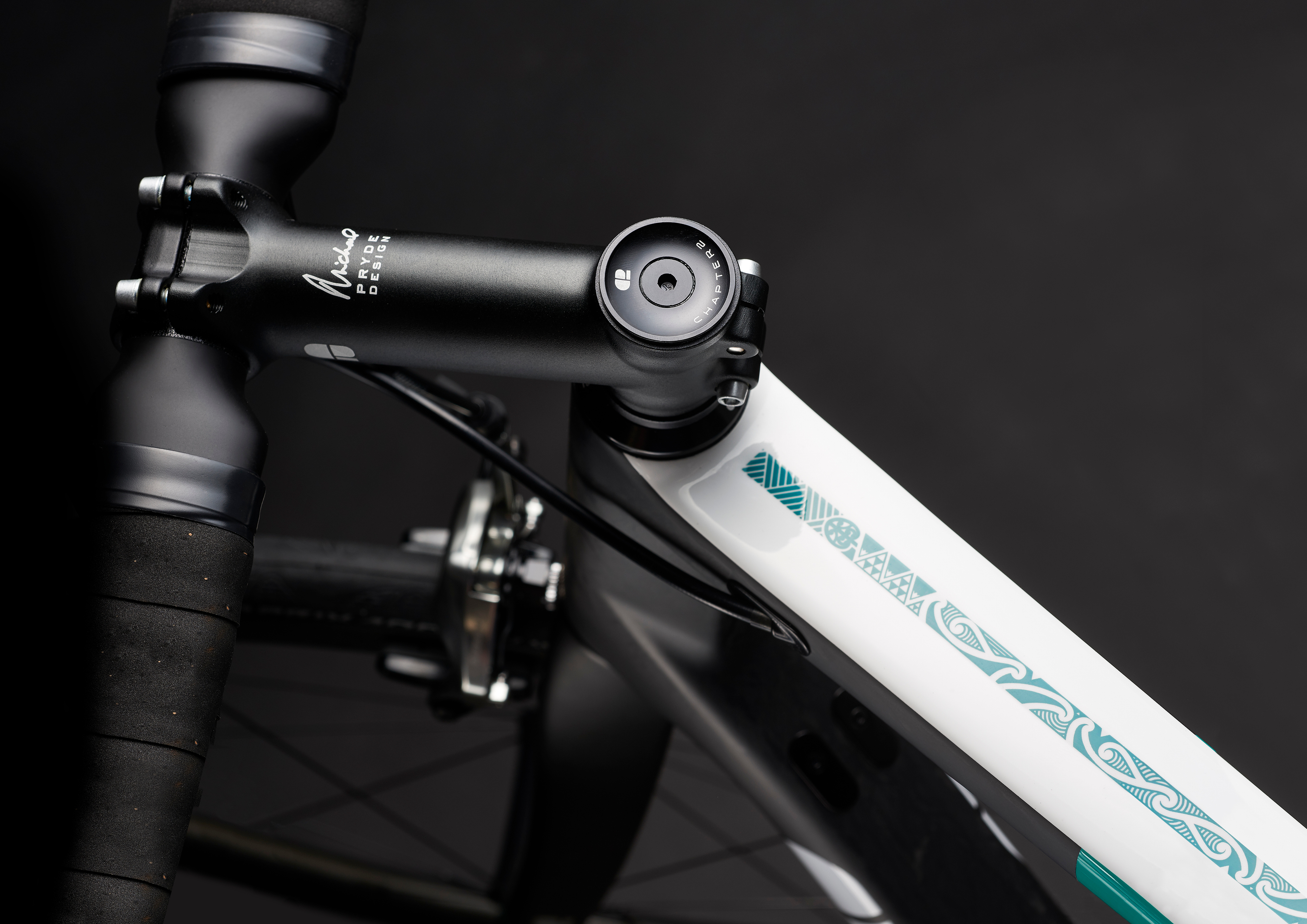
  • To be easily implemented on a global scale with their long term strategy the brandmark was created to work with the typography and on its own, helping the business launch in territories where trademarking the wordmark would be problematic. Inspired by the minimalism in the Bauhaus movement, the mark is an abstraction of C2. Unique and usable at small and large scales. The wordmark in contrast, is restrained, echoing the simplicity of the frames. Colour palette is pure New Zealand. A teal colour inspired by glacial rivers. The white, from the mountainous peaks of the Southern Alps.

  • Year one projected sales was for 275 frame units. Chapter 2 have sold over 1,000 units, generating revenue of NZD $3M . They achieved distribution across 16 countries and sold bikes to 35 countries around the globe. The brand has been consistently featured in a number of high profile print and online publications, and the bikes were used in social media by some of the largest manufacturers in the industry including Campagnolo, the third largest component manufacturer behind Shimano and SRAM.

  • Chapter2 Bikes are not for the everyday cyclist, they are aimed at experienced riders looking for something a little different. For this reason, ‘The Road Less Travelled’ was established as a brand idea and a Maori Illustrator, Mohi Toko, was commissioned to develop a visual story that could bring it to life. Emphasising the birthplace and origin of the brand. The graphic was used extensively throughout the bicycle livery, packaging and accessories. This was a kiwi story that resonated with overseas consumers, and was a key component to customer attraction and sales success. As the brand was going to sell extensively through their online channel, a custom shipping box was developed which would protect the frame and also stand out upon delivery; a unique unboxing experience has not been previously seen in the industry. The boxes geometric shape was influenced by the main frame, with other components positioned to create a visual story of how the the bike was made up.