In the midst of the BLM movement, Be Equitable (BE) was driven to do more than unconscious bias training. To create systemic transformations, they needed to motivate businesses to begin an ongoing journey. In a category overwhelmed by problems, BE’s new identity imagines the possibilities of a truly equitable future.
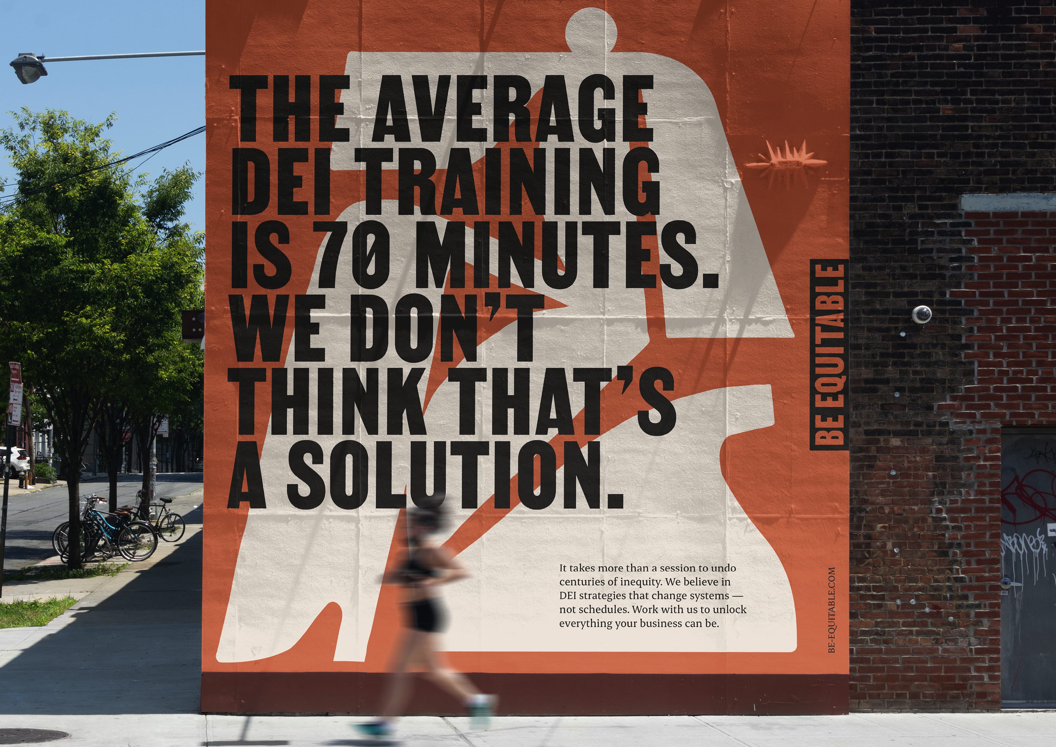
Image: Alt text: A large, orange billboard with a white illustrated body, overlaid with bold, black text that reads ‘the average DEI training is 70 minutes. We don’t think that’s a solution.’ In the bottom corner, subcopy reads ‘it takes more than a session to undo centuries of inequity. We believe in DEI strategies that change systems — not schedules. Work with us to unlock everything your business can be.’
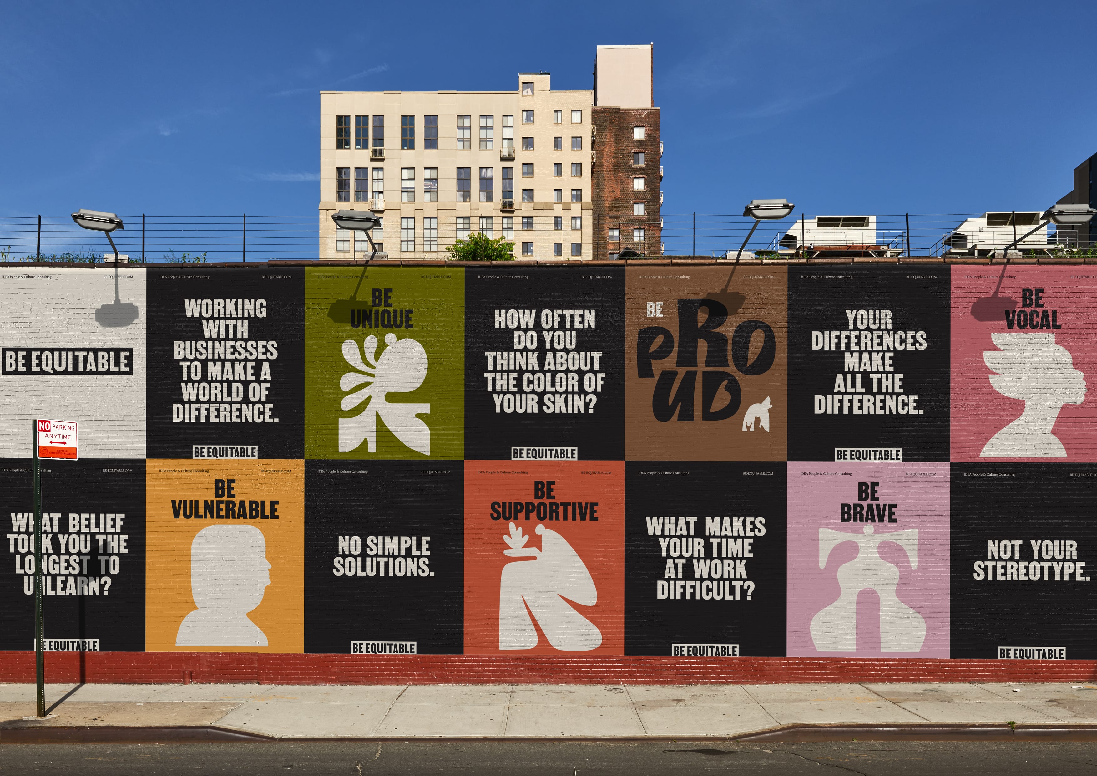
Image: Alt text: A photograph of a wall with fourteen different posters painted on it. They alternate from black posters with bold statements and provocative questions, to brightly coloured ones featuring illustrated heads and bodies.
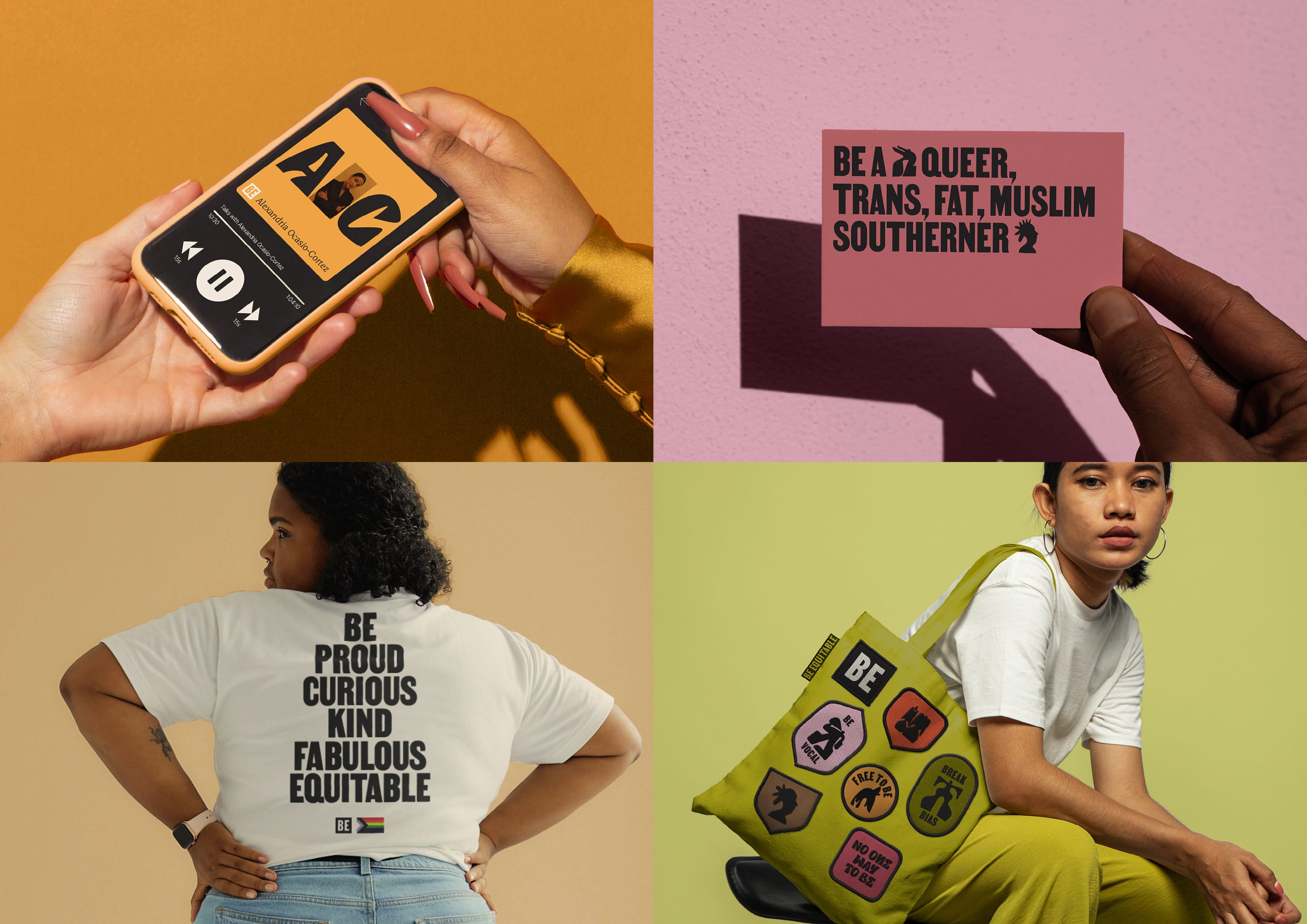
Image: Alt text: A spread with four images. The top left is a picture of a podcast about AOC. Top right is a business card that reads “Be a queer, fat, Muslim Southerner” in bold, black text. Bottom left is a woman wearing a t-shirt that reads. Bottom right is a woman with a tote bag with a variety of patches with BE illustrations and type.
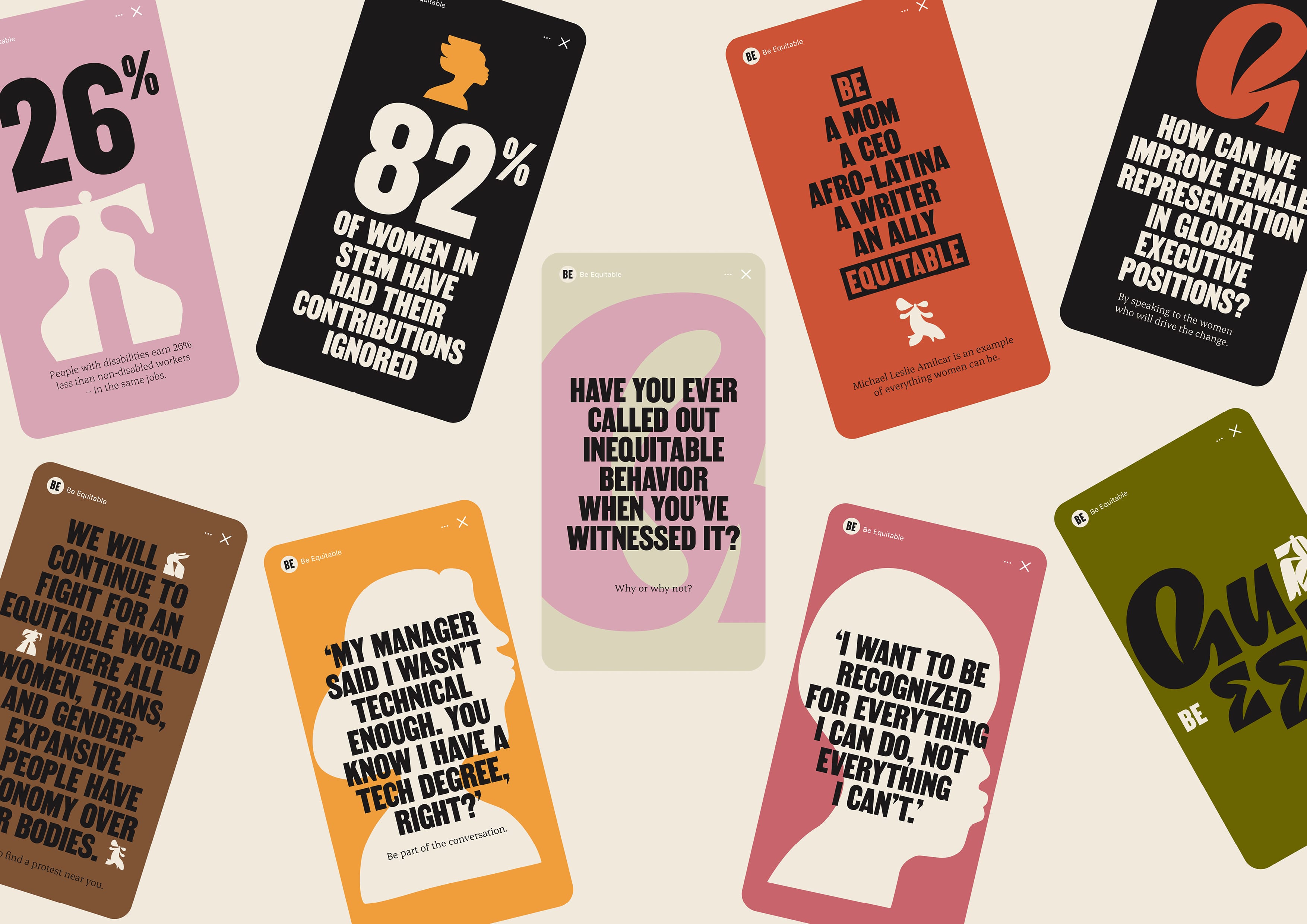
Image: Alt text: An assortment of different social medias stories. They have brightly coloured backgrounds, illustrated bodies and text that shares quotes, statistics, bold statements and provocative questions.
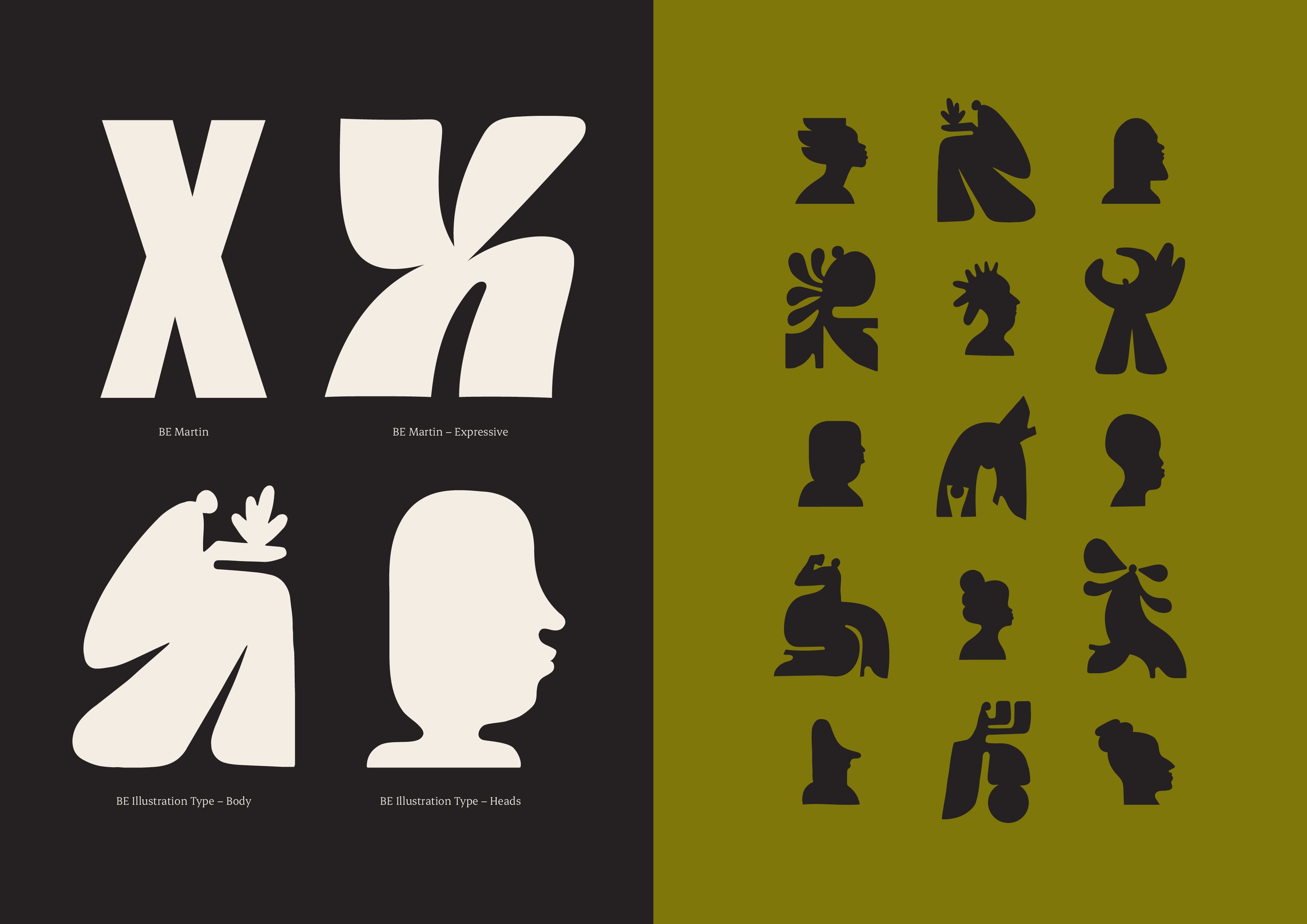
Image: Alt text: on the left a type specimen that shows the four weights of Be Equitable's typeface, BE Martin, BE Martin Expressive, BE Illustration type for heads and bodies. The right side shows a mixture of different bodies and heads from the typeface.
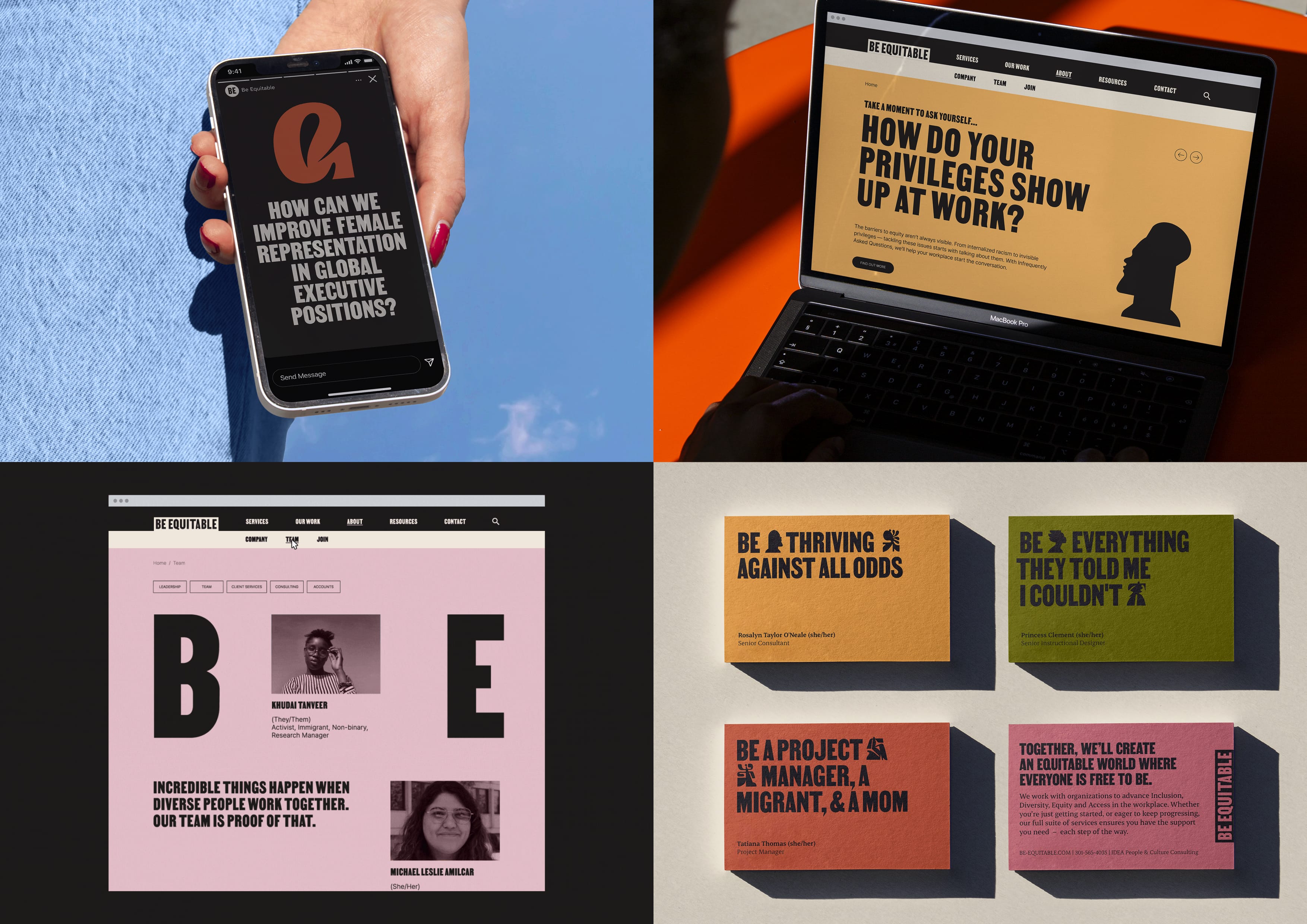
Image: Alt text: A spread with four images. The top left is a social media story that reads 'How can we improve female representation in global executive positions?'. Top right An open laptop displaying the Be Equitable website. Bottom left the team page from the Be Equitable website. Bottom right four colourful business cards.
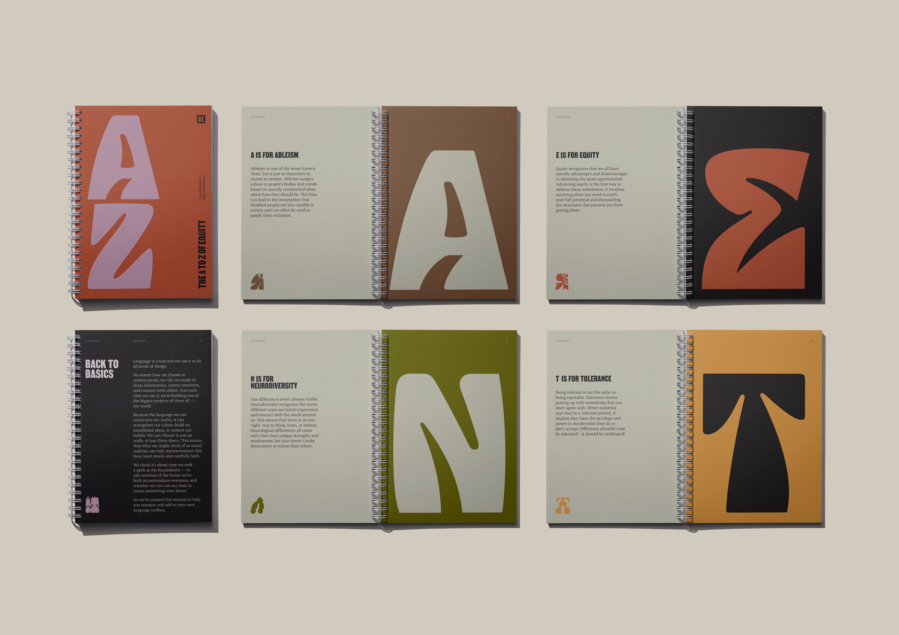
Image: Alt text: A spread of different pages from a book titled ‘The A to Z of Equity.’ Each page has a large colourful letter, with a short description accompanying each word. The pages discuss ableism, equity, neurodiversity and tolerance.
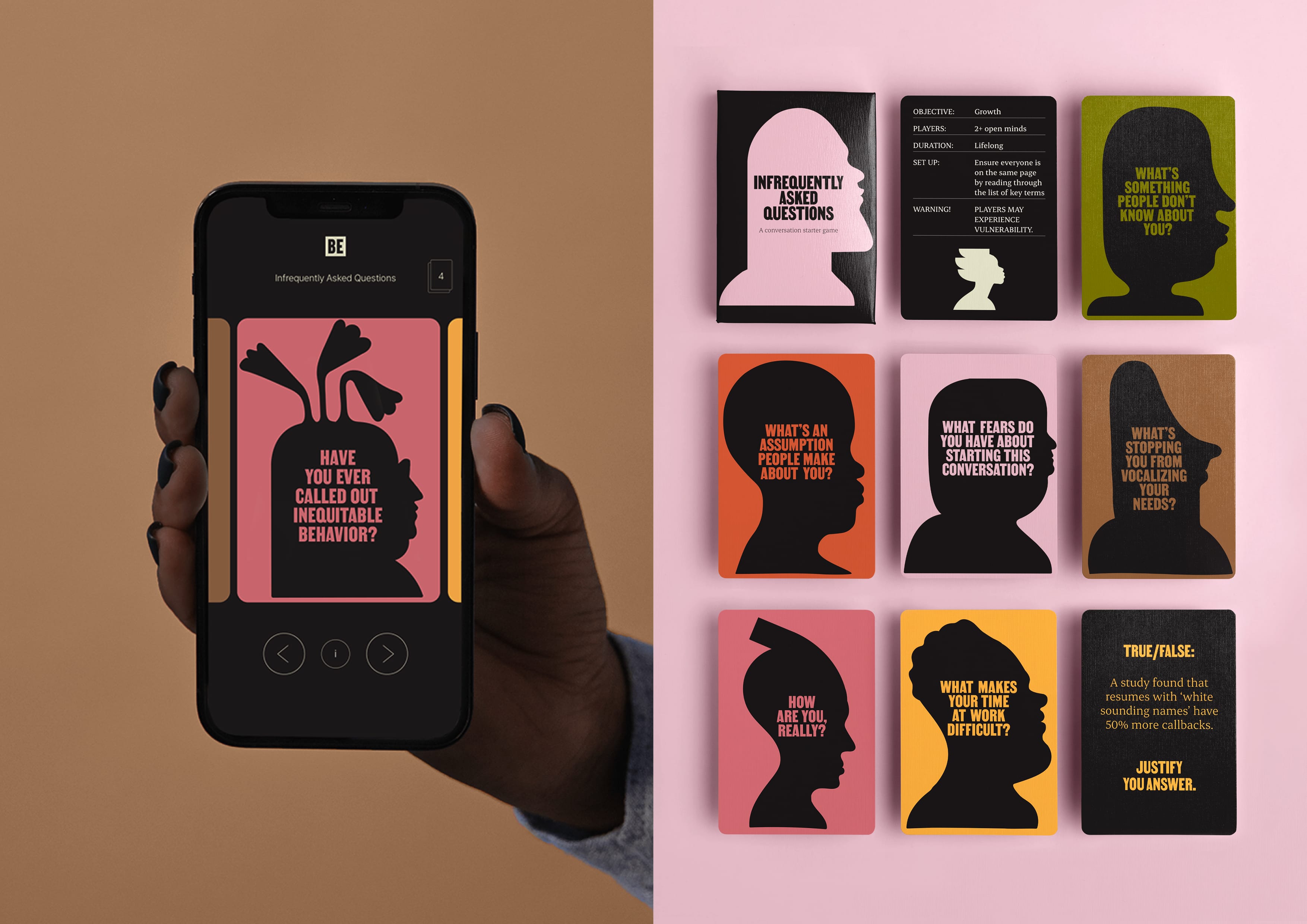
Image: Alt text: A series of cards for a game called ‘Infrequently Asked Questions’, including a digital version displayed on a phone. The cards are brightly coloured, with black silhouetted heads. Each card has a different, provocative question, such as ‘what’s an assumption people make about you?’.
CHALLENGE
SOLUTION
IMPACT
MORE
Systemic change requires difficult, ongoing work. But with cliched imagery and promises of DEI ‘solutions’, this process wasn’t being honestly reflected in the category. To support their shift to long-term partnerships, BE needed to authentically convey the complexity of systemic, organisational change and confidently share their mission with the world. The new branding needed to challenge clients accustomed to buzzwords, defy stereotypical representations of diversity, and motivate business to do the work. It was important for the new identity to also serve as an extension of their values and an example of what it means to be an equitable organisation.
Balancing an outspoken attitude and optimistic approach, BE’s brand is challenging but uplifting. The illustration suite is not limited to literal depictions of people. Instead, these imaginative and intentionally imperfect forms offer a glimpse into a possible future – a truly equitable world where difference is the norm. By celebrating the outcomes of BE’s work, they bring positivity to an otherwise challenging space. With the suite embedded into a type format, they’re able to be easily implemented by designers and non-designers alike. Each element was selected to further BE’s work, creating a toolkit that demonstrates what it means to be equitable
Following the BLM movement, it was clear that organisations needed more than a one-off training session. BE was determined to shift the industry away from quick-fixes and towards systemic transformations. Challenging businesses accustomed to buzzwords and promises of ease, the identity rewrites the language of DEI ‘solutions’. Instead, it motivates clients to begin a difficult, ongoing journey by celebrating the opportunities of equity. By collaborating with diverse creatives, the brand is a step towards inclusivity in itself. Each element encourages BE to further their work, uplift their community and continue the conversation – in the workplace and out in the world.
At the time of creation, the US was experiencing a period of political turbulence. From racial violence, to health crises, to the violation of reproductive rights – the news cycle was exhausting and overwhelming. While acknowledging the problems is crucial for creating change, BE also needed to inspire businesses to take action. A key role for the brand was to bring a positive and proactive approach to the space – one that recognises the often overlooked role of optimism. Its illustrations celebrate our differences and imagine the possibilities of a truly equitable world, while a custom, expressive typeface allows BE to communicate impactful messages in a joyful and uplifting way. Together, these elements help BE to model a potential future and reignite our belief that creating it is possible.