Atlassian’s Colour System at Scale

good-design-award_gold-winner_rgb_blk_logo
  • 2023

  • Digital
    Interface

Commissioned By:

Atlassian Design System team

Designed In:

Australia

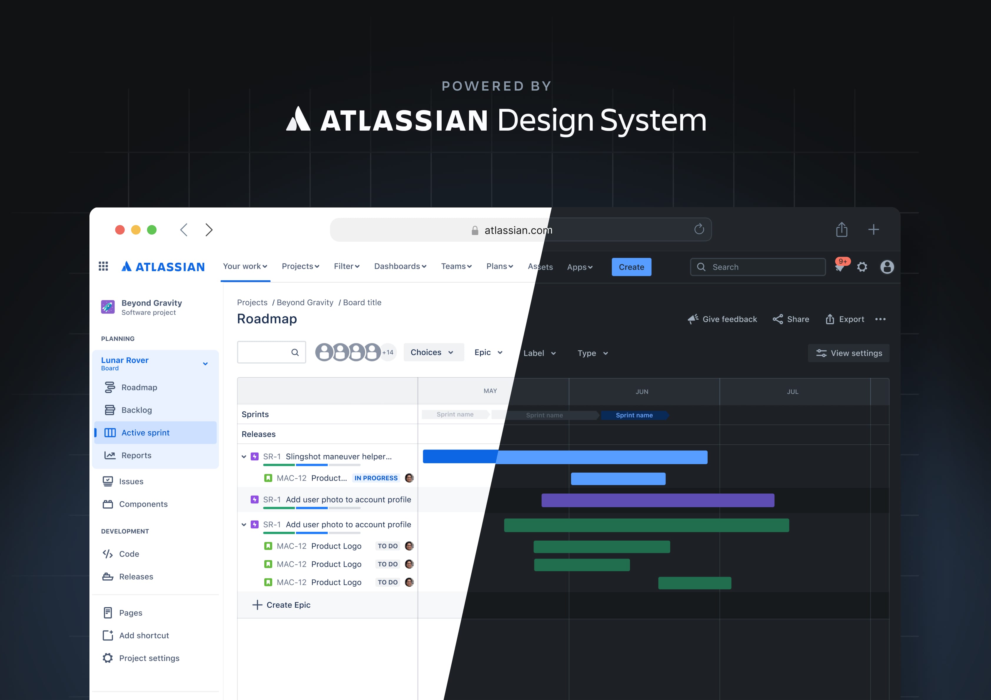
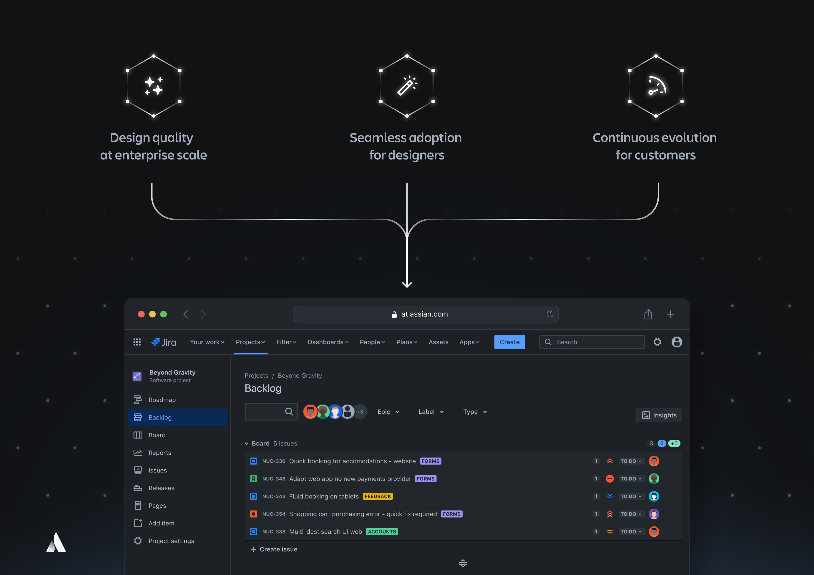
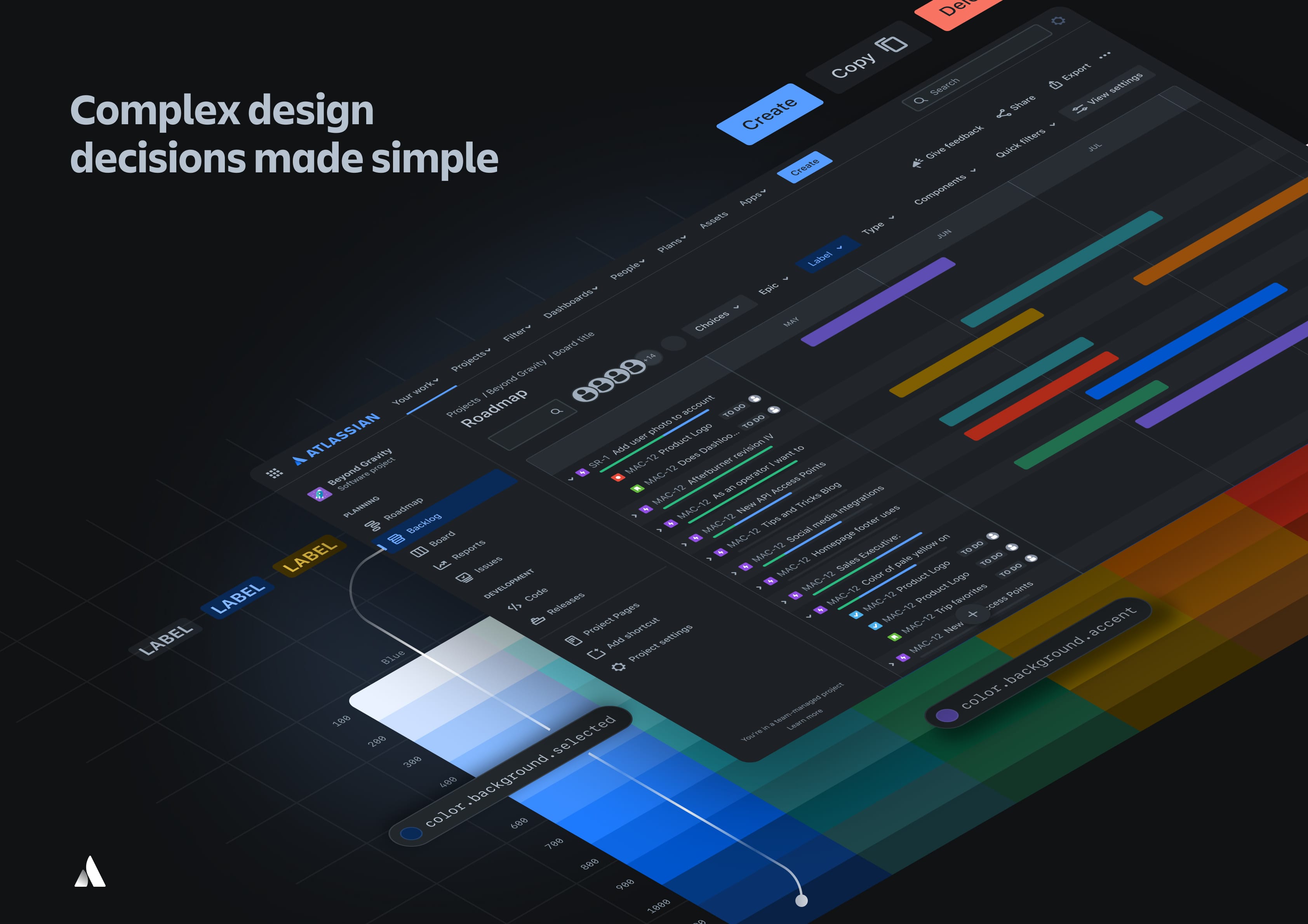
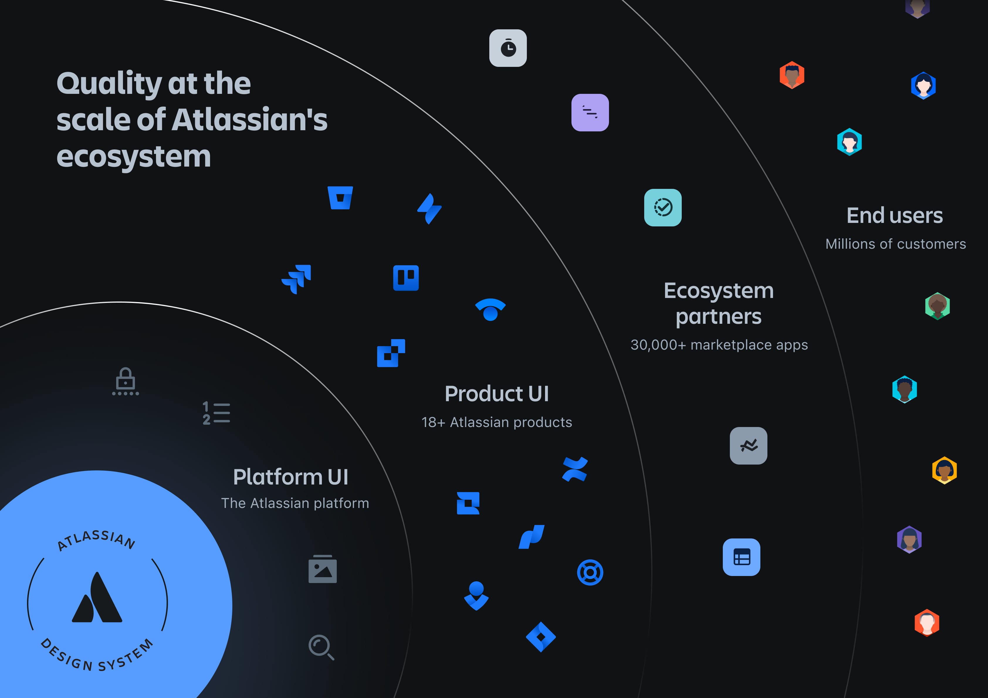
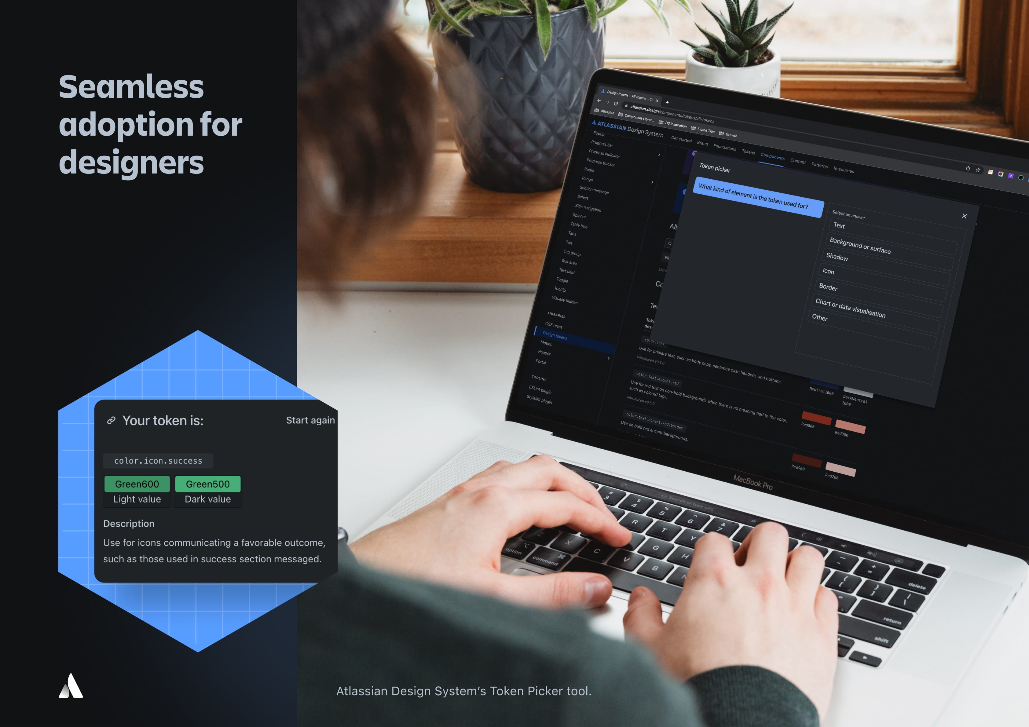
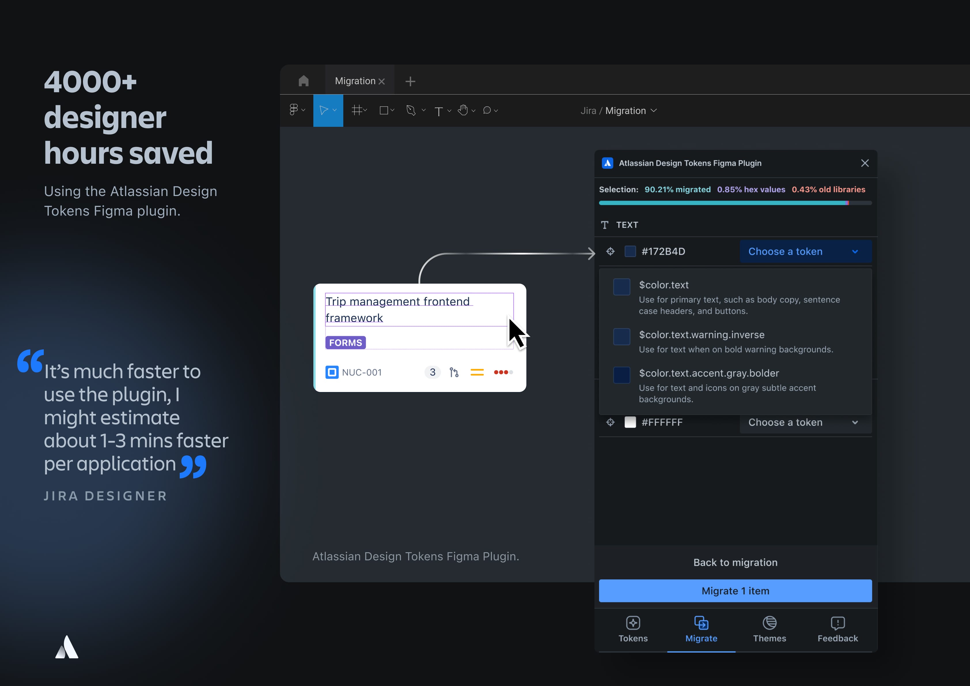
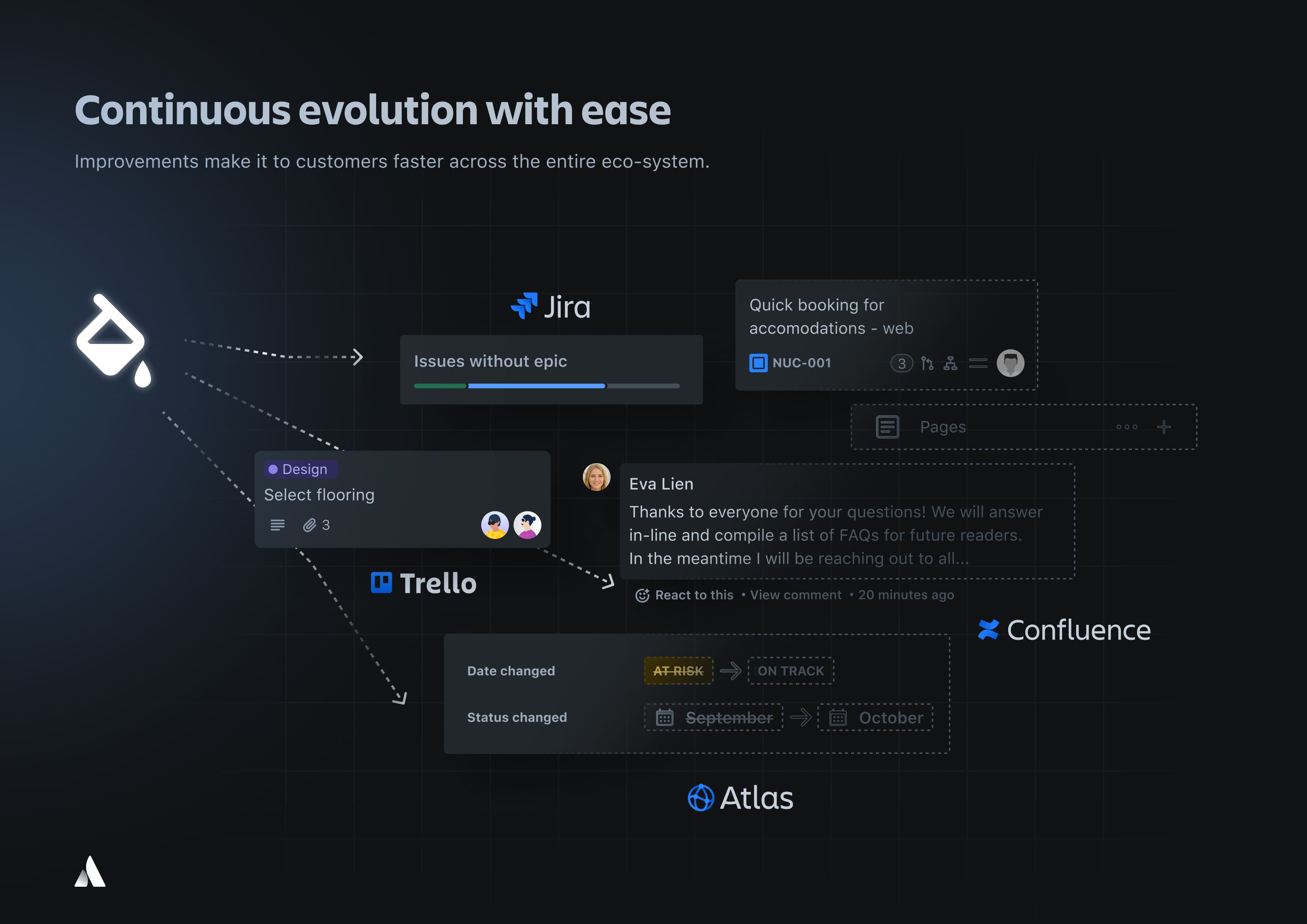
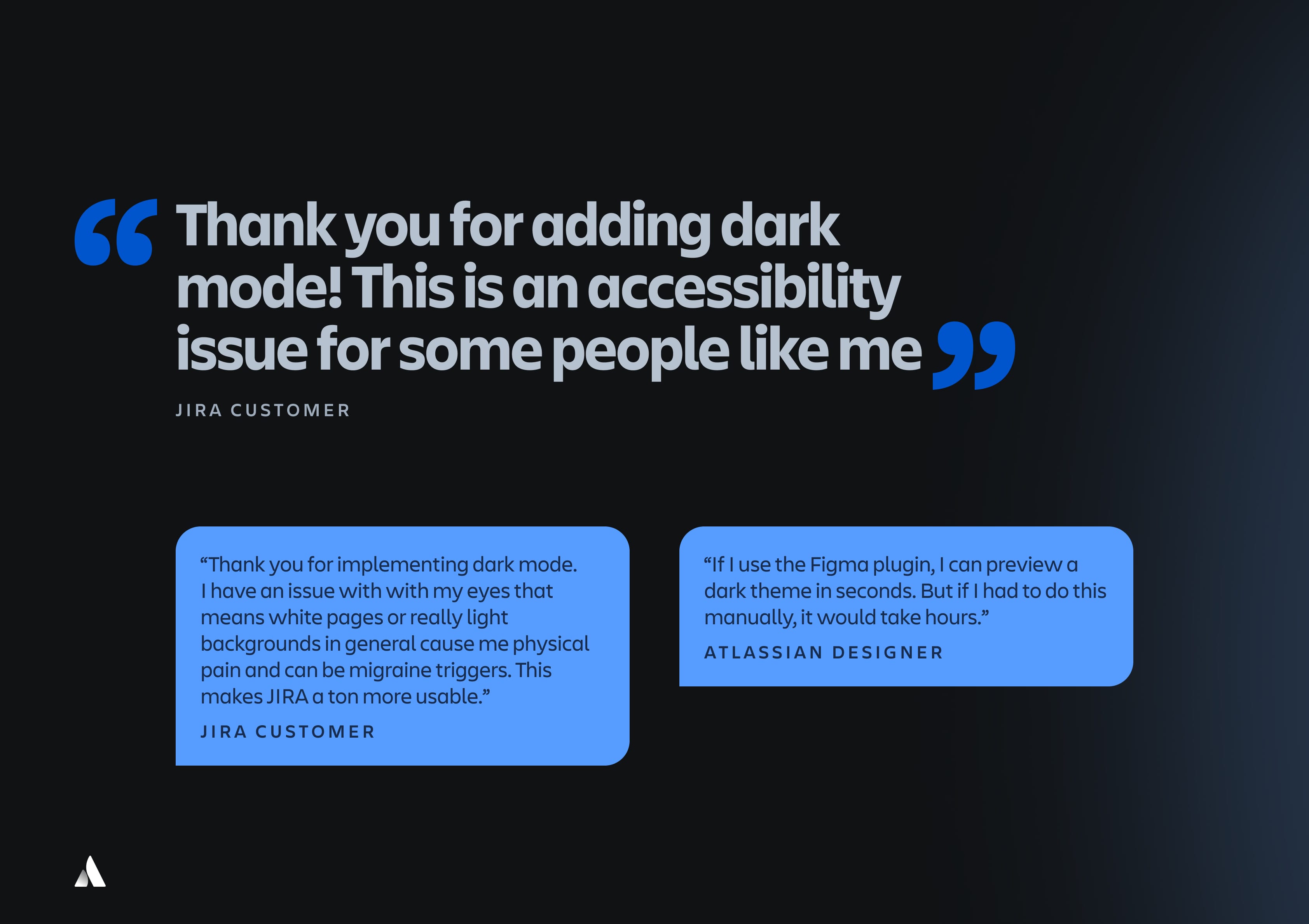
Atlassian Design System has rolled out a foundational, harmonious and empowering colour system at enterprise scale for millions of customers. Making the lives of designers and developers more enjoyable through codified design decisions and clever tooling that saves time and increases the quality of the visual theming experience.


view website
Buy online

Image:
Image:
Image:
Image:
Image:
Image:
Image:
  • CHALLENGE
  • SOLUTION
  • IMPACT
  • MORE
  • Millions of customers were experiencing a poor user interface from our legacy colour solution which was restrictive, difficult to use and time consuming for our designers. Solving within a complex ecosystem of 18+ products and 30,000 third-party apps meant we had to focus on how we would empower thousands of designers and developers to make confident and consistent design decisions that enabled experience quality and colour accessibility at scale. The solution needed to be robust, frictionless to adopt and use and continuously evolve to meet our customer’s colour accessibility needs, light sensitivity needs and strong preferences for Dark Theme.

  • We crafted a brand new colour system that made the complex appear simple, at immense scale. Through customer research and testing, we improved the inclusiveness of the system by delivering accessible colour contrasts and improved usability via a modernised colour palette. We codified these design decisions via 300 design tokens to provide confidence and clarity between designers and developers. The visual design is cohesive across the entire Atlassian product suite, particularly in Dark Theme. Underpinned by our service design approach to adoption, our world leading tooling automates migration, makes smart suggestions and drives education in context of the design workflow.

  • By focusing on the human centric needs of our customers, we designed and delivered the largest visual transformation Atlassian has seen at enterprise scale. We have improved the wellbeing and satisfaction of millions of customers who require Dark Theme as an accessibility benefit and made it seamless for our marketplace partners to do right by their customers with our design system capability. The UI tooling that we have crafted has saved our designers over 4,000 hours by taking UI tasks down from hours to seconds and empowered them to execute a higher quality visual outcome at scale with confidence.

  • Our colour system which delivered Atlassian’s first global Dark Theme solution at scale focused on three key areas. Firstly, the quality of the visual design execution, which was approached systematically through human centered design. We researched the bigger landscape and mapped colour usages from our product experiences on a spectrum, added new accent colours, created consistent steps between colour swatches, aligned contrast across colours and reduced the number of neutrals. We delivered 94 colour tokens focused on charts and data visualisation alone to enable our analytics capabilities. Secondly, we designed the end to end service adoption journey to create a healthy two way feedback loop between our designers and end users. We crafted world leading tooling like our Design Token Picker and Figma Plugin which provide design education in context of a designer's workflow whilst automating and recommending smart suggestions to increase productivity and enjoyment. Thirdly, we architected our solution for large scale roll out to ensure that UI improvements from customer feedback can be realised in days and not months, delivering value to customers faster. This has enabled us to drive a cultural change towards more mature design practices which are sustainable for our company and for our industry.