7UP Global Brand Restage

good-design-award_winner_rgb_blk_logo
  • 2023

  • Communication
    Branding and Identity

Commissioned By:

PepsiCo Design & Innovation

Designed In:

Ireland

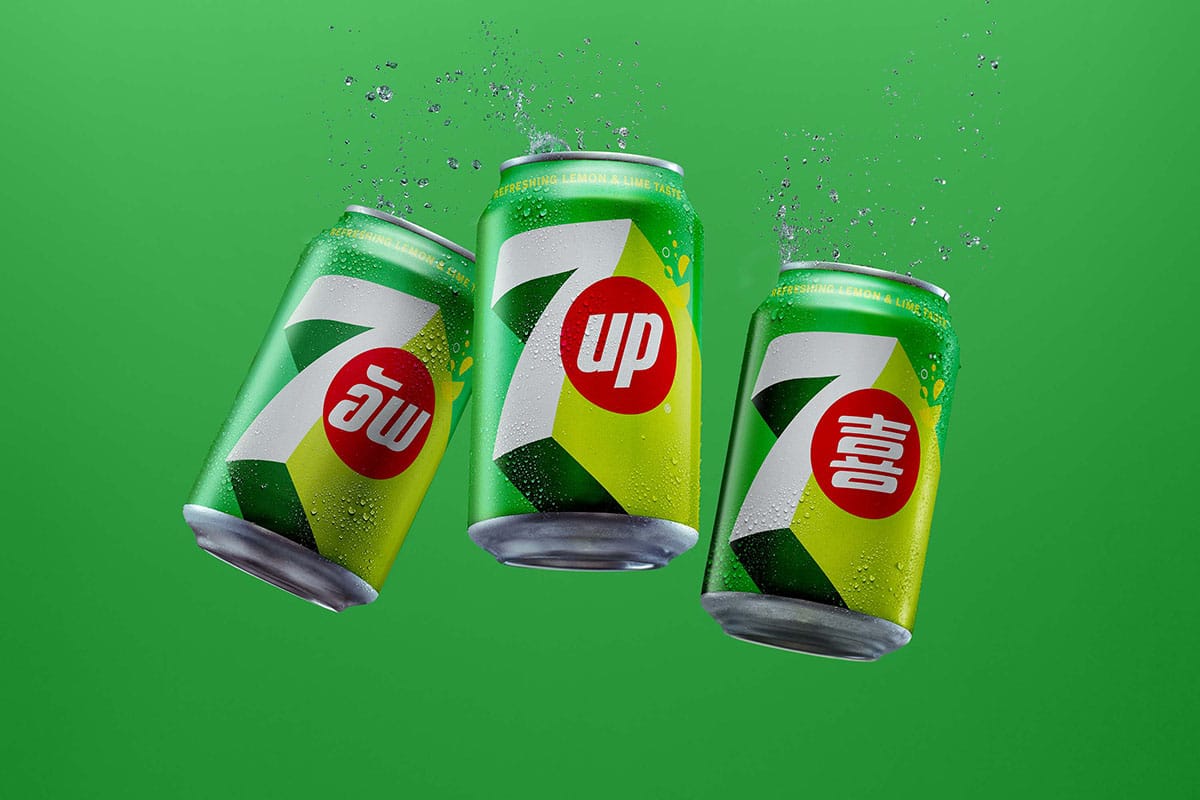
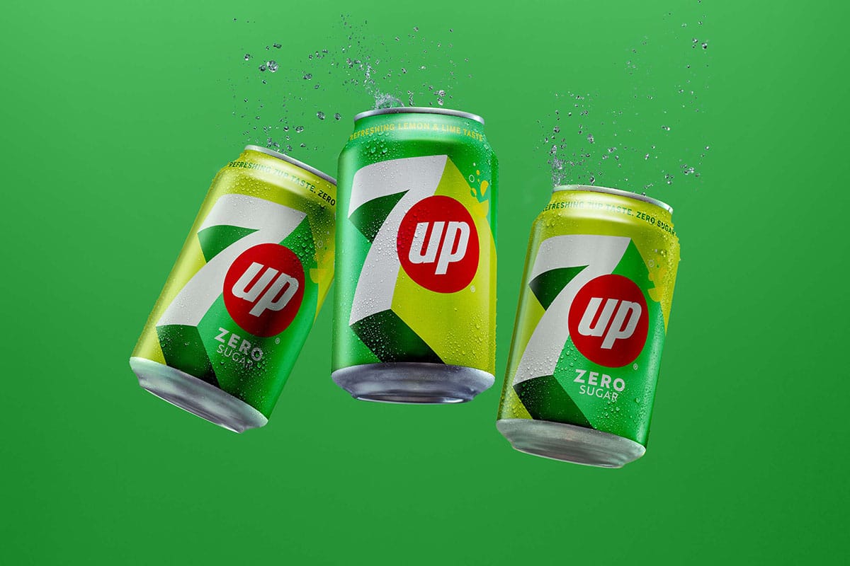
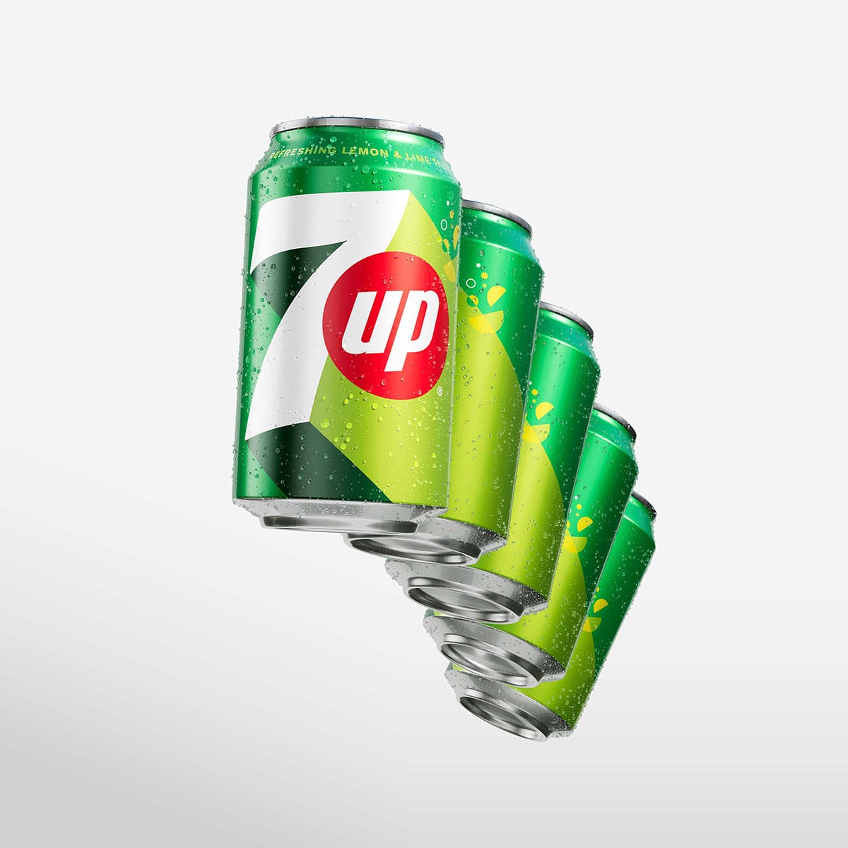
7UP® is a brand beloved for its refreshing lemon-lime flavor, popular with consumers across global markets. The brand posits that life is always better when we choose moments that uplift us, and it was time to bring this timeless 7UP narrative forward.


  • CHALLENGE
  • SOLUTION
  • IMPACT
  • MORE
  • To breathe new life and fresh attitude into the brand, 7UP needed an updated Visual Identity System (VIS) and new packaging. The restaged 7UP VIS represents a frame of mind and style that encompasses all that is refreshing, distinctive, and modern. The previous brand identity of 7UP had been established seven years ago. Wanting to reach a younger audience, it was clearly time to update the brand’s positioning. The new look and feel for the global 7UP brand had to be both timeless and modern, and carry design codes that would appeal to consumers across wide geographies and cultures.

  • In addition to these goals, as a part of the restage, 7UP Zero Sugar also needed to establish an intentional presence of its own while still maintaining an overall coherence established by the core brand. We developed compelling visuals that led consumers on a journey into the iconic brand world of 7UP and set the framework for building ‘UP’ as a distinctive asset. By owning UP as a concept, both visually and viscerally, the brand communicates that life is always better on the upside. 7UP now makes this uplifting perspective seen as well as felt.

  • To convey uplifting emotion and movement, we wove elements of levity throughout both the static photography and motion assets. Utilizing a fluid upward camera movement and incorporating a warm sunlit glow, we were able to imply ‘UPliftment’ as a feeling across the 7UP brand. The new VIS and packaging design drives distinctiveness and relevance - adding freshness, modernity, and vibrancy to the 7UP brand. Making its mark on the present, 7UP is re-engaging consumers and drawing them in to engage with the beloved brand.

  • We developed compelling visuals that led consumers on a journey into the iconic brand world of 7UP and set the framework for building ‘UP’ as a distinctive asset. By owning UP as a concept, both visually and viscerally, the brand communicates that life is always better on the upside. From the elegantly simple to the beautifully inventive, 7UP now makes this uplifting perspective seen as well as felt. The new 7UP VIS employs bold contrast and refreshing colors to convey a sense of immediate clarity and upward-focused power. We used a trio of vibrant green shades set against the clean white and commanding red of the 7UP logo. In order to distinguish between 7UP and 7UP Zero Sugar, we swapped the shades of green used in the background. We upgraded the brand’s signature green with added citrus zing to signal the freshness and zest of the product taste.